Statistical Thinking in Python (Part 2)
- Course: DataCamp: Statistical Thinking in Python (Part 2)
- This notebook is a reproducible reference.
- The material is from the course
- I completed the exercises
- If you find the content beneficial, consider a DataCamp Subscription.
def create_dir_save_filedownloads and saves the required data (data/2020-06-01_statistical_thinking_2) and image (Images/2020-06-01_statistical_thinking_2) files.
Course Description
An understanding of statistical inference will be provided. Building on the foundations from Part 1, your ability to estimate parameters and conduct hypothesis tests using real-world data sets will be enhanced. Hands-on analysis, including the study of beak measurements of Darwin’s finches, will solidify your skills. By the end of the course, you’ll be equipped with advanced tools and practical experience to confidently approach and solve your own data inference challenges.
Synopsis
Parameter estimation by optimization
- Objective: Estimate probability distribution parameters to describe data.
- Key Concepts:
- Importance of parameter estimation in statistical inference.
- Use of probability distributions to model data.
- Methods:
- Normality check using Michelson’s speed of light data.
- Calculation of mean and standard deviation.
- Comparison of empirical and theoretical CDFs.
- Findings:
- Good parameter estimates provide a good fit between empirical and theoretical CDFs.
- Impact of poor parameter estimates on the accuracy of the CDF fit.
Bootstrap confidence intervals
- Objective: Estimate confidence intervals using bootstrap resampling.
- Key Concepts:
- Variability in parameter estimates.
- Interpretation of bootstrap confidence intervals.
- Methods:
- Implementation of the bootstrap method.
- Application to Michelson’s data for mean estimation.
- Findings:
- Bootstrap provides insight into the precision of parameter estimates.
- Confidence intervals help in understanding the range of plausible values.
Introduction to hypothesis testing
- Objective: Framework for making statistical decisions.
- Key Concepts:
- Null and alternative hypotheses.
- Test statistics and their role.
- P-values and significance levels.
- Methods:
- Explanation of hypothesis testing steps.
- Introduction to decision-making based on statistical tests.
- Findings:
- P-values quantify the evidence against the null hypothesis.
- Significance levels help determine the threshold for rejecting the null hypothesis.
Hypothesis test examples
- Objective: Practical application of hypothesis testing.
- Key Concepts:
- Type I and Type II errors.
- Interpretation of test results.
- Methods:
- Hypothesis tests on real datasets (e.g., finch beak data).
- Calculation and interpretation of p-values.
- Findings:
- Examples illustrate the application of hypothesis testing.
- Understanding errors in hypothesis testing helps in making informed decisions.
Case study
- Objective: Comprehensive analysis using learned methods.
- Key Concepts:
- Integration of parameter estimation, bootstrap, and hypothesis testing.
- Application to biological data (Darwin’s finches).
- Methods:
- Detailed analysis of finch beak measurements from different years.
- Use of statistical methods to interpret data.
- Findings:
- Combined methods provide a thorough understanding of data.
- Statistical analysis aids in drawing meaningful conclusions from biological studies.
Imports
1
2
3
4
5
6
7
8
9
import pandas as pd
import matplotlib.pyplot as plt
from matplotlib import collections as mc
import numpy as np
from scipy.stats import pearsonr
import seaborn as sns
from pathlib import Path
import requests
from datetime import datetime
1
import matplotlib as mpl
1
mpl.__version__
1
'3.8.4'
Pandas Configuration Options
1
2
3
pd.set_option('display.max_columns', 200)
pd.set_option('display.max_rows', 300)
pd.set_option('display.expand_frame_repr', True)
Matplotlib Configuration Options
1
2
3
4
plt.rcParams['figure.figsize'] = (10.0, 10.0)
# plt.style.use('seaborn-dark-palette')
plt.rcParams['axes.grid'] = True
plt.rcParams["patch.force_edgecolor"] = True
Functions
def create_dir_save_file
1
2
3
4
5
6
7
8
9
10
11
12
13
14
15
16
17
def create_dir_save_file(dir_path: Path, url: str):
    """
    Check if the path exists and create it if it does not.
    Check if the file exists and download it if it does not.
    """
    if not dir_path.parents[0].exists():
        dir_path.parents[0].mkdir(parents=True)
        print(f'Directory Created: {dir_path.parents[0]}')
    else:
        print('Directory Exists')

    if not dir_path.exists():
        r = requests.get(url, allow_redirects=True)
        open(dir_path, 'wb').write(r.content)
        print(f'File Created: {dir_path.name}')
    else:
        print('File Exists')
1
2
data_dir = Path('data/2020-06-01_statistical_thinking_2')
images_dir = Path('Images/2020-06-01_statistical_thinking_2')
def ecdf
- empirical cumulative distribution function
- Computing the ECDF
1
2
3
4
5
6
7
8
9
10
11
12
def ecdf(data):
    """Compute ECDF for a one-dimensional array of measurements."""
    # Number of data points: n
    n = len(data)

    # x-data for the ECDF: x
    x = np.sort(data)

    # y-data for the ECDF: y
    y = np.arange(1, n+1) / n

    return x, y
def pearson
- Pearson correlation coefficient
- Computing the Pearson correlation coefficient
1
2
3
4
5
6
7
def pearson_r(x, y):
    """Compute Pearson correlation coefficient between two arrays."""
    # Compute correlation matrix: corr_mat
    corr_mat = np.corrcoef(x, y)

    # Return entry [0,1]
    return corr_mat[0,1]
Datasets
1
2
3
4
5
6
7
8
9
10
11
12
13
14
anscombe = 'https://assets.datacamp.com/production/repositories/470/datasets/fe820c6cbe9bcf4060eeb9e31dd86aa04264153a/anscombe.csv'
bee_sperm = 'https://assets.datacamp.com/production/repositories/470/datasets/e427679d28d154934a6c087b2fa945bc7696db6d/bee_sperm.csv'
female_lit_fer = 'https://assets.datacamp.com/production/repositories/470/datasets/f1e7f8a98c18da5c60b625cb8af04c3217f4a5c3/female_literacy_fertility.csv'
finch_beaks_1975 = 'https://assets.datacamp.com/production/repositories/470/datasets/eb228490f7d823bfa6458b93db075ca5ccd3ec3d/finch_beaks_1975.csv'
finch_beaks_2012 = 'https://assets.datacamp.com/production/repositories/470/datasets/b28d5bf65e38460dca7b3c5c0e4d53bdfc1eb905/finch_beaks_2012.csv'
fortis_beak = 'https://assets.datacamp.com/production/repositories/470/datasets/532cb2fecd1bffb006c79a28f344af2290d643f3/fortis_beak_depth_heredity.csv'
frog_tongue = 'https://assets.datacamp.com/production/repositories/470/datasets/df6e0479c0f292ce9d2b951385f64df8e2a8e6ac/frog_tongue.csv'
basball = 'https://assets.datacamp.com/production/repositories/470/datasets/593c37a3588980e321b126e30873597620ca50b7/mlb_nohitters.csv'
scandens_beak = 'https://assets.datacamp.com/production/repositories/470/datasets/7ff772e1f4e99ed93685296063b6e604a334236d/scandens_beak_depth_heredity.csv'
sheffield_weather = 'https://assets.datacamp.com/production/repositories/470/datasets/129cba08c45749a82701fbe02180c5b69eb9adaf/sheffield_weather_station.csv'
nohitter_time = 'https://raw.githubusercontent.com/trenton3983/DataCamp/master/data/2020-06-01_statistical_thinking_2/nohitter_time.csv'
sol = 'https://assets.datacamp.com/production/repositories/469/datasets/df23780d215774ff90be0ea93e53f4fb5ebbade8/michelson_speed_of_light.csv'
votes = 'https://assets.datacamp.com/production/repositories/469/datasets/8fb59b9a99957c3b9b1c82b623aea54d8ccbcd9f/2008_all_states.csv'
swing = 'https://assets.datacamp.com/production/repositories/469/datasets/e079fddb581197780e1a7b7af2aeeff7242535f0/2008_swing_states.csv'
1
2
3
4
5
6
7
8
datasets = [anscombe, bee_sperm, female_lit_fer, finch_beaks_1975, finch_beaks_2012, fortis_beak, frog_tongue, basball, scandens_beak, sheffield_weather, nohitter_time, sol, votes, swing]
data_paths = list()

for data in datasets:
    file_name = data.split('/')[-1].replace('?raw=true', '')
    data_path = data_dir / file_name
    create_dir_save_file(data_path, data)
    data_paths.append(data_path)
1
2
3
4
5
6
7
8
9
10
11
12
13
14
15
16
17
18
19
20
21
22
23
24
25
26
27
28
Directory Exists
File Exists
Directory Exists
File Exists
Directory Exists
File Exists
Directory Exists
File Exists
Directory Exists
File Exists
Directory Exists
File Exists
Directory Exists
File Exists
Directory Exists
File Exists
Directory Exists
File Exists
Directory Exists
File Exists
Directory Exists
File Exists
Directory Exists
File Exists
Directory Exists
File Exists
Directory Exists
File Exists
DataFrames
1
2
3
4
5
6
7
8
9
10
11
12
13
14
15
16
17
18
19
20
21
22
23
df_bb = pd.read_csv(data_paths[7])
nohitter_times = pd.read_csv(data_paths[10])
sol = pd.read_csv(data_paths[11])
votes = pd.read_csv(data_paths[12])
swing = pd.read_csv(data_paths[13])
fem = pd.read_csv(data_paths[2])
anscombe = pd.read_csv(data_paths[0], header=[0, 1])
anscombe.columns = [f'{x[1]}_{x[0]}' for x in anscombe.columns]  # reduce multi-level column name to single level
sheffield = pd.read_csv(data_paths[9], header=[8], sep='\\s+')
frogs = pd.read_csv(data_paths[6], header=[14])
frogs.date = pd.to_datetime(frogs.date, format='%Y_%m_%d')
baseball_df = pd.read_csv(data_paths[7])
baseball_df.date = pd.to_datetime(baseball_df.date, format='%Y%m%d')
baseball_df['days_since_last_nht'] = baseball_df.date.diff()  # calculate days since last no-hitter
baseball_df['games_since_last_nht'] = baseball_df.game_number.diff().fillna(0) - 1  # calculate games since last no-hitter
bees = pd.read_csv(data_paths[1], header=[3])
finch_1975 = pd.read_csv(data_paths[3])
finch_1975['year'] = 1975
finch_1975.rename(columns={'Beak length, mm': 'beak_length', 'Beak depth, mm': 'beak_depth'}, inplace=True)
finch_2012 = pd.read_csv(data_paths[4])
finch_2012['year'] = 2012
finch_2012.rename(columns={'blength': 'beak_length', 'bdepth': 'beak_depth'}, inplace=True)
finch = pd.concat([finch_1975, finch_2012]).reset_index(drop=True)
Parameter estimation by optimization
When doing statistical inference, we speak the language of probability. A probability distribution that describes your data has parameters. So, a major goal of statistical inference is to estimate the values of these parameters, which allows us to concisely and unambiguously describe our data and draw conclusions from it. In this chapter, you will learn how to find the optimal parameters, those that best describe your data.
Optimal parameters
- Outcomes of measurements follow probability distributions defined by the story of how the data came to be.
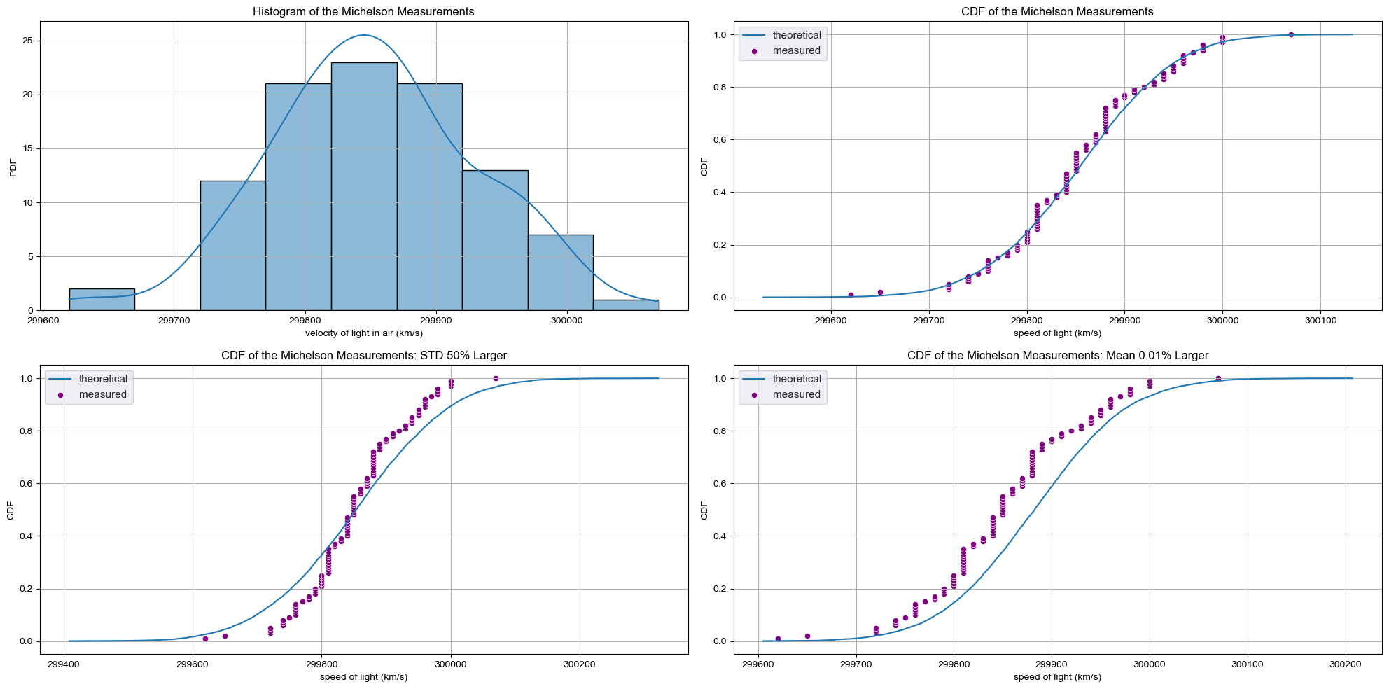
- When we looked at Michelson’s speed of light in air measurements, we assumed that the results were Normally distributed.
- We verified that both by looking at the PDF and the CDF, which was more effective becasue there is no binning bias.
Checking Normality of the Michelson data
- To compute the theoretical CDF by sampling, we pass two parameters to
np.random.normal - Calculate the mean and standard deviation (std) of the data
- The values chosen for these parameters are the mean and std of the data
CDF of the Michelson measurements
- The theoretical CDF overlays nicely with the empirical CDF.
- How did we know the mean and std calculated from the data were the appropriate values for the Normal parameters?
CDF with Bad Estimates
- We could have chosen others
- What if the std differs by 50%?
- The CDF no longer match.
- What if the main varies by just 0.01%?
Optimal Parameters
- If we believe the process that generates our data gives Normally distributed results, the set of parameters that brings the model, in this case, a Normal distribution, in closest agreement with the data, uses the mean and std computed directly from the data.
- Parameter values that bring the model in closest agreement with the data
- These are the optimal parameters.
- Remember though, the parameters are only optimal for the model chosen for the data.
Mass of MA Large mouth bass
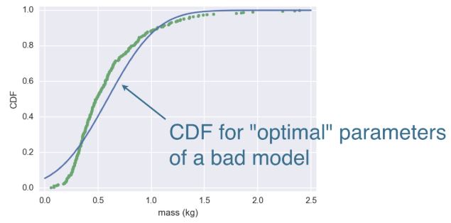
- When your model is wrong, the optimal parameters are not really meaningful.
- Finding the optimal parameters is not always as easy as just computing the mean and std from the data.
- We’ll encounter this later in this chapter when we do linear regressions and we rely on built-in Numpy functions to find the optimal parameter for us.
Packages to do statistical inference
- There are great tolls in the Python ecosystem for doing statistical inference, including by optimization
- scipy.stats
- statsmodels
- In this course we focus on hacker statistics using Numpy.
- The same simple principle is applicable to a wide variety of statistical problems.
1
2
3
4
5
6
7
8
9
10
11
12
13
14
15
16
17
18
19
20
21
22
23
24
25
26
27
28
29
30
31
32
33
34
35
36
37
38
39
40
41
42
43
44
45
46
47
f, axes = plt.subplots(2, 2, figsize=(20, 10), sharex=False)

# Plot 1
sns.histplot(sol['velocity of light in air (km/s)'], bins=9, kde=True, ax=axes[0, 0])
axes[0, 0].set_title('Histogram of the Michelson Measurements')
axes[0, 0].set_ylabel('PDF')

# Plot 2
mean = np.mean(sol['velocity of light in air (km/s)'])
std = np.std(sol['velocity of light in air (km/s)'])

samples = np.random.normal(mean, std, size=10000)
x, y = ecdf(sol['velocity of light in air (km/s)'])
x_theor, y_theor = ecdf(samples)

sns.set()
sns.lineplot(x=x_theor, y=y_theor, label='theoretical', ax=axes[0, 1])
sns.scatterplot(x=x, y=y, label='measured', color='purple', ax=axes[0, 1])
axes[0, 1].set_title('CDF of the Michelson Measurements')
axes[0, 1].set_xlabel('speed of light (km/s)')
axes[0, 1].set_ylabel('CDF')

# Plot 3
samples = np.random.normal(mean, std*1.5, size=10000)
x_theor3, y_theor3 = ecdf(samples)

sns.set()
sns.lineplot(x=x_theor3, y=y_theor3, label='theoretical', ax=axes[1, 0])
sns.scatterplot(x=x, y=y, label='measured', color='purple', ax=axes[1, 0])
axes[1, 0].set_title('CDF of the Michelson Measurements: STD 50% Larger')
axes[1, 0].set_xlabel('speed of light (km/s)')
axes[1, 0].set_ylabel('CDF')
ticks= axes[1, 0].get_xticks()

# Plot 4
samples = np.random.normal(mean*1.0001, std, size=10000)
x_theor4, y_theor4 = ecdf(samples)

sns.set()
sns.lineplot(x=x_theor4, y=y_theor4, label='theoretical', ax=axes[1, 1])
sns.scatterplot(x=x, y=y, label='measured', color='purple', ax=axes[1, 1])
axes[1, 1].set_title('CDF of the Michelson Measurements: Mean 0.01% Larger')
axes[1, 1].set_xlabel('speed of light (km/s)')
axes[1, 1].set_ylabel('CDF')

plt.tight_layout()
plt.show()
How often do we get no-hitters?
The number of games played between each no-hitter in the modern era (1901-2015) of Major League Baseball is stored in the array nohitter_times.
If you assume that no-hitters are described as a Poisson process, then the time between no-hitters is Exponentially distributed. As you have seen, the Exponential distribution has a single parameter, which we will call $\tau$, the typical interval time. The value of the parameter $\tau$ that makes the exponential distribution best match the data is the mean interval time (where time is in units of number of games) between no-hitters.
Compute the value of this parameter from the data. Then, use np.random.exponential() to “repeat” the history of Major League Baseball by drawing inter-no-hitter times from an exponential distribution with the $\tau$ you found and plot the histogram as an approximation to the PDF.
NumPy, pandas, matlotlib.pyplot, and seaborn have been imported for you as np, pd, plt, and sns, respectively.
Instructions
- Seed the random number generator with
42. - Compute the mean time (in units of number of games) between no-hitters.
- Draw 100,000 samples from an Exponential distribution with the parameter you computed from the mean of the inter-no-hitter times.
- Plot the theoretical PDF using
plt.hist(). Remember to use keyword argumentsbins=50,normed=True, andhisttype='step'. Be sure to label your axes. - Show your plot.
1
2
3
4
5
6
7
8
9
10
11
12
13
14
15
16
# Seed random number generator
np.random.seed(42)

# Compute mean no-hitter time: tau
tau = np.mean(nohitter_times)

# Draw out of an exponential distribution with parameter tau: inter_nohitter_time
inter_nohitter_time = np.random.exponential(tau, 100000)

# Plot the PDF and label axes
_ = plt.hist(inter_nohitter_time, bins=50, density=True, histtype='step')
_ = plt.xlabel('Games between no-hitters')
_ = plt.ylabel('PDF')

# Show the plot
plt.show()
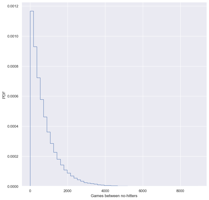
We see the typical shape of the Exponential distribution, going from a maximum at 0 and decaying to the right.
Do the data follow our story?
You have modeled no-hitters using an Exponential distribution. Create an ECDF of the real data. Overlay the theoretical CDF with the ECDF from the data. This helps you to verify that the Exponential distribution describes the observed data.
It may be helpful to remind yourself of the function you created in the previous course to compute the ECDF, as well as the code you wrote to plot it.
Instructions
- Compute an ECDF from the actual time between no-hitters (
nohitter_times). Use theecdf()function you wrote in the prequel course. - Create a CDF from the theoretical samples you took in the last exercise (
inter_nohitter_time). - Plot
x_theorandy_theoras a line usingplt.plot(). Then overlay the ECDF of the real dataxandyas points. To do this, you have to specify the keyword argumentsmarker = '.'andlinestyle = 'none'in addition toxandyinsideplt.plot(). - Set a 2% margin on the plot.
- Show the plot.
1
2
3
4
5
6
7
8
9
10
11
12
13
14
15
16
17
18
# Create an ECDF from real data: x, y
x, y = ecdf(nohitter_times.nohitter_time)

# Create a CDF from theoretical samples: x_theor, y_theor
x_theor, y_theor = ecdf(inter_nohitter_time)

# Overlay the plots
plt.plot(x_theor, y_theor, label='Theoretical ECDF')
plt.plot(x, y, marker='.', linestyle='none', label='Real ECDF')

# Margins and axis labels
plt.margins(0.02)
plt.xlabel('Games between no-hitters')
plt.ylabel('CDF')
plt.legend()

# Show the plot
plt.show()
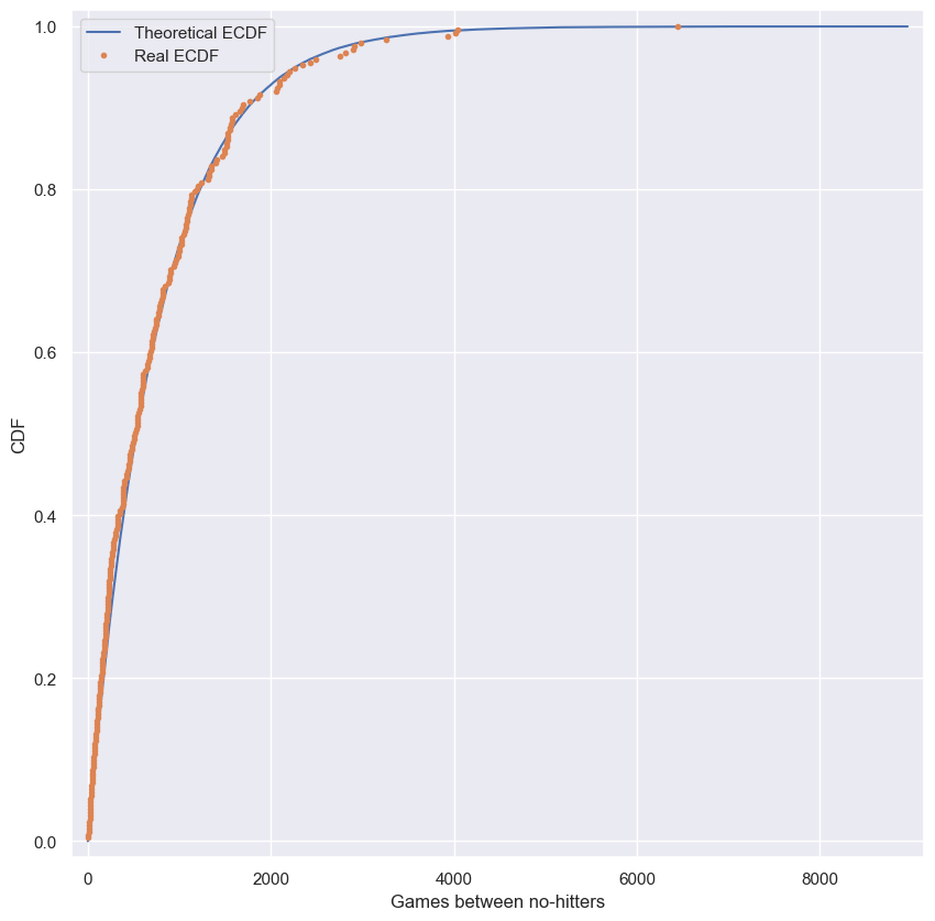
It looks like no-hitters in the modern era of Major League Baseball are Exponentially distributed. Based on the story of the Exponential distribution, this suggests that they are a random process; when a no-hitter will happen is independent of when the last no-hitter was.
How is this parameter optimal?
Now sample out of an exponential distribution with $\tau$ being twice as large as the optimal $\tau$. Do it again for $\tau$ half as large. Make CDFs of these samples and overlay them with your data. You can see that they do not reproduce the data as well. Thus, the $\tau$ you computed from the mean inter-no-hitter times is optimal in that it best reproduces the data.
Note: In this and all subsequent exercises, the random number generator is pre-seeded for you to save you some typing.
Instructions
- Take
10000samples out of an Exponential distribution with parameter $\tau_{\frac{1}{2}} =$tau/2. - Take
10000samples out of an Exponential distribution with parameter $\tau_{2} =$2*tau. - Generate CDFs from these two sets of samples using your
ecdf()function. - Add these two CDFs as lines to your plot.
1
2
3
4
5
6
7
8
9
10
11
12
13
14
15
16
17
18
19
20
21
22
23
24
25
26
27
28
# Plot the theoretical CDFs
plt.plot(x_theor, y_theor, label='Theoretical ECDF')
plt.plot(x, y, marker='.', linestyle='none', label='Real ECDF')
plt.margins(0.02)
plt.xlabel('Games between no-hitters')
plt.ylabel('CDF')

# Compute mean no-hitter time: tau
tau = np.mean(nohitter_times)

# Take samples with half tau: samples_half
samples_half = np.random.exponential(tau/2, 10000)

# Take samples with double tau: samples_double
samples_double = np.random.exponential(tau*2, 10000)

# Generate CDFs from these samples
x_half, y_half = ecdf(samples_half)
x_double, y_double = ecdf(samples_double)

# Plot these CDFs as lines
_ = plt.plot(x_half, y_half, label='Half tau')
_ = plt.plot(x_double, y_double, label='Double tau')

plt.legend(bbox_to_anchor=(1.05, 1), loc='upper left')

# Show the plot
plt.show()
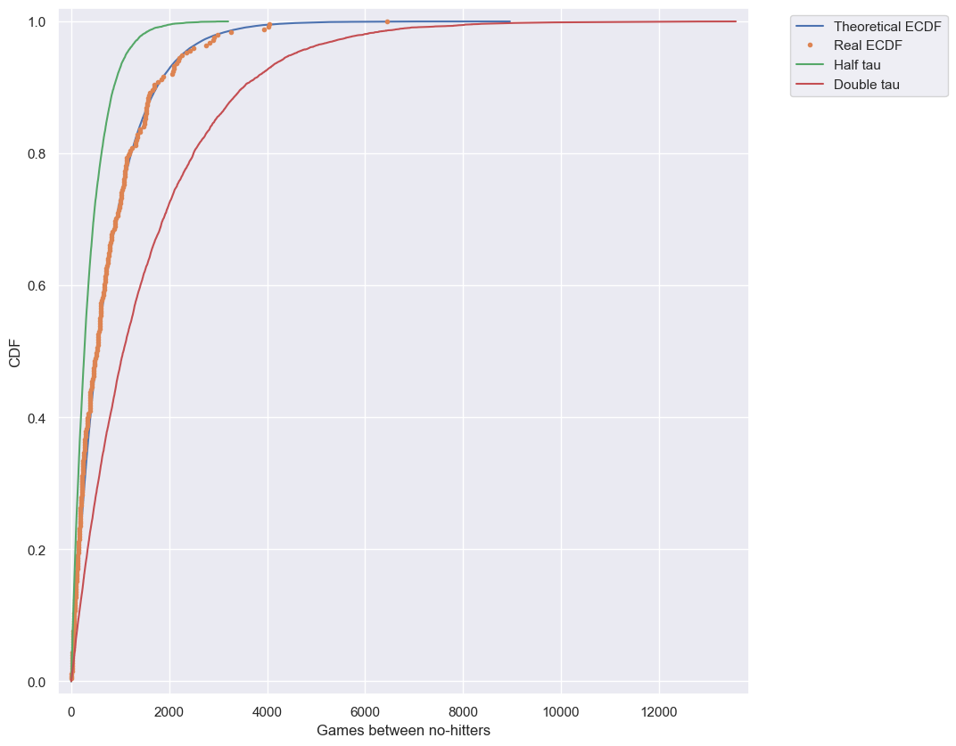
Notice how the value of tau given by the mean matches the data best. In this way, tau is an optimal parameter.
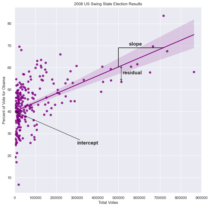
Linear regression by least squares
- Sometimes, two variables are related
- You may recall from the prequel course that we computed the Pearson correlation coefficient between Obama’s vote share in each county in swing states and the total vote count of the respective counties.
- The Pearson correlation coefficient is important to compute, be we might like to get a fuller understanding of how the data are related to each other.
- Specifically, we might suspect some underlying function give the data its shape.
- Often times, a linear function is appropriate to describe the data, and this is what we focus on in the course.
- The parameters of the function are slope and intercept.
- The slope sets how steep the line is, and the intercept sets where the line crosses the y-axis.
- How do we figure out which slope and intercept best describe the data?
- We want to choose the slope and intercept such that the data points collectively lie as close as possible to the line.
- This is easiest to think about by first considering one data point.
- The vertical distance between the data point and the line is called the residual
- In this case, the residual has a negative value because the data point lies below the line.
- Each data point has an associated residual.
Least squares
- The process of finding the parameters for which the sum of the squares of the residual is minimal, is called lease squares
- We define the line that is closest to the data to be the line for which the sum of the squares of all the residuals is minimal.
- There are many algorithms to do this in practice.
Lease squares with np.polyfit()
- We will use the np.polyfit(), which performs least squares analysis with polynomial functions.
- We can use it because a linear function is a first degree polynomial.
- The first two arguments to this function are the x and y data.
- The thirst argument is the degree of the polynomial you wish to fit; for linear functions, use 1.
- The function returns the slope and intercept of the best fit line.
- The slope tells us we get about 4 more percent votes for Obama for every 100,000 additional voters in a county.
1
2
3
4
5
slope, intercept = np.polyfit(swing.total_votes, swing.dem_share, 1)
print(slope)
>>> 4.0370717009465555e-05
print(intercept)
>>> 40.113911968641744
1
2
3
4
5
6
7
8
9
10
11
12
13
14
15
16
17
g = sns.regplot(x='total_votes', y='dem_share', data=swing, color='purple')
plt.xlim(0, 900000)
plt.ylabel('Percent of Vote for Obama')
plt.xlabel('Total Votes')
plt.title('2008 US Swing State Election Results')

plt.annotate('intercept', xy=(0, 40.1), weight='bold', xytext=(300000, 25),
             fontsize=15, arrowprops=dict(arrowstyle="->", color='black'))

plt.text(550000, 70, 'slope', fontsize=15, weight='bold')
lc = mc.LineCollection([[(500000, 69), (720000, 69)], [(500000, 69), (500000, 60)]], color='black')
g.add_collection(lc)

plt.text(520000, 57, 'residual', fontsize=15, weight='bold')
plt.annotate('', xy=(513312, 53.59), xytext=(513312, 61), arrowprops=dict(arrowstyle="<->", color='black'))

plt.show()
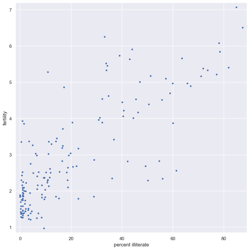
EDA of literacy/fertility data
In the next few exercises, we will look at the correlation between female literacy and fertility (defined as the average number of children born per woman) throughout the world. For ease of analysis and interpretation, we will work with the illiteracy rate.
It is always a good idea to do some EDA ahead of our analysis. To this end, plot the fertility versus illiteracy and compute the Pearson correlation coefficient. The Numpy array illiteracy has the illiteracy rate among females for most of the world’s nations. The array fertility has the corresponding fertility data.
Here, it may be useful to refer back to the function you wrote in the previous course to compute the Pearson correlation coefficient.
Instructions
- Plot
fertility(y-axis) versusilliteracy(x-axis) as a scatter plot. - Set a 2% margin.
- Compute and print the Pearson correlation coefficient between
illiteracyandfertility.
1
fem.head()
| Country | Continent | female literacy | fertility | population | |
|---|---|---|---|---|---|
| 0 | Chine | ASI | 90.5 | 1.769 | 1,324,655,000 |
| 1 | Inde | ASI | 50.8 | 2.682 | 1,139,964,932 |
| 2 | USA | NAM | 99.0 | 2.077 | 304,060,000 |
| 3 | Indonésie | ASI | 88.8 | 2.132 | 227,345,082 |
| 4 | Brésil | LAT | 90.2 | 1.827 | 191,971,506 |
1
2
illiteracy = 100 - fem['female literacy']
fertility = fem['fertility']
1
2
3
4
5
6
7
8
9
10
11
12
13
14
# Plot the illiteracy rate versus fertility
plt.plot(illiteracy, fertility, marker='.', linestyle='none')

# Set the margins and label axes
plt.margins(0.02)
plt.xlabel('percent illiterate')
plt.ylabel('fertility')

# Show the plot
plt.show()

# Show the Pearson correlation coefficient
print(pearson_r(illiteracy, fertility))
print(pearsonr(illiteracy, fertility))
1
2
0.8041324026815344
PearsonRResult(statistic=0.8041324026815345, pvalue=5.635092985976876e-38)
You can see the correlation between illiteracy and fertility by eye, and by the substantial Pearson correlation coefficient of 0.8. It is difficult to resolve in the scatter plot, but there are many points around near-zero illiteracy and about 1.8 children/woman.
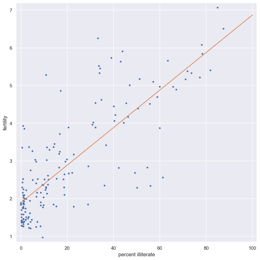
Linear regression
We will assume that fertility is a linear function of the female illiteracy rate. That is, $f=ai+b$, where a is the slope and b is the intercept. We can think of the intercept as the minimal fertility rate, probably somewhere between one and two. The slope tells us how the fertility rate varies with illiteracy. We can find the best fit line using np.polyfit().
Plot the data and the best fit line. Print out the slope and intercept. (Think: what are their units?)
Instructions
- Compute the slope and intercept of the regression line using
np.polyfit(). Remember,fertilityis on the y-axis andilliteracyon the x-axis. - Print out the slope and intercept from the linear regression.
- To plot the best fit line, create an array
xthat consists of 0 and 100 usingnp.array(). Then, compute the theoretical values ofybased on your regression parameters. I.e.,y = a * x + b. - Plot the data and the regression line on the same plot. Be sure to label your axes.
1
2
3
4
5
6
7
8
9
10
11
12
13
14
15
16
17
18
19
20
21
22
# Plot the illiteracy rate versus fertility
plt.plot(illiteracy, fertility, marker='.', linestyle='none')
plt.margins(0.02)
plt.xlabel('percent illiterate')
plt.ylabel('fertility')

# Perform a linear regression using np.polyfit(): a, b
a, b = np.polyfit(illiteracy, fertility, 1)

# Print the results to the screen
print('slope =', a, 'children per woman / percent illiterate')
print('intercept =', b, 'children per woman')

# Make theoretical line to plot
x = np.array([0, 100])
y = a * x + b

# Add regression line to your plot
plt.plot(x, y)

# Draw the plot
plt.show()
1
2
slope = 0.04979854809063423 children per woman / percent illiterate
intercept = 1.888050610636557 children per woman
How is it optimal?
The function np.polyfit() that you used to get your regression parameters finds the optimal slope and intercept. It is optimizing the sum of the squares of the residuals, also known as RSS (for residual sum of squares). In this exercise, you will plot the function that is being optimized, the RSS, versus the slope parameter a. To do this, fix the intercept to be what you found in the optimization. Then, plot the RSS vs. the slope. Where is it minimal?
Instructions
- Specify the values of the slope to compute the RSS. Use
np.linspace()to get200points in the range between0and0.1. For example, to get100points in the range between0and0.5, you could usenp.linspace()like so:np.linspace(0, 0.5, 100). - Initialize an array,
rss, to contain the RSS usingnp.empty_like()and the array you created above. Theempty_like()function returns a new array with the same shape and type as a given array (in this case,a_vals). - Write a
forloop to compute the sum of RSS of the slope. Hint: the RSS is given bynp.sum((y_data - a * x_data - b)**2). The variablebyou computed in the last exercise is already in your namespace. Here,fertilityis they_dataandilliteracythex_data. - Plot the RSS (
rss) versus slope (a_vals).
1
2
3
4
5
6
7
8
9
10
11
12
13
14
15
16
# Specify slopes to consider: a_vals
a_vals = np.linspace(0, 0.1, 200)

# Initialize sum of square of residuals: rss
rss = np.empty_like(a_vals)

# Compute sum of square of residuals for each value of a_vals
for i, a in enumerate(a_vals):
    rss[i] = np.sum((fertility - a*illiteracy - b)**2)

# Plot the RSS
plt.plot(a_vals, rss, '-')
plt.xlabel('slope (children per woman / percent illiterate)')
plt.ylabel('sum of square of residuals')

plt.show()
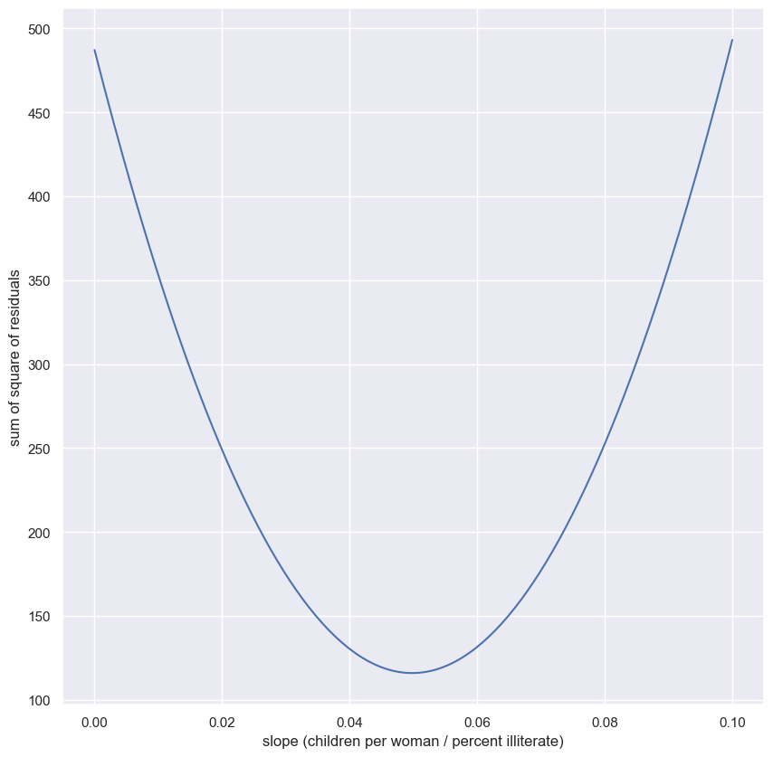
Notice that the minimum on the plot, that is the value of the slope that gives the minimum sum of the square of the residuals, is the same value you got when performing the regression.
The importance of EDA: Anscombe’s quartet
- In 1973, statistician Francis Anscombe published a paper that contained for fictitious x-y data sets, plotted below.
- He uses these data sets to make an important point.
- The point becomes clear if we blindly go about doing parameter estimation on these data sets.
- Lets look at the mean x & y values of the four data sets.
- They’re all the same
- What if we do a linear regression on each of the data sets?
- They’re the same
- Some of the fits are less optimal than others
- Let’s look at the sum of the squares of the residuals.
- They’re basically all the same
- The data sets were constructed so this would happen.
- He was making a very important point
- There are already some powerful tolls for statistical inference.
- You can compute summary statistics and optimal parameters, including linear regression parameters, and by the end of the course, you’ll be able to construct confidence intervals which quantify uncertainty about the parameter estimates.
- These are crucial skills for any data analyst, no doubt
Look before you leap!
- This is a powerful reminder to do some graphical exploratory data analysis before you start computing and making judgments about your data.
Anscombe’s quartet
- For example, plot[0, 0] (
x_0, y_0) might be well modeled with a line, and the regression parameters will be meaningful. - The same is true of plot[1, 0] (
x_2, y_2), but the outlier throws off the slope and intercept - After doing EDA, you should look into what is causing that outlier
- Plot[1, 1] (
x_3, y_3) might also have a linear relationship between x, and y, but from the plot, you can conclude that you should try to acquire more data for intermediate x values to make sure that it does. - Plot[0, 1] (
x_1, y_1) is definitely not linear, and you need to choose another model. - Explore your data first!
1
anscombe
| x_0 | y_0 | x_1 | y_1 | x_2 | y_2 | x_3 | y_3 | |
|---|---|---|---|---|---|---|---|---|
| 0 | 10.0 | 8.04 | 10.0 | 9.14 | 10.0 | 7.46 | 8.0 | 6.58 |
| 1 | 8.0 | 6.95 | 8.0 | 8.14 | 8.0 | 6.77 | 8.0 | 5.76 |
| 2 | 13.0 | 7.58 | 13.0 | 8.74 | 13.0 | 12.74 | 8.0 | 7.71 |
| 3 | 9.0 | 8.81 | 9.0 | 8.77 | 9.0 | 7.11 | 8.0 | 8.84 |
| 4 | 11.0 | 8.33 | 11.0 | 9.26 | 11.0 | 7.81 | 8.0 | 8.47 |
| 5 | 14.0 | 9.96 | 14.0 | 8.10 | 14.0 | 8.84 | 8.0 | 7.04 |
| 6 | 6.0 | 7.24 | 6.0 | 6.13 | 6.0 | 6.08 | 8.0 | 5.25 |
| 7 | 4.0 | 4.26 | 4.0 | 3.10 | 4.0 | 5.39 | 19.0 | 12.50 |
| 8 | 12.0 | 10.84 | 12.0 | 9.13 | 12.0 | 8.15 | 8.0 | 5.56 |
| 9 | 7.0 | 4.82 | 7.0 | 7.26 | 7.0 | 6.42 | 8.0 | 7.91 |
| 10 | 5.0 | 5.68 | 5.0 | 4.74 | 5.0 | 5.73 | 8.0 | 6.89 |
1
2
3
4
5
6
7
8
9
10
11
12
13
14
15
16
17
18
19
20
21
22
23
24
25
26
27
28
29
30
for i in range(1, 5):
    plt.subplot(2, 2, i)
    g = sns.scatterplot(x=f'x_{i-1}', y=f'y_{i-1}', data=anscombe)

    # x & y mean
    x_mean = anscombe.loc[:, f'x_{i-1}'].mean()
    y_mean = anscombe.loc[:, f'y_{i-1}'].mean()
    plt.vlines(anscombe.loc[:, f'x_{i-1}'].mean(), 0, 14, color='g')
    plt.text(9.2, 4, f'x-mean: {x_mean}')
    plt.hlines(anscombe.loc[:, f'y_{i-1}'].mean(), 2, 20, color='g')
    plt.text(13, 6.9, f'y-mean: {y_mean:0.1f}')

    # regression line
    slope, intercept = np.polyfit(anscombe[f'x_{i-1}'], anscombe[f'y_{i-1}'], 1)
    y1 = slope*2 + intercept
    y2 = slope*20 + intercept
    lc = mc.LineCollection([[(2, y1), (20, y2)]], color='green')
    g.add_collection(lc)
    plt.text(15, 12, 'reg-line')

    # sum of the squares of the residuals
    A = np.vstack((anscombe.loc[:, f'x_{i-1}'], np.ones(11))).T
    resid = np.linalg.lstsq(A, anscombe.loc[:, f'y_{i-1}'], rcond=-1)[1][0]
    plt.text(12.3, 1, f'sum sq. resid: {resid:0.1f}')

    plt.ylim(0, 14)
    plt.xlim(2, 20)
    plt.xticks(list(range(4, 22, 2)))
    plt.ylabel('y')
    plt.xlabel('x')
The importance of EDA
Why should exploratory data analysis be the first step in an analysis of data (after getting your data imported and cleaned, of course)?
Answer the question
- You can be protected from misinterpretation of the type demonstrated by Anscombe’s quartet.
- EDA provides a good starting point for planning the rest of your analysis.
- EDA is not really any more difficult than any of the subsequent analysis, so there is no excuse for not exploring the data.
- All of these reasons!
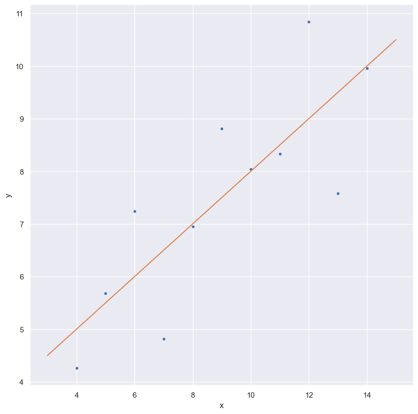
Linear regression on appropriate Anscombe data
For practice, perform a linear regression on the data set from Anscombe’s quartet that is most reasonably interpreted with linear regression.
Instructions
- Compute the parameters for the slope and intercept using
np.polyfit(). The Anscombe data are stored in the arraysxandy. - Print the slope
aand interceptb. - Generate theoretical $x$ and $y$ data from the linear regression. Your $x$ array, which you can create with
np.array(), should consist of3and15. To generate the $y$ data, multiply the slope byx_theorand add the intercept. - Plot the Anscombe data as a scatter plot and then plot the theoretical line. Remember to include the
marker='.'andlinestyle='none'keyword arguments in addition toxandywhen you plot the Anscombe data as a scatter plot. You do not need these arguments when plotting the theoretical line.
1
2
x = anscombe.x_0
y = anscombe.y_0
1
2
3
4
5
6
7
8
9
10
11
12
13
14
15
16
17
18
19
20
# Perform linear regression: a, b
a, b = np.polyfit(x, y, 1)

# Print the slope and intercept
print(a, b)

# Generate theoretical x and y data: x_theor, y_theor
x_theor = np.array([3, 15])
y_theor = a * x_theor + b

# Plot the Anscombe data and theoretical line
_ = plt.plot(x, y, marker='.', linestyle='none')
_ = plt.plot(x_theor, y_theor)

# Label the axes
plt.xlabel('x')
plt.ylabel('y')

# Show the plot
plt.show()
1
0.5000909090909095 3.0000909090909076
Linear regression on all Anscombe data
Now, to verify that all four of the Anscombe data sets have the same slope and intercept from a linear regression, you will compute the slope and intercept for each set. The data are stored in lists; anscombe_x = [x1, x2, x3, x4] and anscombe_y = [y1, y2, y3, y4], where, for example, x2 and y2 are the $x$ and $y$ values for the second Anscombe data set.
Instructions
- Write a
forloop to do the following for each Anscombe data set. - Compute the slope and intercept.
- Print the slope and intercept.
1
2
3
4
5
6
7
8
9
# Iterate through x,y pairs
for i in range(0, 4):
    # Compute the slope and intercept: a, b
    x = anscombe.loc[:, f'x_{i}']
    y = anscombe.loc[:, f'y_{i}']
    a, b = np.polyfit(x, y, 1)

    # Print the result
    print(f'x_{i} & y_{i} slope: {a:0.4f} intercept: {b:0.4f}')
1
2
3
4
x_0 & y_0 slope: 0.5001 intercept: 3.0001
x_1 & y_1 slope: 0.5000 intercept: 3.0009
x_2 & y_2 slope: 0.4997 intercept: 3.0025
x_3 & y_3 slope: 0.4999 intercept: 3.0017
Bootstrap confidence intervals
To “pull yourself up by your bootstraps” is a classic idiom meaning that you achieve a difficult task by yourself with no help at all. In statistical inference, you want to know what would happen if you could repeat your data acquisition an infinite number of times. This task is impossible, but can we use only the data we actually have to get close to the same result as an infinitude of experiments? The answer is yes! The technique to do it is aptly called bootstrapping. This chapter will introduce you to this extraordinarily powerful tool.
Generating bootstrap replicates
- In the prequel to this course we computed summary statistics of measurements, including the mean, median and standard deviation (std).
- Remember, we need to think probabilistically.
- What if we acquire the data again?
- Would we get the same mean? Probably not.
- In inference problems, it is rare that we are interested in the result from a single experiment or data acquisition.
- We want to say something more general.
- Michaelson was not interested in what the measured speed of light was in the specific 100 measurements conducted in the summer of 1879.
- He wanted to know what the speed of light actually is.
- Statistically speaking, that means he wanted to know what speed of light he would observe if he did the experiment over and over again an infinite number of times.
- Unfortunately, actually repeating the experiment lots and lots of times is just not possible.
- But, as hackers, we can simulate getting the data again.
- The idea is that we resample the data we have and recompute the summary statistic of interest, say the mean.
- To resample an array of measurements, we randomly select one entry and store it,
- Importantly, we replace the entry in the original array, or equivalently, we just don’t delete it.
- This is call sampling with replacement.
- The, we randomly select another one and store it.
- We do this n times, where n is the total number of measurements, five in this case.
- We then have a resampled array of data.
- Data:
[23.3, 27.1, 24.3, 25.7, 26.0] - Mean = 25.2
- Resampled Data:
[27.1, 26.0, 23.3, 25.7, 23.3] - Mean = 25.08
- Using this new resampled array, we compute the summary statistic and store the result.
- Resampling the speed of light data is as if we repeated Michelson’s set of measurements.
- We do this over and over again to get a large number of summary statistics from the resampled data sets.
- We can use these results to plot an ECDF, for example, to get a picture of the probability distribution describing the summary statistic.
- This process is an example of bootstrapping, which more generally is the use of resampled data to perform statistical inference.
- To make sure we have our terminology down, each resampled array is called a bootstrap sample
- A bootstrap replicate is the value of the summary statistic computed from the bootstrap sample.
- The name makes sense; it’s a simulated replica of the original data acquired by bootstrapping.
- Let’s look at how we can generate a bootstrap sample and compute a bootstrap replicate from it using Python.
- We’ll use Michelson’s measurements of the speed of light.
Resampling
- We’ll use
np.random.choiceto perform the resampling. - There is a
sizeargument so we can specify the sample size - The function does not delete an entry we it samples out of the array.
- With this, we can draw 100 samples out of the Michelson speed of light data.
- This is a bootstrap sample, since there we 100 data points and we are choosing 100 of them with replacement.
- Now that we have a bootstrap sample, we can compute a bootstrap replicate.
- We can pick whatever summary statistic we like.
- We’ll compute the mean, median and std.
- It’s as simple as treating the bootstrap sample as though it were a dataset.
1
np.random.choice(list(range(1, 6)), size=5)
1
array([4, 5, 4, 1, 3])
1
2
3
4
vel = sol['velocity of light in air (km/s)']
print(f'Mean: {vel.mean()}')
print(f'Median: {vel.median()}')
print(f'STD: {vel.std()}')
1
2
3
Mean: 299852.4
Median: 299850.0
STD: 79.01054781905178
1
2
3
4
bs_sample = np.random.choice(vel, size=100)
print(f'Mean: {bs_sample.mean()}')
print(f'Median: {np.median(bs_sample)}')
print(f'STD: {np.std(bs_sample)}')
1
2
3
Mean: 299855.0
Median: 299860.0
STD: 74.42445834535849
Getting the terminology down
Getting tripped up over terminology is a common cause of frustration in students. Unfortunately, you often will read and hear other data scientists using different terminology for bootstrap samples and replicates. This is even more reason why we need everything to be clear and consistent for this course. So, before going forward discussing bootstrapping, let’s get our terminology down. If we have a data set with $n$ repeated measurements, a bootstrap sample is an array of length $n$ that was drawn from the original data with replacement. What is a bootstrap replicate?
Answer the question
Just another name for a bootstrap sample.- A single value of a statistic computed from a bootstrap sample.
An actual repeat of the measurements.
Bootstrapping by hand
To help you gain intuition about how bootstrapping works, imagine you have a data set that has only three points, [-1, 0, 1]. How many unique bootstrap samples can be drawn (e.g., [-1, 0, 1] and [1, 0, -1] are unique), and what is the maximum mean you can get from a bootstrap sample? It might be useful to jot down the samples on a piece of paper.
(These are too few data to get meaningful results from bootstrap procedures, but this example is useful for intuition.)
Instructions
There are 3 unique samples, and the maximum mean is 0.There are 10 unique samples, and the maximum mean is 0.There are 10 unique samples, and the maximum mean is 1.There are 27 unique samples, and the maximum mean is 0.There are 27 unique samples, and the maximum mean is 1.
- Types to choose from?
n = 3 - Number of chosen?
r = 3 - Order is important.
- Repetition is allowed.
- Formula: $n^{r}$
There are 27 total bootstrap samples, and one of them, [1,1,1] has a mean of 1. Conversely, 7 of them have a mean of zero.
Visualizing bootstrap samples
In this exercise, you will generate bootstrap samples from the set of annual rainfall data measured at the Sheffield Weather Station in the UK from 1883 to 2015. The data are stored in the NumPy array rainfall in units of millimeters (mm). By graphically displaying the bootstrap samples with an ECDF, you can get a feel for how bootstrap sampling allows probabilistic descriptions of data.
Instructions
- Write a
forloop to acquire50bootstrap samples of the rainfall data and plot their ECDF. - Use
np.random.choice()to generate a bootstrap sample from the NumPy arrayrainfall. Be sure that thesizeof the resampled array islen(rainfall). - Use the function
ecdf()that you wrote in the prequel to this course to generate thexandyvalues for the ECDF of the bootstrap samplebs_sample. - Plot the ECDF values. Specify
color='gray'(to make gray dots) andalpha=0.1(to make them semi-transparent, since we are overlaying so many) in addition to themarker='.'andlinestyle='none'keyword arguments. - Use
ecdf()to generatexandyvalues for the ECDF of the originalrainfalldata available in the array rainfall. - Plot the ECDF values of the original data.
1
rainfall = sheffield.groupby('yyyy').agg({'rain': 'sum'})['rain'].tolist()
1
2
3
4
5
6
7
8
9
10
11
12
13
14
15
16
17
18
19
20
21
for _ in range(50):
    # Generate bootstrap sample: bs_sample
    bs_sample = np.random.choice(rainfall, size=len(rainfall))

    # Compute and plot ECDF from bootstrap sample
    x, y = ecdf(bs_sample)
    _ = plt.plot(x, y, marker='.', linestyle='none',
                 color='gray', alpha=0.1)

# Compute and plot ECDF from original data
x, y = ecdf(rainfall)
_ = plt.plot(x, y, marker='.', label='real data')

# Make margins and label axes
plt.margins(0.02)
_ = plt.xlabel('yearly rainfall (mm)')
_ = plt.ylabel('ECDF')
plt.legend()

# Show the plot
plt.show()
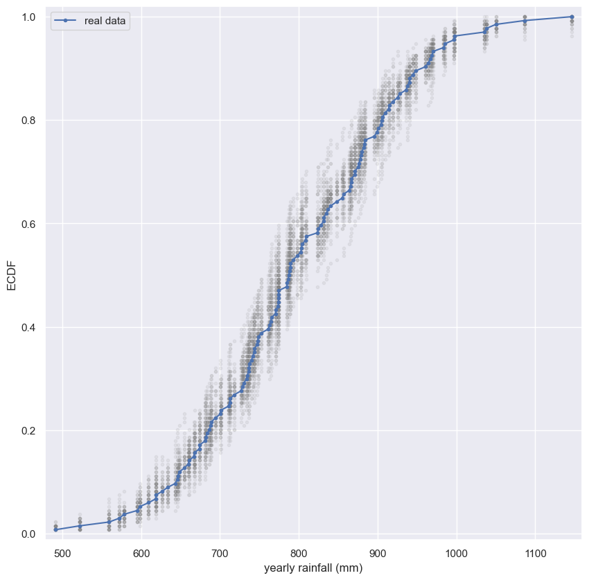
Notice how the bootstrap samples give an idea of how the distribution of rainfalls is spread.
Bootstrap confidence intervals
- In the last video, we learned how to take a set of data, create a bootstrap sample, and then compute a bootstrap replicate of a given statistic.
- Since we will repeat the replicates over and over again, we can write a function to generate a bootstrap replicate.
- We will call the function
bootstrap_replicate_1d, since it works on 1-dimensional arrays. - We pass in the data and also a function that computes the statistic of interest.
- We could pass
np.meanornp.medianfor example. - Generating a replicate takes two steps.
- First, we choose entries out of the data array so that the bootstrap sample has the same number of entries as the original data.
- Then, we compute the statistic using the specified function
- If we call the function, we get a bootstrap replicate
def bootstrap_replicate_1d
1
2
3
4
def bootstrap_replicate_1d(data, func):
    """Generate bootstrap replicate of 1D data."""
    bs_sample = np.random.choice(data, len(data))
    return func(bs_sample)
1
bootstrap_replicate_1d(sol['velocity of light in air (km/s)'], np.mean)
1
299854.9
1
bootstrap_replicate_1d(sol['velocity of light in air (km/s)'], np.mean)
1
299859.0
Many bootstrap replicates
- How do we repeatedly get replicates?
- First, we have to initialize an array to store our bootstrap replicates.
- We will make 10,000 replicates, so we use
np.emptyto create the empty array. - Next, we write a
for-loopto generate a replicate and store it in thebs_replicatesarray. - Now that we have the replicates, we can make a histogram to see what we might expect to get for the mean of repeated measurements of the speed of light.
density=Truesets the height of the bars of the histogram such that the total area of the bars is equal to one.- This is call normalization, and we do it so that the histogram approximates a probability density function.
- The area under the PDF gives a probability.
- So, we have computed the approximate PDF of the mean speed of light we would expect to get if we performed the measurements again.
- If we repeat the experiment again and again, we are likely to only see the sample mean vary by about 30 km/s.
- Now it’s useful to summarize this result without having to resort to a graphical method like a histogram.
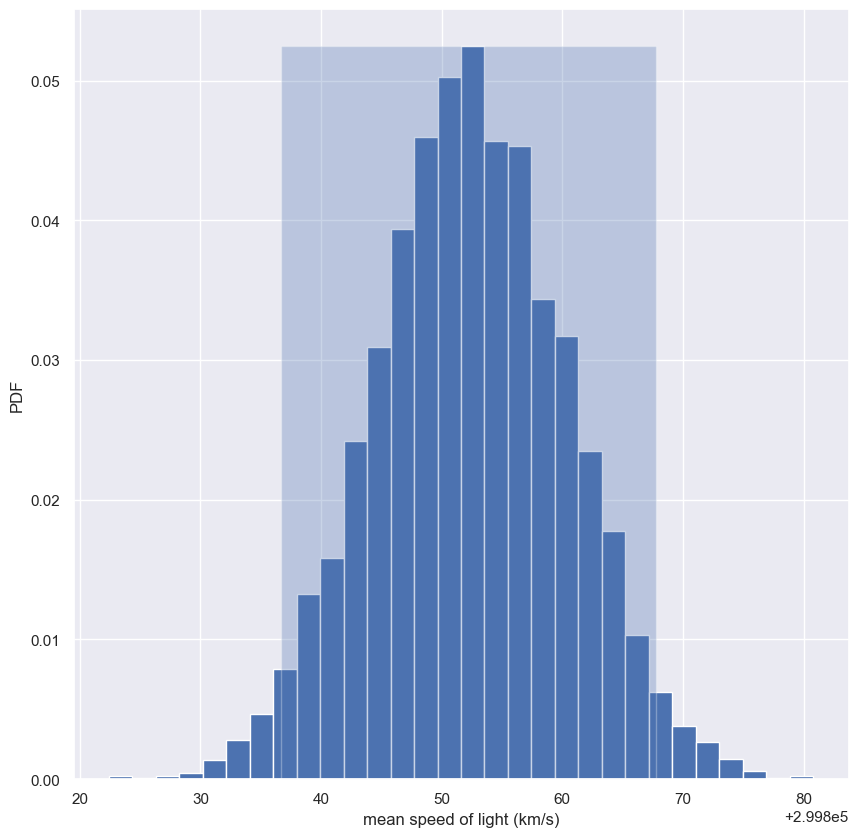
Confidence interval of a statistic
- To do this, we will compute the 95% confidence interval of the mean.
- The p% confidence interval is defined as follows
- If we repeated measurements over and over again, p% of the observed values would lie within the p% confidence interval.
- In our case, if we repeated the 100 measurements of the speed of light over and over again, 95% of the sample means would lie within the 95% confidence interval.
- By doing bootstrap replicas, we just “repeated” the experiment over and over again.
- We just use
np.perentileto compute the 2.5th and 97.5th percentiles to get the 95% confidence interval.
1
2
3
4
5
6
7
8
9
10
11
12
13
14
15
bs_replicates = np.empty(10000)

for i in range(10000):
    bs_replicates[i] = bootstrap_replicate_1d(sol['velocity of light in air (km/s)'], np.mean)

conf_int = np.percentile(bs_replicates, [2.5, 97.5])
print(conf_int)

n, bins, _ = plt.hist(bs_replicates, bins=30, density=True)

plt.fill_betweenx([0, n.max()], conf_int[0], conf_int[1], alpha=0.3)

plt.xlabel('mean speed of light (km/s)')
plt.ylabel('PDF')
plt.show()
1
[299836.7 299867.8]
Generating many bootstrap replicates
The function bootstrap_replicate_1d() from the video is available in your namespace. Now you’ll write another function, draw_bs_reps(data, func, size=1), which generates many bootstrap replicates from the data set. This function will come in handy for you again and again as you compute confidence intervals and later when you do hypothesis tests.
Instructions
- Define a function with call signature
draw_bs_reps(data, func, size=1). - Using
np.empty(), initialize an array calledbs_replicatesof sizesizeto hold all of the bootstrap replicates. - Write a
forloop that ranges oversizeand computes a replicate usingbootstrap_replicate_1d(). Refer to the exercise description above to see the function signature ofbootstrap_replicate_1d(). Store the replicate in the appropriate index ofbs_replicates. - Return the array of replicates
bs_replicates. This has already been done for you.
def draw_bs_reps
1
2
3
4
5
6
7
8
9
10
11
def draw_bs_reps(data, func, size=1):
    """Draw bootstrap replicates."""

    # Initialize array of replicates: bs_replicates
    bs_replicates = np.empty(size)

    # Generate replicates
    for i in range(size):
        bs_replicates[i] = bootstrap_replicate_1d(data, func)

    return bs_replicates
Bootstrap replicates of the mean and the SEM
In this exercise, you will compute a bootstrap estimate of the probability density function of the mean annual rainfall at the Sheffield Weather Station. Remember, we are estimating the mean annual rainfall we would get if the Sheffield Weather Station could repeat all of the measurements from 1883 to 2015 over and over again. This is a probabilistic estimate of the mean. You will plot the PDF as a histogram, and you will see that it is Normal.
In fact, it can be shown theoretically that under not-too-restrictive conditions, the value of the mean will always be Normally distributed. (This does not hold in general, just for the mean and a few other statistics.) The standard deviation of this distribution, called the standard error of the mean, or SEM, is given by the standard deviation of the data divided by the square root of the number of data points. I.e., for a data set, sem = np.std(data) / np.sqrt(len(data)). Using hacker statistics, you get this same result without the need to derive it, but you will verify this result from your bootstrap replicates.
The dataset has been pre-loaded for you into an array called rainfall.
Instructions
- Draw
10000bootstrap replicates of the mean annual rainfall using yourdraw_bs_reps()function and therainfallarray. Hint: Pass innp.meanforfuncto compute the mean. - As a reminder,
draw_bs_reps()accepts 3 arguments:data,func, andsize. - Compute and print the standard error of the mean of
rainfall. - The formula to compute this is
np.std(data) / np.sqrt(len(data)). - Compute and print the standard deviation of your bootstrap replicates
bs_replicates. - Make a histogram of the replicates using the
density=Truekeyword argument and50bins.
1
2
3
4
5
6
7
8
9
10
11
12
13
14
15
16
17
18
# Take 10,000 bootstrap replicates of the mean: bs_replicates
bs_replicates = draw_bs_reps(rainfall, np.mean, 10000)

# Compute and print SEM
sem = np.std(rainfall) / np.sqrt(len(rainfall))
print(sem)

# Compute and print standard deviation of bootstrap replicates
bs_std = np.std(bs_replicates)
print(bs_std)

# Make a histogram of the results
_ = plt.hist(bs_replicates, bins=50, density=True)
_ = plt.xlabel('mean annual rainfall (mm)')
_ = plt.ylabel('PDF')

# Show the plot
plt.show()
1
2
10.635458130769608
10.55070953324053
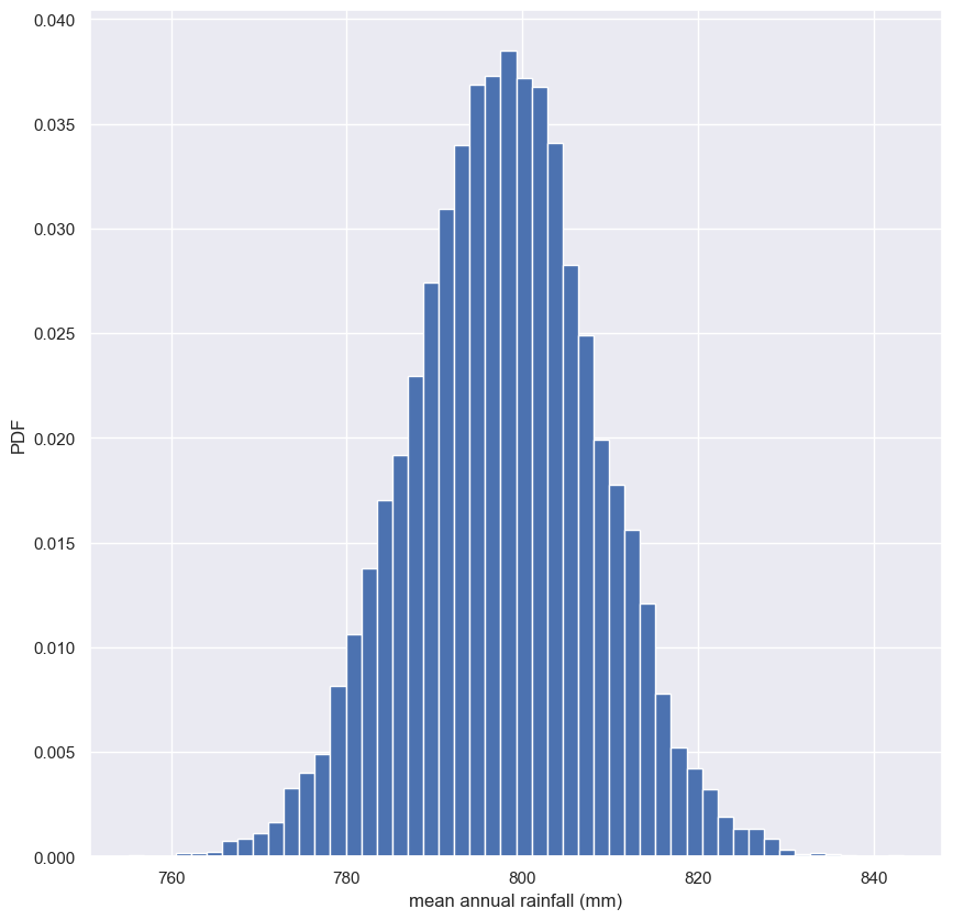
Notice that the SEM we got from the known expression and the bootstrap replicates is the same and the distribution of the bootstrap replicates of the mean is Normal.
Confidence intervals of rainfall data
A confidence interval gives upper and lower bounds on the range of parameter values you might expect to get if we repeat our measurements. For named distributions, you can compute them analytically or look them up, but one of the many beautiful properties of the bootstrap method is that you can take percentiles of your bootstrap replicates to get your confidence interval. Conveniently, you can use the np.percentile() function.
Use the bootstrap replicates you just generated to compute the 95% confidence interval. That is, give the 2.5th and 97.5th percentile of your bootstrap replicates stored as bs_replicates. What is the 95% confidence interval?
(765, 776) mm/year- (780, 821) mm/year
(761, 817) mm/year(761, 841) mm/year
1
2
conf_int = np.percentile(bs_replicates, [2.5, 97.5])
print(conf_int)
1
[777.18011194 818.45406716]
Bootstrap replicates of other statistics
We saw in a previous exercise that the mean is Normally distributed. This does not necessarily hold for other statistics, but no worry: as hackers, we can always take bootstrap replicates! In this exercise, you’ll generate bootstrap replicates for the variance of the annual rainfall at the Sheffield Weather Station and plot the histogram of the replicates.
Here, you will make use of the draw_bs_reps() function you defined a few exercises ago. It is provided below for your reference:
1
2
3
4
5
6
7
8
def draw_bs_reps(data, func, size=1):
    """Draw bootstrap replicates."""
    # Initialize array of replicates
    bs_replicates = np.empty(size)
    # Generate replicates
    for i in range(size):
        bs_replicates[i] = bootstrap_replicate_1d(data, func)
    return bs_replicates
Instructions
- Draw
10000bootstrap replicates of the variance in annual rainfall, stored in therainfalldataset, using yourdraw_bs_reps()function. Hint: Pass innp.varfor computing the variance. - Divide your variance replicates (
bs_replicates) by100to put the variance in units of square centimeters for convenience. - Make a histogram of
bs_replicatesusing thedensity=Truekeyword argument and50bins.
1
2
3
4
5
6
7
8
9
10
11
12
13
14
15
16
17
# Generate 10,000 bootstrap replicates of the variance: bs_replicates
bs_replicates = draw_bs_reps(rainfall, np.var, 10000)

# Put the variance in units of square centimeters
bs_replicates = bs_replicates/100

conf_int = np.percentile(bs_replicates, [2.5, 97.5])
print(conf_int)

# Make a histogram of the results
n, bins, _ = plt.hist(bs_replicates, bins=50, density=True)
plt.fill_betweenx([0, n.max()], conf_int[0], conf_int[1], alpha=0.3)
plt.xlabel('variance of annual rainfall (sq. cm)')
plt.ylabel('PDF')

# Show the plot
plt.show()
1
[118.79130786 185.07380985]
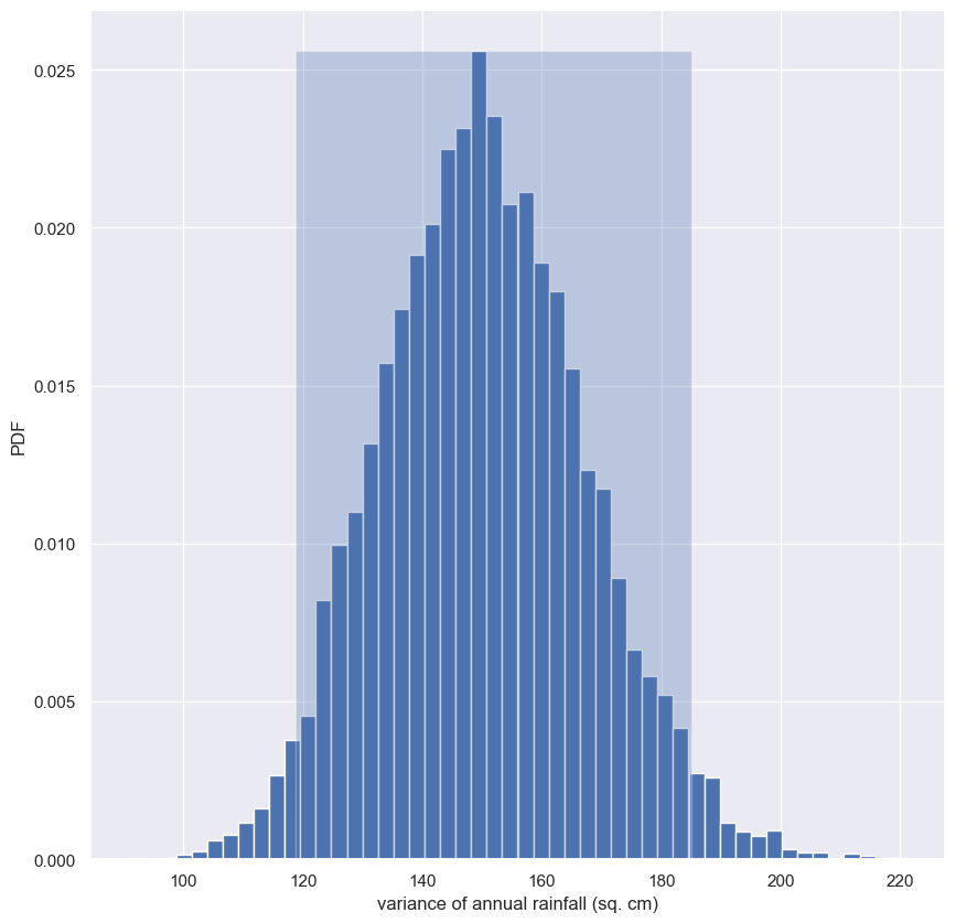
This is not normally distributed, as it has a longer tail to the right. Note that you can also compute a confidence interval on the variance, or any other statistic, using np.percentile() with your bootstrap replicates.
Confidence interval on the rate of no-hitters
Consider again the inter-no-hitter intervals for the modern era of baseball. Generate 10,000 bootstrap replicates of the optimal parameter $τ$. Plot a histogram of your replicates and report a 95% confidence interval.
Instructions
- Generate
10000bootstrap replicates of $τ$ from thenohitter_timesdata using yourdraw_bs_reps()function. Recall that the optimal $τ$ is calculated as the mean of the data. - Compute the 95% confidence interval using
np.percentile()and passing in two arguments: The arraybs_replicates, and the list of percentiles - in this case2.5and97.5. - Print the confidence interval.
- Plot a histogram of your bootstrap replicates.
1
2
3
4
5
6
7
8
9
10
11
12
13
14
15
16
17
# Draw bootstrap replicates of the mean no-hitter time (equal to tau): bs_replicates
bs_replicates = draw_bs_reps(nohitter_times.nohitter_time, np.mean, 10000)

# Compute the 95% confidence interval: conf_int
conf_int = np.percentile(bs_replicates, [2.5, 97.5])

# Print the confidence interval
print('95% confidence interval =', conf_int, 'games')

# Plot the histogram of the replicates
n, bins, _ = plt.hist(bs_replicates, bins=50, density=True)
plt.fill_betweenx([0, n.max()], conf_int[0], conf_int[1], alpha=0.3)
plt.xlabel(r'$\tau$ (games)')
plt.ylabel('PDF')

# Show the plot
plt.show()
1
95% confidence interval = [662.58964143 870.47440239] games
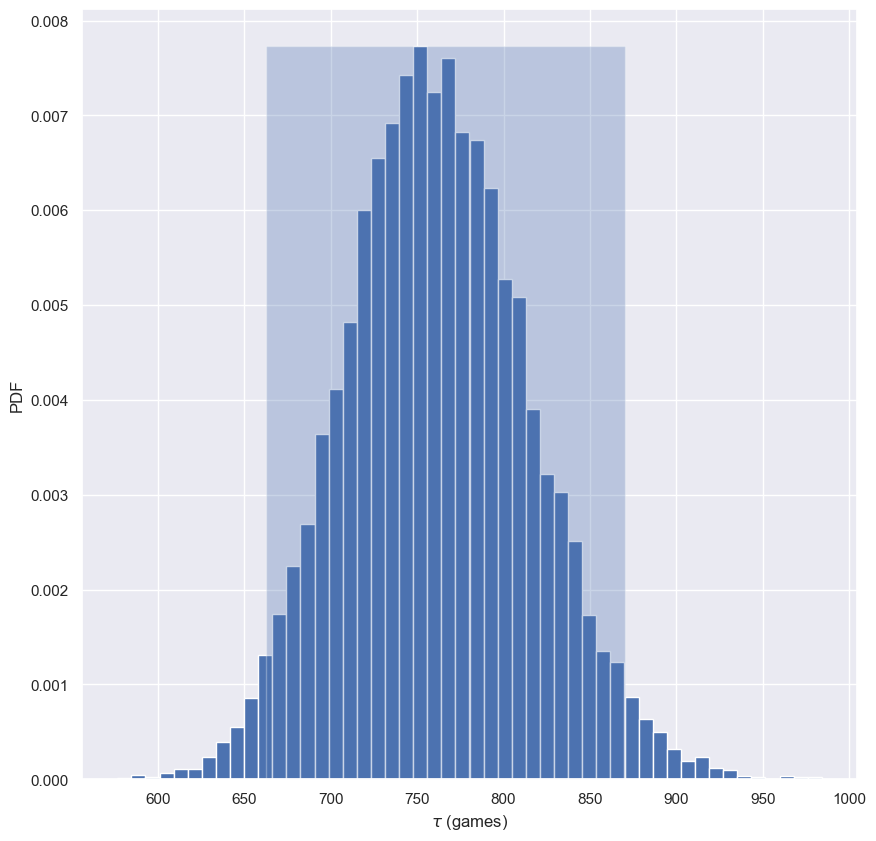
This gives you an estimate of what the typical time between no-hitters is. It could be anywhere between 660 and 870 games.
Pairs bootstrap
- When we computed bootstrap confidence intervals on summary statistics, we did so nonparametrically.
- By this, I mean that we did not assume any model underlying the data; the estimates we done using the data alone.
- When we performed a linear least squares regression, however, we were using a linear model, which has two parameters, the slope and intercept.
- This was a parametric estimate.
- The optimal parameter values we compute for our parametric model are like other statistics, in that we get different values for them if we acquired the data again.
- We can perform bootstrap estimates to get confidence intervals on the slope and intercept as well.
- Remember: we need to think probabilistically.
2008 US Swing State Election Results
- Let’s consider the swing state election data from the prequel course.
- What if we had the election again, under identical conditions?
- How would the slope and intercept change?
- This is kind of a tricky question; there are several ways to get bootstrap estimates of the confidence intervals on these parameters, each of which makes different assumptions about the data.
Pairs bootstrap for linear regression
- We will do a method that makes the least assumptions, called pairs bootstrap
- Since we cannot resample individual data because each county has two variables associated with it, the vote share for Obama and the total number of votes, we resample pairs.
- For the election data, we could randomly select a given county, and keep its total votes and Democratic share as a pair.
- So our bootstrap sample consists of a set (x, y) pair.
- We then compute the slope and intercept from this pairs bootstrap sample to get the bootstrap replicates.
- You can get confidence intervals from many bootstrap replicates of the slope and intercept, just like before.
Generating a pairs bootstrap sample
- Because
np.random.choicemust sample a 1D array, we will sample the indices of the data points. - We can generate the indices of a numpy array using the
np.arrangefunction, which gives an array of sequential integers. - We then sample the indices with replacement
- The bootstrap sample is generated by slicing out the respective values from the original data arrays.
- We can perform a linear regression using
np.polyfiton the pairs bootstrap sample to get a bootstrap replicate. - If we compare the result to the linear regression on the original data, they are close, but not equal.
- As we have seen before, you can use many of these replicates to generate bootstrap confidence intervals for the slope and intercept using
np.percentile. - You can also plot the lines you get from your bootstrap replicate to get a graphic idea how the regression line may change if the data were collected again.
- You’ll work through this whole procedure in the exercises.
- Always keep in mind that you are thinking probabilistically.
- Getting an optimal parameter values is the first step.
- Now, you are finding out how that parameter is likely to change upon repeated measurements.
1
np.arange(7)
1
array([0, 1, 2, 3, 4, 5, 6])
1
2
3
4
5
6
7
8
# random.choice by indices
inds = np.arange(len(swing.total_votes))
bs_inds = np.random.choice(inds, len(inds))
bs_total_votes = swing.total_votes[bs_inds].tolist()
bs_dem_share = swing.dem_share[bs_inds].tolist()

bs_slope, bs_intercept = np.polyfit(bs_total_votes, bs_dem_share, 1)
print(bs_slope, bs_intercept)
1
4.626047844746474e-05 40.39416987543208
1
2
3
4
# given the data in a pandas dataframe
bs_df_sample = swing[['total_votes', 'dem_share']].sample(len(swing.index), replace=True).copy()

np.polyfit(bs_df_sample.total_votes, bs_df_sample.dem_share, 1)
1
array([4.44451644e-05, 3.85875615e+01])
1
2
# linear regression of original data
np.polyfit(swing.total_votes, swing.dem_share, 1)
1
array([4.0370717e-05, 4.0113912e+01])
def bs_df_poly_1
1
2
3
4
5
6
7
8
9
10
11
12
13
14
15
16
17
18
19
def bs_df_poly_1(df: pd.DataFrame, size: int, x1: int, x2: int) -> list:
    """
    Calculates a number of bootstrap samples determined by size
    For each bs_df_sample, calculate the slope & intercept
    For each slope & intercept, calculate the line y1 & y2 for a line segment
    The returned list can be plotted with matplotlib.collections.LineCollection

    df: two column dataframe with x & y
    size: number of bootstrap samples
    x1: first x-intercept
    x2: second x_intercpt

    returns a list of line coordinates [[(x1, y1), (x2, y2)], [(x1, y1), (x2, y2)]]
    returns a list of slope intercepts
    """
    bs_df_samples = [df.sample(len(df), replace=True) for _ in range(size)]
    poly_samples = [np.polyfit(v.iloc[:, 0], v.iloc[:, 1], 1) for v in bs_df_samples]
    collections = [[(x1, v[0]*x1 + v[1]), (x2, v[0]*x2 + v[1])] for v in poly_samples]
    return poly_samples, collections
1
2
3
4
5
6
7
8
9
10
11
12
13
14
15
16
17
18
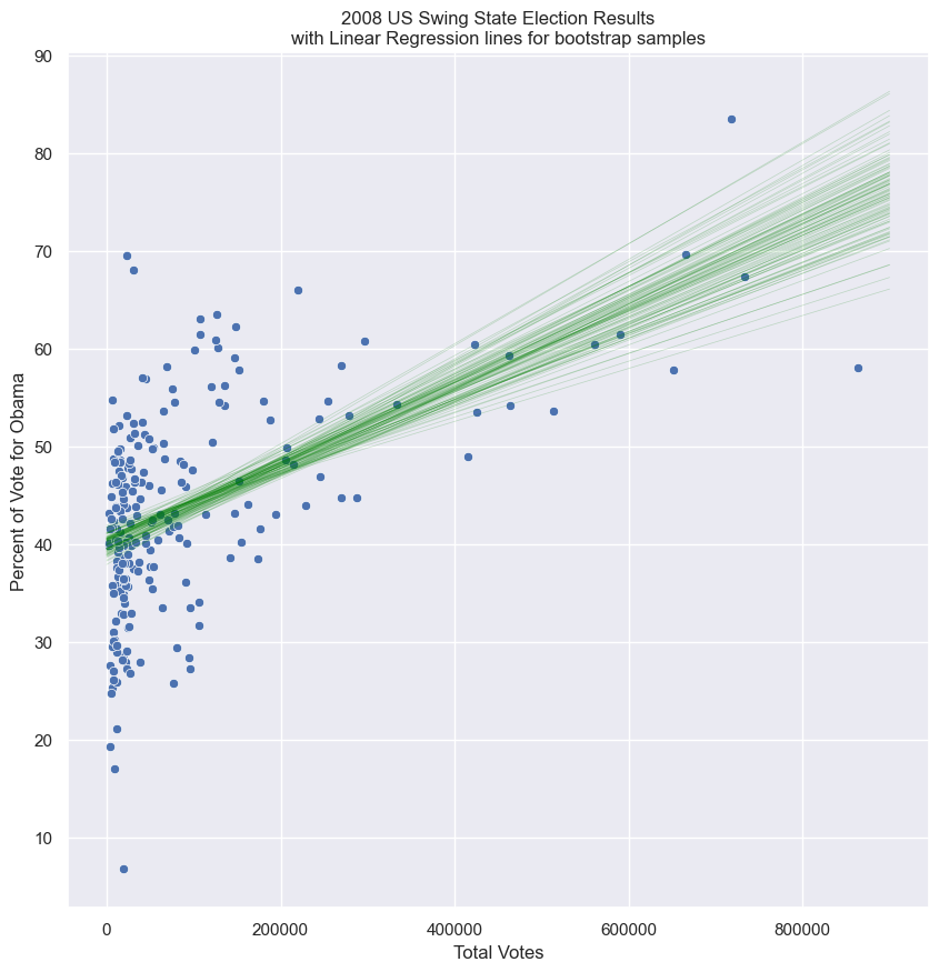
g = sns.scatterplot(x=swing.total_votes, y=swing.dem_share, )
polys, lines = bs_df_poly_1(swing[['total_votes', 'dem_share']], 100, 0, 900000)
# lines can be plotted with slope and intercept
x = np.array([0, 900000])
for poly in polys:
plt.plot(x, poly[0]*x + poly[1], linewidth=0.5, alpha=0.2, color='green')
# or lines can be plotted with a collection of lines
# lc = mc.LineCollection(lines, color='green', alpha=0.2)
# g.add_collection(lc)
plt.title('2008 US Swing State Election Results\nwith Linear Regression lines for bootstrap samples')
plt.xlabel('Total Votes')
plt.ylabel('Percent of Vote for Obama')
plt.show()
A function to do pairs bootstrap
As discussed in the video, pairs bootstrap involves resampling pairs of data. Each collection of pairs fit with a line, in this case using np.polyfit(). We do this again and again, getting bootstrap replicates of the parameter values. To have a useful tool for doing pairs bootstrap, you will write a function to perform pairs bootstrap on a set of x,y data.
Instructions
- Define a function with call signature
draw_bs_pairs_linreg(x, y, size=1)to perform pairs bootstrap estimates on linear regression parameters. - Use
np.arange()to set up an array of indices going from0tolen(x). These are what you will resample and use them to pick values out of thexandyarrays. - Use
np.empty()to initialize the slope and intercept replicate arrays to be of sizesize. - Write a
forloop to:- Resample the indices
inds. Usenp.random.choice()to do this. - Make new $x$ and $y$ arrays
bs_xandbs_yusing the the resampled indicesbs_inds. To do this, slicexandywithbs_inds. - Use
np.polyfit()on the new $x$ and $y$ arrays and store the computed slope and intercept.
- Resample the indices
- Return the pair bootstrap replicates of the slope and intercept.
def draw_bs_pairs_linreg
1
2
3
4
5
6
7
8
9
10
11
12
13
14
15
16
17
def draw_bs_pairs_linreg(x, y, size=1):
    """Perform pairs bootstrap for linear regression."""

    # Set up array of indices to sample from: inds
    inds = np.arange(len(x))

    # Initialize replicates: bs_slope_reps, bs_intercept_reps
    bs_slope_reps = np.empty(size)
    bs_intercept_reps = np.empty(size)

    # Generate replicates
    for i in range(size):
        bs_inds = np.random.choice(inds, size=len(inds))
        bs_x, bs_y = x[bs_inds], y[bs_inds]
        bs_slope_reps[i], bs_intercept_reps[i] = np.polyfit(bs_x, bs_y, 1)

    return bs_slope_reps, bs_intercept_reps
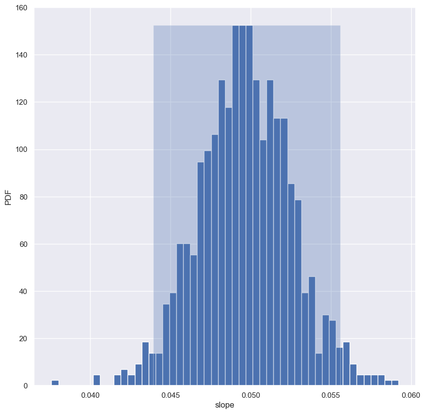
Pairs bootstrap of literacy/fertility data
Using the function you just wrote, perform pairs bootstrap to plot a histogram describing the estimate of the slope from the illiteracy/fertility data. Also report the 95% confidence interval of the slope. The data is available to you in the NumPy arrays illiteracy and fertility.
As a reminder, draw_bs_pairs_linreg() has a function signature of draw_bs_pairs_linreg(x, y, size=1), and it returns two values: bs_slope_reps and bs_intercept_reps.
Instructions
- Use your
draw_bs_pairs_linreg()function to take1000bootstrap replicates of the slope and intercept. The x-axis data isilliteracyand y-axis data isfertility. - Compute and print the 95% bootstrap confidence interval for the slope.
- Plot and show a histogram of the slope replicates. Be sure to label your axes.
1
2
3
4
5
6
7
8
9
10
11
12
13
# Generate replicates of slope and intercept using pairs bootstrap
bs_slope_reps, bs_intercept_reps = draw_bs_pairs_linreg(illiteracy, fertility, 1000)

# Compute and print 95% CI for slope
conf_int = np.percentile(bs_slope_reps, [2.5, 97.5])
print(conf_int)

# Plot the histogram
n, bins, _ = plt.hist(bs_slope_reps, bins=50, density=True)
plt.fill_betweenx([0, n.max()], conf_int[0], conf_int[1], alpha=0.3)
plt.xlabel('slope')
plt.ylabel('PDF')
plt.show()
1
[0.04392444 0.05557051]
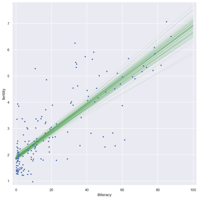
Plotting bootstrap regressions
A nice way to visualize the variability we might expect in a linear regression is to plot the line you would get from each bootstrap replicate of the slope and intercept. Do this for the first 100 of your bootstrap replicates of the slope and intercept (stored as bs_slope_reps and bs_intercept_reps).
Instructions
- Generate an array of $x$-values consisting of
0and100for the plot of the regression lines. Use thenp.array()function for this. - Write a
forloop in which you plot a regression line with a slope and intercept given by the pairs bootstrap replicates. Do this for100lines. - When plotting the regression lines in each iteration of the
forloop, recall the regression equationy = a*x + b. Here,aisbs_slope_reps[i]andbisbs_intercept_reps[i]. - Specify the keyword arguments
linewidth=0.5,alpha=0.2, andcolor='red'in your call toplt.plot(). - Make a scatter plot with
illiteracyon the x-axis andfertilityon the y-axis. Remember to specify themarker='.'andlinestyle='none'keyword arguments. - Label the axes, set a 2% margin, and show the plot.
1
2
3
4
5
6
7
8
9
10
11
12
13
14
15
# Generate array of x-values for bootstrap lines: x
x = np.array([0, 100])

# Plot the bootstrap lines
for i in range(0, 100):
    _ = plt.plot(x, bs_slope_reps[i]*x + bs_intercept_reps[i], linewidth=0.5, alpha=0.2, color='green')

# Plot the data
_ = plt.plot(illiteracy, fertility, marker='.', linestyle='none')

# Label axes, set the margins, and show the plot
_ = plt.xlabel('illiteracy')
_ = plt.ylabel('fertility')
plt.margins(0.02)
plt.show()
Introduction to hypothesis testing
You now know how to define and estimate parameters given a model. But the question remains: how reasonable is it to observe your data if a model is true? This question is addressed by hypothesis tests. They are the icing on the inference cake. After completing this chapter, you will be able to carefully construct and test hypotheses using hacker statistics.
Formulating and simulating a hypothesis
- When we studied linear regression, we assumed a linear model for how the data are generated and then estimated the parameters that are defined by that model.
- But, how do we assess how reasonable it is that our observed data are actually described by the model?
- This is the realm of hypothesis testing.
- Let’s start by thinking about a simpler scenario.
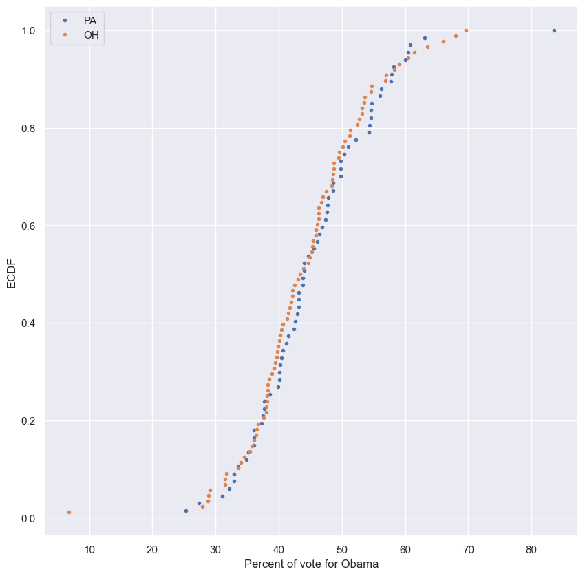
Consider the following
- Ohio and Pennsylvania are similar states.
- They’re neighbors and they both have liberal urban counties and also lots of rural conservative counties.
- I hypothesize that country-level voting in these two states have identical probability distributions.
- We have voting data to help test this hypothesis.
- Stated more concretely, we’re going to assess how reasonable the observed data are assuming the hypothesis is true.
Null hypothesis
- The hypothesis we are testing is typically called the null hypothesis.
- We might start by just plotting the two ECDFs of county-level votes.
- Based on the graph below, it’s pretty tough to make a judgment.
- Pennsylvania seems to be slightly more toward Obama in the middle part of the ECDFs, but not by much.
- We can’t really draw a conclusion here.
- We could just compare some summary statistics.
- An answer is still not clear.
- The means and medians of the two states are really close, and the standard deviations are almost identical.
- Eyeballing the data is not enough to make a determination.
- To resolve this issue, we can simulate what the data would look like if the country-level voting trends in the two states were identically distributed.
- We can do this by putting the Democratic share of the vote for all of Pennsylvania’s 67 counties and Ohio’s 88 counties together.
- We then ignore what state they belong to.
- Next, randomly scramble the ordering of the counties.
- We then re-label the first 67 to be Pennsylvania and the remaining to be Ohio.
- We we just redid the election as if there was no difference between Pennsylvania and Ohio.
Permutation
- This technique, of scrambling the order of an array, is called permutation.
- It is at the heart of simulating a null hypothesis were we assume two quantities are identically distributed.
1
swing.head()
| state | county | total_votes | dem_votes | rep_votes | dem_share | |
|---|---|---|---|---|---|---|
| 0 | PA | Erie County | 127691 | 75775 | 50351 | 60.08 |
| 1 | PA | Bradford County | 25787 | 10306 | 15057 | 40.64 |
| 2 | PA | Tioga County | 17984 | 6390 | 11326 | 36.07 |
| 3 | PA | McKean County | 15947 | 6465 | 9224 | 41.21 |
| 4 | PA | Potter County | 7507 | 2300 | 5109 | 31.04 |
1
2
3
4
5
pa_dem_share = swing.dem_share[swing.state == 'PA']
oh_dem_share = swing.dem_share[swing.state == 'OH']

pa_x, pa_y = ecdf(pa_dem_share)
oh_x, oh_y = ecdf(oh_dem_share)
1
2
3
4
5
6
plt.plot(pa_x, pa_y, marker='.', linestyle='none', label='PA')
plt.plot(oh_x, oh_y, marker='.', linestyle='none', label='OH')
plt.xlabel('Percent of vote for Obama')
plt.ylabel('ECDF')
plt.legend()
plt.show()
1
2
df = pd.DataFrame({'PA': pa_dem_share.reset_index(drop=True), 'OH': oh_dem_share.reset_index(drop=True)})
df.head()
| PA | OH | |
|---|---|---|
| 0 | 60.08 | 56.94 |
| 1 | 40.64 | 50.46 |
| 2 | 36.07 | 65.99 |
| 3 | 41.21 | 45.88 |
| 4 | 31.04 | 42.23 |
1
2
3
pa_oh_stats = df.agg(['mean', 'median', 'std'])
pa_oh_stats['PA - OH'] = pa_oh_stats.PA - pa_oh_stats.OH
pa_oh_stats
| PA | OH | PA - OH | |
|---|---|---|---|
| mean | 45.476418 | 44.318182 | 1.158236 |
| median | 44.030000 | 43.675000 | 0.355000 |
| std | 9.803028 | 9.895699 | -0.092671 |
Generating a permutation sample
- Make a single array with all the counties.
- Use
np.random.permutationto permute the entries of the array. - Get the permutation samples by assigning the first 67 to be labeled Pennsylvania and the last 88 to be labeled Ohio
1
2
3
4
dem_share_both = np.concatenate((df.PA.dropna(), df.OH.dropna()))
dem_share_both = np.random.permutation(dem_share_both)
perm_sample_pa = dem_share_both[:len(df.PA.dropna())]
perm_sample_oh = dem_share_both[len(df.PA.dropna()):]
Generating a permutation sample
In the video, you learned that permutation sampling is a great way to simulate the hypothesis that two variables have identical probability distributions. This is often a hypothesis you want to test, so in this exercise, you will write a function to generate a permutation sample from two data sets.
Remember, a permutation sample of two arrays having respectively n1 and n2 entries is constructed by concatenating the arrays together, scrambling the contents of the concatenated array, and then taking the first n1 entries as the permutation sample of the first array and the last n2 entries as the permutation sample of the second array.
Instructions
- Concatenate the two input arrays into one using
np.concatenate(). Be sure to pass indata1anddata2as one argument(data1, data2). - Use
np.random.permutation()to permute the concatenated array. - Store the first
len(data1)entries ofpermuted_dataasperm_sample_1and the lastlen(data2)entries ofpermuted_dataasperm_sample_2. In practice, this can be achieved by using:len(data1)andlen(data1):to slicepermuted_data. - Return
perm_sample_1andperm_sample_2.
def permutation_sample
1
2
3
4
5
6
7
8
9
10
11
12
13
14
15
def permutation_sample(data1, data2, seed=None):
    """Generate a permutation sample from two data sets."""

    # Concatenate the data sets: data
    data = np.concatenate((data1, data2))

    # Permute the concatenated array: permuted_data
    np.random.seed(seed)
    permuted_data = np.random.permutation(data)

    # Split the permuted array into two: perm_sample_1, perm_sample_2
    perm_sample_1 = permuted_data[:len(data1)]
    perm_sample_2 = permuted_data[len(data1):]

    return perm_sample_1, perm_sample_2
Visualizing permutation sampling
To help see how permutation sampling works, in this exercise you will generate permutation samples and look at them graphically.
We will use the Sheffield Weather Station data again, this time considering the monthly rainfall in June (a dry month) and November (a wet month). We expect these might be differently distributed, so we will take permutation samples to see how their ECDFs would look if they were identically distributed.
The data are stored in the Numpy arrays rain_june and rain_november.
As a reminder, permutation_sample() has a function signature of permutation_sample(data_1, data_2) with a return value of permuted_data[:len(data_1)], permuted_data[len(data_1):], where permuted_data = np.random.permutation(np.concatenate((data_1, data_2))).
Instructions
- Write a for
loopto generate 50 permutation samples, compute their ECDFs, and plot them. - Generate a permutation sample pair from
rain_juneandrain_novemberusing yourpermutation_sample()function. - Generate the
xandyvalues for an ECDF for each of the two permutation samples for the ECDF using yourecdf()function. - Plot the ECDF of the first permutation sample (
x_1andy_1) as dots. Do the same for the second permutation sample (x_2andy_2). - Generate
xandyvalues for ECDFs for therain_juneandrain_novemberdata and plot the ECDFs using respectively the keyword argumentscolor='red'andcolor='blue'. - Label your axes, set a 2% margin, and show your plot.
1
2
rain_june = sheffield['rain'][sheffield.mm == 6]
rain_november = sheffield['rain'][sheffield.mm == 11]
1
2
3
4
5
6
7
8
9
10
11
12
13
14
15
16
17
18
19
20
21
22
23
24
for i in range(50):
    # Generate permutation samples
    perm_sample_1, perm_sample_2 = permutation_sample(rain_june, rain_november)


    # Compute ECDFs
    x_1, y_1 = ecdf(perm_sample_1)
    x_2, y_2 = ecdf(perm_sample_2)

    # Plot ECDFs of permutation sample
    _ = plt.plot(x_1, y_1, marker='.', linestyle='none', color='red', alpha=0.02)
    _ = plt.plot(x_2, y_2, marker='.', linestyle='none', color='blue', alpha=0.02)

# Create and plot ECDFs from original data
x_1, y_1 = ecdf(rain_june)
x_2, y_2 = ecdf(rain_november)
_ = plt.plot(x_1, y_1, marker='.', linestyle='none', color='red')
_ = plt.plot(x_2, y_2, marker='.', linestyle='none', color='blue')

# Label axes, set margin, and show plot
plt.margins(0.02)
_ = plt.xlabel('monthly rainfall (mm)')
_ = plt.ylabel('ECDF')
plt.show()
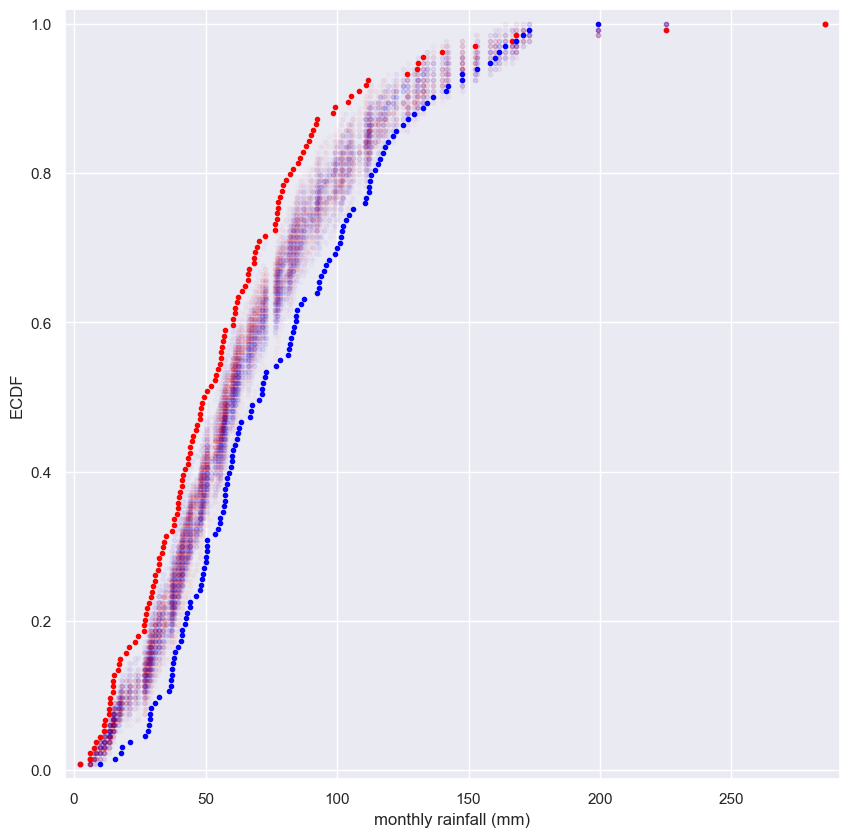
Notice that the permutation samples ECDFs overlap and give a purple haze. None of the ECDFs from the permutation samples overlap with the observed data, suggesting that the hypothesis is not commensurate with the data. June and November rainfall are not identically distributed.
Test statistics and p-values
- We are testing the null hypothesis that the county-level voting is identically distributed between
- Remember that testing a hypothesis is an assessment of how reasonable the observed data are, assuming the hypothesis is true.
- What about the data do we assess and how do we quantify the assessment?
- The answer to these questions hinges on the concept of a test statistic.
- A test statistic is a single number that can be computed from observed data and also from data you simulate under the null hypothesis.
- It serves as a basis of comparison between what the hypothesis predicts and what we actually observed.
- Importantly, you should choose your test statistic to be something that is pertinent to the question you are trying to answer with you hypothesis test, in this case, are the two states different?
- If they’re identical, they should have the same mean vote share for Obama.
- So the difference in mean vote share should be zero.
- We’ll therefore choose the difference in means as our test statistic.
- From the permutation sample we generated in the last video, the value of the test statistic is 1.12%
- We already calculated that the difference in mean vote share from the actual election was 1.16%.
- For this permutation replicate, we did not quite get as big of a difference in means than what was observed in the original data.
- We can redo the election 10,000 times under the null hypothesis by generating lots and lots of permutation replicates.
- The difference of means from the elections simulated under the null hypothesis lies somewhere between -4 and 4%
- The actual mean percent vote difference was 1.16%, shown by the red line
- If we tally up the area of the histogram that is to the right of the read line, we get that about 23% of the simulated elections had at least a 1.16% difference or greater.
- This value, 0.23, is called the p-value
- It is the probability of getting at least a 1.16% difference in the mean vote share assuming the states have identically distributed voting.
- Is it plausible that we would observe the vote share we got if Pennsylvania and Ohio had been identically distributed?
- Sure it is. It happened 23% of the time under the null hypothesis.
- We have to be careful about the definition of the p-value.
- The p-value is the probability of obtaining a value of your test statistic that is at least as extreme as what was observed, under the assumption the null hypothesis is true.
- The p-value is exactly that.
- It is not the probability that the null hypothesis is true
- The p-value is only meaningful if the null hypothesis is clearly stated, along with the test statistic used to evaluate is.
- When the p-value is small, it is often said that the data are statistically significantly different than what we would observed under the null hypothesis.
- Statistical significance is determined by the smallness of the p-value.
- For this reason, the hypothesis testing we’re doing is sometimes called null hypothesis significance testing, or NHST.
- I encourage you not to just label something as statistically significant or not, but rather to consider the value of the p-value, as well as how much difference the data are from what you would expect from the null hypothesis.
- Remember: statistical significance (this is, low p-value) and practical significance, whether or not the difference of the data from the null hypothesis matters for practical considerations, are two different things.
1
2
3
4
5
dem_share_pa = swing.dem_share[swing.state == 'PA']
dem_share_oh= swing.dem_share[swing.state == 'OH']

perm_sample_PA, perm_sample_OH = permutation_sample(dem_share_pa, dem_share_oh, seed=42)
print(f'For seed={i}: Mean difference: {np.mean(perm_sample_PA) - np.mean(perm_sample_OH)}')
1
For seed=49: Mean difference: 1.122220149253728
1
2
mean_diff = np.mean(dem_share_pa) - np.mean(dem_share_oh)
mean_diff
1
1.1582360922659447
1
2
3
4
replicates = list()
for i in range(10000):
    perm_sample_PA, perm_sample_OH = permutation_sample(dem_share_pa, dem_share_oh, i)
    replicates.append(np.mean(perm_sample_PA) - np.mean(perm_sample_OH))
1
2
3
4
5
6
7
8
9
10
11
12
13
14
15
16
17
18
19
20
21
p = sns.histplot(replicates, bins=30, kde=True)

plt.vlines(mean_diff, 0, 0.25, color='r', label='mean')

plt.annotate('p-value', xy=(3.5, 0.05), weight='bold', color='teal',
             xytext=(4, 0.15), fontsize=15, arrowprops=dict(arrowstyle="->", color='teal'))

for rectangle in p.patches:
    if rectangle.get_x() >= mean_diff:
        rectangle.set_facecolor('teal')

width = p.patches[19].get_x() - mean_diff  # edge of the rectangle following the mean
height = p.patches[18].get_height()
plt.bar(x=mean_diff+0.5*width, height=height, width=width, color='#99cccc')

ticks, labels = plt.xticks()

plt.legend()
plt.ylabel('PDF')
plt.xlabel('PA - OH mean percent replicate vote difference')
plt.show()
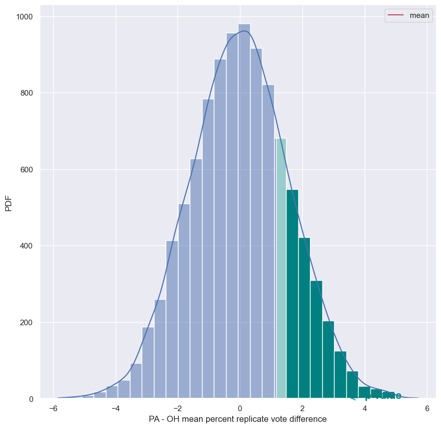
Test statistics
When performing hypothesis tests, your choice of test statistic should be:
Answer the question
something well-known, like the mean or median.be a parameter that can be estimated.- be pertinent to the question you are seeking to answer in your hypothesis test.
What is a p-value?
The p-value is generally a measure of:
Answer the question
the probability that the hypothesis you are testing is true.the probability of observing your data if the hypothesis you are testing is true.- the probability of observing a test statistic equally or more extreme than the one you observed, given that the null hypothesis is true.
Generating permutation replicates
As discussed in the video, a permutation replicate is a single value of a statistic computed from a permutation sample. As the draw_bs_reps() function you wrote in chapter 2 is useful for you to generate bootstrap replicates, it is useful to have a similar function, draw_perm_reps(), to generate permutation replicates. You will write this useful function in this exercise.
The function has call signature draw_perm_reps(data_1, data_2, func, size=1). Importantly, func must be a function that takes two arrays as arguments. In most circumstances, func will be a function you write yourself.
Instructions
- Define a function with this signature:
draw_perm_reps(data_1, data_2, func, size=1). - Initialize an array to hold the permutation replicates using
np.empty(). - Write a
forloop to:- Compute a permutation sample using your
permutation_sample()function - Pass the samples into
func()to compute the replicate and store the result in your array of replicates.
- Compute a permutation sample using your
- Return the array of replicates.
def draw_perm_reps
1
2
3
4
5
6
7
8
9
10
11
12
13
14
def draw_perm_reps(data_1, data_2, func, size=1, seed=None):
    """Generate multiple permutation replicates."""

    # Initialize array of replicates: perm_replicates
    perm_replicates = np.empty(size)

    for i in range(size):
        # Generate permutation sample
        perm_sample_1, perm_sample_2 = permutation_sample(data_1, data_2, seed)

        # Compute the test statistic
        perm_replicates[i] = func(perm_sample_1, perm_sample_2)

    return perm_replicates
Look before you leap: EDA before hypothesis testing
Kleinteich and Gorb (Sci. Rep., 4, 5225, 2014) performed an interesting experiment with South American horned frogs. They held a plate connected to a force transducer, along with a bait fly, in front of them. They then measured the impact force and adhesive force of the frog’s tongue when it struck the target.
Frog A is an adult and Frog B is a juvenile. The researchers measured the impact force of 20 strikes for each frog. In the next exercise, we will test the hypothesis that the two frogs have the same distribution of impact forces. But, remember, it is important to do EDA first! Let’s make a bee swarm plot for the data. They are stored in a Pandas data frame, df, where column ID is the identity of the frog and column impact_force is the impact force in Newtons (N).
Instructions
- Use
sns.swarmplot()to make a bee swarm plot of the data by specifying thex,y, anddatakeyword arguments. - Label your axes.
- Show the plot.
1
2
3
4
5
6
7
8
9
# Make bee swarm plot
sns.swarmplot(x='ID', y='impact force (mN)', data=frogs)

# Label axes
plt.xlabel('frog')
plt.ylabel('impact force (mN)')

# Show the plot
plt.show()
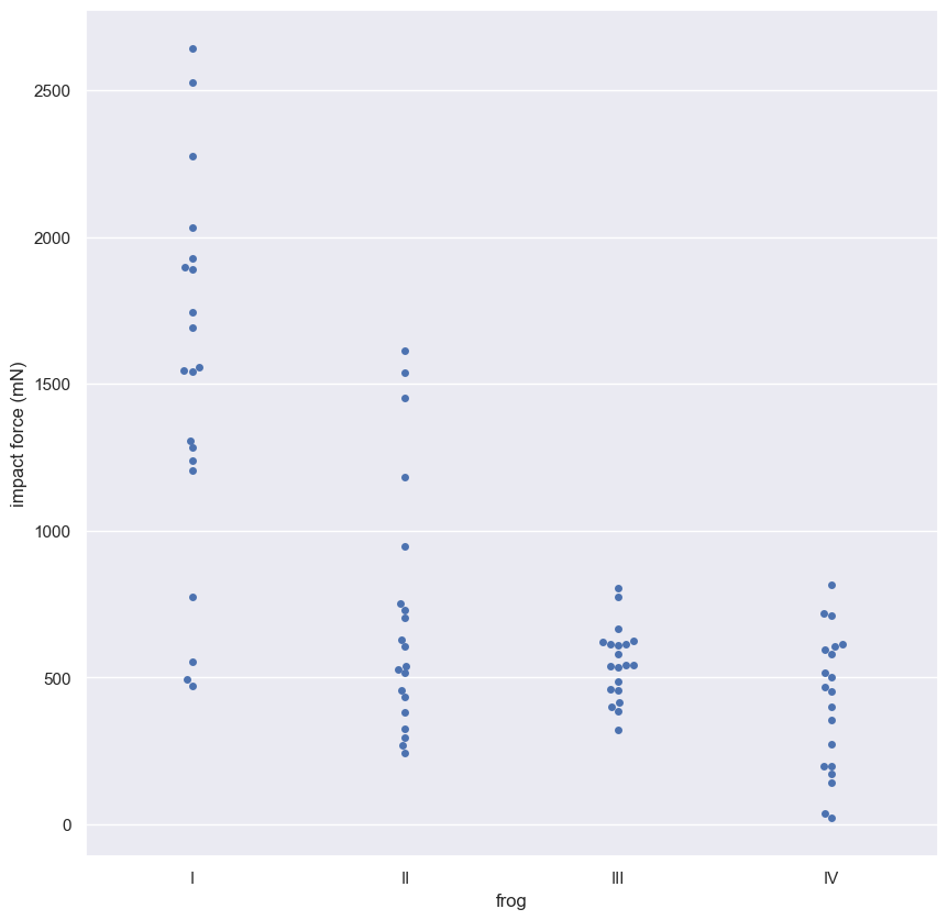
Eyeballing it, it does not look like they come from the same distribution. Frog II, the adult, has three or four very hard strikes, and Frog IV, the juvenile, has a couple weak ones. However, it is possible that with only 20 samples it might be too difficult to tell if they have difference distributions, so we should proceed with the hypothesis test.
Permutation test on frog data
The average strike force of Frog A was 0.71 Newtons (N), and that of Frog B was 0.42 N for a difference of 0.29 N. It is possible the frogs strike with the same force and this observed difference was by chance. You will compute the probability of getting at least a 0.29 N difference in mean strike force under the hypothesis that the distributions of strike forces for the two frogs are identical. We use a permutation test with a test statistic of the difference of means to test this hypothesis.
For your convenience, the data has been stored in the arrays force_a and force_b.
Instructions
- Define a function with call signature
diff_of_means(data_1, data_2)that returns the differences in means between two data sets, mean ofdata_1minus mean ofdata_2. - Use this function to compute the empirical difference of means that was observed in the frogs.
- Draw 10,000 permutation replicates of the difference of means.
- Compute the p-value.
- Print the p-value.
def diff_of_means
1
2
3
4
5
6
7
def diff_of_means(data_1, data_2):
    """Difference in means of two arrays."""

    # The difference of means of data_1, data_2: diff
    diff = np.mean(data_1) - np.mean(data_2)

    return diff
1
2
force_a = frogs['impact force (mN)'][frogs.ID == 'II'].div(1000).to_list()
force_b = frogs['impact force (mN)'][frogs.ID == 'IV'].div(1000).to_list()
1
2
3
4
5
6
7
8
9
10
11
# Compute difference of mean impact force from experiment: empirical_diff_means
empirical_diff_means = diff_of_means(force_a, force_b)

# Draw 10,000 permutation replicates: perm_replicates
perm_replicates = draw_perm_reps(force_a, force_b, diff_of_means, size=10000)

# Compute p-value: p
p = np.sum(perm_replicates >= empirical_diff_means) / len(perm_replicates)

# Print the result
print(f'p-value = {p}')
1
p-value = 0.0055
The p-value tells you that there is about a 0.6% chance that you would get the difference of means observed in the experiment if frogs were exactly the same. A p-value below 0.01 is typically said to be “statistically significant,” but: warning! warning! warning! You have computed a p-value; it is a number. I encourage you not to distill it to a yes-or-no phrase. p = 0.006 and p = 0.000000006 are both said to be “statistically significant,” but they are definitely not the same!
Bootstrap hypothesis tests
- Let’s go over the pipeline of hypothesis testing that we have been studying.
- Clearly state the null hypothesis
- Stating the null hypothesis so that it is crystal clear is essential to be able to simulate it. 1. Define the test statistic 1. Generate many sets of simulated data assuming the null hypothesis is true. 1. Compute the test statistic for each simulated data set. 1. The p-value is then the fraction of your simulated data sets for which the test statistic is at least as extreme as for the real data.
Let’s do another hypothesis test
- Consider again Michelson’s measurements of the speed of light.
- Around the same time that Michelson did his experiment, his future collaborator Simon Newcomb also measured the speed of light.
- Newcomb’s measurement had a mean of 299,860 km/s, differing from Michelson’s by about 8 km/s.
- We want to know if there’s something fundamentally different about Newcomb’s and Michelson’s measurements.
- The thing is, we only have Newcomb’s mean and none of his data points.
- The question is, could Michelson have gotten the data set he did if the true mean speed of light in his experiments was equal to Newcomb’s?
- We formally state our hypothesis as:
- The true mean speed of light in Michelson’s experiments was actually Newcomb’s reported mean, which we’ll call the Newcomb value.
- When I say the true mean speed of light in Michelson’s experiments, think the mean, Michelson would have gotten had he done his experiment many times.
- Because we are comparing a data set with a value, a permutation test is not applicable.
- We need to simulate the situation in which the true mean speed of light in Michelson’s experiments is Newcomb’s value.
- To achieve this, we shift Michelson’s data such that its mean now matches Newcomb’s value.
- We can then use bootstrapping on this shifted data to simulate data acquisition under the null hypothesis.
- The test statistic is the mean of the bootstrap sample minus Newcomb’s value.
- We write a function,
diff_from_newcomb, to compute it, and compute the observed test statistic. - We then use the
draw_bs_repsfunction to generate the bootstrap replicates, which is the value of the test statistic computed from a bootstrap sample. - Note that the data we pass into the function are the shifted Michelson measurements because those are the ones we use to simulate the null hypothesis.
- The p-value is computed exactly the same was as for the permutation test.
- We report the fraction of bootstrap replicates that are less than the observed test statistic.
- In this case, we use less than, because the mean of from Michelson’s experiments was less than Newcomb’s value.
- We get a p-value of 0.16, which suggests that it’s quite possible that Newcomb and Michelson did not really have fundamental differences in their measurements.
- This is an example of a one-sample test, since we had one set of samples from Michelson and were comparing to a single number from Newcomb.
- Often in the field, you will do two-sample tests that require the bootstrap, which you will explore in the exercises.
- Explicitly simulating a null hypothesis like this, where we have to shift the mean, can be tricky.
One Sample Test
- Compare one set of data to a single number
Two Sample Test
- Compare two sets of data
1
2
3
4
newcomb_value = 299860  #km/s
michelson_speed_of_light = sol['velocity of light in air (km/s)']
michelson_mean = np.mean(michelson_speed_of_light)
michelson_shifted = michelson_speed_of_light - michelson_mean + newcomb_value
1
2
m_x, m_y = ecdf(michelson_speed_of_light)
m_x_shifted, m_y_shifted = ecdf(michelson_shifted)
1
2
3
4
5
6
7
8
sns.scatterplot(x=m_x, y=m_y, label="Michelson's Data")
sns.scatterplot(x=m_x_shifted, y=m_y_shifted, label="Michelson's Data shifted to Newcomb's Mean", color='g')
plt.vlines(michelson_mean, 0, 1, colors='b', linestyles='--', label=f"Michelson's Mean: {michelson_mean}")
plt.vlines(newcomb_value, 0, 1, colors='g', linestyles='--', label=f"Newcomb's Mean: {newcomb_value}")
plt.legend()
plt.ylabel('CDF')
plt.xlabel('Speed of Light (km/s)')
plt.show()
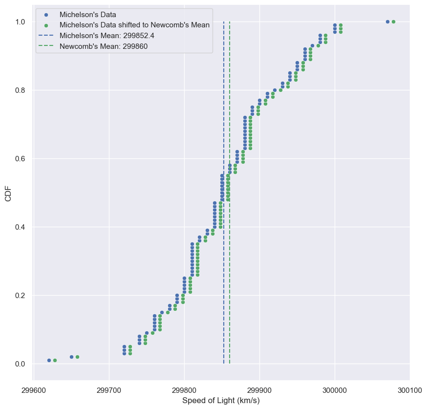
def diff_from_newcomb
1
2
3
4
5
6
7
# calculate the test statistic
def diff_from_newcomb(data: list, newcomb_value: int=299860) -> float:
    return np.mean(data) - newcomb_value


diff_obs = diff_from_newcomb(michelson_speed_of_light)
diff_obs
1
-7.599999999976717
1
2
3
4
5
# compute the p-value
bs_replicates = draw_bs_reps(michelson_shifted, diff_from_newcomb, 10000)

p_value = np.sum(bs_replicates <= diff_obs) / 10000
print(f"p-value: {p_value}. Only {p_value*100:0.02f}% of the replicates are <= to Newcomb's mean.")
1
p-value: 0.1596. Only 15.96% of the replicates are <= to Newcomb's mean.
A one-sample bootstrap hypothesis test
Another juvenile frog was studied, Frog C, and you want to see if Frog B and Frog C have similar impact forces. Unfortunately, you do not have Frog C’s impact forces available, but you know they have a mean of 0.55 N. Because you don’t have the original data, you cannot do a permutation test, and you cannot assess the hypothesis that the forces from Frog B and Frog C come from the same distribution. You will therefore test another, less restrictive hypothesis: The mean strike force of Frog B is equal to that of Frog C.
To set up the bootstrap hypothesis test, you will take the mean as our test statistic. Remember, your goal is to calculate the probability of getting a mean impact force less than or equal to what was observed for Frog B if the hypothesis that the true mean of Frog B’s impact forces is equal to that of Frog C is true. You first translate all of the data of Frog B such that the mean is 0.55 N. This involves adding the mean force of Frog C and subtracting the mean force of Frog B from each measurement of Frog B. This leaves other properties of Frog B’s distribution, such as the variance, unchanged.
Instructions
- Translate the impact forces of Frog B such that its mean is 0.55 N.
- Use your
draw_bs_reps()function to take 10,000 bootstrap replicates of the mean of your translated forces. - Compute the p-value by finding the fraction of your bootstrap replicates that are less than the observed mean impact force of Frog B. Note that the variable of interest here is
force_b. - Print your p-value.
1
2
3
force_c = frogs['impact force (mN)'][frogs.ID == 'III'].div(1000).to_list()
force_c_mean = np.mean(force_c)
print(f'Frog C Mean Impact Force (N): {force_c_mean:0.02f}')
1
Frog C Mean Impact Force (N): 0.55
1
2
3
4
5
6
7
8
9
10
11
# Make an array of translated impact forces: translated_force_b
translated_force_b = force_b - np.mean(force_b) + 0.55

# Take bootstrap replicates of Frog B's translated impact forces: bs_replicates
bs_replicates = draw_bs_reps(translated_force_b, np.mean, 10000)

# Compute fraction of replicates that are less than the observed Frog B force: p
p = np.sum(bs_replicates <= np.mean(force_b)) / 10000

# Print the p-value
print('p = ', p)
1
p =  0.0065
Great work! The low p-value suggests that the null hypothesis that Frog B and Frog C have the same mean impact force is false.
A two-sample bootstrap hypothesis test for difference of means
We now want to test the hypothesis that Frog A and Frog B have the same mean impact force, but not necessarily the same distribution, which is also impossible with a permutation test.
To do the two-sample bootstrap test, we shift both arrays to have the same mean, since we are simulating the hypothesis that their means are, in fact, equal. We then draw bootstrap samples out of the shifted arrays and compute the difference in means. This constitutes a bootstrap replicate, and we generate many of them. The p-value is the fraction of replicates with a difference in means greater than or equal to what was observed.
The objects forces_concat and empirical_diff_means are already in your namespace.
Instructions
- Compute the mean of all forces (from
forces_concat) usingnp.mean(). - Generate shifted data sets for both
force_aandforce_bsuch that the mean of each is the mean of the concatenated array of impact forces. - Generate 10,000 bootstrap replicates of the mean each for the two shifted arrays.
- Compute the bootstrap replicates of the difference of means by subtracting the replicates of the shifted impact force of Frog B from those of Frog A.
- Compute and print the p-value from your bootstrap replicates.
1
2
forces_concat = force_a + force_b
empirical_diff_means = np.mean(force_a) - np.mean(force_b)
1
2
3
4
5
6
7
8
9
10
11
12
13
14
15
16
17
# Compute mean of all forces: mean_force
mean_force = np.mean(forces_concat)

# Generate shifted arrays
force_a_shifted = force_a - np.mean(force_a) + mean_force
force_b_shifted = force_b - np.mean(force_b) + mean_force

# Compute 10,000 bootstrap replicates from shifted arrays
bs_replicates_a = draw_bs_reps(force_a_shifted, np.mean, 10000)
bs_replicates_b = draw_bs_reps(force_b_shifted, np.mean, 10000)

# Get replicates of difference of means: bs_replicates
bs_replicates = bs_replicates_a - bs_replicates_b

# Compute and print p-value: p
p = np.sum(bs_replicates >= empirical_diff_means) / 10000
print('p-value =', p)
1
p-value = 0.0059
You got a similar result as when you did the permutation test. Nonetheless, remember that it is important to carefully think about what question you want to ask. Are you only interested in the mean impact force, or in the distribution of impact forces?
Hypothesis test examples
As you saw from the last chapter, hypothesis testing can be a bit tricky. You need to define the null hypothesis, figure out how to simulate it, and define clearly what it means to be “more extreme” in order to compute the p-value. Like any skill, practice makes perfect, and this chapter gives you some good practice with hypothesis tests.
A/B testing
- Imagine your company has proposed a redesign of the splash page of its website.
- They’re interested in how many more users click through to the website for the redesign versus the original design.
Is your redesign effective?
- You devise a test
- Take a set of 1000 visitors to the site and direct 500 of them to the original splash screen and 500 of them to the redesigned one.
- You determine whether or not each of them clicks through to the rest of the website.
- On the original page, which we’ll call page A, 45 visitors clicked through, and on the redesigned page, page B, 67 visitors clicked through.
- This make you happy because that’s almost a 50% increase in the click-through rate.
- But maybe there really is no difference between the effect of the two designs on click-through rate and the difference you saw is due to random chance.
- You want to check: what’s the probability that you would observe, at least the observed difference in numbers of clicks through, if that were the case?
- This is asking exactly the question you can address with a hypothesis test.
Null hypothesis
- The click-through rate is not affected by the redesign.
- A permutation test is a good choice here because you can simulate the result as if the redesign had no effect on the click-through rate.
Permutation test of clicks through
- For each splash page design, we have a Numpy array which contains 1 or 0 values for whether or not a visitor click through.
- Next, we need to define a function
diff_fracfor our test statistic.- Ours is the fraction of visitors who click through
- We can compute the fraction who click through, by summing the entries in the arrays of ones and zeros, and then dividing by the number of entries.
- Finally, we compute the observed value of the test statistic using this function
diff_frac. - Now everything is in place to generate our permutation replicates of the test statistic using the
draw_perm_repsfunction you wrote in the exercises; we’ll generate 10,000 replicates. - We compute the p-value as the number of replicates where the test statistic was at least as great as what we observed.
- We get a value of 0.016, which is relatively small, so we might reasonably think that the redesign is a real improvement.
- This is an example of an A/B test.
A/B test
- A/B testing is often used by organizations to see if a change in strategy gives different, hopefully better, results
Null hypothesis of an A/B test
- Generally, the null hypothesis in an A/B test is that your test statistic is impervious to the change.
- A low p-value implies the change in strategy lead to a change in performance.
- Once again, be warned that statistical significance does not mean practical significance.
- A difference in click-through rate may be statistically significant, but if it’s only a couple more people per day, your marketing team may not consider the change worth the cost.
A/B testing is just a special case of the hypothesis testing framework we have already been working with. a fun and informative one.
def diff_frac
1
2
3
4
5
def diff_frac(data_A: np.array, data_B: np.array) -> float:
    frac_A = np.sum(data_A) / len(data_A)
    frac_B = np.sum(data_B) / len(data_B)

    return frac_B - frac_A
1
2
3
4
5
6
A_0 = np.zeros((455, 1))
A_1 = np.ones((45, 1))
clickthrough_A = np.concatenate((A_0, A_1), axis=0)
B_0 = np.zeros((433, 1))
B_1 = np.ones((67, 1))
clickthrough_B = np.concatenate((B_0, B_1), axis=0)
1
2
3
4
5
6
7
8
9
10
11
12
13
# Initialize array to store permutation replicates
perm_replicates = np.empty(10000)

# Generate permutation replicates
for i in range(10000):
    perm_replicates[i] = draw_perm_reps(clickthrough_A, clickthrough_B, diff_frac, size=1)[0]

# Compute observed difference in fractions
diff_frac_obs = diff_frac(clickthrough_A, clickthrough_B)

# Compute p-value
p_value = np.sum(perm_replicates >= diff_frac_obs) / 10000
p_value
1
0.0186
The vote for the Civil Rights Act in 1964
The Civil Rights Act of 1964 was one of the most important pieces of legislation ever passed in the USA. Excluding “present” and “abstain” votes, 153 House Democrats and 136 Republicans voted yea. However, 91 Democrats and 35 Republicans voted nay. Did party affiliation make a difference in the vote?
To answer this question, you will evaluate the hypothesis that the party of a House member has no bearing on his or her vote. You will use the fraction of Democrats voting in favor as your test statistic and evaluate the probability of observing a fraction of Democrats voting in favor at least as small as the observed fraction of 153/244. (That’s right, at least as small as. In 1964, it was the Democrats who were less progressive on civil rights issues.) To do this, permute the party labels of the House voters and then arbitrarily divide them into “Democrats” and “Republicans” and compute the fraction of Democrats voting yea.
Instructions
- Construct Boolean arrays,
demsandrepsthat contain the votes of the respective parties; e.g.,demshas 153Trueentries and 91Falseentries. - Write a function,
frac_yea_dems(dems, reps)that returns the fraction of Democrats that voted yea. The first input is an array of Booleans, Two inputs are required to use yourdraw_perm_reps()function, but the second is not used. - Use your
draw_perm_reps()function to draw 10,000 permutation replicates of the fraction of Democrat yea votes. - Compute and print the p-value.
1
2
3
4
5
6
7
8
9
10
11
12
13
14
15
# Construct arrays of data: dems, reps
dems = np.array([True] * 153 + [False] * 91)
reps = np.array([True] * 136 + [False] * 35)

def frac_yea_dems(dems, reps):
    """Compute fraction of Democrat yea votes."""
    frac = np.sum(dems) / len(dems)
    return frac

# Acquire permutation samples: perm_replicates
perm_replicates = draw_perm_reps(dems, reps, frac_yea_dems, 10000)

# Compute and print p-value: p
p = np.sum(perm_replicates <= 153/244) / len(perm_replicates)
print('p-value =', p)
1
p-value = 0.0001
This small p-value suggests that party identity had a lot to do with the voting. Importantly, the South had a higher fraction of Democrat representatives, and consequently also a more racist bias.
What is equivalent?
You have experience matching stories to probability distributions. Similarly, you use the same procedure for two different A/B tests if their stories match. In the Civil Rights Act example you just did, you performed an A/B test on voting data, which has a Yes/No type of outcome for each subject (in that case, a voter). Which of the following situations involving testing by a web-based company has an equivalent set up for an A/B test as the one you just did with the Civil Rights Act of 1964?
Answer the question
You measure how much time each customer spends on your website before and after an advertising campaign.- You measure the number of people who click on an ad on your company’s website before and after changing its color.
You measure how many clicks each person has on your company’s website before and after changing the header layout.
The “Democrats” are those who view the ad before the color change, and the “Republicans” are those who view it after.
A time-on-website analog
It turns out that you already did a hypothesis test analogous to an A/B test where you are interested in how much time is spent on the website before and after an ad campaign. The frog tongue force (a continuous quantity like time on the website) is an analog. “Before” = Frog A and “after” = Frog B. Let’s practice this again with something that actually is a before/after scenario.
We return to the no-hitter data set. In 1920, Major League Baseball implemented important rule changes that ended the so-called dead ball era. Importantly, the pitcher was no longer allowed to spit on or scuff the ball, an activity that greatly favors pitchers. In this problem you will perform an A/B test to determine if these rule changes resulted in a slower rate of no-hitters (i.e., longer average time between no-hitters) using the difference in mean inter-no-hitter time as your test statistic. The inter-no-hitter times for the respective eras are stored in the arrays nht_dead and nht_live, where “nht” is meant to stand for “no-hitter time.”
Since you will be using your draw_perm_reps() function in this exercise, it may be useful to remind yourself of its call signature: draw_perm_reps(d1, d2, func, size=1) or even referring back to the chapter 3 exercise in which you defined it.
Instructions
- Compute the observed difference in mean inter-nohitter time using
diff_of_means(). - Generate 10,000 permutation replicates of the difference of means using
draw_perm_reps(). - Compute and print the p-value.
1
2
nht_dead = baseball_df.games_since_last_nht[baseball_df.date.dt.year < 1920].to_numpy()
nht_live = baseball_df.games_since_last_nht[baseball_df.date.dt.year >= 1920].to_numpy()
1
2
3
4
5
6
7
8
9
# Compute the observed difference in mean inter-no-hitter times: nht_diff_obs
nht_diff_obs = diff_of_means(nht_dead, nht_live)

# Acquire 10,000 permutation replicates of difference in mean no-hitter time: perm_replicates
perm_replicates = draw_perm_reps(nht_dead, nht_live, diff_of_means, 10000)

# Compute and print the p-value: p
p = np.sum(perm_replicates <= nht_diff_obs) / len(perm_replicates)
print('p-val =', p)
1
p-val = 0.0002
The p-value is 0.0001, which means that only one out of your 10,000 replicates had a result as extreme as the actual difference between the dead ball and live ball eras. This suggests strong statistical significance. Watch out, though, you could very well have gotten zero replicates that were as extreme as the observed value. This just means that the p-value is quite small, almost certainly smaller than 0.001.
What should you have done first?
That was a nice hypothesis test you just did to check out whether the rule changes in 1920 changed the rate of no-hitters. But what should you have done with the data first?
Answer the question
- Performed EDA, perhaps plotting the ECDFs of inter-no-hitter times in the dead ball and live ball eras.
Nothing. The hypothesis test was only a few lines of code.
Always a good idea to do first! I encourage you to go ahead and plot the ECDFs right now. You will see by eye that the null hypothesis that the distributions are the same is almost certainly not true.
1
2
x_dead, y_dead = ecdf(nht_dead)
x_live, y_live = ecdf(nht_live)
1
2
3
4
5
6
7
8
9
sns.scatterplot(x=x_dead, y=y_dead, label='dead ball: through 1919')
sns.scatterplot(x=x_live, y=y_live, label='live ball: from 1920', color='purple')
plt.vlines(np.mean(nht_dead), 0, 1, linestyles='--', label=f'dead ball mean: {np.mean(nht_dead):0.02f}', color='b')
plt.vlines(np.mean(nht_live), 0, 1, linestyles='--', label=f'live ball mean: {np.mean(nht_live):0.02f}', color='purple')
plt.ylabel('CDF')
plt.xlabel('Number of games between no-hitters')
plt.legend(loc=7)
plt.title('ECDF for Number of Games Between No-Hitters\nDead Ball Era vs. Live Ball Era')
plt.show()
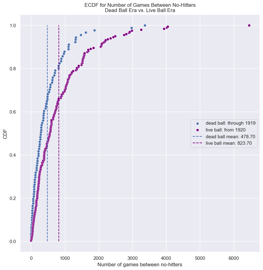
Test of correlation
2008 US swing state election results
- Consider again the swing state county-level voting data
- In the prequel to this course, we computed the Pearson correlation coefficient between Obama’s vote share and the total number of votes.
- Remember, the Pearson correlation coefficient is a measure of how much of the variability in two variables is due to them being correlated.
- It ranges from -1 for totally negatively correlated to 1 for positively correlated.
- We got a value of about 0.54.
- This value of the Pearson correlation coefficient indicates the data are not perfectly correlated, but are correlated nonetheless.
- How can we know for sure if this correlation is real, or if it could have happened just by chance?
Hypothesis test of correlation
- We can do a hypothesis test.
- Posit a null hypothesis that there is no correlation between the two variables, in this case Obama’s vote share and total votes.
- Posit a null hypothesis: the two variables are completely uncorrelated
- We then simulate the election assuming the null hypothesis is true (which you will figure out how to do in the exercises), and use the Pearson correlation coefficient, $\rho$, as the test statistic.
- Simulate data assuming null hypothesis is True
- The p-value is then the fraction of replicates that have a Pearson correlation coefficient at least as large as what was observed
- Compute p-value as fraction of replicates that have $\rho$ at leas as large as observed.
- I did this procedure, and in all 10,000 of my replicates under the null hypothesis, not one had a Pearson correlation coefficient as high as the observed value of 0.54.
- The same for 100,000 and 1,000,000 replicates.
- This does not mean the p-value is zero.
- It means, it is so low, we would have to generate an enormous number of replicates to have even one that has a test statistic sufficiently extreme.
- We conclude the p-value is exceedingly small and there is essentially no doubt that counties with higher vote count, tended to vote for Obama.
- After all, this is how he won the election.
1
obama_pearson_observed = swing.corr(numeric_only=True).loc['total_votes', 'dem_share']  # from pandas dataframe function
1
2
3
4
5
6
7
g = sns.regplot(x='total_votes', y='dem_share', data=swing)
plt.xlim(0, 900000)
plt.text(400000, 30, f'ρ = {obama_pearson_observed:0.02f}', fontsize=20)
plt.ylabel('Percent of Vote for Obama')
plt.xlabel('Total Votes')
plt.title('2008 US Swing State Election Results')
plt.show()
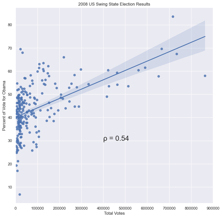
1
2
3
4
5
6
7
8
9
10
# Initialize permutation replicates: perm_replicates
obama_perm_replicates = np.empty(10000)

# Draw replicates
for i in range(len(obama_perm_replicates)):
    # Permute dem_share measurments
    dem_share_permuted = np.random.permutation(swing.dem_share)

    # Compute Pearson correlation
    obama_perm_replicates[i] = pearson_r(dem_share_permuted, swing.total_votes)
1
2
3
4
5
6
7
sns.histplot(obama_perm_replicates, kde=True)
plt.axvline(obama_pearson_observed, 0, 1, label=f'ovserved ρ: {obama_pearson_observed:0.02f}', color='firebrick')
plt.legend()
plt.xlabel('Pearson correlation')
plt.ylabel('probability under null')
plt.title('10000 Replicates of Pearson\nShare of Total Votes for Obama')
plt.show()
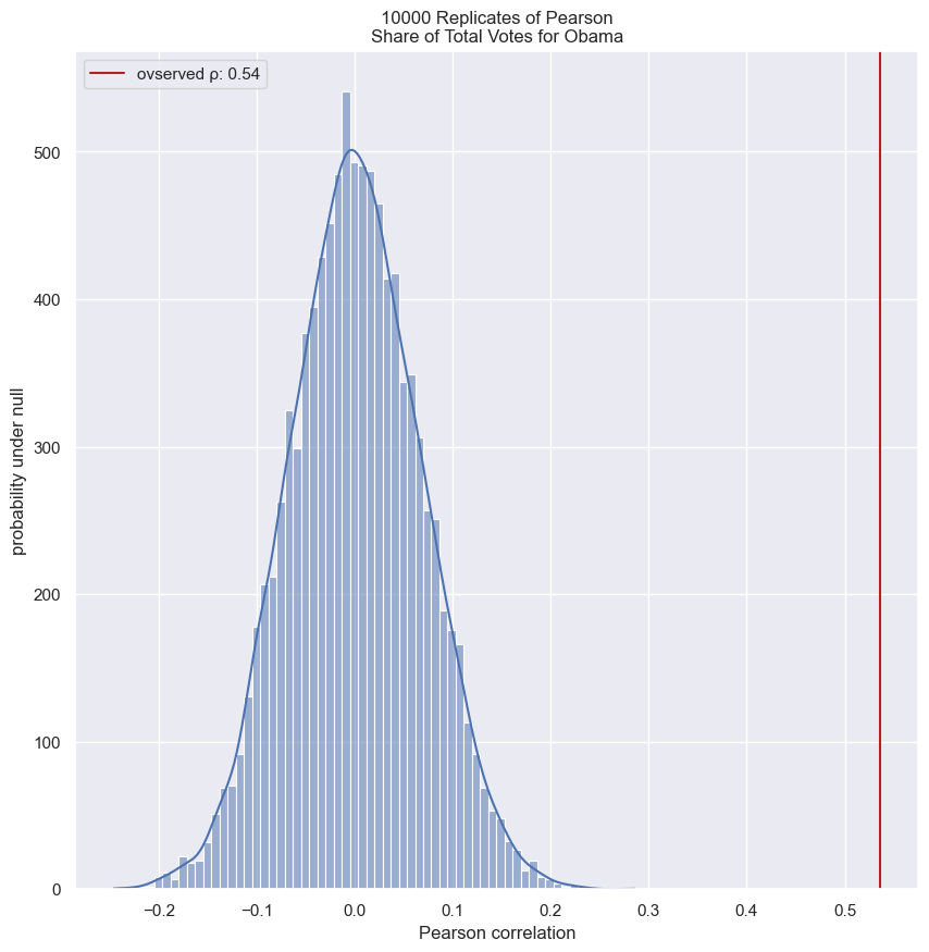
Simulating a null hypothesis concerning correlation
The observed correlation between female illiteracy and fertility in the data set of 162 countries may just be by chance; the fertility of a given country may actually be totally independent of its illiteracy. You will test this null hypothesis in the next exercise.
To do the test, you need to simulate the data assuming the null hypothesis is true. Of the following choices, which is the best way to do it?
Answer the question
Choose 162 random numbers to represent the illiteracy rate and 162 random numbers to represent the corresponding fertility rate.Do a pairs bootstrap: Sample pairs of observed data with replacement to generate a new set of (illiteracy, fertility) data.- Pairs bootstrap will get you a confidence interval on the Pearson correlation. You can get a confidence interval for its value. You would find, for example, that it cannot be close to zero. But this is not a simulation of the null hypothesis.
Do a bootstrap sampling in which you sample 162 illiteracy values with replacement and then 162 fertility values with replacement.- This works and is a legitimate way to simulate the data. The pairings are now random. However, it is not preferred because it is not exact like a permutation test is.
- Do a permutation test: Permute the illiteracy values but leave the fertility values fixed to generate a new set of (illiteracy, fertility) data.
- This exactly simulates the null hypothesis and does so more efficiently than the last option. It is exact because it uses all data and eliminates any correlation because which illiteracy value pairs to which fertility value is shuffled.
Do a permutation test: Permute both the illiteracy and fertility values to generate a new set of (illiteracy, fertility data).- This works perfectly, and is exact because it uses all data and eliminates any correlation because we shuffle which illiteracy value pairs to which fertility value. However, it is not necessary, and computationally inefficient, to permute both illiteracy and fertility.
Hypothesis test on Pearson correlation
The observed correlation between female illiteracy and fertility may just be by chance; the fertility of a given country may actually be totally independent of its illiteracy. You will test this hypothesis. To do so, permute the illiteracy values but leave the fertility values fixed. This simulates the hypothesis that they are totally independent of each other. For each permutation, compute the Pearson correlation coefficient and assess how many of your permutation replicates have a Pearson correlation coefficient greater than the observed one.
The function pearson_r() that you wrote in the prequel to this course for computing the Pearson correlation coefficient is already in your name space.
Instructions
- Compute the observed Pearson correlation between
illiteracyandfertility. - Initialize an array to store your permutation replicates.
- Write a
for loopto draw 10,000 replicates: - Permute the
illiteracymeasurements usingnp.random.permutation(). - Compute the Pearson correlation between the permuted illiteracy array,
illiteracy_permuted, andfertility. - Compute and print the p-value from the replicates.
1
2
illiteracy = 100 - fem['female literacy'].to_numpy()
fertility = fem.fertility.to_numpy()
1
2
3
4
5
6
7
8
9
10
11
12
13
14
15
16
17
# Compute observed correlation: r_obs
r_obs = pearson_r(illiteracy, fertility)

# Initialize permutation replicates: perm_replicates
perm_replicates = np.empty(10000)

# Draw replicates
for i in range(len(perm_replicates)):
    # Permute illiteracy measurments: illiteracy_permuted
    illiteracy_permuted = np.random.permutation(illiteracy)

    # Compute Pearson correlation
    perm_replicates[i] = pearson_r(illiteracy_permuted, fertility)

# Compute p-value: p
p = sum(perm_replicates >= r_obs) / len(perm_replicates)
print('p-val =', p)
1
p-val = 0.0
You got a p-value of zero. In hacker statistics, this means that your p-value is very low, since you never got a single replicate in the 10,000 you took that had a Pearson correlation greater than the observed one. You could try increasing the number of replicates you take to continue to move the upper bound on your p-value lower and lower.
1
2
3
4
5
6
7
sns.histplot(perm_replicates, kde=True)
plt.axvline(r_obs, 0, 1, label=f'observed ρ: {r_obs:0.02f}', color='firebrick')
plt.legend()
plt.xlabel('Pearson correlation')
plt.ylabel('probability under null')
plt.title('10000 Replicates of Pearson\nIlliteracy as Correlated to Fertility')
plt.show()
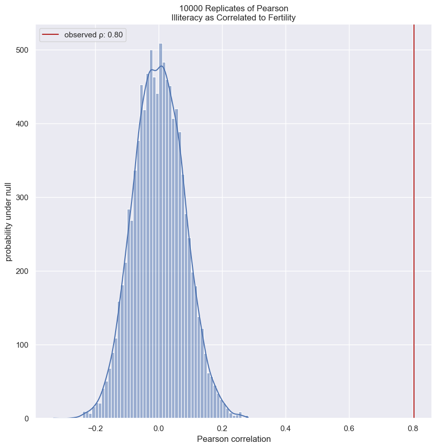
Do neonicotinoid insecticides have unintended consequences?
As a final exercise in hypothesis testing before we put everything together in our case study in the next chapter, you will investigate the effects of neonicotinoid insecticides on bee reproduction. These insecticides are very widely used in the United States to combat aphids and other pests that damage plants.
In a recent study, Straub, et al. (Proc. Roy. Soc. B, 2016 investigated the effects of neonicotinoids on the sperm of pollinating bees. In this and the next exercise, you will study how the pesticide treatment affected the count of live sperm per half milliliter of semen.
First, we will do EDA, as usual. Plot ECDFs of the alive sperm count for untreated bees (stored in the Numpy array control) and bees treated with pesticide (stored in the Numpy array treated).
Instructions
- Use your
ecdf()function to generatex,yvalues from thecontrolandtreatedarrays for plotting the ECDFs. - Plot the ECDFs on the same plot.
- The margins have been set for you, along with the legend and axis labels.
1
2
3
# the values used in the DataCamp exercise are multipled by 2. I have not done that here.
control = bees['Alive Sperm Millions'][bees.Treatment == 'Control'].to_numpy()
treated = bees['Alive Sperm Millions'][bees.Treatment == 'Pesticide'].to_numpy()
1
2
3
4
5
6
7
8
9
10
11
12
13
14
15
16
17
18
19
20
# Compute x,y values for ECDFs
x_control, y_control = ecdf(control)
x_treated, y_treated = ecdf(treated)

# Plot the ECDFs
plt.plot(x_control, y_control, marker='.', linestyle='none', color='b', label='control ecdf')
plt.plot(x_treated, y_treated, marker='.', linestyle='none', color='g', label='treated ecdf')
plt.axvline(np.mean(control), color='b', linestyle='--', label=f'observed control mean: {np.mean(control):0.02f}')
plt.axvline(np.mean(treated), color='g', linestyle='--', label=f'observed treated mean: {np.mean(treated):0.02f}')

# Set the margins
plt.margins(0.02)

# Add a legend
plt.legend(loc=7)

# Label axes and show plot
plt.xlabel('millions of alive sperm per mL')
plt.ylabel('ECDF')
plt.show()
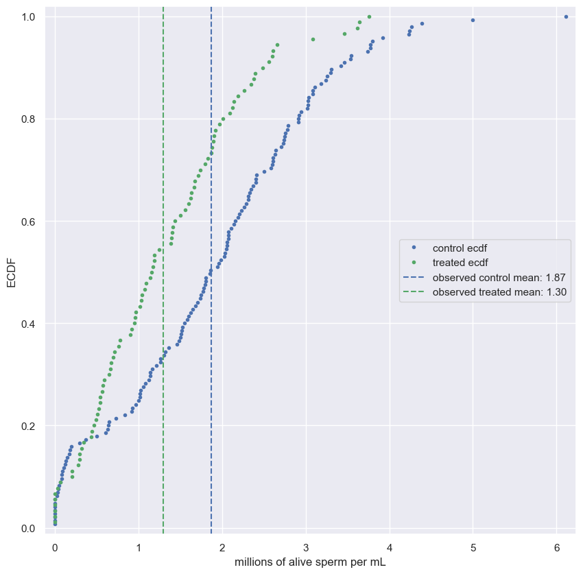
The ECDFs show a pretty clear difference between the treatment and control; treated bees have fewer alive sperm. Let’s now do a hypothesis test in the next exercise.
Bootstrap hypothesis test on bee sperm counts
Now, you will test the following hypothesis: On average, male bees treated with neonicotinoid insecticide have the same number of active sperm per milliliter of semen than do untreated male bees. You will use the difference of means as your test statistic.
For your reference, the call signature for the draw_bs_reps() function you wrote in chapter 2 is draw_bs_reps(data, func, size=1).
Instructions
- Compute the mean alive sperm count of
controlminus that oftreated. - Compute the mean of all alive sperm counts. To do this, first concatenate
controlandtreatedand take the mean of the concatenated array. - Generate shifted data sets for both
controlandtreatedsuch that the shifted data sets have the same mean. - Generate 10,000 bootstrap replicates of the mean each for the two shifted arrays. Use your
draw_bs_reps()function. - Compute the bootstrap replicates of the difference of means.
- Compute and print the p-value.
1
2
3
4
5
6
7
8
9
10
11
12
13
14
15
16
17
18
19
20
# Compute the difference in mean sperm count: diff_means
diff_means = diff_of_means(control, treated)

# Compute mean of pooled data: mean_count
mean_count = np.mean(np.concatenate((control, treated)))

# Generate shifted data sets
control_shifted = control - np.mean(control) + mean_count
treated_shifted = treated - np.mean(treated) + mean_count

# Generate bootstrap replicates
bs_reps_control = draw_bs_reps(control_shifted, np.mean, size=10000)
bs_reps_treated = draw_bs_reps(treated_shifted, np.mean, size=10000)

# Get replicates of difference of means: bs_replicates
bs_replicates = bs_reps_control - bs_reps_treated

# Compute and print p-value: p
p = np.sum(bs_replicates >= diff_means) / len(bs_replicates)
print('p-value =', p)
1
p-value = 0.0
The p-value is small, most likely less than 0.0001, since you never saw a bootstrap replicated with a difference of means at least as extreme as what was observed. In fact, when I did the calculation with 10 million replicates, I got a p-value of 2e-05.
1
2
3
4
5
6
7
8
9
10
11
12
13
14
15
16
17
18
19
20
21
# Compute x,y values for ECDFs
x_control, y_control = ecdf(control_shifted)
x_treated, y_treated = ecdf(treated_shifted)

# Plot the ECDFs
plt.plot(x_control, y_control, marker='.', linestyle='none', color='b', label='shifted control ecdf')
plt.plot(x_treated, y_treated, marker='.', linestyle='none', color='g', label='shifted treated ecdf')
plt.axvline(np.mean(control_shifted), color='b', linestyle='--', label=f'shifted control mean: {np.mean(control_shifted):0.02f}')
plt.axvline(np.mean(treated_shifted), color='g', linestyle='--', label=f'shifted treated mean: {np.mean(treated_shifted):0.02f}')

# Set the margins
plt.margins(0.02)

# Add a legend
plt.legend(loc=7)

# Label axes and show plot
plt.title('ECDF of Shifted Control & Treatment Means')
plt.xlabel('millions of alive sperm per mL')
plt.ylabel('ECDF')
plt.show()
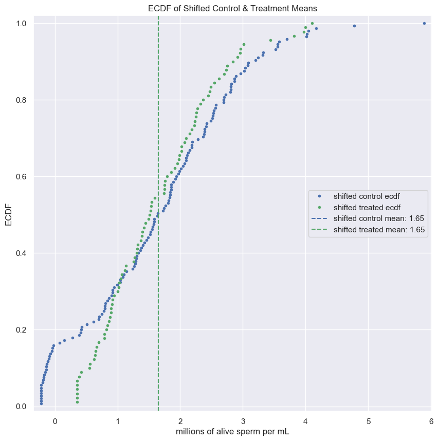
1
2
3
4
5
6
7
sns.histplot(bs_replicates, kde=True)
plt.axvline(diff_means, linestyle='--', color='firebrick', label=f'Observed diff mean: {diff_means:0.02f}')
plt.title('Bootstrap Replicates of Difference of Means\nControl & Treated Mean Shifted to Mean of Combined Data')
plt.xlabel('Difference of Shifted Means')
plt.ylabel('Probability Under Null Hypothesis')
plt.legend()
plt.show()
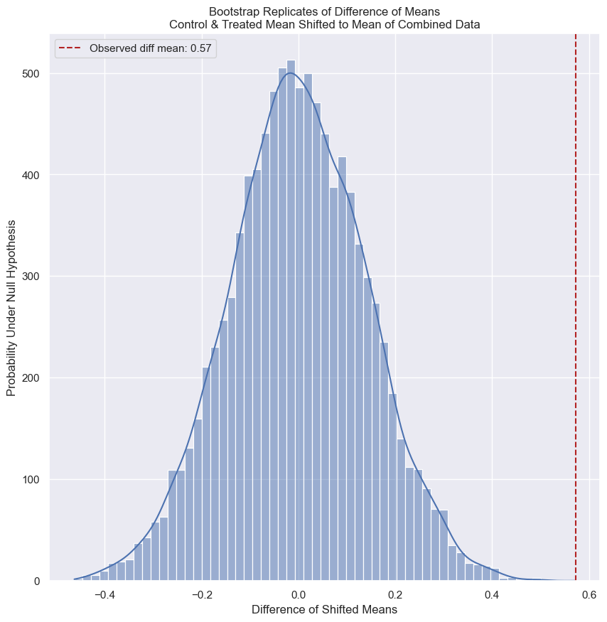
Case study
Every year for the past 40-plus years, Peter and Rosemary Grant have gone to the Galápagos island of Daphne Major and collected data on Darwin’s finches. Using your skills in statistical inference, you will spend this chapter with their data, and witness first hand, through data, evolution in action. It’s an exhilarating way to end the course!
Finch beaks and the need for statistics
Your well-equipped toolbox
- Graphical and quantitative EDA
- Parameter estimation
- You know how to think probabilistically and infer values and confidence intervals for parameters
- Confidence interval calculation
- Hypothesis testing
- You know how to formulate a hypothesis and use your data, and Python, to test it
Darwin and the Finches
- You may know that many of the important observations that lead Charles Darwin to develop the theory of evolution were made in the Galápagos archipelago, particularly in the study of the small birds, called finches, that inhabit them.
- The islandas are ideal for studying evolution because they are isolated so the do not have complicated effects from interactions with other species, including humans.
- Furthermore, some of them are small, so entire populations can be monitored on a given island.
- Every year sinces 1973, Peter and Rosemary Grant of Princeton University have been spending several months of the year on the tiny volcanic cinder cone island of Daphne Major.
- This island has two dominant ground finch species, Geospiza fortis and Geospiza scandens.
- The Grants have monitored them every year, tagging them, making physiological measurements, taking samples for genetic sequencing, and more.
- In 2014, they published a book, 40 Years of Evolution: Darwin’s Finches on Daphne Major Island.
- They generously placed all of their data on the Dryad data repository making it free for anyone to use.
- The data set is impressive and a great set for using data science and statistical inference to learn about evolution.
Investigations
- This section will work with the Grants’ measurements of the beak length and beak depth.
- You will consider different aspects of the beak geometry, including how it varies over time, from species to species, and from parents to offspring.
- For the first analysis, you will investigate how the beak depth of Geospiza scandens has changed over time.
- You will start with some exploratory analysis of the measurements of these species from 1975 and 2012.
- You will then perform a parameter estimation, with confidence intervals, of mean beak depth fro those respective years.
Finally, you will do a hypothesis test investigating if the mean beak depth has changed from 1975 to 2012.
EDA of beak depths of Darwin’s finches
For your first foray into the Darwin finch data, you will study how the beak depth (the distance, top to bottom, of a closed beak) of the finch species Geospiza scandens has changed over time. The Grants have noticed some changes of beak geometry depending on the types of seeds available on the island, and they also noticed that there was some interbreeding with another major species on Daphne Major, Geospiza fortis. These effects can lead to changes in the species over time.
In the next few problems, you will look at the beak depth of G. scandens on Daphne Major in 1975 and in 2012. To start with, let’s plot all of the beak depth measurements in 1975 and 2012 in a bee swarm plot.
The data are stored in a pandas DataFrame called df with columns 'year' and 'beak_depth'. The units of beak depth are millimeters (mm).
Instructions
- Create the beeswarm plot.
- Label the axes.
- Show the plot.
1
finch.species.unique()
1
array(['fortis', 'scandens'], dtype=object)
1
2
3
4
sns.swarmplot(data=finch[finch.species == 'scandens'], x='year', y='beak_depth')
plt.xlabel('year')
plt.ylabel('beak depth (mm)')
plt.show()
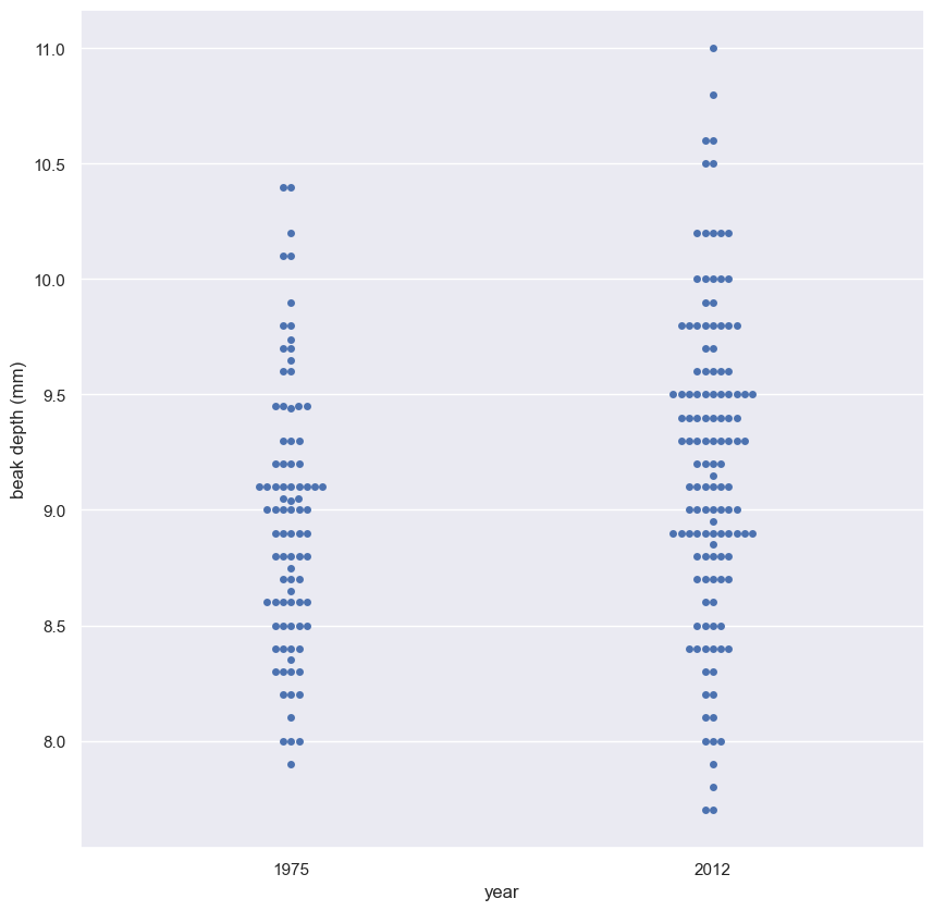
It is kind of hard to see if there is a clear difference between the 1975 and 2012 data set. Eyeballing it, it appears as though the mean of the 2012 data set might be slightly higher, and it might have a bigger variance.
ECDFs of beak depths
While bee swarm plots are useful, we found that ECDFs are often even better when doing EDA. Plot the ECDFs for the 1975 and 2012 beak depth measurements on the same plot.
For your convenience, the beak depths for the respective years has been stored in the NumPy arrays bd_1975 and bd_2012.
Instructions
- Compute the ECDF for the 1975 and 2012 data.
- Plot the two ECDFs.
- Set a 2% margin and add axis labels and a legend to the plot.
1
2
bd_1975 = finch_1975.beak_depth[finch_1975.species == 'scandens'].values
bd_2012 = finch_2012.beak_depth[finch_2012.species == 'scandens'].values
1
2
3
4
5
6
7
8
9
10
11
12
13
14
15
16
17
18
# Compute ECDFs
x_1975, y_1975 = ecdf(bd_1975)
x_2012, y_2012 = ecdf(bd_2012)

# Plot the ECDFs
plt.scatter(x_1975, y_1975, marker='.', s=10)
plt.scatter(x_2012, y_2012, marker='.', s=10)

# Set the margins
plt.margins(0.02)

# Add axis labels and legend
plt.xlabel('beak depth (mm)')
plt.ylabel('ECDF')
plt.legend(('1975', '2012'), loc='lower right')

# Show the plot
plt.show()
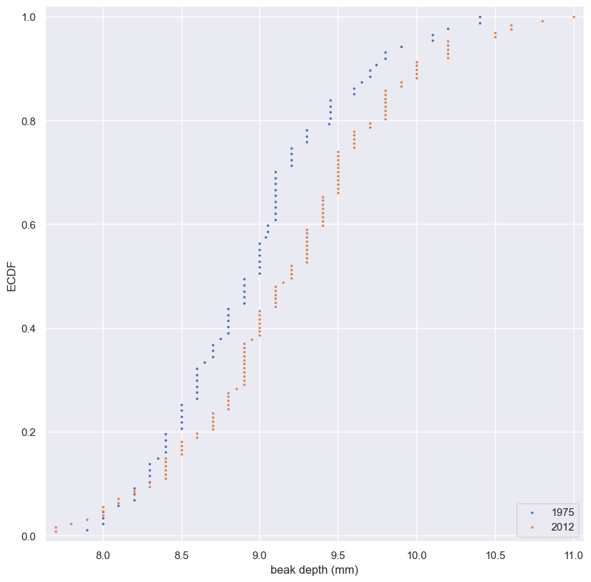
The differences are much clearer in the ECDF. The mean is larger in the 2012 data, and the variance does appear larger as well.
1
2
# seaborn 0.11 can do the same thing from one dataframe and no separate function
sns.ecdfplot(data=finch[finch.species == 'scandens'], x='beak_depth', hue='year')
1
<Axes: xlabel='beak_depth', ylabel='Proportion'>
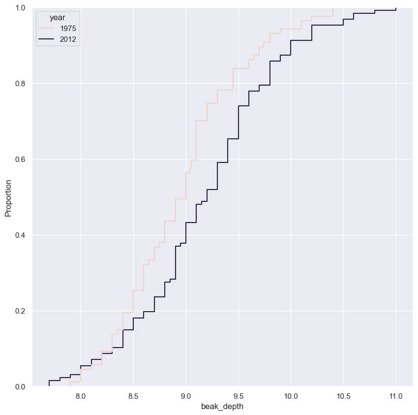
Parameter estimates of beak depths
Estimate the difference of the mean beak depth of the G. scandens samples from 1975 and 2012 and report a 95% confidence interval.
Since in this exercise you will use the draw_bs_reps() function you wrote in chapter 2, it may be helpful to refer back to it.
Instructions
- Compute the difference of the sample means.
- Take 10,000 bootstrap replicates of the mean for the 1975 beak depths using your draw_bs_reps() function. Also get 10,000 bootstrap replicates of the mean for the 2012 beak depths.
- Subtract the 1975 replicates from the 2012 replicates to get bootstrap replicates of the difference of means.
- Use the replicates to compute the 95% confidence interval.
1
2
3
4
5
6
7
8
9
10
11
12
13
14
15
16
# Compute the difference of the sample means: mean_diff
mean_diff = np.mean(bd_2012) - np.mean(bd_1975)

# Get bootstrap replicates of means
bs_replicates_1975 = draw_bs_reps(bd_1975, np.mean, size=10000)
bs_replicates_2012 = draw_bs_reps(bd_2012, np.mean, size=10000)

# Compute samples of difference of means: bs_diff_replicates
bs_diff_replicates = bs_replicates_2012 - bs_replicates_1975

# Compute 95% confidence interval: conf_int
conf_int = np.percentile(bs_diff_replicates, [2.5, 97.5])

# Print the results
print(f'difference of means: {mean_diff} mm')
print(f'95% confidence interval: {conf_int} mm')
1
2
difference of means: 0.22622047244094645 mm
95% confidence interval: [0.06275272 0.39216535] mm
Hypothesis test: Are beaks deeper in 2012?
Your plot of the ECDF and determination of the confidence interval make it pretty clear that the beaks of G. scandens on Daphne Major have gotten deeper. But is it possible that this effect is just due to random chance? In other words, what is the probability that we would get the observed difference in mean beak depth if the means were the same?
Be careful! The hypothesis we are testing is not that the beak depths come from the same distribution. For that we could use a permutation test. The hypothesis is that the means are equal. To perform this hypothesis test, we need to shift the two data sets so that they have the same mean and then use bootstrap sampling to compute the difference of means.
Instructions
- Make a concatenated array of the 1975 and 2012 beak depths and compute and store its mean.
- Shift
bd_1975andbd_2012such that their means are equal to the one you just computed for the combined data set. - Take 10,000 bootstrap replicates of the mean each for the 1975 and 2012 beak depths.
- Subtract the 1975 replicates from the 2012 replicates to get bootstrap replicates of the difference.
- Compute and print the p-value. The observed difference in means you computed in the last exercise is still in your namespace as
mean_diff.
1
2
3
4
5
6
7
8
9
10
11
12
13
14
15
16
17
18
19
# Compute mean of combined data set: combined_mean
combined_mean = np.mean(np.concatenate((bd_1975, bd_2012)))

# Shift the samples
bd_1975_shifted = bd_1975 - np.mean(bd_1975) + combined_mean
bd_2012_shifted = bd_2012 - np.mean(bd_2012) + combined_mean

# Get bootstrap replicates of shifted data sets
bs_replicates_1975 = draw_bs_reps(bd_1975_shifted, np.mean, size=10000)
bs_replicates_2012 = draw_bs_reps(bd_2012_shifted, np.mean, size=10000)

# Compute replicates of difference of means: bs_diff_replicates
bs_diff_replicates = bs_replicates_2012 - bs_replicates_1975

# Compute the p-value
p = np.sum(bs_diff_replicates >= mean_diff) / len(bs_diff_replicates)

# Print p-value
print(f'p: {p}')
1
p: 0.005
- We get a p-value of 0.0034, which suggests that there is a statistically significant difference. But remember: it is very important to know how different they are! In the previous exercise, you got a difference of 0.2 mm between the means. You should combine this with the statistical significance. Changing by 0.2 mm in 37 years is substantial by evolutionary standards. If it kept changing at that rate, the beak depth would double in only 400 years.
1
2
3
4
5
6
sns.ecdfplot(data=bs_replicates_1975, label='1975')
sns.ecdfplot(data=bs_replicates_2012, label='2012')
plt.legend(title='year')
plt.xlabel('beak depth (mm)')
plt.title('ECDF of Replicates with Shifted Mean')
plt.show()
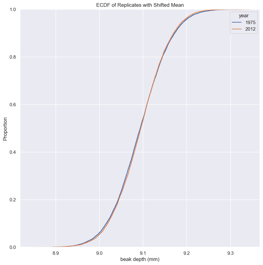
Variation in beak shapes
- You just determined that the beak depth of Geospiza scandens changed over the course of 37 years.
- There are a few hypotheses as to why this is the case.
- One reason may be a drought in 1976 and 1977 that resulted in the death of the plants that produce small seeds on the island.
- The larger seeds required deeper beaks to crack them, so large-beaked birds survived and then reproduced.
- If this is the case, it stands to reason that the length of the beak might also change over time.
- Importantly, if the length and depth change at the same rate, the beak has the same shape; it just gets bigger.
- But if the beak length and beak depth change differently, the shape of the beak changes.
- In the next few exercises, you will investigate how beak length and depth change together.
- This means it’s time for some linear regression.
- As a hint, the
draw_bs_pairs_linregfunction you wrote, will be helpful in computing confidence intervals for you linear regression parameters.
EDA of beak length and depth
The beak length data are stored as bl_1975 and bl_2012, again with units of millimeters (mm). You still have the beak depth data stored in bd_1975 and bd_2012. Make scatter plots of beak depth (y-axis) versus beak length (x-axis) for the 1975 and 2012 specimens.
Instructions
- Make a scatter plot of the 1975 data. Use the
color='blue'keyword argument. Also use analpha=0.5keyword argument to have transparency in case data points overlap. - Do the same for the 2012 data, but use the
color='red'keyword argument. - Add a legend and label the axes.
- Show your plot.
1
2
bl_1975 = finch_1975.beak_length[finch_1975.species == 'scandens'].values
bl_2012 = finch_2012.beak_length[finch_2012.species == 'scandens'].values
1
2
3
4
5
6
7
8
9
10
11
12
13
# Make scatter plot of 1975 data
plt.scatter(bl_1975, bd_1975, marker='.', linestyle='None', color='blue', alpha=0.5)

# Make scatter plot of 2012 data
plt.scatter(bl_2012, bd_2012, marker='.', linestyle='None', color='red', alpha=0.5)

# Label axes and make legend
plt.xlabel('beak length (mm)')
plt.ylabel('beak depth (mm)')
plt.legend(('1975', '2012'), loc='upper left')

# Show the plot
plt.show()
Great work! In looking at the plot, we see that beaks got deeper (the red points are higher up in the y-direction), but not really longer. If anything, they got a bit shorter, since the red dots are to the left of the blue dots. So, it does not look like the beaks kept the same shape; they became shorter and deeper.
Linear regressions
Perform a linear regression for both the 1975 and 2012 data. Then, perform pairs bootstrap estimates for the regression parameters. Report 95% confidence intervals on the slope and intercept of the regression line.
You will use the draw_bs_pairs_linreg() function you wrote back in chapter 2.
As a reminder, its call signature is draw_bs_pairs_linreg(x, y, size=1), and it returns bs_slope_reps and bs_intercept_reps. The beak length data are stored as bl_1975 and bl_2012, and the beak depth data is stored in bd_1975 and bd_2012.
Instructions
- Compute the slope and intercept for both the 1975 and 2012 data sets.
- Obtain 1000 pairs bootstrap samples for the linear regressions using your
draw_bs_pairs_linreg()function. - Compute 95% confidence intervals for the slopes and the intercepts.
1
2
3
4
5
6
7
8
9
10
11
12
13
14
15
16
17
18
19
# Compute the linear regressions
slope_1975, intercept_1975 = np.polyfit(bl_1975, bd_1975, deg=1)
slope_2012, intercept_2012 = np.polyfit(bl_2012, bd_2012, deg=1)

# Perform pairs bootstrap for the linear regressions
bs_slope_reps_1975, bs_intercept_reps_1975 = draw_bs_pairs_linreg(bl_1975, bd_1975, size=1000)
bs_slope_reps_2012, bs_intercept_reps_2012 = draw_bs_pairs_linreg(bl_2012, bd_2012, size=1000)

# Compute confidence intervals of slopes
slope_conf_int_1975 = np.percentile(bs_slope_reps_1975, [2.5, 97.5])
slope_conf_int_2012 = np.percentile(bs_slope_reps_2012, [2.5, 97.5])
intercept_conf_int_1975 = np.percentile(bs_intercept_reps_1975, [2.5, 97.5])
intercept_conf_int_2012 = np.percentile(bs_intercept_reps_2012, [2.5, 97.5])

# Print the results
print(f'1975: slope: {slope_1975:0.2f} conf int: {np.round(slope_conf_int_1975, 2)}')
print(f'1975: intercept: {intercept_1975:0.2f} conf int: {np.round(intercept_conf_int_1975, 2)}')
print(f'2012: slope: {slope_2012:0.2f} conf int: {np.round(slope_conf_int_2012, 2)}')
print(f'2012: intercept: {intercept_2012:0.2f} conf int: {np.round(intercept_conf_int_2012, 2)}')
1
2
3
4
1975: slope: 0.47 conf int: [0.34 0.59]
1975: intercept: 2.39 conf int: [0.67 4.12]
2012: slope: 0.46 conf int: [0.33 0.6 ]
2012: intercept: 2.98 conf int: [1.13 4.73]
Displaying the linear regression results
Now, you will display your linear regression results on the scatter plot, the code for which is already pre-written for you from your previous exercise. To do this, take the first 100 bootstrap samples (stored in bs_slope_reps_1975, bs_intercept_reps_1975, bs_slope_reps_2012, and bs_intercept_reps_2012) and plot the lines with alpha=0.2 and linewidth=0.5 keyword arguments to plt.plot().
Instructions
- Generate the x-values for the bootstrap lines using
np.array(). They should consist of 10 mm and 17 mm. - Write a
forloop to plot 100 of the bootstrap lines for the 1975 and 2012 data sets. The lines for the 1975 data set should be'blue'and those for the 2012 data set should be'red'.
1
2
3
4
5
6
7
8
9
10
11
12
13
14
15
16
17
18
19
20
21
# Make scatter plot of 1975 data
plt.plot(bl_1975, bd_1975, marker='.', linestyle='none', color='blue', alpha=0.5)

# Make scatter plot of 2012 data
plt.plot(bl_2012, bd_2012, marker='.', linestyle='none', color='red', alpha=0.5)

# Label axes and make legend
plt.xlabel('beak length (mm)')
plt.ylabel('beak depth (mm)')
plt.legend(('1975', '2012'), loc='upper left')

# Generate x-values for bootstrap lines: x
x = np.array([10, 17])

# Plot the bootstrap lines
for i in range(100):
    plt.plot(x, bs_slope_reps_1975[i]*x + bs_intercept_reps_1975[i], linewidth=0.5, alpha=0.2, color='blue')
    plt.plot(x, bs_slope_reps_2012[i]*x + bs_intercept_reps_2012[i], linewidth=0.5, alpha=0.2, color='red')

# Draw the plot again
plt.show()
Beak length to depth ratio
The linear regressions showed interesting information about the beak geometry. The slope was the same in 1975 and 2012, suggesting that for every millimeter gained in beak length, the birds gained about half a millimeter in depth in both years. However, if we are interested in the shape of the beak, we want to compare the ratio of beak length to beak depth. Let’s make that comparison.
Remember, the data are stored in bd_1975, bd_2012, bl_1975, and bl_2012.
Instructions
- Make arrays of the beak length to depth ratio of each bird for 1975 and for 2012.
- Compute the mean of the length to depth ratio for 1975 and for 2012.
- Generate 10,000 bootstrap replicates each for the mean ratio for 1975 and 2012 using your
draw_bs_reps()function. - Get a 99% bootstrap confidence interval for the length to depth ratio for 1975 and 2012.
- Print the results.
1
2
3
4
5
6
7
8
9
10
11
12
13
14
15
16
17
18
19
# Compute length-to-depth ratios
ratio_1975 = bl_1975 / bd_1975
ratio_2012 = bl_2012 / bd_2012

# Compute means
mean_ratio_1975 = np.mean(ratio_1975)
mean_ratio_2012 = np.mean(ratio_2012)

# Generate bootstrap replicates of the means
bs_replicates_1975 = draw_bs_reps(ratio_1975, np.mean, size=10000)
bs_replicates_2012 = draw_bs_reps(ratio_2012, np.mean, size=10000)

# Compute the 99% confidence intervals
conf_int_1975 = np.percentile(bs_replicates_1975, [0.5, 99.5])
conf_int_2012 = np.percentile(bs_replicates_2012, [0.5, 99.5])

# Print the results
print(f'1975: mean ratio: {mean_ratio_1975:0.2f} conf int: {np.round(conf_int_1975, 2)}')
print(f'2012: mean ratio: {mean_ratio_2012:0.2f} conf int: {np.round(conf_int_2012, 2)}')
1
2
1975: mean ratio: 1.58 conf int: [1.56 1.6 ]
2012: mean ratio: 1.47 conf int: [1.44 1.49]
How different is the ratio?
In the previous exercise, you computed the mean beak length to depth ratio with 99% confidence intervals for 1975 and for 2012. The results of that calculation are shown graphically in the plot accompanying this problem. In addition to these results, what would you say about the ratio of beak length to depth?
Instructions
- The mean beak length-to-depth ratio decreased by about 0.1, or 7%, from 1975 to 2012. The 99% confidence intervals are not even close to overlapping, so this is a real change. The beak shape changed.
It is impossible to say if this is a real effect or just due to noise without computing a p-value. Let me compute the p-value and get back to you.
1
2
3
4
5
plt.figure(figsize=(6, 4))
sns.scatterplot(x=[mean_ratio_1975, mean_ratio_2012], y=['1975', '2012'])
plt.hlines(y=['1975', '2012'], xmin=[conf_int_1975[0], conf_int_2012[0]], xmax=[conf_int_1975[1], conf_int_2012[1]])
plt.xlabel('beak length / beak depth')
plt.show()
Calculation of heritability
- What’s causing the beaks of Geospiza scandens to get bigger over time?
- I mentioned the selective pressure brought on by the drought.
- But why do some birds have such large beaks to begin with?
- A prevailing explanation is that scandens birds are mating with the other major finch species on Daphne Major, Geospiza fortis.
- These hybrid birds then mate with pure scandens, in a process called introgressive hybridization, which can bring fortix characteristics into the scandens species.
- This is very similar to what likely happened to humans when they encountered neanderthals.
- In order to assess the viability of the explanation, we need to know how strongly parental traits are passed to offspring.
- In this last set of exercises, we will investigate the extent to which parental beak depth is inherited by offspring in both scandens and fortis.
- You are applying your new statistical skills to a real, fundamental, scientific problem.
1
2
3
4
5
6
7
8
fortis_parent_offspr = pd.read_csv(data_paths[5])  # has separate male/female measurements
fortis_parent_offspr['mid_parent'] = fortis_parent_offspr.iloc[:, 1:].mean(axis=1)
scandens_parent_offspr = pd.read_csv(data_paths[8])  # has mean of male/female measurements

bd_parent_fortis = fortis_parent_offspr['mid_parent'].values
bd_offspring_fortis = fortis_parent_offspr['Mid-offspr'].values
bd_parent_scandens = scandens_parent_offspr['mid_parent'].values
bd_offspring_scandens = scandens_parent_offspr['mid_offspring'].values
EDA of heritability
The array bd_parent_scandens contains the average beak depth (in mm) of two parents of the species G. scandens. The array bd_offspring_scandens contains the average beak depth of the offspring of the respective parents. The arrays bd_parent_fortis and bd_offspring_fortis contain the same information about measurements from G. fortis birds.
Make a scatter plot of the average offspring beak depth (y-axis) versus average parental beak depth (x-axis) for both species. Use the alpha=0.5 keyword argument to help you see overlapping points.
Instructions
- Generate scatter plots for both species. Display the data for G. fortis in blue and G. scandens in red.
- Set the axis labels, make a legend, and show the plot.
1
2
3
4
5
6
7
8
9
10
11
12
13
# Make scatter plots
plt.scatter(bd_parent_fortis, bd_offspring_fortis, s=10, color='blue', alpha=0.5)
plt.scatter(bd_parent_scandens, bd_offspring_scandens, s=10, color='red', alpha=0.5)

# Label axes
plt.xlabel('parental beak depth (mm)')
plt.ylabel('offspring beak depth (mm)')

# Add legend
plt.legend(('G. fortis', 'G. scandens'), loc='lower right')

# Show plot
plt.show()
It appears as though there is a stronger correlation in G. fortis than in G. scandens. This suggests that beak depth is more strongly inherited in G. fortis. We’ll quantify this correlation next.
1
fortis_parent_offspr[['Mid-offspr', 'mid_parent']].corr()
| Mid-offspr | mid_parent | |
|---|---|---|
| Mid-offspr | 1.000000 | 0.728341 |
| mid_parent | 0.728341 | 1.000000 |
1
scandens_parent_offspr.corr()
| mid_parent | mid_offspring | |
|---|---|---|
| mid_parent | 1.000000 | 0.411706 |
| mid_offspring | 0.411706 | 1.000000 |
Correlation of offspring and parental data
In an effort to quantify the correlation between offspring and parent beak depths, we would like to compute statistics, such as the Pearson correlation coefficient, between parents and offspring. To get confidence intervals on this, we need to do a pairs bootstrap.
You have already written a function to do pairs bootstrap to get estimates for parameters derived from linear regression. Your task in this exercise is to make a new function with call signature draw_bs_pairs(x, y, func, size=1) that performs pairs bootstrap and computes a single statistic on pairs samples defined. The statistic of interest is computed by calling func(bs_x, bs_y). In the next exercise, you will use pearson_r for func.
Instructions
- Set up an array of indices to sample from. (Remember, when doing pairs bootstrap, we randomly choose indices and use those to get the pairs.)
- Initialize the array of bootstrap replicates. This should be a one-dimensional array of length
size. - Write a
forloop to draw the samples. - Randomly choose indices from the array of indices you previously set up.
- Extract
xvalues andyvalues from the input array using the indices you just chose to generate a bootstrap sample. - Use
functo compute the statistic of interest from the bootstrap samples ofxandyand store it in your array of bootstrap replicates. - Return the array of bootstrap replicates.
def draw_bs_pairs
1
2
3
4
5
6
7
8
9
10
11
12
13
14
15
16
def draw_bs_pairs(x, y, func, size=1):
    """Perform pairs bootstrap for a single statistic."""

    # Set up array of indices to sample from: inds
    inds = np.arange(len(x))

    # Initialize replicates: bs_replicates
    bs_replicates = np.empty(size)

    # Generate replicates
    for i in range(size):
        bs_inds = np.random.choice(inds, size=len(inds))
        bs_x, bs_y = x[bs_inds], y[bs_inds]
        bs_replicates[i] = func(bs_x, bs_y)

    return bs_replicates
Pearson correlation of offspring and parental data
The Pearson correlation coefficient seems like a useful measure of how strongly the beak depth of parents are inherited by their offspring. Compute the Pearson correlation coefficient between parental and offspring beak depths for G. scandens. Do the same for G. fortis. Then, use the function you wrote in the last exercise to compute a 95% confidence interval using pairs bootstrap.
Remember, the data are stored in bd_parent_scandens, bd_offspring_scandens, bd_parent_fortis, and bd_offspring_fortis.
Instructions
- Use the
pearson_r()function to compute the Pearson correlation coefficient for G. scandens and G. fortis. - Acquire 1000 pairs bootstrap replicates of the Pearson correlation coefficient using the
draw_bs_pairs()function you wrote in the previous exercise for G. scandens and G. fortis. - Compute the 95% confidence interval for both using your bootstrap replicates.
1
2
3
4
5
6
7
8
9
10
11
12
13
14
15
# Compute the Pearson correlation coefficients
r_scandens = pearson_r(bd_parent_scandens, bd_offspring_scandens)
r_fortis = pearson_r(bd_parent_fortis, bd_offspring_fortis)

# Acquire 1000 bootstrap replicates of Pearson r
bs_replicates_scandens = draw_bs_pairs(bd_parent_scandens, bd_offspring_scandens, pearson_r, size=1000)
bs_replicates_fortis = draw_bs_pairs(bd_parent_fortis, bd_offspring_fortis, pearson_r, size=1000)

# Compute 95% confidence intervals
conf_int_scandens = np.percentile(bs_replicates_scandens, [2.5, 97.5])
conf_int_fortis = np.percentile(bs_replicates_fortis, [2.5, 97.5])

# Print results
print(f'G. scandens: {r_scandens:0.2f}, {np.round(conf_int_scandens, 2)}')
print(f'G. fortis: {r_fortis:0.2f}, {np.round(conf_int_fortis, 2)}')
1
2
G. scandens: 0.41, [0.27 0.54]
G. fortis: 0.73, [0.67 0.78]
It is clear from the confidence intervals that beak depth of the offspring of G. fortis parents is more strongly correlated with their offspring than their G. scandens counterparts.
Measuring heritability
Remember that the Pearson correlation coefficient is the ratio of the covariance to the geometric mean of the variances of the two data sets. This is a measure of the correlation between parents and offspring, but might not be the best estimate of heritability. If we stop and think, it makes more sense to define heritability as the ratio of the covariance between parent and offspring to the variance of the parents alone. In this exercise, you will estimate the heritability and perform a pairs bootstrap calculation to get the 95% confidence interval.
This exercise highlights a very important point. Statistical inference (and data analysis in general) is not a plug-n-chug enterprise. You need to think carefully about the questions you are seeking to answer with your data and analyze them appropriately. If you are interested in how heritable traits are, the quantity we defined as the heritability is more apt than the off-the-shelf statistic, the Pearson correlation coefficient.
Remember, the data are stored in bd_parent_scandens, bd_offspring_scandens, bd_parent_fortis, and bd_offspring_fortis.
Instructions
- Write a function
heritability(parents, offspring)that computes heritability defined as the ratio of the covariance of the trait in parents and offspring divided by the variance of the trait in the parents. Hint: Remind yourself of thenp.cov()function we covered in the prequel to this course. - Use this function to compute the heritability for G. scandens and G. fortis.
- Acquire 1000 bootstrap replicates of the heritability using pairs bootstrap for G. scandens and G. fortis.
- Compute the 95% confidence interval for both using your bootstrap replicates.
- Print the results.
1
2
3
4
def heritability(parents, offspring):
    """Compute the heritability from parent and offspring samples."""
    covariance_matrix = np.cov(parents, offspring)
    return covariance_matrix[0, 1] / covariance_matrix[0,0]
1
2
3
4
5
6
7
8
9
10
11
12
13
14
15
# Compute the heritability
heritability_scandens = heritability(bd_parent_scandens, bd_offspring_scandens)
heritability_fortis = heritability(bd_parent_fortis, bd_offspring_fortis)

# Acquire 1000 bootstrap replicates of heritability
replicates_scandens = draw_bs_pairs(bd_parent_scandens, bd_offspring_scandens, heritability, size=1000)
replicates_fortis = draw_bs_pairs(bd_parent_fortis, bd_offspring_fortis, heritability, size=1000)

# Compute 95% confidence intervals
conf_int_scandens = np.percentile(replicates_scandens, [2.5, 97.5])
conf_int_fortis = np.percentile(replicates_fortis, [2.5, 97.5])

# Print results
print(f'G. scandens: {heritability_scandens:0.2f}, {np.round(conf_int_scandens, 2)}')
print(f'G. fortis: {heritability_fortis:0.2f}, {np.round(conf_int_fortis, 2)}')
1
2
G. scandens: 0.55, [0.35 0.77]
G. fortis: 0.72, [0.65 0.8 ]
Here again, we see that G. fortis has stronger heritability than G. scandens. This suggests that the traits of G. fortis may be strongly incorporated into G. scandens by introgressive hybridization.
Is beak depth heritable at all in G. scandens?
The heritability of beak depth in G. scandens seems low. It could be that this observed heritability was just achieved by chance and beak depth is actually not really heritable in the species. You will test that hypothesis here. To do this, you will do a pairs permutation test.
Instructions
- Initialize your array of replicates of heritability. We will take 10,000 pairs permutation replicates.
- Write a
forloop to generate your replicates. - Permute the
bd_parent_scandensarray usingnp.random.permutation(). - Compute the heritability between the permuted array and the
bd_offspring_scandensarray using theheritability() function you wrote in the last exercise. Store the result in the replicates array. - Compute the p-value as the number of replicates that are greater than the observed
heritability_scandensyou computed in the last exercise.
1
2
3
4
5
6
7
8
9
10
11
12
13
14
15
# Initialize array of replicates: perm_replicates
perm_replicates = np.empty(10000)

# Draw replicates
for i in range(10000):
    # Permute parent beak depths
    bd_parent_permuted = np.random.permutation(bd_parent_scandens)
    perm_replicates[i] = heritability(bd_parent_permuted, bd_offspring_scandens)


# Compute p-value: p
p = np.sum(perm_replicates >= heritability_scandens) / len(perm_replicates)

# Print the p-value
print('p-val =', p)
1
p-val = 0.0
You get a p-value of zero, which means that none of the 10,000 permutation pairs replicates you drew had a heritability high enough to match that which was observed. This strongly suggests that beak depth is heritable in G. scandens, just not as much as in G. fortis. If you like, you can plot a histogram of the heritability replicates to get a feel for how extreme of a value of heritability you might expect by chance.
1
2
plt.hist(perm_replicates, bins=100)
plt.show()
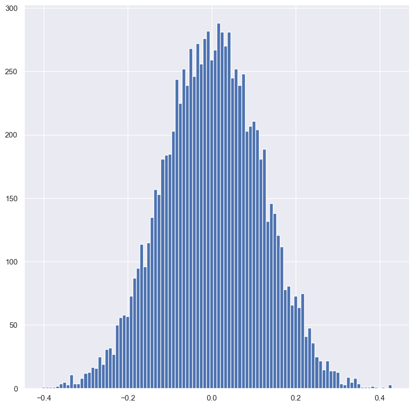
Certificate