Supervised Learning with scikit-learn
- Course: DataCamp: Supervised Learning with scikit-learn
- This notebook was created as a reproducible reference.
- The material is from the course
- The course website uses
scikit-learn v0.19.2,pandas v0.19.2, andnumpy v1.17.4
- The course website uses
- If you find the content beneficial, consider a DataCamp Subscription.
- I added a function (
create_dir_save_file) to automatically download and save the required data (data/2020-10-14_supervised_learning_sklearn) and image (Images/2020-10-14_supervised_learning_sklearn) files. - Package Versions:
- Pandas version: 2.2.1
- Matplotlib version: 3.8.1
- Seaborn version: 0.13.2
- SciPy version: 1.12.0
- Scikit-Learn version: 1.3.2
- NumPy version: 1.26.4
Synopsis
This post covers the essentials of supervised machine learning using scikit-learn in Python. Designed for those looking to enhance their understanding of predictive modeling and data science, the guide offers practical insights and hands-on examples with real-world datasets.
Key Highlights:
- Introduction to Supervised Learning: Learn the fundamentals of supervised learning and its various applications.
- Working with Real-world Data: Gain skills in handling and preparing different types of data for effective modeling.
- Building Predictive Models: Detailed guidance on creating and training predictive models using scikit-learn.
- Model Tuning and Evaluation: Explore methods to fine-tune model parameters and evaluate their performance accurately.
- Practical Examples: Engage with comprehensive examples and case studies that illustrate the concepts discussed.
This guide aims to equip you with the necessary tools to implement supervised learning algorithms and make data-driven decisions effectively.
Course Description
Machine learning is the field that teaches machines and computers to learn from existing data to make predictions on new data: Will a tumor be benign or malignant? Which of your customers will take their business elsewhere? Is a particular email spam? In this course, you’ll learn how to use Python to perform supervised learning, an essential component of machine learning. You’ll learn how to build predictive models, tune their parameters, and determine how well they will perform with unseen data—all while using real world datasets. You’ll be using scikit-learn, one of the most popular and user-friendly machine learning libraries for Python.
Imports
1
2
3
4
5
6
7
8
9
10
11
12
13
14
15
16
17
18
19
20
21
22
23
24
25
import pandas as pd
import numpy as np
from pprint import pprint as pp
from itertools import combinations
import requests
from pathlib import Path

import seaborn as sns
import matplotlib.pyplot as plt
from scipy.stats import randint
from matplotlib.colors import ListedColormap

from sklearn.datasets import load_iris, load_digits
from sklearn.neighbors import KNeighborsClassifier
from sklearn.model_selection import train_test_split, cross_val_score, GridSearchCV, RandomizedSearchCV
from sklearn.linear_model import LinearRegression, Ridge, Lasso, LogisticRegression, ElasticNet
from sklearn.metrics import mean_squared_error, confusion_matrix, classification_report, roc_curve, precision_recall_curve, roc_auc_score, accuracy_score
from sklearn.tree import DecisionTreeClassifier
from sklearn.pipeline import make_pipeline
from sklearn.preprocessing import StandardScaler

from sklearn.impute import SimpleImputer
from sklearn.pipeline import Pipeline
from sklearn.svm import SVC
from sklearn.preprocessing import scale, StandardScaler
1
2
import warnings
warnings.simplefilter("ignore")
Configuration Options
1
2
3
4
5
pd.set_option('display.max_columns', 200)
pd.set_option('display.max_rows', 300)
pd.set_option('display.expand_frame_repr', True)
# plt.style.use('ggplot')
plt.rcParams["patch.force_edgecolor"] = True
Functions
1
2
3
4
5
6
7
8
9
10
11
12
13
14
15
16
17
def create_dir_save_file(dir_path: Path, url: str):
    """
    Check if the path exists and create it if it does not.
    Check if the file exists and download it if it does not.
    """
    if not dir_path.parents[0].exists():
        dir_path.parents[0].mkdir(parents=True)
        print(f'Directory Created: {dir_path.parents[0]}')
    else:
        print('Directory Exists')

    if not dir_path.exists():
        r = requests.get(url, allow_redirects=True)
        open(dir_path, 'wb').write(r.content)
        print(f'File Created: {dir_path.name}')
    else:
        print('File Exists')
1
2
data_dir = Path('data/2020-10-14_supervised_learning_sklearn')
images_dir = Path('Images/2020-10-14_supervised_learning_sklearn')
Datasets
1
2
3
4
5
6
7
file_mpg = 'https://assets.datacamp.com/production/repositories/628/datasets/3781d588cf7b04b1e376c7e9dda489b3e6c7465b/auto.csv'
file_housing = 'https://assets.datacamp.com/production/repositories/628/datasets/021d4b9e98d0f9941e7bfc932a5787b362fafe3b/boston.csv'
file_diabetes = 'https://assets.datacamp.com/production/repositories/628/datasets/444cdbf175d5fbf564b564bd36ac21740627a834/diabetes.csv'
file_gapminder = 'https://assets.datacamp.com/production/repositories/628/datasets/a7e65287ebb197b1267b5042955f27502ec65f31/gm_2008_region.csv'
file_voting = 'https://assets.datacamp.com/production/repositories/628/datasets/35a8c54b79d559145bbeb5582de7a6169c703136/house-votes-84.csv'
file_wwine = 'https://assets.datacamp.com/production/repositories/628/datasets/2d9076606fb074c66420a36e06d7c7bc605459d4/white-wine.csv'
file_rwine = 'https://assets.datacamp.com/production/repositories/628/datasets/013936d2700e2d00207ec42100d448c23692eb6f/winequality-red.csv'
1
2
3
4
5
6
7
8
datasets = [file_mpg, file_housing, file_diabetes, file_gapminder, file_voting, file_wwine, file_rwine]
data_paths = list()

for data in datasets:
    file_name = data.split('/')[-1].replace('?raw=true', '')
    data_path = data_dir / file_name
    create_dir_save_file(data_path, data)
    data_paths.append(data_path)
1
2
3
4
5
6
7
8
9
10
11
12
13
14
Directory Exists
File Exists
Directory Exists
File Exists
Directory Exists
File Exists
Directory Exists
File Exists
Directory Exists
File Exists
Directory Exists
File Exists
Directory Exists
File Exists
DataFrames
Classification
In this chapter, you will be introduced to classification problems and learn how to solve them using supervised learning techniques. And you’ll apply what you learn to a political dataset, where you classify the party affiliation of United States congressmen based on their voting records.
Supervised learning
What is machine learning?
- The art and science of giving computers the ability to learn to make decisions from data without being explicitly programmed.
- Examples:
- Your computer can learn to predict whether an email is spam or not spam, given its content and sender.
- Your computer can learn to cluster, say, Wikipedia entries, into different categories based on the words they contain.
- It could then assign any new Wikipedia article to one of the existing clusters.
- Note that, in the first example, we are trying to predict a particular class label, the is, spam or not spam.
- In the second example, there is not such label.
- When there are labels present, we call it supervised learning.
- Where there are not labels present, we call it unsupervised learning.
Unsupervised learning
- In essence, is the machine learning task of uncovering hidden patterns and structures from unlabeled data.
- Example:
- A business may wish to group its customers into distinct categories (Clustering) based on their purchasing behavior without knowing in advance what these categories might be.
- This is known as clustering, one branch of unsupervised learning.
- A business may wish to group its customers into distinct categories (Clustering) based on their purchasing behavior without knowing in advance what these categories might be.
Reinforcement learning
- Machines or software agents interact with an environment.
- Reinforcement learning agents are able to automatically figure out how to optimize their behavior given a system of rewards and punishments.
- Reinforcement learning draws inspiration from behavioral psychology and has applications in many fields, such as, economics, genetics, as well as game playing.
- In 2016, reinforcement learning was used to train Google DeepMind’s AlphaGo, which was the first computer program to beat the world champion in Go.
Supervised learning
- In supervised learning, we have several data points or samples, described using predictor variables or features and a target variable.
- Out data is commonly represented in a tables structure such as the one below, in which there is a row for data point and a column for each feature.
1
2
3
4
5
6
7
8
|    |                        Predictor Variables                      | Target    |
|    |   sepal_length |   sepal_width |   petal_length |   petal_width | species   |
|---:|---------------:|--------------:|---------------:|--------------:|:----------|
|  0 |            5.1 |           3.5 |            1.4 |           0.2 | setosa    |
|  1 |            4.9 |           3   |            1.4 |           0.2 | setosa    |
|  2 |            4.7 |           3.2 |            1.3 |           0.2 | setosa    |
|  3 |            4.6 |           3.1 |            1.5 |           0.2 | setosa    |
|  4 |            5   |           3.6 |            1.4 |           0.2 | setosa    |
- Here, we see the iris dataset: each row represents measurements of a different flower and each column is a particular kind of measurement, like the width and length of a certain part of the flower.
- The aim of supervised learning is to build a model that is able to predict the target variable, here, the particular species of a flower, given the predictor variables, the physical measurements.
- If the target variable consists of categories, like
'click'or'no click','spam'or'not spam', or different species of flowers, we call the learning task, classification. - Alternatively, if the target is a continuously varying variable, the price of a house, it is a regression task.
- This chapter will focus on classification, the following, on regression.
- The goal of supervised learning is frequently to either automate a time-consuming, or expensive, manual task, such as a doctor’s diagnosis, or to make predictions about the future, say whether a customer will click on an add, or not.
- For supervised learning, you need labeled data and there are many ways to go get it: you can get historical data, which already has labels that you are interested in; you can perform experiments to get labeled data, such as A/B-testing to see how many clicks you get; or you can also use crowd-sourced labeling data, like reCAPTCHA does for text recognition.
- In any case, the goal is to learn from data, for which the right output is known, so that we can make predictions on new data from which we don’t know the output.
Supervised learning in python
- There are many ways to perform supervised learning in Python.
- In this course, we will use
scikit-learn, orsklearn, one of the most popular and use-friendly machine learning libraries for Python. - It also integrate very well with the
SciPystack, including libraries such asNumPy. - There are a number of other ML libraries out there, such as
TensorFlowandkeras, which are well worth checking out, once you get the basics down.
Naming conventions
- A note on naming conventions: out in the wild, you will find that what we call a feature, others may call a predictor variable, or independent variable, and what we call a target variable, others may call dependent variable, or response variable.
Which of these is a classification problem?
Once you decide to leverage supervised machine learning to solve a new problem, you need to identify whether your problem is better suited to classification or regression. This exercise will help you develop your intuition for distinguishing between the two.
Provided below are 4 example applications of machine learning. Which of them is a supervised classification problem?
Answer the question
- Using labeled financial data to predict whether the value of a stock will go up or go down next week.
- Exactly! In this example, there are two discrete, qualitative outcomes: the stock market going up, and the stock market going down. This can be represented using a binary variable, and is an application perfectly suited for classification.
Using labeled housing price data to predict the price of a new house based on various features.- Incorrect. The price of a house is a quantitative variable. This is not a classification problem.
Using unlabeled data to cluster the students of an online education company into different categories based on their learning styles.- Incorrect. When using unlabeled data, we enter the territory of unsupervised learning.
Using labeled financial data to predict what the value of a stock will be next week.- Incorrect. The value of a stock is a quantitative value. This is not a classification problem.
Exploratory data analysis
- Samples are in rows
- Features are in columns
1
2
3
4
5
6
7
8
9
10
11
12
13
14
15
16
17
18
iris = load_iris()
print(f'Type: {type(iris)}')
print(f'Keys: {iris.keys()}')
print(f'Data Type: {type(iris.data)}\nTarget Type: {type(iris.target)}')
print(f'Data Shape: {iris.data.shape}')
print(f'Target Names: {iris.target_names}')

X = iris.data
y = iris.target
df = pd.DataFrame(X, columns=iris.feature_names)
df['label'] = y
species_map = dict(zip(range(3), iris.target_names))
df['species'] = df.label.map(species_map)
df = df.reindex(['sepal length (cm)', 'sepal width (cm)', 'petal length (cm)', 'petal width (cm)', 'species', 'label'], axis=1)
display(df.head())

# pd.plotting.scatter_matrix(df, c=y, figsize=(12, 10))
ax = sns.pairplot(df.iloc[:, :5], hue='species', corner=True)
1
2
3
4
5
6
Type: <class 'sklearn.utils._bunch.Bunch'>
Keys: dict_keys(['data', 'target', 'frame', 'target_names', 'DESCR', 'feature_names', 'filename', 'data_module'])
Data Type: <class 'numpy.ndarray'>
Target Type: <class 'numpy.ndarray'>
Data Shape: (150, 4)
Target Names: ['setosa' 'versicolor' 'virginica']
| sepal length (cm) | sepal width (cm) | petal length (cm) | petal width (cm) | species | label | |
|---|---|---|---|---|---|---|
| 0 | 5.1 | 3.5 | 1.4 | 0.2 | setosa | 0 |
| 1 | 4.9 | 3.0 | 1.4 | 0.2 | setosa | 0 |
| 2 | 4.7 | 3.2 | 1.3 | 0.2 | setosa | 0 |
| 3 | 4.6 | 3.1 | 1.5 | 0.2 | setosa | 0 |
| 4 | 5.0 | 3.6 | 1.4 | 0.2 | setosa | 0 |
Numerical EDA
In this chapter, you’ll be working with a dataset obtained from the UCI Machine Learning Repository consisting of votes made by US House of Representatives Congressmen. Your goal will be to predict their party affiliation (‘Democrat’ or ‘Republican’) based on how they voted on certain key issues. Here, it’s worth noting that we have preprocessed this dataset to deal with missing values. This is so that your focus can be directed towards understanding how to train and evaluate supervised learning models. Once you have mastered these fundamentals, you will be introduced to preprocessing techniques in Chapter 4 and have the chance to apply them there yourself - including on this very same dataset!
Before thinking about what supervised learning models you can apply to this, however, you need to perform Exploratory data analysis (EDA) in order to understand the structure of the data. For a refresher on the importance of EDA, check out the first two chapters of Statistical Thinking in Python (Part 1).
Get started with your EDA now by exploring this voting records dataset numerically. It has been pre-loaded for you into a DataFrame called df. Use pandas’ .head(), .info(), and .describe() methods in the IPython Shell to explore the DataFrame, and select the statement below that is not true.
1
2
3
4
5
cols = ['party', 'infants', 'water', 'budget', 'physician', 'salvador', 'religious', 'satellite', 'aid',
        'missile', 'immigration', 'synfuels', 'education', 'superfund', 'crime', 'duty_free_exports', 'eaa_rsa']
votes = pd.read_csv(data_paths[4], header=None, names=cols)
votes.iloc[:, 1:] = votes.iloc[:, 1:].replace({'?': None, 'n': 0, 'y': 1})
votes.head()
| party | infants | water | budget | physician | salvador | religious | satellite | aid | missile | immigration | synfuels | education | superfund | crime | duty_free_exports | eaa_rsa | |
|---|---|---|---|---|---|---|---|---|---|---|---|---|---|---|---|---|---|
| 0 | republican | 0.0 | 1.0 | 0.0 | 1.0 | 1.0 | 1.0 | 0.0 | 0.0 | 0.0 | 1.0 | NaN | 1.0 | 1.0 | 1.0 | 0.0 | 1.0 |
| 1 | republican | 0.0 | 1.0 | 0.0 | 1.0 | 1.0 | 1.0 | 0.0 | 0.0 | 0.0 | 0.0 | 0.0 | 1.0 | 1.0 | 1.0 | 0.0 | NaN |
| 2 | democrat | NaN | 1.0 | 1.0 | NaN | 1.0 | 1.0 | 0.0 | 0.0 | 0.0 | 0.0 | 1.0 | 0.0 | 1.0 | 1.0 | 0.0 | 0.0 |
| 3 | democrat | 0.0 | 1.0 | 1.0 | 0.0 | NaN | 1.0 | 0.0 | 0.0 | 0.0 | 0.0 | 1.0 | 0.0 | 1.0 | 0.0 | 0.0 | 1.0 |
| 4 | democrat | 1.0 | 1.0 | 1.0 | 0.0 | 1.0 | 1.0 | 0.0 | 0.0 | 0.0 | 0.0 | 1.0 | NaN | 1.0 | 1.0 | 1.0 | 1.0 |
Possible Answers
- The DataFrame has a total of
435rows and17columns. - Except for
'party', all of the columns are of typeint64. - The first two rows of the DataFrame consist of votes made by Republicans and the next three rows consist of votes made by Democrats.
There are 17 predictor variables, or features, in this DataFrame.- The number of columns in the DataFrame is not equal to the number of features. One of the columns -
'party'is the target variable.
- The number of columns in the DataFrame is not equal to the number of features. One of the columns -
- The target variable in this DataFrame is
'party'.
Visual EDA
The Numerical EDA you did in the previous exercise gave you some very important information, such as the names and data types of the columns, and the dimensions of the DataFrame. Following this with some visual EDA will give you an even better understanding of the data. In the video, Hugo used the scatter_matrix() function on the Iris data for this purpose. However, you may have noticed in the previous exercise that all the features in this dataset are binary; that is, they are either 0 or 1. So a different type of plot would be more useful here, such as seaborn.countplot.
Given on the right is a countplot of the 'education' bill, generated from the following code:
1
2
3
4
plt.figure()
sns.countplot(x='education', hue='party', data=df, palette='RdBu')
plt.xticks([0,1], ['No', 'Yes'])
plt.show()
In sns.countplot(), we specify the x-axis data to be 'education', and hue to be 'party'. Recall that 'party' is also our target variable. So the resulting plot shows the difference in voting behavior between the two parties for the 'education' bill, with each party colored differently. We manually specified the color to be 'RdBu', as the Republican party has been traditionally associated with red, and the Democratic party with blue.
It seems like Democrats voted resoundingly against this bill, compared to Republicans. This is the kind of information that our machine learning model will seek to learn when we try to predict party affiliation solely based on voting behavior. An expert in U.S politics may be able to predict this without machine learning, but probably not instantaneously - and certainly not if we are dealing with hundreds of samples!
In the IPython Shell, explore the voting behavior further by generating countplots for the 'satellite' and 'missile' bills, and answer the following question: Of these two bills, for which ones do Democrats vote resoundingly in favor of, compared to Republicans? Be sure to begin your plotting statements for each figure with plt.figure() so that a new figure will be set up. Otherwise, your plots will be overlayed onto the same figure.
1
2
3
4
# in order to use catplot, the dataframe needs to be in a tidy format
vl = votes.set_index('party').stack().reset_index().rename(columns={'level_1': 'cat', 0: 'vote'})

g = sns.catplot(data=vl, x='vote', col='cat', col_wrap=4, hue='party', kind='count', height=3, palette='RdBu')
Possible Answers
'satellite'.'missile'.- Both
'satellite'and'missile'. Neither'satellite'nor'missile'.
The classification challenge
- We have a set of labeled data and we want to build a classifier that takes unlabeled data as input and output a label.
- How do we construct this classifier?
- We first need to choose a type of classifier, and it needs to learn from the already labeled data.
- For this reason, we call the already labeled data, the training data.
k-Nearest Neighbors (KNN)
- We’ll choose a simple algorithm call K-nearest neighbors.
- the basic idea of KNN, is to predict the label of any data point by looking at the K, for example, 3, closest labeled data points, and getting them to vote on what label the unlabeled point should have.
- In this image, there’s an example of KNN in two dimensions: how do you classify the data point in the middle?
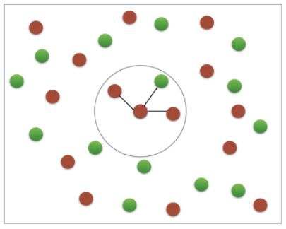
- If
k=3, you would classify it as red
- If
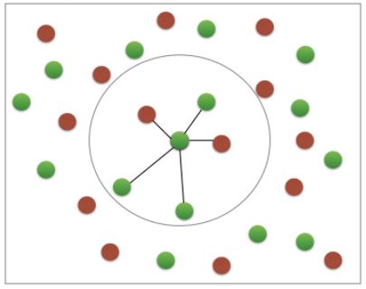
- If
k=5, you would classify it as green
- If
KNN: Intuition
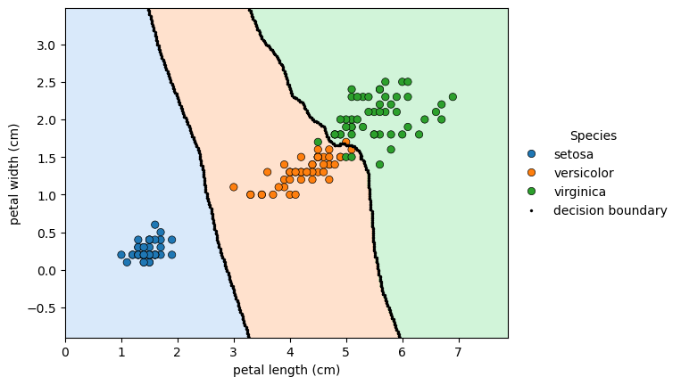
- To get a bit of intuition for KNN, let’s check out a scatter plot of two dimensions of the iris dataset, petal length and petal width.
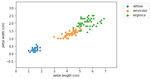
- The following holds for higher dimensions, however, we’ll show thae 2D case for illustrative purposes.
- What the KNN algorithm essentially does, is create a set of decision boundaries and we visualized the 2D case here.
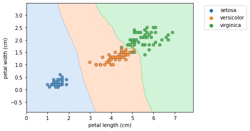
- Any new data point will have a species prediction based on the boundary.
scikit-learn fit and predict
- All machine learning models in
scikit-learnare implemented as python classes - These classes serve two purposes:
- They implement the algorithms for learning a model, and predicting
- Storing all the information that is learned from the data.
- Training a model on the data is also called fitting the model to the data.
- In
scikit-learnwe use the.fit()method to do this. - The
.predict()is used to predict the label of an unlabeled data point.
- In
Code to create boundary plot in the previous block
- See How to extract only the boundary values from k-nearest neighbors predict to see a method to extract the boundary values.
1
2
3
4
5
6
7
8
9
10
11
12
13
14
15
16
17
18
19
20
21
22
23
24
25
26
27
28
29
30
31
32
33
34
35
36
37
38
39
40
# instantiate model
knn = KNeighborsClassifier(n_neighbors=6)

# predict for 'petal length (cm)' and 'petal width (cm)'
knn.fit(df.iloc[:, 2:4], df.label)

h = .02  # step size in the mesh

# create colormap for the contour plot
cmap_light = ListedColormap(list(sns.color_palette('pastel', n_colors=3)))

# Plot the decision boundary.
# For that, we will assign a color to each point in the mesh [x_min, x_max]x[y_min, y_max].
x_min, x_max = df['petal length (cm)'].min() - 1, df['petal length (cm)'].max() + 1
y_min, y_max = df['petal width (cm)'].min() - 1, df['petal width (cm)'].max() + 1
xx, yy = np.meshgrid(np.arange(x_min, x_max, h), np.arange(y_min, y_max, h))
Z = knn.predict(np.c_[xx.ravel(), yy.ravel()]).reshape(xx.shape)

# create plot
fig, ax = plt.subplots()

# add decision boundary countour map
ax.contourf(xx, yy, Z, cmap=cmap_light, alpha=0.4)

# add data points
sns.scatterplot(data=df, x='petal length (cm)', y='petal width (cm)', hue='species', ax=ax, edgecolor='k')

# use diff to create a mask
mask = np.diff(Z, axis=1) != 0
mask2 = np.diff(Z, axis=0) != 0

# apply mask against xx and yy
xd = np.concatenate((xx[:, 1:][mask], xx[1:, :][mask2]))
yd = np.concatenate((yy[:, 1:][mask], yy[1:, :][mask2]))

# plot the decision boundary
sns.scatterplot(x=xd, y=yd, color='k', edgecolor='k', s=5, ax=ax, label='decision boundary')

# legend
_ = ax.legend(title='Species', bbox_to_anchor=(1, 0.5), loc='center left', frameon=False)
Using scikit-learn to fit a classifier
from sklearn.neighbors import KNeighborsClassifier- The API requires data as a
pandas.DataFrameor as anumpy.array - The API features must take on continuous values, such as the price of a house, as opposed to categories, such as
'male'or'female'. - There should be no missing values in the data.
- All dataset we’ll work with, satisfy these properties.
- Dealing with categorical features and missing data will be discussed later in the course.
- The API requires that the features are in an array, where each column is a feature, and each row, a different observation or data point.
- There must be a label for each observation.
- Check out what’s returned when the classifier is fit
- It returns the classifier itself, and modifies it, to fit it to the data.
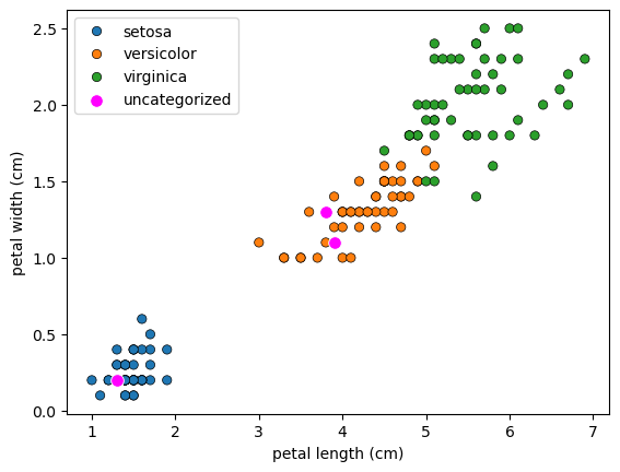
- Now that the classifier is fit, use it to predict on some unlabeled data.
1
2
3
4
5
6
# new data
X_new = np.array([[5.6, 2.8, 3.9, 1.1], [5.7, 2.6, 3.8, 1.3], [4.7, 3.2, 1.3, 0.2]])

fig, ax = plt.subplots()
sns.scatterplot(data=df, x='petal length (cm)', y='petal width (cm)', hue='species', ax=ax, edgecolor='k')
_ = sns.scatterplot(x=X_new[:, 2], y=X_new[:, 3], ax=ax, color='magenta', label='uncategorized', s=70)
1
2
3
4
5
6
7
8
9
10
# instantiate the model, and set the number of neighbors
knn = KNeighborsClassifier(n_neighbors=6)

# fit the model to the training set, the labeled data
knn.fit(df.iloc[:, :4], df.label)

# predit the label of the new data
pred = knn.predict(X_new)
spcies_pred = list(map(species_map.get, pred))
print(f'Predicted Label: {pred}\nSpecies: {spcies_pred}')
1
2
Predicted Label: [1 1 0]
Species: ['versicolor', 'versicolor', 'setosa']
k-Nearest Neighbors: Fit
Having explored the Congressional voting records dataset, it is time now to build your first classifier. In this exercise, you will fit a k-Nearest Neighbors classifier to the voting dataset, which has once again been pre-loaded for you into a DataFrame df.
In the video, Hugo discussed the importance of ensuring your data adheres to the format required by the scikit-learn API. The features need to be in an array where each column is a feature and each row a different observation or data point - in this case, a Congressman’s voting record. The target needs to be a single column with the same number of observations as the feature data. We have done this for you in this exercise. Notice we named the feature array X and response variable y: This is in accordance with the common scikit-learn practice.
Your job is to create an instance of a k-NN classifier with 6 neighbors (by specifying the n_neighbors parameter) and then fit it to the data. The data has been pre-loaded into a DataFrame called df.
Instructions
- Import
KNeighborsClassifierfromsklearn.neighbors. - Create arrays
Xandyfor the features and the target variable. Here this has been done for you. Note the use of.drop()to drop the target variable'party'from the feature arrayXas well as the use of the.valuesattribute to ensureXandyare NumPy arrays. Without using.values,Xandyare a DataFrame and Series respectively; the scikit-learn API will accept them in this form also as long as they are of the right shape. - Instantiate a
KNeighborsClassifiercalledknnwith6neighbors by specifying then_neighborsparameter. - Fit the classifier to the data using the
.fit()method.
1
2
v_na = votes.dropna().reset_index(drop=True)
v_na.head()
| party | infants | water | budget | physician | salvador | religious | satellite | aid | missile | immigration | synfuels | education | superfund | crime | duty_free_exports | eaa_rsa | |
|---|---|---|---|---|---|---|---|---|---|---|---|---|---|---|---|---|---|
| 0 | democrat | 0.0 | 1.0 | 1.0 | 0.0 | 1.0 | 1.0 | 0.0 | 0.0 | 0.0 | 0.0 | 0.0 | 0.0 | 1.0 | 1.0 | 1.0 | 1.0 |
| 1 | republican | 0.0 | 1.0 | 0.0 | 1.0 | 1.0 | 1.0 | 0.0 | 0.0 | 0.0 | 0.0 | 0.0 | 1.0 | 1.0 | 1.0 | 0.0 | 1.0 |
| 2 | democrat | 1.0 | 1.0 | 1.0 | 0.0 | 0.0 | 0.0 | 1.0 | 1.0 | 1.0 | 0.0 | 1.0 | 0.0 | 0.0 | 0.0 | 1.0 | 1.0 |
| 3 | democrat | 1.0 | 1.0 | 1.0 | 0.0 | 0.0 | 0.0 | 1.0 | 1.0 | 1.0 | 0.0 | 0.0 | 0.0 | 0.0 | 0.0 | 1.0 | 1.0 |
| 4 | democrat | 1.0 | 0.0 | 1.0 | 0.0 | 0.0 | 0.0 | 1.0 | 1.0 | 1.0 | 1.0 | 0.0 | 0.0 | 0.0 | 0.0 | 1.0 | 1.0 |
1
2
3
4
5
# Create a k-NN classifier with 6 neighbors
knn = KNeighborsClassifier(n_neighbors=6)

# Fit the classifier to the data
knn.fit(v_na.iloc[:, 1:], v_na.party)
KNeighborsClassifier(n_neighbors=6)In a Jupyter environment, please rerun this cell to show the HTML representation or trust the notebook.
On GitHub, the HTML representation is unable to render, please try loading this page with nbviewer.org.
KNeighborsClassifier(n_neighbors=6)
Now that your k-NN classifier with 6 neighbors has been fit to the data, it can be used to predict the labels of new data points.
k-Nearest Neighbors: Predict
Having fit a k-NN classifier, you can now use it to predict the label of a new data point. However, there is no unlabeled data available since all of it was used to fit the model! You can still use the .predict() method on the X that was used to fit the model, but it is not a good indicator of the model’s ability to generalize to new, unseen data.
In the next video, Hugo will discuss a solution to this problem. For now, a random unlabeled data point has been generated and is available to you as X_new. You will use your classifier to predict the label for this new data point, as well as on the training data X that the model has already seen. Using .predict() on X_new will generate 1 prediction, while using it on X will generate 435 predictions: 1 for each sample.
The DataFrame has been pre-loaded as df. This time, you will create the feature array X and target variable array y yourself.
Instructions
- Create arrays for the features and the target variable from
df. As a reminder, the target variable is'party'. - Instantiate a
KNeighborsClassifierwith6neighbors. - Fit the classifier to the data.
- Predict the labels of the training data,
X. - Predict the label of the new data point
X_new.
1
2
X_new = np.array([[0.69646919, 0.28613933, 0.22685145, 0.55131477, 0.71946897, 0.42310646, 0.9807642 , 0.68482974,
                   0.4809319 , 0.39211752, 0.34317802, 0.72904971, 0.43857224, 0.0596779 , 0.39804426, 0.73799541]])
1
2
3
4
5
6
7
8
9
10
11
12
13
14
15
16
# Create arrays for the features and the response variable
y = v_na.party
X = v_na.iloc[:, 1:]

# Create a k-NN classifier with 6 neighbors: knn
knn = KNeighborsClassifier(n_neighbors=6)

# Fit the classifier to the data
knn.fit(X, y)

# Predict the labels for the training data X
y_pred = knn.predict(X)

# Predict and print the label for the new data point X_new
new_prediction = knn.predict(X_new)
print(f'Prediction: {new_prediction}')
1
Prediction: ['democrat']
Did your model predict ‘democrat’ or ‘republican’? How sure can you be of its predictions? In other words, how can you measure its performance? This is what you will learn in the next video.
Measuring model performance
- Now that we know how to fit a classifier and use it to predict the labels of previously unseen data, we need to figure out how to measure its performance. We need a metric.
- In classification problems, accuracy is a commonly-used metric.
- The accuracy of a classifier is defined as the number of correct predictions divided by the total number of data points.
- This begs the question though: which data do we use to compute accuracy?
- What we’re really interested in is how well out model will perform on new data; samples that the algorithm has never seen before.
- You could compute the accuracy on the data you used to fit the classifier.
- However, as this data was used to train it, the classifier’s performance will not be indicative of how well it can generalize to unseen data.
- For this reason, it is common practice to split the data into two sets, a training and test set.
- The classifier is trained or fit on the training set.
- Then predictions are made on the labeled test set, and compared with the known labels.
- The accuracy of the predictions is then computed.
Train Test Split
sklearn.model_selection.train_test_splitrandom_statesets a seed for the random number generator that splits the data into train and test, which allows for reproducing the exact split of the data.- returns four arrays: train data, test data, training labels and test labels.
- the default split is %75/%25, which is a good rule of thumb, and is specified by
test_size. - it is also best practice to perform the split so that the split reflects the labels on the data.
- That is, you want the labels to be distributed in train and test sets as they are in the original dataset, as is achieved by setting
stratify=y, whereyis the array or dataframe of labels.
- That is, you want the labels to be distributed in train and test sets as they are in the original dataset, as is achieved by setting
- See below that the accuracy of the model is approximately %96, which is pretty good for an out-of-the-box model.
Model complexity and over / underfitting
- Recall that we recently discussed the concept of a decision boundary.
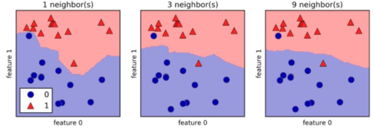
- We visualized a decision boundary for several, increasing values of
Kin a KNN model. - As
Kincreases, the decision boundary get smoother and less curvy. - Therefore, we consider it to be a less complex model than those with a lower
K. - Generally, complex models run the risk of being sensitive to noise in the specific data that you have, rather than reflecting general trends in the data.
- This is known as overfitting.
- If you increase
Keven more, and make the model even simpler, then the model will perform less well on both test and training sets, as indicated in the following schematic figure, known as a model complexity curve. 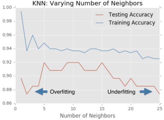
- We can see there is a sweet spot in the middle that gives us the best performance on the test set
1
df.head()
| sepal length (cm) | sepal width (cm) | petal length (cm) | petal width (cm) | species | label | |
|---|---|---|---|---|---|---|
| 0 | 5.1 | 3.5 | 1.4 | 0.2 | setosa | 0 |
| 1 | 4.9 | 3.0 | 1.4 | 0.2 | setosa | 0 |
| 2 | 4.7 | 3.2 | 1.3 | 0.2 | setosa | 0 |
| 3 | 4.6 | 3.1 | 1.5 | 0.2 | setosa | 0 |
| 4 | 5.0 | 3.6 | 1.4 | 0.2 | setosa | 0 |
1
2
3
4
5
6
7
8
9
10
11
12
13
14
15
16
17
18
19
# from sklearn.model_selection import train_test_split

# split the data
X_train, X_test, y_train, y_test = train_test_split(df.iloc[:, :4], df.species, test_size=0.3, random_state=21, stratify=df.species)

# instantiate the classifier
knn = KNeighborsClassifier(n_neighbors=8)

# fit it to the training data
knn.fit(X_train, y_train)

# make predictions on the test data
y_pred = knn.predict(X_test)

# check the accuracy using the score method of the model
score = knn.score(X_test, y_test)

# print the predictions and score
print(f'Test set score: {score:0.3f}\nTest set predictions:\n{y_pred}')
1
2
3
4
5
6
7
8
9
10
Test set score: 0.956
Test set predictions:
['virginica' 'versicolor' 'virginica' 'virginica' 'versicolor' 'setosa'
 'versicolor' 'setosa' 'setosa' 'versicolor' 'setosa' 'virginica' 'setosa'
 'virginica' 'virginica' 'setosa' 'setosa' 'setosa' 'versicolor' 'setosa'
 'virginica' 'virginica' 'virginica' 'setosa' 'versicolor' 'versicolor'
 'versicolor' 'setosa' 'setosa' 'versicolor' 'virginica' 'virginica'
 'setosa' 'setosa' 'versicolor' 'virginica' 'virginica' 'versicolor'
 'versicolor' 'virginica' 'versicolor' 'versicolor' 'setosa' 'virginica'
 'versicolor']
The digits recognition dataset
Up until now, you have been performing binary classification, since the target variable had two possible outcomes. Hugo, however, got to perform multi-class classification in the videos, where the target variable could take on three possible outcomes. Why does he get to have all the fun?! In the following exercises, you’ll be working with the MNIST digits recognition dataset, which has 10 classes, the digits 0 through 9! A reduced version of the MNIST dataset is one of scikit-learn’s included datasets, and that is the one we will use in this exercise.
Each sample in this scikit-learn dataset is an 8x8 image representing a handwritten digit. Each pixel is represented by an integer in the range 0 to 16, indicating varying levels of black. Recall that scikit-learn’s built-in datasets are of type Bunch, which are dictionary-like objects. Helpfully for the MNIST dataset, scikit-learn provides an 'images' key in addition to the 'data' and 'target' keys that you have seen with the Iris data. Because it is a 2D array of the images corresponding to each sample, this 'images' key is useful for visualizing the images, as you’ll see in this exercise (for more on plotting 2D arrays, see Chapter 2 of DataCamp’s course on Data Visualization with Python). On the other hand, the 'data' key contains the feature array - that is, the images as a flattened array of 64 pixels.
Notice that you can access the keys of these Bunch objects in two different ways: By using the . notation, as in digits.images, or the [] notation, as in digits['images'].
For more on the MNIST data, check out this exercise in Part 1 of DataCamp’s Importing Data in Python course. There, the full version of the MNIST dataset is used, in which the images are 28x28. It is a famous dataset in machine learning and computer vision, and frequently used as a benchmark to evaluate the performance of a new model.
Instructions
- Import
datasetsfromsklearnandmatplotlib.pyplotasplt. - Load the digits dataset using the
.load_digits()method ondatasets. - Print the keys and
DESCRof digits. - Print the shape of
imagesanddatakeys using the.notation. - Display the 1011th image using
plt.imshow(). This has been done for you, so hit ‘Submit Answer’ to see which handwritten digit this happens to be!
1
2
3
4
5
6
7
8
9
10
11
12
13
14
# Load the digits dataset: digits
digits = load_digits()

# Print the keys and DESCR of the dataset
print(digits.keys())
print(digits.DESCR)

# Print the shape of the images and data keys
print(digits.images.shape)
print(digits.data.shape)

# Display digit 1010
plt.imshow(digits.images[1010], cmap=plt.cm.gray_r, interpolation='nearest')
plt.show()
1
2
3
4
5
6
7
8
9
10
11
12
13
14
15
16
17
18
19
20
21
22
23
24
25
26
27
28
29
30
31
32
33
34
35
36
37
38
39
40
41
42
43
44
45
46
47
48
49
50
51
52
53
dict_keys(['data', 'target', 'frame', 'feature_names', 'target_names', 'images', 'DESCR'])
.. _digits_dataset:

Optical recognition of handwritten digits dataset
--------------------------------------------------

**Data Set Characteristics:**

    :Number of Instances: 1797
    :Number of Attributes: 64
    :Attribute Information: 8x8 image of integer pixels in the range 0..16.
    :Missing Attribute Values: None
    :Creator: E. Alpaydin (alpaydin '@' boun.edu.tr)
    :Date: July; 1998

This is a copy of the test set of the UCI ML hand-written digits datasets
https://archive.ics.uci.edu/ml/datasets/Optical+Recognition+of+Handwritten+Digits

The data set contains images of hand-written digits: 10 classes where
each class refers to a digit.

Preprocessing programs made available by NIST were used to extract
normalized bitmaps of handwritten digits from a preprinted form. From a
total of 43 people, 30 contributed to the training set and different 13
to the test set. 32x32 bitmaps are divided into nonoverlapping blocks of
4x4 and the number of on pixels are counted in each block. This generates
an input matrix of 8x8 where each element is an integer in the range
0..16. This reduces dimensionality and gives invariance to small
distortions.

For info on NIST preprocessing routines, see M. D. Garris, J. L. Blue, G.
T. Candela, D. L. Dimmick, J. Geist, P. J. Grother, S. A. Janet, and C.
L. Wilson, NIST Form-Based Handprint Recognition System, NISTIR 5469,
1994.

|details-start|
**References**
|details-split|

- C. Kaynak (1995) Methods of Combining Multiple Classifiers and Their
  Applications to Handwritten Digit Recognition, MSc Thesis, Institute of
  Graduate Studies in Science and Engineering, Bogazici University.
- E. Alpaydin, C. Kaynak (1998) Cascading Classifiers, Kybernetika.
- Ken Tang and Ponnuthurai N. Suganthan and Xi Yao and A. Kai Qin.
  Linear dimensionalityreduction using relevance weighted LDA. School of
  Electrical and Electronic Engineering Nanyang Technological University.
  2005.
- Claudio Gentile. A New Approximate Maximal Margin Classification
  Algorithm. NIPS. 2000.

|details-end|
(1797, 8, 8)
(1797, 64)
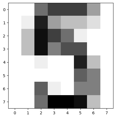
It looks like the image in question corresponds to the digit ‘5’. Now, can you build a classifier that can make this prediction not only for this image, but for all the other ones in the dataset? You’ll do so in the next exercise!
Train/Test Split + Fit/Predict/Accuracy
Now that you have learned about the importance of splitting your data into training and test sets, it’s time to practice doing this on the digits dataset! After creating arrays for the features and target variable, you will split them into training and test sets, fit a k-NN classifier to the training data, and then compute its accuracy using the .score() method.
Instructions
- Import
KNeighborsClassifierfromsklearn.neighborsandtrain_test_splitfromsklearn.model_selection. - Create an array for the features using
digits.dataand an array for the target usingdigits.target. - Create stratified training and test sets using
0.2for the size of the test set. Use a random state of42. Stratify the split according to the labels so that they are distributed in the training and test sets as they are in the original dataset. - Create a k-NN classifier with
7neighbors and fit it to the training data. - Compute and print the accuracy of the classifier’s predictions using the
.score()method.
1
2
3
4
5
6
7
8
9
10
11
12
13
14
15
16
17
18
19
20
21
22
23
24
# Create feature and target arrays
X = digits.data
y = digits.target

# Split into training and test set
X_train, X_test, y_train, y_test = train_test_split(X, y, test_size=0.2, random_state=42, stratify=y)

# Create a k-NN classifier with 7 neighbors: knn
knn = KNeighborsClassifier(n_neighbors=7)

# Fit the classifier to the training data
knn.fit(X_train, y_train)

# predict
pred = knn.predict(X_test)

result = list(zip(pred, y_test))
not_correct = [v for v in result if v[0] != v[1]]
num_correct = len(result) - len(not_correct)

# Print the accuracy
score = knn.score(X_test, y_test)

print(f'Incorrect Result: {not_correct}\nNumber Correct: {num_correct}\nScore: {score:0.2f}')
1
2
3
Incorrect Result: [(8, 6), (1, 8), (7, 8), (4, 9), (8, 9), (1, 8)]
Number Correct: 354
Score: 0.98
Incredibly, this out of the box k-NN classifier with 7 neighbors has learned from the training data and predicted the labels of the images in the test set with 98% accuracy, and it did so in less than a second! This is one illustration of how incredibly useful machine learning techniques can be.
Overfitting and underfitting
Remember the model complexity curve that Hugo showed in the video? You will now construct such a curve for the digits dataset! In this exercise, you will compute and plot the training and testing accuracy scores for a variety of different neighbor values. By observing how the accuracy scores differ for the training and testing sets with different values of k, you will develop your intuition for overfitting and underfitting.
The training and testing sets are available to you in the workspace as X_train, X_test, y_train, y_test. In addition, KNeighborsClassifier has been imported from sklearn.neighbors.
Instructions
- Inside the for loop:
- Setup a k-NN classifier with the number of neighbors equal to
k. - Fit the classifier with
kneighbors to the training data. - Compute accuracy scores the training set and test set separately using the
.score()method and assign the results to thetrain_accuracyandtest_accuracyarrays respectively.
- Setup a k-NN classifier with the number of neighbors equal to
1
2
3
4
5
6
7
8
9
10
11
12
13
14
15
16
17
18
19
20
21
22
23
24
25
26
# Setup arrays to store train and test accuracies
neighbors = np.arange(1, 9)
train_accuracy = np.empty(len(neighbors))
test_accuracy = np.empty(len(neighbors))

# Loop over different values of k
for i, k in enumerate(neighbors):
    # Setup a k-NN Classifier with k neighbors: knn
    knn = knn = KNeighborsClassifier(n_neighbors=k)

    # Fit the classifier to the training data
    knn.fit(X_train, y_train)

    #Compute accuracy on the training set
    train_accuracy[i] = knn.score(X_train, y_train)

    #Compute accuracy on the testing set
    test_accuracy[i] = knn.score(X_test, y_test)

# Generate plot
plt.plot(neighbors, test_accuracy, label = 'Testing Accuracy')
plt.plot(neighbors, train_accuracy, label = 'Training Accuracy')
plt.legend()
plt.title('KNN: Varying Number of Neighbors')
plt.xlabel('Number of Neighbors')
_ = plt.ylabel('Accuracy')
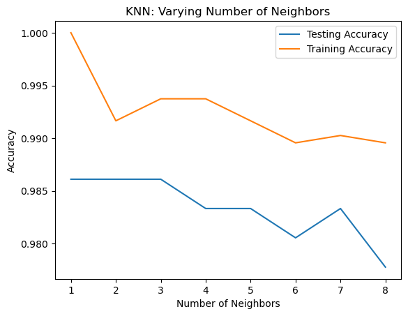
It looks like the test accuracy is highest when using 3 and 5 neighbors. Using 8 neighbors or more seems to result in a simple model that underfits the data. Now that you’ve grasped the fundamentals of classification, you will learn about regression in the next chapter!
Regression
In the previous chapter, you used image and political datasets to predict binary and multiclass outcomes. But what if your problem requires a continuous outcome? Regression is best suited to solving such problems. You will learn about fundamental concepts in regression and apply them to predict the life expectancy in a given country using Gapminder data.
Introduction to regression
- In regression tasks, the target value is a continuously varying variable, such as a country’s GDP or the price of a house.
- The first regression task will be using the Boston housing dataset.
- The data can be loaded from a CSV or scikit-learn’s built-in datasets.
'CRIM'is per capita crime rate'NX'is nitric oxides concentration'RM'is average number of rooms per dwelling- The target variable,
'MEDV', is the median value of owner occupied homes in thousands of dollars
Creating feature and target arrays
- Recall that scikit-learn wants
featuresandtargetvalues in distinct arrays,Xandy. - Using the
.valuesattribute returns theNumPyarrays.pandasdocumentation recommends using.to_numpy
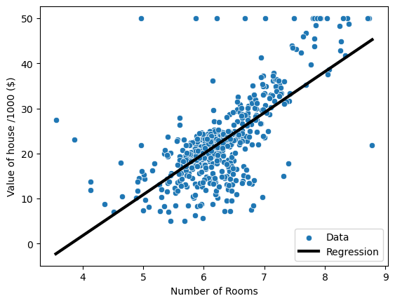
Predicting house value from a single feature
- As a first task, let’s try to predict the price from a single feature: the average number of rooms
- The 5th column is the average number of rooms,
'RM' - To reshape the arrays, use the
.reshapemethod to keep the first dimension, but add another dimension of size one toX.
Fitting a regression model
- Instantiate
sklearn.linear_model.LinearRegression - Fit the model by passing in the data and target
Check out the regressors predictions over the range of the data with
np.linspacebetween themaxandminvalue ofX_rooms.
1
2
3
4
5
6
7
8
9
10
11
12
13
14
15
16
17
18
19
20
21
22
23
24
25
26
27
28
29
30
31
32
33
34
boston = pd.read_csv(data_paths[1])
display(boston.head())

# creating features and target arrays
X = boston.drop('MEDV', axis=1).to_numpy()
y = boston.MEDV.to_numpy()

# predict from a single feature
X_rooms = X[:, 5]

# check variable type
print(f'X_rooms type: {type(X_rooms)}, shape: {X_rooms.shape}\ny type: {type(y)}, shape: {y.shape}')

# reshape
X_rooms = X_rooms.reshape(-1, 1)
y = y.reshape(-1, 1)
print(f'X_rooms shape: {X_rooms.shape}\ny shape: {y.shape}')

# instantiate model
reg = LinearRegression()

# fit a linear model
reg.fit(X_rooms, y)

# data range variable
pred_space = np.linspace(min(X_rooms), max(X_rooms)).reshape(-1, 1)

# plot house value as a function of rooms
sns.scatterplot(data=boston, x='RM', y='MEDV', label='Data')
plt.plot(pred_space, reg.predict(pred_space), color='k', lw=3, label='Regression')
plt.legend(loc='lower right')
plt.xlabel('Number of Rooms')
plt.ylabel('Value of house /1000 ($)')
plt.show()
| CRIM | ZN | INDUS | CHAS | NX | RM | AGE | DIS | RAD | TAX | PTRATIO | B | LSTAT | MEDV | |
|---|---|---|---|---|---|---|---|---|---|---|---|---|---|---|
| 0 | 0.00632 | 18.0 | 2.31 | 0 | 0.538 | 6.575 | 65.2 | 4.0900 | 1 | 296.0 | 15.3 | 396.90 | 4.98 | 24.0 |
| 1 | 0.02731 | 0.0 | 7.07 | 0 | 0.469 | 6.421 | 78.9 | 4.9671 | 2 | 242.0 | 17.8 | 396.90 | 9.14 | 21.6 |
| 2 | 0.02729 | 0.0 | 7.07 | 0 | 0.469 | 7.185 | 61.1 | 4.9671 | 2 | 242.0 | 17.8 | 392.83 | 4.03 | 34.7 |
| 3 | 0.03237 | 0.0 | 2.18 | 0 | 0.458 | 6.998 | 45.8 | 6.0622 | 3 | 222.0 | 18.7 | 394.63 | 2.94 | 33.4 |
| 4 | 0.06905 | 0.0 | 2.18 | 0 | 0.458 | 7.147 | 54.2 | 6.0622 | 3 | 222.0 | 18.7 | 396.90 | 5.33 | 36.2 |
1
2
3
4
X_rooms type: <class 'numpy.ndarray'>, shape: (506,)
y type: <class 'numpy.ndarray'>, shape: (506,)
X_rooms shape: (506, 1)
y shape: (506, 1)
Which of the following is a regression problem?
Andy introduced regression to you using the Boston housing dataset. But regression models can be used in a variety of contexts to solve a variety of different problems.
Given below are four example applications of machine learning. Your job is to pick the one that is best framed as a regression problem.
Answer the question
An e-commerce company using labeled customer data to predict whether or not a customer will purchase a particular item.A healthcare company using data about cancer tumors (such as their geometric measurements) to predict whether a new tumor is benign or malignant.A restaurant using review data to ascribe positive or negative sentiment to a given review.- A bike share company using time and weather data to predict the number of bikes being rented at any given hour.
- The target variable here - the number of bike rentals at any given hour - is quantitative, so this is best framed as a regression problem.
Importing data for supervised learning
In this chapter, you will work with Gapminder data that we have consolidated into one CSV file available in the workspace as 'gapminder.csv'. Specifically, your goal will be to use this data to predict the life expectancy in a given country based on features such as the country’s GDP, fertility rate, and population. As in Chapter 1, the dataset has been preprocessed.
Since the target variable here is quantitative, this is a regression problem. To begin, you will fit a linear regression with just one feature: 'fertility', which is the average number of children a woman in a given country gives birth to. In later exercises, you will use all the features to build regression models.
Before that, however, you need to import the data and get it into the form needed by scikit-learn. This involves creating feature and target variable arrays. Furthermore, since you are going to use only one feature to begin with, you need to do some reshaping using NumPy’s .reshape() method. Don’t worry too much about this reshaping right now, but it is something you will have to do occasionally when working with scikit-learn so it is useful to practice.
Instructions
- Import
numpyandpandasas their standard aliases. - Read the file
'gapminder.csv'into a DataFramedfusing theread_csv()function. - Create array
Xfor the'fertility'feature and arrayyfor the'life'target variable. Reshape the arrays by using the
.reshape()method and passing in-1and1.
1
2
3
4
5
6
7
8
9
10
11
12
13
14
15
16
17
18
# Read the CSV file into a DataFrame: df
df = pd.read_csv(data_paths[3])

# Create arrays for features and target variable
y = df.life.values
X = df.fertility.values

# Print the dimensions of X and y before reshaping
print("Dimensions of y before reshaping: {}".format(y.shape))
print("Dimensions of X before reshaping: {}".format(X.shape))

# Reshape X and y
y = y.reshape(-1, 1)
X = X.reshape(-1, 1)

# Print the dimensions of X and y after reshaping
print("Dimensions of y after reshaping: {}".format(y.shape))
print("Dimensions of X after reshaping: {}".format(X.shape))
1
2
3
4
Dimensions of y before reshaping: (139,)
Dimensions of X before reshaping: (139,)
Dimensions of y after reshaping: (139, 1)
Dimensions of X after reshaping: (139, 1)
Exploring the Gapminder data
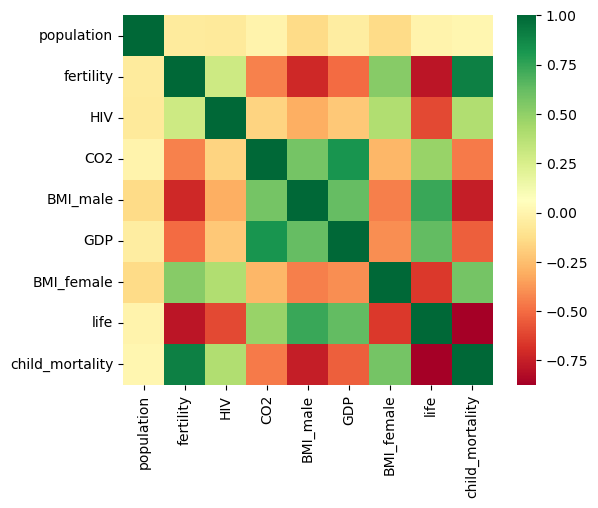
As always, it is important to explore your data before building models. On the right, we have constructed a heatmap showing the correlation between the different features of the Gapminder dataset, which has been pre-loaded into a DataFrame as df and is available for exploration in the IPython Shell. Cells that are in green show positive correlation, while cells that are in red show negative correlation. Take a moment to explore this: Which features are positively correlated with life, and which ones are negatively correlated? Does this match your intuition?
Then, in the IPython Shell, explore the DataFrame using pandas methods such as .info(), .describe(), .head().
In case you are curious, the heatmap was generated using Seaborn’s heatmap function and the following line of code, where df.corr() computes the pairwise correlation between columns:
sns.heatmap(df.corr(), square=True, cmap='RdYlGn')
Once you have a feel for the data, consider the statements below and select the one that is not true. After this, Hugo will explain the mechanics of linear regression in the next video and you will be on your way building regression models!
Instructions
- The DataFrame has
139samples (or rows) and9columns. lifeandfertilityare negatively correlated.- The mean of
lifeis69.602878. fertilityis of typeint64.GDPandlifeare positively correlated.
1
ax = sns.heatmap(df.select_dtypes(include=['number']).corr(), square=True, cmap='RdYlGn')
The basics of linear regression
- How does linear regression work?
Regression mechanics
- We want to ft a line to the data and a line in two dimensions is always of the form $y=a*x+b$, where $y$ is the target, $x$ is the single feature, and $a$ and $b$ are the parameters of the model that we want to learn.
- The question of fitting is reduced to: how do we choose $a$ and $b$?
- A common method is to define an error function for any given line, and then choose the line that minimizes the error function.
- Such an error function is also called a loss or a cost function.
The loss function
- What will our loss function be?
- We want the line to be as close to the actual data points as possible.
- For this reason, we wish to minimize the vertical distance between the fit, and the data.
- For each data point, calculate the vertical distance between it and the line.
- This distance is called a residual.
- We could try to minimize the sum of the residuals, but then a large positive residual would cancel out a large negative residual.
- For this reason, we minimize the sum of the squares of the residuals.
- This will be the loss function, and using this loss function is commonly called ordinary least squares (OLS).
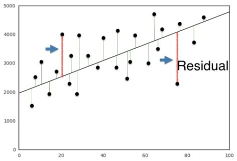
- Note this is the same as minimizing the mean squared error of the predictions on the training set.
- See the statistic curriculum for more detail.
- When
.fitis called on a linear regression model in scikit-learn, it performs this OLS, under the hood.
Linear regression in higher dimensions
- When we have two features and one target, a line is in the form $y=a_{1}x_{1}+a_{2}x_{2}+b$, so to fit a linear regression model, is to specify three variables, $a_{1}$, $a_{2}$, and $b$.
- In higher dimensions, with more than one or two features, a line is of this form, $y=a_{1}x_{1}+a_{2}x_{2}+a_{3}x_{3}+…+a_{n}x_{n}+b$, so fitting a linear regression model is to specify a coefficient, $a_{i}$, for each features, as well as the variable $b$.
- The scikit-learn API works exactly the same in this case: pass two arrays to the
.fitmethod, one containing the features, the other is the target variable.
Linear regression on all Boston Housing features
- The default scoring method for linear regression is called $R^2$.
- This metric quantifies the amount of variance in the target variable that is predicted from the feature variables.
- See the scikit-learn documentation, and the DataCamp statistics curriculum for more details.
- To compute $R^2$, apply the .score method to the model, and pass it two arguments, the features and target data.
- This metric quantifies the amount of variance in the target variable that is predicted from the feature variables.
- Generally, linear regression will never be used out of the box, like this; you will mostly likely wish to use regularization, which we’ll see soon, and which places further constraints on the model coefficients.
Learning about linear regression and how to use it in scikit-learn, is an essential first step toward using regularized linear models.
1
boston.head()
| CRIM | ZN | INDUS | CHAS | NX | RM | AGE | DIS | RAD | TAX | PTRATIO | B | LSTAT | MEDV | |
|---|---|---|---|---|---|---|---|---|---|---|---|---|---|---|
| 0 | 0.00632 | 18.0 | 2.31 | 0 | 0.538 | 6.575 | 65.2 | 4.0900 | 1 | 296.0 | 15.3 | 396.90 | 4.98 | 24.0 |
| 1 | 0.02731 | 0.0 | 7.07 | 0 | 0.469 | 6.421 | 78.9 | 4.9671 | 2 | 242.0 | 17.8 | 396.90 | 9.14 | 21.6 |
| 2 | 0.02729 | 0.0 | 7.07 | 0 | 0.469 | 7.185 | 61.1 | 4.9671 | 2 | 242.0 | 17.8 | 392.83 | 4.03 | 34.7 |
| 3 | 0.03237 | 0.0 | 2.18 | 0 | 0.458 | 6.998 | 45.8 | 6.0622 | 3 | 222.0 | 18.7 | 394.63 | 2.94 | 33.4 |
| 4 | 0.06905 | 0.0 | 2.18 | 0 | 0.458 | 7.147 | 54.2 | 6.0622 | 3 | 222.0 | 18.7 | 396.90 | 5.33 | 36.2 |
1
2
3
4
5
6
7
8
9
10
11
12
13
14
15
16
# split the data
X_train, X_test, y_train, y_test = train_test_split(boston.drop('MEDV', axis=1), boston.MEDV, test_size=0.3, random_state=42)

# instantiate the regressor
reg_all = LinearRegression()

# fit on the training set
reg_all.fit(X_train, y_train)

# predict on the test set
y_pred = reg_all.predict(X_test)

# score the model
score = reg_all.score(X_test, y_test)

print(f'Model Score: {score:0.3f}')
1
Model Score: 0.711
Fit & predict for regression
Now, you will fit a linear regression and predict life expectancy using just one feature. You saw Andy do this earlier using the 'RM' feature of the Boston housing dataset. In this exercise, you will use the 'fertility' feature of the Gapminder dataset. Since the goal is to predict life expectancy, the target variable here is 'life'. The array for the target variable has been pre-loaded as y and the array for 'fertility' has been pre-loaded as X_fertility.
A scatter plot with 'fertility' on the x-axis and 'life' on the y-axis has been generated. As you can see, there is a strongly negative correlation, so a linear regression should be able to capture this trend. Your job is to fit a linear regression and then predict the life expectancy, overlaying these predicted values on the plot to generate a regression line. You will also compute and print the $R^2$ score using sckit-learn’s .score() method.
Instructions
- Import
LinearRegressionfromsklearn.linear_model. - Create a
LinearRegressionregressor calledreg. - Set up the prediction space to range from the minimum to the maximum of
X_fertility. This has been done for you. - Fit the regressor to the data (
X_fertilityandy) and compute its predictions using the.predict()method and theprediction_spacearray. - Compute and print the $R^2$ score using the
.score()method. - Overlay the plot with your linear regression line. This has been done for you, so hit ‘Submit Answer’ to see the result!
1
df.head()
| population | fertility | HIV | CO2 | BMI_male | GDP | BMI_female | life | child_mortality | Region | |
|---|---|---|---|---|---|---|---|---|---|---|
| 0 | 34811059.0 | 2.73 | 0.1 | 3.328945 | 24.59620 | 12314.0 | 129.9049 | 75.3 | 29.5 | Middle East & North Africa |
| 1 | 19842251.0 | 6.43 | 2.0 | 1.474353 | 22.25083 | 7103.0 | 130.1247 | 58.3 | 192.0 | Sub-Saharan Africa |
| 2 | 40381860.0 | 2.24 | 0.5 | 4.785170 | 27.50170 | 14646.0 | 118.8915 | 75.5 | 15.4 | America |
| 3 | 2975029.0 | 1.40 | 0.1 | 1.804106 | 25.35542 | 7383.0 | 132.8108 | 72.5 | 20.0 | Europe & Central Asia |
| 4 | 21370348.0 | 1.96 | 0.1 | 18.016313 | 27.56373 | 41312.0 | 117.3755 | 81.5 | 5.2 | East Asia & Pacific |
1
2
3
4
5
6
7
8
9
10
11
12
13
14
15
16
17
18
19
20
21
22
23
24
25
X_fertility = df.fertility.to_numpy().reshape(-1, 1)
y = df.life.to_numpy().reshape(-1, 1)

# Create the regressor: reg
reg = LinearRegression()

# Create the prediction space
prediction_space = np.linspace(df.fertility.max(), df.fertility.min()).reshape(-1,1)

# Fit the model to the data
reg.fit(X_fertility, y)

# Compute predictions over the prediction space: y_pred
y_pred = reg.predict(prediction_space)

# Print R^2
score = reg.score(X_fertility, y)
print(f'Score: {score}')

# Plot regression line
sns.scatterplot(data=df, x='fertility', y='life')
plt.xlabel('Fertility')
plt.ylabel('Life Expectancy')
plt.plot(prediction_space, y_pred, color='black', linewidth=3)
plt.show()
1
Score: 0.6192442167740035
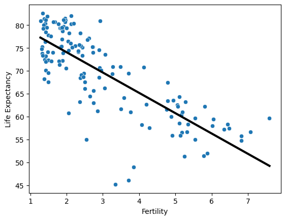
Notice how the line captures the underlying trend in the data. And the performance is quite decent for this basic regression model with only one feature.
Train/test split for regression
As you learned in Chapter 1, train and test sets are vital to ensure that your supervised learning model is able to generalize well to new data. This was true for classification models, and is equally true for linear regression models.
In this exercise, you will split the Gapminder dataset into training and testing sets, and then fit and predict a linear regression over all features. In addition to computing the $R^2$ score, you will also compute the Root Mean Squared Error (RMSE), which is another commonly used metric to evaluate regression models. The feature array X and target variable array y have been pre-loaded for you from the DataFrame df.
Instructions
- Import
LinearRegressionfromsklearn.linear_model,mean_squared_errorfromsklearn.metrics, andtrain_test_splitfromsklearn.model_selection. - Using
Xandy, create training and test sets such that 30% is used for testing and 70% for training. Use a random state of42. - Create a linear regression regressor called
reg_all, fit it to the training set, and evaluate it on the test set. - Compute and print the $R^2$ score using the
.score()method on the test set. Compute and print the RMSE. To do this, first compute the Mean Squared Error using the
mean_squared_error()function with the argumentsy_testandy_pred, and then take its square root usingnp.sqrt().
1
2
3
4
5
6
7
8
9
10
11
12
13
14
15
16
17
18
19
X = df.drop(['life', 'Region'], axis=1).to_numpy()
y = df.life.to_numpy()

# Create training and test sets
X_train, X_test, y_train, y_test = train_test_split(X, y, test_size = 0.3, random_state=42)

# Create the regressor: reg_all
reg_all = LinearRegression()

# Fit the regressor to the training data
reg_all.fit(X_train, y_train)

# Predict on the test data: y_pred
y_pred = reg_all.predict(X_test)

# Compute and print R^2 and RMSE
print(f"R^2: {reg_all.score(X_test, y_test):0.3f}")
rmse = np.sqrt(mean_squared_error(y_test, y_pred))
print(f"Root Mean Squared Error: {rmse:0.3f}")
1
2
R^2: 0.838
Root Mean Squared Error: 3.248
Using all features has improved the model score. This makes sense, as the model has more information to learn from. However, there is one potential pitfall to this process. Can you spot it? You’ll learn about this, as well how to better validate your models, in the next section.
Cross-validation
- You’re now also becoming more acquainted with train test split, and computing model performance metrics on the test set.
- Can you spot a potential pitfall of this process?
- If you’re computing $R^2$ on your test set, the $R^2$ returned, is dependent on the way the data is split.
- The data points in the test set may have some peculiarities that mean the $R^2$ computed on it, is not representative of the model’s ability to generalize to unseen data.
- To combat this dependence on what is essentially an arbitrary split, we use a technique call cross-validation.
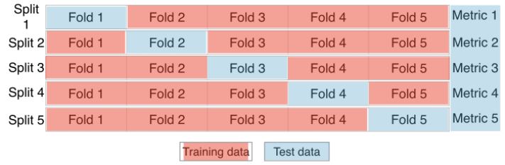
- Begin by splitting the dataset into five groups, or folds.
- Hold out the first fold as a test set, fit the model on the remaining 4 folds, predict on the test test set, and compute the metric of interest.
- Next, hold out the second fold as the test set, fit on the remaining data, predict on the test set, and compute the metric of interest.
- Then, similarly, with the third, fourth and fifth fold.
- As a result, there are five values of $R^2$ from which statistics of interest can be computed, such as mean, median, and 95% confidence interval.
- As the dataset is split into 5 folds, this process is called 5-fold cross validation.
- 10 folds would be 10-fold cross validation.
- Generally, if k folds are used, it is called k-fold cross validation or k-fold CV.
- The trade-off is, more folds are computationally more expensive, because there is more fitting and predicting.
- This method avoids the problem of the metric of choice being dependent on the train test split.
Cross-validation in scikit-learn
sklearn.model_selection.cross_val_score- This returns an array of cross-validation scores, which are assigned to
cv_results - The length of the array is the number of folds specified by the
cvparameter. - The reported score is $R^2$, the default score for linear regression
We can also compute the
mean
1
2
3
4
5
6
7
8
# instantiate the model
reg = LinearRegression()

# call cross_val_score
cv_results = cross_val_score(reg, boston.drop('MEDV', axis=1), boston.MEDV, cv=5)

print(f'Scores: {np.round(cv_results, 3)}')
print(f'Scores mean: {np.round(np.mean(cv_results), 3)}')
1
2
Scores: [ 0.639  0.714  0.587  0.079 -0.253]
Scores mean: 0.353
5-fold cross-validation
Cross-validation is a vital step in evaluating a model. It maximizes the amount of data that is used to train the model, as during the course of training, the model is not only trained, but also tested on all of the available data.
In this exercise, you will practice 5-fold cross validation on the Gapminder data. By default, scikit-learn’s cross_val_score() function uses $R^2$ as the metric of choice for regression. Since you are performing 5-fold cross-validation, the function will return 5 scores. Your job is to compute these 5 scores and then take their average.
The DataFrame has been loaded as df and split into the feature/target variable arrays X and y. The modules pandas and numpy have been imported as pd and np, respectively.
Instructions
- Import
LinearRegressionfromsklearn.linear_modelandcross_val_scorefromsklearn.model_selection. - Create a linear regression regressor called
reg. - Use the
cross_val_score()function to perform 5-fold cross-validation onXandy. - Compute and print the average cross-validation score. You can use NumPy’s
mean()function to compute the average.
1
2
3
4
5
6
7
8
9
10
# Create a linear regression object: reg
reg = LinearRegression()

# Compute 5-fold cross-validation scores: cv_scores
cv_scores = cross_val_score(reg, X, y, cv=5)

# Print the 5-fold cross-validation scores
print(f'Scores: {np.round(cv_scores, 3)}')

print(f'Scores mean: {np.round(np.mean(cv_scores), 3)}')
1
2
Scores: [0.817 0.829 0.902 0.806 0.945]
Scores mean: 0.86
Now that you have cross-validated your model, you can more confidently evaluate its predictions.
K-Fold CV comparison
Cross validation is essential but do not forget that the more folds you use, the more computationally expensive cross-validation becomes. In this exercise, you will explore this for yourself. Your job is to perform 3-fold cross-validation and then 10-fold cross-validation on the Gapminder dataset.
In the IPython Shell, you can use %timeit to see how long each 3-fold CV takes compared to 10-fold CV by executing the following cv=3 and cv=10:
%timeit cross_val_score(reg, X, y, cv = ____)
pandas and numpy are available in the workspace as pd and np. The DataFrame has been loaded as df and the feature/target variable arrays X and y have been created.
Instructions
- Import
LinearRegressionfromsklearn.linear_modelandcross_val_scorefromsklearn.model_selection. - Create a linear regression regressor called
reg. - Perform 3-fold CV and then 10-fold CV. Compare the resulting mean scores.
1
2
3
4
5
6
7
8
9
10
# Create a linear regression object: reg
reg = LinearRegression()

# Perform 3-fold CV
cvscores_3 = cross_val_score(reg, X, y, cv=3)
print(f'cv=3 scores mean: {np.round(np.mean(cvscores_3), 3)}')

# Perform 10-fold CV
cvscores_10 = cross_val_score(reg, X, y, cv=10)
print(f'cv=10 scores mean: {np.round(np.mean(cvscores_10), 3)}')
1
2
cv=3 scores mean: 0.872
cv=10 scores mean: 0.844
1
2
3
4
cv3 = %timeit -n10 -r3 -q -o cross_val_score(reg, X, y, cv=3)
cv10 = %timeit -n10 -r3 -q -o cross_val_score(reg, X, y, cv=10)

print(f'cv=3 time: {cv3}\ncv=10 time: {cv10}')
1
2
cv=3 time: 3.16 ms ± 413 µs per loop (mean ± std. dev. of 3 runs, 10 loops each)
cv=10 time: 8.98 ms ± 1.91 ms per loop (mean ± std. dev. of 3 runs, 10 loops each)
Regularized regression
Why regularize?
- Recall that what a linear regression does, is minimize a loss function, to choose a coefficient, $a_{i}$, for each feature variable.
- If we allow these coefficients, or parameters, to be super large, we can get overfitting.
- It isn’t easy to see in two dimensions, but when there are many features, this is, if the data sit in a high-dimensional space with large coefficients, it gets easy to predict nearly anything.
- For this reason, it’s common practice to alter the loss function, so it penalizes for large coefficients.
- This is called Regularization.
Ridge regression
- The first type of regularized regression that we’ll look at, is called ridge regression, in which out loss function is the standard OLS loss function, plus the squared value of each coefficient, multiplied by some constant, $\alpha$
- $\text{Loss function}=\text{OLS loss function}+\alpha*\sum_{i=1}^n a_{i}^2$
- Thus, when minimizing the loss function to fit to our data, models are penalized for coefficients with a large magnitude: large positive and large negative coefficients.
- Note, $\alpha$ is a parameter we need to choose in order to fit and predict.
- Essentially, we can select the $\alpha$ for which our model performs best.
- Picking $\alpha$ for ridge regression is similar to picking
kinKNN.
- This is called hyperparameter tuning, and we’ll see much more of this in section 3.
- This $\alpha$, which you may also see called $\lambda$ in the wild, can be thought of as a parameter that controls the model complexity.
- Notice when $\alpha = 0$, we get back $\text{OLS}$, which can lead to overfitting.
- Large coefficients, in this case, are not penalized, and the overfitting problem is not accounted for.
- A very high $\alpha$ means large coefficients are significantly penalized, which can lead to a model that’s too simple, and end up underfitting the data.
- The method of performing ridge regression with scikit-learn, mirrors the other models we have seen.
Ridge regression in scikit-learn
sklearn.linear_model.Ridge- Set $\alpha$ with the
alphaparameter. - Setting the
normalizeparameter toTrue, ensures all the variables are on the same scale, which will be covered later in more depth.
Lasso regression
- There is another type of regularized regression called lasso regression, in which our loss function is the standard OLS loss function, plus the absolute value of each coefficient, multiplied by some constant, $\alpha$.
$\text{Loss function}=\text{OLS loss function}+\alpha*\sum_{i=1}^n a_{i} $
Lasso regression in scikit-learn
sklearn.linear_model.Lasso- Lasso regression in scikit-learn, mirrors ridge regression.
Lasso regression for feature selection
- One of the useful aspects of lasso regression is it can be used to select important features of a dataset.
- This is because it tends to reduce the coefficients of less important features to be exactly zero.
- The features whose coefficients are not shrunk to zero, are ‘selected’ by the
LASSOalgorithm.
- Plotting the coefficients as a function of feature name, yields graph below, and you can see directly, the most important predictor for our target variable,
housing price, is number of rooms,'RM'. - This is not surprising, and is a great sanity check.
- This type of feature selection is very important for machine learning in an industry or business setting, because it allows you, as the Data Scientist, to communicate important results to non-technical colleagues.
- The power of reporting important features from a linear model, cannot be overestimated.
- It is also valuable in research science, in order to identify which factors are important predictors for various physical phenomena.
2024-04-22 Update Notes
In earlier versions of scikit-learn, the Ridge regression model included a normalize parameter that allowed users to specify whether to normalize the input features before fitting the model. Normalization here refers to scaling individual features to have zero mean and unit variance.
However, in more recent versions of scikit-learn, this normalize parameter has been deprecated. The recommendation now is to use a StandardScaler for feature scaling before applying the model, or to use a Pipeline to streamline this process. This change promotes a more explicit handling of preprocessing steps, improving code clarity and flexibility.
Here’s an example of how you might handle this with a Pipeline:
1
2
3
4
5
6
from sklearn.linear_model import Ridge
from sklearn.preprocessing import StandardScaler
from sklearn.pipeline import make_pipeline

# Create a pipeline that first scales the data then applies Ridge regression
model = make_pipeline(StandardScaler(), Ridge(alpha=1.0))
Using a pipeline ensures that the same scaling applied to the training data is also applied to any new data before making predictions, which is essential for consistent model performance.
Ridge Regression
1
2
3
4
5
6
7
8
9
10
11
12
13
14
15
16
# split the data
X_train, X_test, y_train, y_test = train_test_split(boston.drop('MEDV', axis=1), boston.MEDV, test_size=0.3, random_state=42)

# instantiate the model
ridge = make_pipeline(StandardScaler(), Ridge(alpha=1.0))

# fit the model
ridge.fit(X_train, y_train)

# predict on the test data
ridge_pred = ridge.predict(X_test)

# get the score
rs = ridge.score(X_test, y_test)

print(f'Ridge Score: {round(rs, 4)}')
1
Ridge Score: 0.7108
Lasso Regression
1
2
3
4
5
6
7
8
9
10
11
12
13
14
15
16
# split the data
X_train, X_test, y_train, y_test = train_test_split(boston.drop('MEDV', axis=1), boston.MEDV, test_size=0.3, random_state=42)

# instantiate the regressor
lasso = make_pipeline(StandardScaler(), Lasso(alpha=1.0))

# fit the model
lasso.fit(X_train, y_train)

# predict on the test data
lasso_pred = lasso.predict(X_test)

# get the score
ls = lasso.score(X_test, y_test)

print(f'Ridge Score: {round(ls, 4)}')
1
Ridge Score: 0.6439
Lasso Regression for Feature Selection
1
2
3
4
5
6
7
8
9
10
11
12
13
14
# store the feature names
names = boston.drop('MEDV', axis=1).columns

# instantiate the regressor
lasso = Lasso(alpha=0.1)

# extract and store the coef attribute
lasso_coef = lasso.fit(boston.drop('MEDV', axis=1), boston.MEDV).coef_

plt.plot(range(len(names)), lasso_coef)
plt.xticks(range(len(names)), names, rotation=60)
plt.ylabel('Coefficients')
plt.grid()
plt.show()
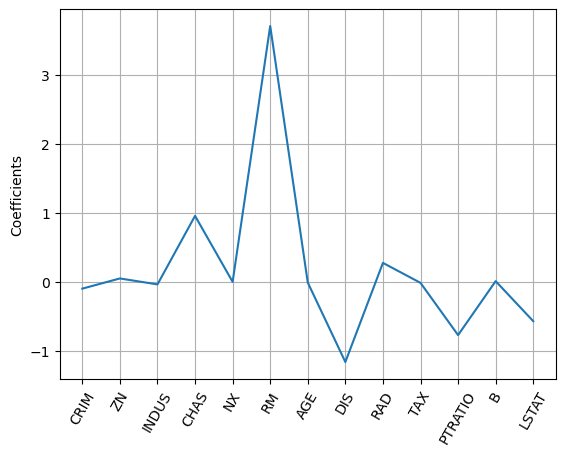
Regularization I: Lasso
In the video, you saw how Lasso selected out the 'RM' feature as being the most important for predicting Boston house prices, while shrinking the coefficients of certain other features to 0. Its ability to perform feature selection in this way becomes even more useful when you are dealing with data involving thousands of features.
In this exercise, you will fit a lasso regression to the Gapminder data you have been working with and plot the coefficients. Just as with the Boston data, you will find that the coefficients of some features are shrunk to 0, with only the most important ones remaining.
The feature and target variable arrays have been pre-loaded as X and y.
Instructions
- Import
Lassofromsklearn.linear_model. - Instantiate a Lasso regressor with an alpha of
0.4and specifynormalize=True. - Fit the regressor to the data and compute the coefficients using the
coef_attribute. - Plot the coefficients on the y-axis and column names on the x-axis. This has been done for you, so hit ‘Submit Answer’ to view the plot!
1
2
3
4
5
6
7
8
9
10
11
12
13
14
15
16
17
18
# Instantiate a lasso regressor: lasso
lasso = make_pipeline(StandardScaler(), Lasso(alpha=0.4))

# Fit the regressor to the data
lasso.fit(X, y)

# Compute and print the coefficients
# Access the 'Lasso' object and its 'coef_' attribute
lasso_coef = lasso.named_steps['lasso'].coef_
print(f'Lasso Coef: {lasso_coef}\n')

# Plot the coefficients
df_columns = df.drop(['life', 'Region'], axis=1).columns

plt.plot(range(len(df_columns)), lasso_coef)
plt.xticks(range(len(df_columns)), df_columns.values, rotation=60)
plt.margins(0.02)
plt.show()
1
2
Lasso Coef: [-0.         -0.30409556 -2.33203165 -0.          0.51040194  1.45942351
 -1.02516505 -4.57678764]
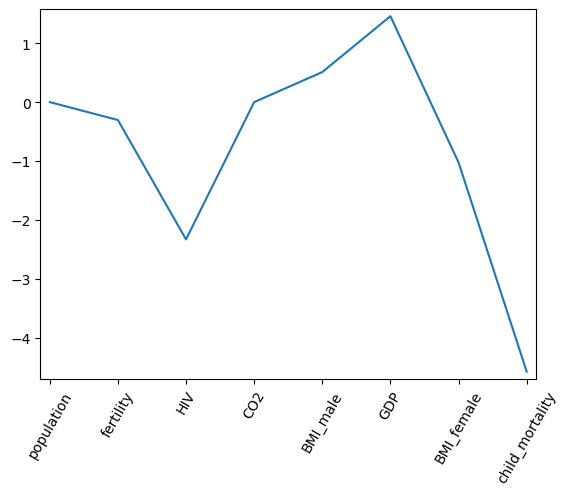
According to the lasso algorithm, it seems like 'child_mortality' is the most important feature when predicting life expectancy.
Regularization II: Ridge
Lasso is great for feature selection, but when building regression models, Ridge regression should be your first choice.
Recall that lasso performs regularization by adding to the loss function a penalty term of the absolute value of each coefficient multiplied by some alpha. This is also known as $L1$ regularization because the regularization term is the $L1$ norm of the coefficients. This is not the only way to regularize, however.
If instead you took the sum of the squared values of the coefficients multiplied by some alpha - like in Ridge regression - you would be computing the $L2$ norm. In this exercise, you will practice fitting ridge regression models over a range of different alphas, and plot cross-validated $R^2$ scores for each, using this function that we have defined for you, which plots the $R^2$ score as well as standard error for each alpha:
Don’t worry about the specifics of the above function works. The motivation behind this exercise is for you to see how the $R^2$ score varies with different alphas, and to understand the importance of selecting the right value for alpha. You’ll learn how to tune alpha in the next chapter.
Instructions
- Instantiate a Ridge regressor and specify
normalize=True. - Inside the
forloop:- Specify the alpha value for the regressor to use.
- Perform 10-fold cross-validation on the regressor with the specified alpha. The data is available in the arrays
Xandy. - Append the average and the standard deviation of the computed cross-validated scores. NumPy has been pre-imported for you as
np.
- Use the
display_plot()function to visualize the scores and standard deviations.
1
2
3
4
5
6
7
8
9
10
11
12
13
14
15
def display_plot(cv_scores, cv_scores_std, alpha_space):
    fig = plt.figure(figsize=(9, 6))
    ax = fig.add_subplot(1,1,1)
    ax.plot(alpha_space, cv_scores, label='CV Scores')

    std_error = cv_scores_std / np.sqrt(10)

    ax.fill_between(alpha_space, cv_scores + std_error, cv_scores - std_error, color='violet', alpha=0.2, label='CV Score ± std error')
    ax.set_ylabel('CV Score +/- Std Error')
    ax.set_xlabel('Alpha')
    ax.axhline(np.max(cv_scores), linestyle='--', color='.5', label='Max CV Score')
    ax.set_xlim([alpha_space[0], alpha_space[-1]])
    ax.set_xscale('log')
    ax.legend(bbox_to_anchor=(1, 0.5), loc='center left', frameon=False)
    plt.show()
1
2
3
4
5
6
7
8
9
10
11
12
13
14
15
16
17
18
19
20
21
22
23
24
25
# Setup the array of alphas and lists to store scores
alpha_space = np.logspace(-4, 2, 50)
ridge_scores = []
ridge_scores_std = []

# Create a ridge regressor: ridge
ridge = make_pipeline(StandardScaler(), Ridge())

# Compute scores over range of alphas
for alpha in alpha_space:

    # Specify the alpha value to use on the Ridge object within the pipeline
    ridge.named_steps['ridge'].set_params(alpha=alpha)

    # Perform 10-fold CV: ridge_cv_scores
    ridge_cv_scores = cross_val_score(ridge, X, y, cv=10)

    # Append the mean of ridge_cv_scores to ridge_scores
    ridge_scores.append(np.mean(ridge_cv_scores))

    # Append the std of ridge_cv_scores to ridge_scores_std
    ridge_scores_std.append(np.std(ridge_cv_scores))

# Display the plot
display_plot(ridge_scores, ridge_scores_std, alpha_space)
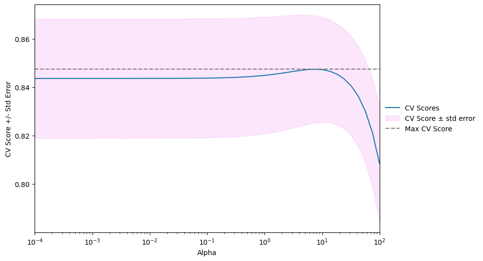
Notice how the cross-validation scores change with different alphas. Which alpha should you pick? How can you fine-tune your model? You’ll learn all about this in the next chapter!
Fine-tuning your model
Having trained your model, your next task is to evaluate its performance. In this chapter, you will learn about some of the other metrics available in scikit-learn that will allow you to assess your model’s performance in a more nuanced manner. Next, learn to optimize your classification and regression models using hyperparameter tuning.
How good is your model
- In classification, we’ve seen that you can use accuracy, the fraction of correctly classified samples, to measure model performance.
- Accuracy is not always a useful metric.
Class imbalance example: Emails
- Consider a SPAM classification problem in which 99% of emails are real and only 1% are SPAM.
- A model can be built to classify all emails as real; this model would be correct 99% of the time, and thus, have an accuracy of 99%, which sounds great.
- However, this naive classifier does a horrible job of predicting SPAM: it never predicts SPAM, so it completely fails at its original purpose.
- The situation when one class is more frequent, is called class imbalance, because the class of real emails contains way more instances than the class of SPAM.
- This is a very common situation in practice, and requires a more nuanced metric to assess the performance of our model.
Diagnosing classification predictions
- Given a binary classifier, such as our SPAM email example, we can draw up a 2-by-2 matrix that summarized predictive performance, call a confusion matrix
- Wikipedia: Confusion Matrix
sklearn.metrics.confusion_matrix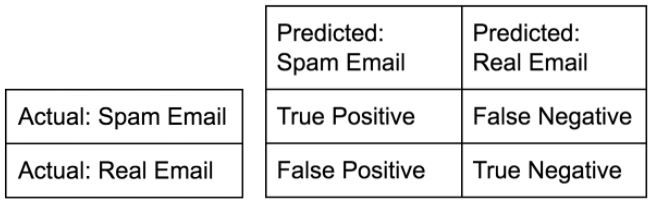
- Across the top, are the predicted labels
- Down the side, are the actual labels
- Given any model, we can fill the confusion matrix according to its predictions.
- In the top left square, are the number of correctly labeled SPAM emails - True Positive
- In the bottom right square, are the number correctly labeled real emails - True Negative
- In the top right square, are the number of incorrectly labeled SPAM emails - False Negative
- In the bottom left square, are the number of incorrectly labeled real emails - False Positive
- Usually, the class of interest, SPAM, is called the positive class.
- Why do we care about the confusion matrix?
- Notice we can retrieve accuracy from the confusion matrix: it’s the sum of the diagonal, divided by the total sum of the matrix
- $\frac{t_{p}+t_{n}}{t_{p}+t_{n}+f_{p}+f_{n}}$
- Notice we can retrieve accuracy from the confusion matrix: it’s the sum of the diagonal, divided by the total sum of the matrix
Metrics from the confusion matrix
- There are several other important metrics you can easily calculate from the confusion matrix.
- Precision, which is the number of true positives, divided by the total number to true positives and false positives.
- $\frac{t_{p}}{t_{p}+f_{p}}$
- It is also call the positive predictive value or PPV
- This is the number of correctly labeled SPAM emails, divided by the total number of emails classified as SPAM.
- Recall, which is the number of true positives, divided by the total number of true positives and false negatives.
- $\frac{t_{p}}{t_{p}+f_{n}}$
- This is also called sensitivity, hit rate, or true positive rate.
- The F1-Score is defined as two times the product of the precision and recall, divided by the sum of the precision and recall
- It’s the harmonic mean of precision and recall
- $2-\frac{precision*recall}{precision+recall}$
- High precision means our classifier had a low false positive rate, that is, not many real emails were predicted as being SPAM.
- High recall means that our classifier predicted most positive, or SPAM emails correctly.
1
2
# using the voting dataset from 1.3.1
v_na.head()
| party | infants | water | budget | physician | salvador | religious | satellite | aid | missile | immigration | synfuels | education | superfund | crime | duty_free_exports | eaa_rsa | |
|---|---|---|---|---|---|---|---|---|---|---|---|---|---|---|---|---|---|
| 0 | democrat | 0.0 | 1.0 | 1.0 | 0.0 | 1.0 | 1.0 | 0.0 | 0.0 | 0.0 | 0.0 | 0.0 | 0.0 | 1.0 | 1.0 | 1.0 | 1.0 |
| 1 | republican | 0.0 | 1.0 | 0.0 | 1.0 | 1.0 | 1.0 | 0.0 | 0.0 | 0.0 | 0.0 | 0.0 | 1.0 | 1.0 | 1.0 | 0.0 | 1.0 |
| 2 | democrat | 1.0 | 1.0 | 1.0 | 0.0 | 0.0 | 0.0 | 1.0 | 1.0 | 1.0 | 0.0 | 1.0 | 0.0 | 0.0 | 0.0 | 1.0 | 1.0 |
| 3 | democrat | 1.0 | 1.0 | 1.0 | 0.0 | 0.0 | 0.0 | 1.0 | 1.0 | 1.0 | 0.0 | 0.0 | 0.0 | 0.0 | 0.0 | 1.0 | 1.0 |
| 4 | democrat | 1.0 | 0.0 | 1.0 | 0.0 | 0.0 | 0.0 | 1.0 | 1.0 | 1.0 | 1.0 | 0.0 | 0.0 | 0.0 | 0.0 | 1.0 | 1.0 |
1
2
3
4
5
6
7
8
9
10
11
12
13
14
15
16
17
# instantiate the model
knn = KNeighborsClassifier(n_neighbors=8)

# split the voting data
X_train, X_test, y_train, y_test = train_test_split(v_na.drop(['party'], axis=1), v_na.party, test_size=0.4, random_state=42)

# fit the training data
knn.fit(X_train, y_train)

# predict the labels fo the test set
y_pred = knn.predict(X_test)

# confusion_matrix
print(f'Confusion Matrix:\n{confusion_matrix(y_test, y_pred)}\n')

# classification report
print(f'Classification Report: \n{classification_report(y_test, y_pred)}')
1
2
3
4
5
6
7
8
9
10
11
12
13
Confusion Matrix:
[[43  4]
 [ 2 44]]

Classification Report:
              precision    recall  f1-score   support

    democrat       0.96      0.91      0.93        47
  republican       0.92      0.96      0.94        46

    accuracy                           0.94        93
   macro avg       0.94      0.94      0.94        93
weighted avg       0.94      0.94      0.94        93
Metrics for classification
In Chapter 1, you evaluated the performance of your k-NN classifier based on its accuracy. However, as Andy discussed, accuracy is not always an informative metric. In this exercise, you will dive more deeply into evaluating the performance of binary classifiers by computing a confusion matrix and generating a classification report.
You may have noticed in the video that the classification report consisted of three rows, and an additional support column. The support gives the number of samples of the true response that lie in that class - so in the video example, the support was the number of Republicans or Democrats in the test set on which the classification report was computed. The precision, recall, and f1-score columns, then, gave the respective metrics for that particular class.
Here, you’ll work with the PIMA Indians diabetes dataset obtained from the UCI Machine Learning Repository. The goal is to predict whether or not a given female patient will contract diabetes based on features such as BMI, age, and number of pregnancies. Therefore, it is a binary classification problem. A target value of 0 indicates that the patient does not have diabetes, while a value of 1 indicates that the patient does have diabetes. As in Chapters 1 and 2, the dataset has been preprocessed to deal with missing values.
The dataset has been loaded into a DataFrame df and the feature and target variable arrays X and y have been created for you. In addition, sklearn.model_selection.train_test_split and sklearn.neighbors.KNeighborsClassifier have already been imported.
Your job is to train a k-NN classifier to the data and evaluate its performance by generating a confusion matrix and classification report.
Instructions
- Import
classification_reportandconfusion_matrixfromsklearn.metrics. - Create training and testing sets with 40% of the data used for testing. Use a random state of
42. - Instantiate a k-NN classifier with
6neighbors, fit it to the training data, and predict the labels of the test set. - Compute and print the confusion matrix and classification report using the
confusion_matrix()andclassification_report()functions.
1
2
3
4
df = pd.read_csv(data_paths[2])
X = df.drop('diabetes', axis=1)
y = df.diabetes
df.head()
| pregnancies | glucose | diastolic | triceps | insulin | bmi | dpf | age | diabetes | |
|---|---|---|---|---|---|---|---|---|---|
| 0 | 6 | 148 | 72 | 35 | 0 | 33.6 | 0.627 | 50 | 1 |
| 1 | 1 | 85 | 66 | 29 | 0 | 26.6 | 0.351 | 31 | 0 |
| 2 | 8 | 183 | 64 | 0 | 0 | 23.3 | 0.672 | 32 | 1 |
| 3 | 1 | 89 | 66 | 23 | 94 | 28.1 | 0.167 | 21 | 0 |
| 4 | 0 | 137 | 40 | 35 | 168 | 43.1 | 2.288 | 33 | 1 |
1
2
3
4
5
6
7
8
9
10
11
12
13
14
15
# Create training and test set
X_train, X_test, y_train, y_test = train_test_split(X, y, test_size=0.4, random_state=42)

# Instantiate a k-NN classifier: knn
knn = knn = KNeighborsClassifier(n_neighbors=6)

# Fit the classifier to the training data
knn.fit(X_train, y_train)

# Predict the labels of the test data: y_pred
y_pred = knn.predict(X_test)

# Generate the confusion matrix and classification report
print(f'Confusion Matrix:\n{confusion_matrix(y_test, y_pred)}\n')
print(f'Classification Report: \n{classification_report(y_test, y_pred)}')
1
2
3
4
5
6
7
8
9
10
11
12
13
Confusion Matrix:
[[176  30]
 [ 56  46]]

Classification Report:
              precision    recall  f1-score   support

           0       0.76      0.85      0.80       206
           1       0.61      0.45      0.52       102

    accuracy                           0.72       308
   macro avg       0.68      0.65      0.66       308
weighted avg       0.71      0.72      0.71       308
By analyzing the confusion matrix and classification report, you can get a much better understanding of your classifier’s performance.
Logistic regression and the ROC curve
- Despite its name, logistic regression is used in classification problems, not regression problems.
- See the stats course for mathematical details.
- This section will provide an intuition towards how logistic regression (log reg) works for binary classification, that is, when we have two possible labels for the target variable.
Logistic regression for binary classification
- Given one feature, log reg will output a probability, $p$, with respect to the target variable.
- If $p$ is greater than 0.5, we label the data as
'1', for less than 0.5, we label it'0'. - Log reg produces a linear decision boundary.
- Using logistic regression in scikit-learn follows exactly the same formula that you now
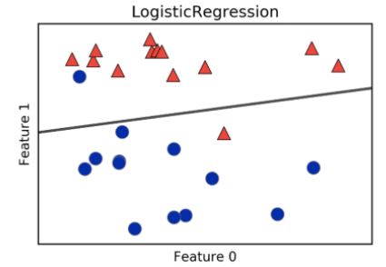
Logistic regression in scikit-learn
- Below, we’ve used the voting dataset from earlier.
- Notice that in defining logistic regression, we have specified a threshold of 0.5 for the probability, a threshold that defines our model.
- Note that this is not particular for log reg, but also could be used for KNN.
- What happens as the threshold is varied?
- In particular, what happens to the true positive and false positive rates as we vary the threshold?
- When the threshold equals 0, $p=0$, the model predicts
'1'for all the data, which means the true positive rate is equal to the false positive rate, is equal to one. - When the threshold equals 1, $p=1$, the model predicts
'0'for all the data, which means that both true and false positive rates are 0. 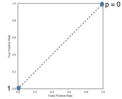
- If we vary the threshold between these two extremes, we get a series of different false positive and true positive rates.
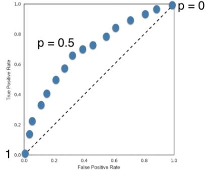
- The set of points we get when trying all positive thresholds, is called the receiver operating characteristic curve, or ROC curve.
- We used the predicted probabilities of the model, assigning a value of
'1'to the observation in question.- This is because, to compute the ROC, we do not merely want the predictions on the test set, be we want the probability that our log reg model outputs before using a threshold to predict the label.
- To do this, we apply the method,
.predict_probato the model and pass it the test data.- This returns an array with two columns: each column contains the probabilities for the respective target values.
- We choose the second column, the one with index 1, that is, the probabilities of the predicted labels being
'1'.
sklearn.metrics.roc_curve- ROC - Receiver Operating Characteristic: a graphical plot that illustrates the diagnostic ability of a binary classifier system as its discrimination threshold is varied. The method was originally developed for operators of military radar receivers, which is why it is so named.
- The ROC curve is created by plotting the true positive rate (TPR) against the false positive rate (FPR) at various threshold settings. The true-positive rate is also known as sensitivity, recall or probability of detection[8] in machine learning. The false-positive rate is also known as probability of false alarm[8] and can be calculated as (1 − specificity). It can also be thought of as a plot of the power as a function of the Type I Error of the decision rule (when the performance is calculated from just a sample of the population, it can be thought of as estimators of these quantities). The ROC curve is thus the sensitivity or recall as a function of fall-out.
- ROC Curves summarize the trade-off between the true positive rate and false positive rate for a predictive model using different probability thresholds.1
- Precision-Recall curves summarize the trade-off between the true positive rate and the positive predictive value for a predictive model using different probability thresholds.1
ROC curves are appropriate when the observations are balanced between each class, whereas precision-recall curves are appropriate for imbalanced datasets.1
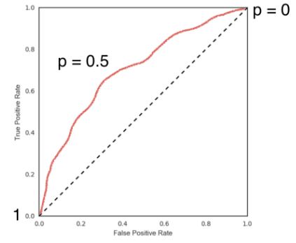
1
2
3
4
5
6
7
8
9
# instantiate the model
logreg = LogisticRegression()

# split the voting data
X_train, X_test, y_train, y_test = train_test_split(v_na.drop(['party'], axis=1), v_na.party, test_size=0.4, random_state=42)

logreg.fit(X_train, y_train)

y_pred = logreg.predict(X_test)
Plotting the ROC curve
1
2
3
4
5
6
7
8
9
10
11
12
y_pred_prob = logreg.predict_proba(X_test)[:, 1]

fpr, tpr, thresholds = roc_curve(y_test, y_pred_prob, pos_label='republican')

plt.figure(figsize=(6, 6))
plt.plot([0, 1], [0, 1], 'k--')
plt.plot(fpr, tpr, label='Logistic Regression')
plt.legend()
plt.xlabel('False Positive Rate')
plt.ylabel('True Positive Rate')
plt.title('Logistic Regression ROC Curve')
plt.show()
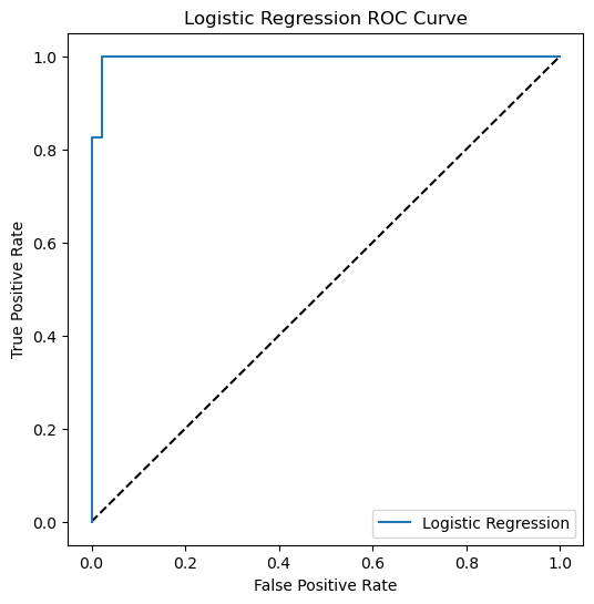
Building a logistic regression model
Time to build your first logistic regression model! As Hugo showed in the video, scikit-learn makes it very easy to try different models, since the Train-Test-Split/Instantiate/Fit/Predict paradigm applies to all classifiers and regressors - which are known in scikit-learn as ‘estimators’. You’ll see this now for yourself as you train a logistic regression model on exactly the same data as in the previous exercise. Will it outperform k-NN? There’s only one way to find out!
The feature and target variable arrays X and y have been pre-loaded, and train_test_split has been imported for you from sklearn.model_selection.
Instructions
- Import:
LogisticRegressionfromsklearn.linear_model.confusion_matrixandclassification_reportfromsklearn.metrics.
- Create training and test sets with 40% (or
0.4) of the data used for testing. Use a random state of42. This has been done for you. - Instantiate a
LogisticRegressionclassifier calledlogreg. - Fit the classifier to the training data and predict the labels of the test set.
- Compute and print the confusion matrix and classification report. This has been done for you, so hit ‘Submit Answer’ to see how logistic regression compares to k-NN!
1
2
3
4
5
6
7
8
9
10
11
12
13
14
15
# Create training and test sets
X_train, X_test, y_train, y_test = train_test_split(X, y, test_size = 0.4, random_state=42)

# Create the classifier: logreg
logreg = LogisticRegression(max_iter=150)

# Fit the classifier to the training data
logreg.fit(X_train, y_train)

# Predict the labels of the test set: y_pred
y_pred = logreg.predict(X_test)

# Compute and print the confusion matrix and classification report
print(confusion_matrix(y_test, y_pred))
print(classification_report(y_test, y_pred))
1
2
3
4
5
6
7
8
9
10
[[168  38]
 [ 36  66]]
              precision    recall  f1-score   support

           0       0.82      0.82      0.82       206
           1       0.63      0.65      0.64       102

    accuracy                           0.76       308
   macro avg       0.73      0.73      0.73       308
weighted avg       0.76      0.76      0.76       308
You now know how to use logistic regression for binary classification - great work! Logistic regression is used in a variety of machine learning applications and will become a vital part of your data science toolbox.
Plotting an ROC curve
Classification reports and confusion matrices are great methods to quantitatively evaluate model performance, while ROC curves provide a way to visually evaluate models. As Hugo demonstrated in the video, most classifiers in scikit-learn have a .predict_proba() method which returns the probability of a given sample being in a particular class. Having built a logistic regression model, you’ll now evaluate its performance by plotting an ROC curve. In doing so, you’ll make use of the .predict_proba() method and become familiar with its functionality.
Here, you’ll continue working with the PIMA Indians diabetes dataset. The classifier has already been fit to the training data and is available as logreg.
Instructions
from sklearn.metrics import roc_curve.- Using the
logregclassifier, which has been fit to the training data, compute the predicted probabilities of the labels of the test setX_test. Save the result asy_pred_prob. - Use the
roc_curve()function withy_testandy_pred_proband unpack the result into the variablesfpr,tpr, andthresholds. - Plot the ROC curve with
fpron the x-axis andtpron the y-axis.
1
2
3
4
5
6
7
8
9
10
11
12
13
14
15
16
17
18
19
20
# Create the classifier: logreg
logreg = LogisticRegression(multi_class='ovr', n_jobs=1, solver='liblinear')

# Fit the classifier to the training data
logreg.fit(X_train, y_train)

# Compute predicted probabilities: y_pred_prob
y_pred_prob = logreg.predict_proba(X_test)[:,1]

# Generate ROC curve values: fpr, tpr, thresholds
fpr, tpr, thresholds = roc_curve(y_test, y_pred_prob)

# Plot ROC curve
plt.subplots(figsize=(4.5, 4.5))
plt.plot([0, 1], [0, 1], 'k--')
plt.plot(fpr, tpr)
plt.xlabel('False Positive Rate')
plt.ylabel('True Positive Rate')
plt.title('ROC Curve')
plt.show()
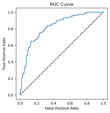
This ROC curve provides a nice visual way to assess your classifier’s performance.
Precision-recall Curve
When looking at your ROC curve, you may have noticed that the y-axis (True positive rate) is also known as recall. Indeed, in addition to the ROC curve, there are other ways to visually evaluate model performance. One such way is the precision-recall curve, which is generated by plotting the precision and recall for different thresholds. As a reminder, precision and recall are defined as:
$Precision=\frac{t_{p}}{t_{p}+f_{p}}$
$Recall=\frac{t_{p}}{t_{p}+f_{n}}$
On the right, a precision-recall curve has been generated for the diabetes dataset. The classification report and confusion matrix are displayed in the IPython Shell.
Study the precision-recall curve and then consider the statements given below. Choose the one statement that is not true. Note that here, the class is positive (1) if the individual has diabetes.
1
2
3
4
5
6
7
8
9
10
lr_precision, lr_recall, _ = precision_recall_curve(y_test, y_pred_prob)
no_skill = len(y_test[y_test==1]) / len(y_test)

plt.subplots(figsize=(5, 5))
plt.plot([0, 1], [no_skill, no_skill], linestyle='--', label='No Skill')
plt.plot(lr_recall, lr_precision, marker='.', label='Logistic')
plt.xlabel('Recall')
plt.ylabel('Precision')
plt.legend()
plt.show()
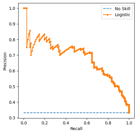
Instructions
- A recall of 1 corresponds to a classifier with a low threshold in which all females who contract diabetes were correctly classified as such, at the expense of many misclassifications of those who did not have diabetes.
- This is a true statement! Observe how when the recall is high, the precision drops.
- Precision is undefined for a classifier which makes no positive predictions, that is, classifies everyone as not having diabetes.
- In the case when there are no true positives or true negatives, precision is 0/0, which is undefined.
- When the threshold is very close to 1, precision is also 1, because the classifier is absolutely certain about its predictions.
- This is a correct statement. Notice how a high precision corresponds to a low recall: The classifier has a high threshold to ensure the positive predictions it makes are correct, which means it may miss some positive labels that have lower probabilities.
Precision and recall take true negatives into consideration.- True negatives do not appear at all in the definitions of precision and recall.
Area under the ROC curve
- Given the ROC curve, can we extract a metric of interest?
- Consider the following: the larger the area under the ROC curve, the better out model is.
- The way to think about this is the following: if we had a model which produced an ROC curve that had a single point at (1, 0), the upper left corner, representing a true positive rate of one and a false positive rate of zero, this would be a great model.
- For this reason, the area under the ROC, commonly denoted as AUC, is another popular metric for classification models.
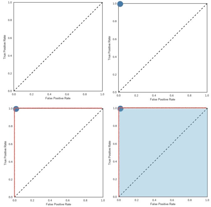
- AUC in
scikit-learnfrom sklearn.metrics import roc_auc_score
1
v_na.head(3)
| party | infants | water | budget | physician | salvador | religious | satellite | aid | missile | immigration | synfuels | education | superfund | crime | duty_free_exports | eaa_rsa | |
|---|---|---|---|---|---|---|---|---|---|---|---|---|---|---|---|---|---|
| 0 | democrat | 0.0 | 1.0 | 1.0 | 0.0 | 1.0 | 1.0 | 0.0 | 0.0 | 0.0 | 0.0 | 0.0 | 0.0 | 1.0 | 1.0 | 1.0 | 1.0 |
| 1 | republican | 0.0 | 1.0 | 0.0 | 1.0 | 1.0 | 1.0 | 0.0 | 0.0 | 0.0 | 0.0 | 0.0 | 1.0 | 1.0 | 1.0 | 0.0 | 1.0 |
| 2 | democrat | 1.0 | 1.0 | 1.0 | 0.0 | 0.0 | 0.0 | 1.0 | 1.0 | 1.0 | 0.0 | 1.0 | 0.0 | 0.0 | 0.0 | 1.0 | 1.0 |
1
2
3
4
5
6
7
8
9
10
11
12
13
14
# instantiate the classifier
logreg = LogisticRegression()

# split the data into train and test sets
X_train, X_test, y_train, y_test = train_test_split(v_na.iloc[:, 1:], v_na.iloc[:, 0], test_size=0.4, random_state=42)

# fit the model to the train data
logreg.fit(X_train, y_train)

# compute the predicted probabilites
y_pred_prob = logreg.predict_proba(X_test)[:,1]

# pass the True labels and the predicted probabilites to roc_auc_score
roc_auc_score(y_test, y_pred_prob)
1
0.996299722479186
- The AUC can also be computed using cross-validation.
- scikit-learn: Computing cross-validated metrics
sklearn.model_selection.cross_val_score- Imported as:
from sklearn.model_selection import cross_val_score
1
2
3
# pass the estimator, features, and target, to cross_val_score, and use scoring='roc_auc'
cv_scores = cross_val_score(logreg, v_na.iloc[:, 1:], v_na.iloc[:, 0], cv=5, scoring='roc_auc')
cv_scores
1
array([0.99636364, 0.99636364, 1.        , 1.        , 0.96401515])
AUC computation
Say you have a binary classifier that in fact is just randomly making guesses. It would be correct approximately 50% of the time, and the resulting ROC curve would be a diagonal line in which the True Positive Rate and False Positive Rate are always equal. The Area under this ROC curve would be 0.5. This is one way in which the AUC, which Hugo discussed in the video, is an informative metric to evaluate a model. If the AUC is greater than 0.5, the model is better than random guessing. Always a good sign!
In this exercise, you’ll calculate AUC scores using the roc_auc_score() function from sklearn.metrics as well as by performing cross-validation on the diabetes dataset.
X and y, along with training and test sets X_train, X_test, y_train, y_test, have been pre-loaded for you, and a logistic regression classifier logreg has been fit to the training data.
Instructions
- Import
roc_auc_scorefromsklearn.metricsandcross_val_scorefromsklearn.model_selection. - Using the
logregclassifier, which has been fit to the training data, compute the predicted probabilities of the labels of the test setX_test. Save the result asy_pred_prob. - Compute the AUC score using the
roc_auc_score()function, the test set labelsy_test, and the predicted probabilitiesy_pred_prob. - Compute the AUC scores by performing 5-fold cross-validation. Use the
cross_val_score()function and specify thescoringparameter to be'roc_auc'.
1
2
3
4
5
6
7
8
9
10
11
12
13
14
15
16
17
18
19
20
21
22
23
24
25
26
27
28
29
30
31
32
# instantiate the classifier
logreg = LogisticRegression(multi_class='ovr', n_jobs=1, solver='liblinear')

# split the data into train and test sets
X_train, X_test, y_train, y_test = train_test_split(X, y, test_size=0.4, random_state=42)

# fit the model to the train data
logreg.fit(X_train, y_train)

# Compute predicted probabilities: y_pred_prob
y_pred_prob = logreg.predict_proba(X_test)[:,1]

# Compute and print AUC score
print(f"AUC: {roc_auc_score(y_test, y_pred_prob)}")

# Compute cross-validated AUC scores: cv_auc
cv_auc = cross_val_score(logreg, X, y, cv=5, scoring='roc_auc')

# Print list of AUC scores
print(f"AUC scores computed using 5-fold cross-validation: {cv_auc}")

# Generate ROC curve values: fpr, tpr, thresholds
fpr, tpr, thresholds = roc_curve(y_test, y_pred_prob)

# Plot ROC curve
plt.subplots(figsize=(4.5, 4.5))
plt.plot([0, 1], [0, 1], 'k--')
plt.plot(fpr, tpr)
plt.xlabel('False Positive Rate')
plt.ylabel('True Positive Rate')
plt.title('ROC Curve')
plt.show()
1
2
AUC: 0.8265752903102989
AUC scores computed using 5-fold cross-validation: [0.79888889 0.80777778 0.81944444 0.86622642 0.85037736]

You now have a number of different methods you can use to evaluate your model’s performance.
Hyperparameter tuning
- We’ve seen that when fitting a linear regression, what we’re really doing is choosing parameters for the model that fit the data the best.
- Linear regression: Choosing parameters
- We also saw that we have to choose a value for the
alphain ridge and lasso regression before fitting it. - Before fitting and predicting K-nearest neighbors,
n_neighborsmust be chosen. - Such parameters, ones that need to be specified before fitting a model, are called hyperparameters.
- Hyperparameters cannot be learned by by fitting the model
- Choosing the correct hyperparameters is a fundamental key for building a successful model.
- Try a bunch of different hyperparameter values
- Fit all of them separately
- See how well each performs
- Choose the best performing one
- This is called hyperparameter tuning and doing so in this fashion is the current standard
- When fitting different values of a hypterparameter, it is essential to use cross-validation, as using
train-test-splitalone, would risk overfitting the hyperparameter to the test set. - Even after tuning out hyperparameters using cross-validation, we’ll want to have already split off a test set in order to report how well our model can be expected to perform on a dataset that it has never seen before.
- Grid search cross-validation
- We choose a grid of possible values we want to try for the hyperparameter(s).
- For example, if there are two hyperparameters,
Candalpha, the grid values to test could look like the following: - We then perform k-fold cross-validation for each point in the grid, that is, for each choice of hyperparameter or combination of parameters.
- We then choose for our model the choice of hyperparameters that performed the best.
- This is called a grid search, and in
scikit-learnwe implement it using the classGridSearchCVfrom sklearn.model_selection import GridSearchCV
- For example, if there are two hyperparameters,
- Specify the hyperparameter as a
dictionaryin which thekeysare the hyperparameter names, such asn_neighborsin KNN oralphain lasso regression.- See the documentation of each model for the name of its hyperparameters
- The
valuesin the griddictionaryarelistscontaining the values we wish to tune the relevant hyperparameter(s) over. - If multiple parameters are specified, all possible combinations will be tried.
GridSearchCVreturns aGridSearchCVobject, which is fit to the data, and this fit performs the grid search inplace.- Use
.best_params_to retrieve the parameters that perform the best .best_score_returns the mean cross-validation score over that fold.
- We choose a grid of possible values we want to try for the hyperparameter(s).
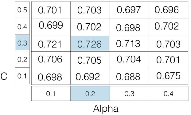
1
2
3
4
5
6
7
8
9
10
11
12
13
14
15
16
# specify the hyperparameter(s) as a dictionary
param_grid = {'n_neighbors': np.arange(1, 50)}

# instantiate the classifier
knn = KNeighborsClassifier()

# use GridSeachCV and pass in the model, the grid to turn over, and the number of folds
knn_cv = GridSearchCV(knn, param_grid, cv=5)

# fit and permord the grid search
knn_cv.fit(v_na.iloc[:, 1:], v_na.iloc[:, 0])

bp = knn_cv.best_params_
bs = round(knn_cv.best_score_, 2)

print(f'Best Parameters: {bp}\nBest Score: {bs}')
1
2
Best Parameters: {'n_neighbors': 2}
Best Score: 0.93
Hyperparameter tuning with GridSearchCV
Hugo demonstrated how to tune the n_neighbors parameter of the KNeighborsClassifier() using GridSearchCV on the voting dataset. You will now practice this yourself, but by using logistic regression on the diabetes dataset instead!
Like the alpha parameter of lasso and ridge regularization that you saw earlier, logistic regression also has a regularization parameter:C. C controls the inverse of the regularization strength, and this is what you will tune in this exercise. A large C can lead to an overfit model, while a small C can lead to an underfit model.
The hyperparameter space for has been setup for you. Your job is to use GridSearchCV and logistic regression to find the optimal in this hyperparameter space. The feature array is available as X and target variable array is available as y.
You may be wondering why you aren’t asked to split the data into training and test sets. Good observation! Here, we want you to focus on the process of setting up the hyperparameter grid and performing grid-search cross-validation. In practice, you will indeed want to hold out a portion of your data for evaluation purposes, and you will learn all about this in the next video!
Instructions
- Import
LogisticRegressionfromsklearn.linear_modelandGridSearchCVfromsklearn.model_selection. - Setup the hyperparameter grid by using
c_spaceas the grid of values to tuneCover. - Instantiate a logistic regression classifier called
logreg. - Use
GridSearchCVwith 5-fold cross-validation to tuneC:- Inside
GridSearchCV(), specify the classifier, parameter grid, and number of folds to use. - Use the
.fit()method on theGridSearchCVobject to fit it to the dataXandy.
- Inside
- Print the best parameter and best score obtained from
GridSearchCVby accessing thebest_params_andbest_score_attributes oflogreg_cv.
1
2
3
4
5
6
7
8
9
10
11
12
13
14
15
16
17
18
19
# Setup the hyperparameter grid
c_space = np.logspace(-5, 8, 15)
param_grid = {'C': c_space, 'max_iter': range(200, 1000, 200)}

# Instantiate a logistic regression classifier: logreg
logreg = LogisticRegression()

# Instantiate the GridSearchCV object: logreg_cv
logreg_cv = GridSearchCV(logreg, param_grid, cv=5)

# Fit it to the data
logreg_cv.fit(X,y)

bp = logreg_cv.best_params_
bs = round(logreg_cv.best_score_, 2)

# Print the tuned parameters and score
print(f"Tuned Logistic Regression Parameters: {bp}")
print(f"Best score is {bs}")
1
2
Tuned Logistic Regression Parameters: {'C': 0.006105402296585327, 'max_iter': 200}
Best score is 0.77
It looks like a C of 0 results in the best performance.
Hyperparameter tuning with RandomizedSearchCV
GridSearchCV can be computationally expensive, especially if you are searching over a large hyperparameter space and dealing with multiple hyperparameters. A solution to this is to use RandomizedSearchCV, in which not all hyperparameter values are tried out. Instead, a fixed number of hyperparameter settings is sampled from specified probability distributions. You’ll practice using RandomizedSearchCV in this exercise and see how this works.
Here, you’ll also be introduced to a new model: the Decision Tree. Don’t worry about the specifics of how this model works. Just like k-NN, linear regression, and logistic regression, decision trees in scikit-learn have .fit() and .predict() methods that you can use in exactly the same way as before. Decision trees have many parameters that can be tuned, such as max_features, max_depth, and min_samples_leaf: This makes it an ideal use case for RandomizedSearchCV.
As before, the feature array X and target variable array y of the diabetes dataset have been pre-loaded. The hyperparameter settings have been specified for you. Your goal is to use RandomizedSearchCV to find the optimal hyperparameters. Go for it!
Instructions
- Import
DecisionTreeClassifierfromsklearn.treeandRandomizedSearchCVfromsklearn.model_selection. - Specify the parameters and distributions to sample from. This has been done for you.
- Instantiate a
DecisionTreeClassifier. - Use
RandomizedSearchCVwith 5-fold cross-validation to tune the hyperparameters:- Inside
RandomizedSearchCV(), specify the classifier, parameter distribution, and number of folds to use. - Use the
.fit()method on theRandomizedSearchCVobject to fit it to the data X and y.
- Inside
- Print the best parameter and best score obtained from RandomizedSearchCV by accessing the
best_params_andbest_score_attributes oftree_cv.
1
2
3
4
5
6
7
8
9
10
11
12
13
14
15
16
17
18
19
20
21
# Setup the parameters and distributions to sample from: param_dist
param_dist = {"max_depth": [3, None],
              "max_features": randint(1, 9),
              "min_samples_leaf": randint(1, 9),
              "criterion": ["gini", "entropy"]}

# Instantiate a Decision Tree classifier: tree
tree = DecisionTreeClassifier()

# Instantiate the RandomizedSearchCV object: tree_cv
tree_cv = RandomizedSearchCV(estimator=tree, param_distributions=param_dist, cv=5)

# Fit it to the data
tree_cv.fit(X, y)

# Print the tuned parameters and score
bp = tree_cv.best_params_
bs = round(tree_cv.best_score_, 2)

print(f"Tuned Decision Tree Parameters: {bp}")
print(f"Best score is {bs}")
1
2
Tuned Decision Tree Parameters: {'criterion': 'gini', 'max_depth': None, 'max_features': 3, 'min_samples_leaf': 7}
Best score is 0.73
You’ll see a lot more of decision trees and RandomizedSearchCV as you continue your machine learning journey. Note that RandomizedSearchCV will never outperform GridSearchCV. Instead, it is valuable because it saves on computation time.
Hold-out set for final evaluation
- After using K-fold cross-validation to tune the model’s hyperparameters, I may want to report how well my model can be expected to perform on a dataset that it has never seen before, given my scoring function of choice.
- How well can the model perform on never before seen data?
- I want to use my model to predict on some labeled data, compare my predictions to the actual labels, and compute the scoring function.
- If I’ve used all the data from cross-validation, estimating the model performance on any of it may not provide an accurate picture of how it will perform on unseen data.
- Using ALL data for cross-validation is not ideal.
- For this reason, it’s important to split all of the data at the very beginning into a training set and hold-out set, then perform cross-validation on the training set to tune my model’s hyperparameters.
- Split data into training and hold-out set at the beginning
- Perform grid search cross-validation on the training set
- After this, select the best hyperparameters and use the hold-out set, which has not been used, to test how well the model can be expected to perform on a dataset that it has never seen before
- Choose best hyperparameters and evaluate on the hold-out set
- All the tools to perform this technique have already been provided.
train-test-splitandGridSearchCVwill be useful.
Hold-out set reasoning
For which of the following reasons would you want to use a hold-out set for the very end?
Possible Answers
You want to maximize the amount of training data used.- You want to be absolutely certain about your model’s ability to generalize to unseen data.
- The idea is to tune the model’s hyperparameters on the training set, and then evaluate its performance on the hold-out set which it has never seen before.
You want to tune the hyperparameters of your model.
Hold-out set in practice I: Classification
You will now practice evaluating a model with tuned hyperparameters on a hold-out set. The feature array and target variable array from the diabetes dataset have been pre-loaded as X and y.
In addition to C, logistic regression has a 'penalty' hyperparameter which specifies whether to use 'l1' or 'l2' regularization. Your job in this exercise is to create a hold-out set, tune the 'C' and 'penalty' hyperparameters of a logistic regression classifier using GridSearchCV on the training set.
Instructions
- Create the hyperparameter grid:
- Use the array
c_spaceas the grid of values for'C'. - For
'penalty', specify a list consisting of'l1'and'l2'.
- Use the array
- Instantiate a logistic regression classifier.
- Create training and test sets. Use a
test_sizeof0.4andrandom_stateof42. In practice, the test set here will function as the hold-out set. - Tune the hyperparameters on the training set using
GridSearchCVwith 5-folds. This involves first instantiating theGridSearchCVobject with the correct parameters and then fitting it to the training data. - Print the best parameter and best score obtained from
GridSearchCVby accessing thebest_params_andbest_score_attributes oflogreg_cv.
1
2
3
4
5
6
7
8
9
10
11
12
13
14
15
16
17
18
19
20
21
22
23
# Create the hyperparameter grid
c_space = np.logspace(-5, 8, 15)
param_grid = {'C': c_space, 'penalty': ['l1', 'l2']}

# Instantiate the logistic regression classifier: logreg
logreg = LogisticRegression(solver='liblinear', multi_class='ovr', n_jobs=1)

# Create train and test sets
X_train, X_test, y_train, y_test = train_test_split(X, y, test_size=0.4, random_state=42)

# Instantiate the GridSearchCV object: logreg_cv
logreg_cv = GridSearchCV(estimator=logreg, param_grid=param_grid, cv=5)

# Fit it to the training data
logreg_cv.fit(X_train, y_train)

# Print the tuned parameters and score
bp = logreg_cv.best_params_
bs = round(logreg_cv.best_score_, 2)

# Print the optimal parameters and best score
print(f"Tuned Logistic Regression Parameter: {bp}")
print(f"Tuned Logistic Regression Accuracy: {bs}")
1
2
Tuned Logistic Regression Parameter: {'C': 3.727593720314938, 'penalty': 'l2'}
Tuned Logistic Regression Accuracy: 0.76
Hold-out set in practice II: Regression
Remember lasso and ridge regression from the previous chapter? Lasso used the $L1$ penalty to regularize, while ridge used the $L2$ penalty. There is another type of regularized regression known as the elastic net. In elastic net regularization, the penalty term is a linear combination of the $L1$ and $L2$ penalties:
- $aL1 + bL2$
In scikit-learn, this term is represented by the 'l1_ratio' parameter: An 'l1_ratio' of 1 corresponds to an $L1$ penalty, and anything lower is a combination of $L1$ and $L2$.
In this exercise, you will GridSearchCV to tune the 'l1_ratio' of an elastic net model trained on the Gapminder data. As in the previous exercise, use a hold-out set to evaluate your model’s performance.
Instructions
- Import the following modules:
ElasticNetfromsklearn.linear_model.mean_squared_errorfromsklearn.metrics.GridSearchCVandtrain_test_splitfromsklearn.model_selection.
- Create training and test sets, with 40% of the data used for the test set. Use a random state of
42. - Specify the hyperparameter grid for
'l1_ratio'usingl1_spaceas the grid of values to search over. - Instantiate the
ElasticNetregressor. - Use
GridSearchCVwith 5-fold cross-validation to tune'l1_ratio'on the training dataX_trainandy_train. This involves first instantiating theGridSearchCVobject with the correct parameters and then fitting it to the training data. - Predict on the test set and compute the $R^2$ and mean squared error.
1
2
3
4
fertility = pd.read_csv(data_paths[3])

y_life = fertility.pop('life')
X_fer = fertility.iloc[:, :-1]
1
2
3
4
5
6
7
8
9
10
11
12
13
14
15
16
17
18
19
20
21
22
23
24
# Create train and test sets
X_train, X_test, y_train, y_test = train_test_split(X_fer, y_life, test_size=0.4, random_state=42)

# Create the hyperparameter grid
l1_space = np.linspace(0, 1, 30)
param_grid = {'l1_ratio': l1_space}

# Instantiate the ElasticNet regressor: elastic_net
elastic_net = ElasticNet()

# Setup the GridSearchCV object: gm_cv
gm_cv = GridSearchCV(estimator=elastic_net, param_grid=param_grid, cv=5)

# Fit it to the training data
gm_cv.fit(X_train, y_train)

# Predict on the test set and compute metrics
y_pred = gm_cv.predict(X_test)
r2 = gm_cv.score(X_test, y_test)
mse = mean_squared_error(y_test, y_pred)

print(f"Tuned ElasticNet l1 ratio: {gm_cv.best_params_}")
print(f"Tuned ElasticNet R squared: {r2}")
print(f"Tuned ElasticNet MSE: {mse}")
1
2
3
Tuned ElasticNet l1 ratio: {'l1_ratio': 0.20689655172413793}
Tuned ElasticNet R squared: 0.8668305372460283
Tuned ElasticNet MSE: 10.05791413339844
Now that you understand how to fine-tune your models, it’s time to learn about preprocessing techniques and how to piece together all the different stages of the machine learning process into a pipeline!
Preprocessing and pipelines
This chapter introduces pipelines, and how scikit-learn allows for transformers and estimators to be chained together and used as a single unit. Preprocessing techniques will be introduced as a way to enhance model performance, and pipelines will tie together concepts from previous chapters.
Preprocessing data
- You have learned how to implement both classification and regression models, how to measure model performance, and how to tun hyperparameters in order to improve performance.
- However, all the data the you have used so far has been relatively nice and in a format that allows you to plug and play into scikit-learn.
- With real-world data, this will rarely be the case, and instead you will have to process the data before you can build models.
- In this chapter, you will learn all about this vital processing step.
Dealing with Categorical Features
- If you are dealing with a dataset that has categorical feature, such as ‘red’ or ‘blue’, or ‘male’ or ‘female’.
- As these are not numerical values, the scikit-learn API will not accept them and you will have to process these feature into the correct format.
- Out goal is to convert these features so they are numerical.
- This is achieved by splitting the feature into a number of binary features called ‘dummy variable’, one fore each category:
0means the observation was not that category, while1means it was.
Dummy Variables
- For example, say we are dealing with a car dataset that has a
'origin'feature with three different possible values:'US','Asia', and'Europe'. - We create binary features for each of the origins, as each car is made in exactly one country, each row in the dataset will have a
1in exactly one of the three columns and0in the other two. - In this case, if a car is not from
'US'and not from'Asia', then implicitly, it is from'Europe'. - That means we do not need three separate features, but only two, so we can delete the
'Europe'column. - If we don’t do this, we are duplicating information, which might be an issue for some models.
- There are several ways to create dummy variable in Python
- scikit-learn:
OneHotEncoder() - pandas:
get_dummies()
- scikit-learn:
Automobile Dataset
- The target variable here is miles per gallon or mpg.
'origin'is our one categorical feature- Encode this feature using dummy variables.
pd.get_dummiescreates three new binary features.- If two of the dummies are 0, then by default, we know the origin, therefore, use the parameter
drop_first=True, ormilage.drop('origin_Asia, axis=1)to remove the first dummy column
- Once dummy variable are created, models can be fit as before.
1
2
milage = pd.read_csv(datasets[0])
milage.head(3)
| mpg | displ | hp | weight | accel | origin | size | |
|---|---|---|---|---|---|---|---|
| 0 | 18.0 | 250.0 | 88 | 3139 | 14.5 | US | 15.0 |
| 1 | 9.0 | 304.0 | 193 | 4732 | 18.5 | US | 20.0 |
| 2 | 36.1 | 91.0 | 60 | 1800 | 16.4 | Asia | 10.0 |
1
2
origin = sorted(milage.origin.unique().tolist())
origin
1
['Asia', 'Europe', 'US']
1
2
sns.boxplot(data=milage, y='mpg', x='origin', order=origin)
plt.show()
1
2
milage = pd.get_dummies(milage, drop_first=True)
milage.head()
| mpg | displ | hp | weight | accel | size | origin_Europe | origin_US | |
|---|---|---|---|---|---|---|---|---|
| 0 | 18.0 | 250.0 | 88 | 3139 | 14.5 | 15.0 | False | True |
| 1 | 9.0 | 304.0 | 193 | 4732 | 18.5 | 20.0 | False | True |
| 2 | 36.1 | 91.0 | 60 | 1800 | 16.4 | 10.0 | False | False |
| 3 | 18.5 | 250.0 | 98 | 3525 | 19.0 | 15.0 | False | True |
| 4 | 34.3 | 97.0 | 78 | 2188 | 15.8 | 10.0 | True | False |
1
2
3
4
# fit a ridge regression mode and compute its R^2
X_train, X_test, y_train, y_test = train_test_split(milage.iloc[:, 1:], milage.mpg, test_size=0.3, random_state=42)
ridge = make_pipeline(StandardScaler(), Ridge(alpha=0.5)).fit(X_train, y_train)
ridge.score(X_test, y_test)
1
0.7273492311054452
1
ridge.named_steps['ridge'].coef_
1
2
array([ 0.92730364, -2.76288714, -3.70761444, -0.44905768, -0.93346077,
       -0.88097073, -1.50921798])
Exploring categorical features
The Gapminder dataset that you worked with in previous chapters also contained a categorical 'Region' feature, which we dropped in previous exercises since you did not have the tools to deal with it. Now however, you do, so we have added it back in!
Your job in this exercise is to explore this feature. Boxplots are particularly useful for visualizing categorical features such as this.
Instructions
- Import
pandasaspd. - Read the CSV file
'gapminder.csv'into a DataFrame calleddf. - Use pandas to create a boxplot showing the variation of life expectancy (
'life') by region ('Region'). To do so, pass the column names in todf.boxplot()(in that order).
1
2
fertility = pd.read_csv(datasets[3])
fertility.head(2)
| population | fertility | HIV | CO2 | BMI_male | GDP | BMI_female | life | child_mortality | Region | |
|---|---|---|---|---|---|---|---|---|---|---|
| 0 | 34811059.0 | 2.73 | 0.1 | 3.328945 | 24.59620 | 12314.0 | 129.9049 | 75.3 | 29.5 | Middle East & North Africa |
| 1 | 19842251.0 | 6.43 | 2.0 | 1.474353 | 22.25083 | 7103.0 | 130.1247 | 58.3 | 192.0 | Sub-Saharan Africa |
1
2
plt.style.use('ggplot')
ax = fertility.boxplot(column='life', by='Region', figsize=(9, 5), rot=60)
Exploratory data analysis should always be the precursor to model building.
Creating dummy variables
As Andy discussed in the video, scikit-learn does not accept non-numerical features. You saw in the previous exercise that the 'Region' feature contains very useful information that can predict life expectancy. For example, Sub-Saharan Africa has a lower life expectancy compared to Europe and Central Asia. Therefore, if you are trying to predict life expectancy, it would be preferable to retain the 'Region' feature. To do this, you need to binarize it by creating dummy variables, which is what you will do in this exercise.
Instructions
- Use the pandas
get_dummies()function to create dummy variables from the df DataFrame. Store the result asdf_region. - Print the columns of
df_region. This has been done for you. - Use the
get_dummies()function again, this time specifyingdrop_first=Trueto drop the unneeded dummy variable (in this case,'Region_America'). - Hit ‘Submit Answer to print the new columns of
df_regionand take note of how one column was dropped!
1
2
3
4
5
6
7
8
9
10
11
# Create dummy variables: df_region
df_region = pd.get_dummies(fertility)

# Print the columns of df_region
display(df_region.head(2))

# Create dummy variables with drop_first=True: df_region
df_region = pd.get_dummies(fertility, drop_first=True)

# Print the new columns of df_region
display(df_region.head(2))
| population | fertility | HIV | CO2 | BMI_male | GDP | BMI_female | life | child_mortality | Region_America | Region_East Asia & Pacific | Region_Europe & Central Asia | Region_Middle East & North Africa | Region_South Asia | Region_Sub-Saharan Africa | |
|---|---|---|---|---|---|---|---|---|---|---|---|---|---|---|---|
| 0 | 34811059.0 | 2.73 | 0.1 | 3.328945 | 24.59620 | 12314.0 | 129.9049 | 75.3 | 29.5 | False | False | False | True | False | False |
| 1 | 19842251.0 | 6.43 | 2.0 | 1.474353 | 22.25083 | 7103.0 | 130.1247 | 58.3 | 192.0 | False | False | False | False | False | True |
| population | fertility | HIV | CO2 | BMI_male | GDP | BMI_female | life | child_mortality | Region_East Asia & Pacific | Region_Europe & Central Asia | Region_Middle East & North Africa | Region_South Asia | Region_Sub-Saharan Africa | |
|---|---|---|---|---|---|---|---|---|---|---|---|---|---|---|
| 0 | 34811059.0 | 2.73 | 0.1 | 3.328945 | 24.59620 | 12314.0 | 129.9049 | 75.3 | 29.5 | False | False | True | False | False |
| 1 | 19842251.0 | 6.43 | 2.0 | 1.474353 | 22.25083 | 7103.0 | 130.1247 | 58.3 | 192.0 | False | False | False | False | True |
Now that you have created the dummy variables, you can use the 'Region' feature to predict life expectancy!
Regression with categorical features
Having created the dummy variables from the 'Region' feature, you can build regression models as you did before. Here, you’ll use ridge regression to perform 5-fold cross-validation.
The feature array X and target variable array y have been pre-loaded.
Instructions
- Import
Ridgefromsklearn.linear_modelandcross_val_scorefromsklearn.model_selection. - Instantiate a ridge regressor called
ridgewithalpha=0.5andnormalize=True. - Perform 5-fold cross-validation on
Xandyusing thecross_val_score()function. - Print the cross-validated scores.
1
life = df_region.pop('life')
1
2
3
4
5
6
7
8
# Instantiate a ridge regressor: ridge
ridge = make_pipeline(StandardScaler(), Ridge(alpha=0.5))

# Perform 5-fold cross-validation: ridge_cv
ridge_cv = cross_val_score(estimator=ridge, X=df_region, y=life, cv=5)

# Print the cross-validated scores
ridge_cv
1
array([0.82107258, 0.80466392, 0.89712164, 0.80403652, 0.93964611])
You now know how to build models using data that includes categorical features.
Handling missing data
- We say that data is missing when there is no value for a given feature in a particular row.
- This can occur in the real-world for many reason:
- There may have been no observation
- There may have been a transcription error
- The data may have been corrupted
- As data scientists, we needs to deal with this issue.
PIMA Indians Diabetes Dataset
- Let’s review the PIMA Indians dataset.
- It doesn’t look like it has any missing values as, according to
df.info(), all features have 768 non-null entries
1
2
3
4
5
6
7
8
9
10
11
12
13
14
15
16
<class 'pandas.core.frame.DataFrame'>
RangeIndex: 768 entries, 0 to 767
Data columns (total 9 columns):
 #   Column       Non-Null Count  Dtype
---  ------       --------------  -----
 0   pregnancies  768 non-null    int64
 1   glucose      768 non-null    int64
 2   diastolic    768 non-null    int64
 3   triceps      768 non-null    int64
 4   insulin      768 non-null    int64
 5   bmi          768 non-null    float64
 6   dpf          768 non-null    float64
 7   age          768 non-null    int64
 8   diabetes     768 non-null    int64
dtypes: float64(2), int64(7)
memory usage: 54.1 KB
- However, missing values can be encoded in a number of different ways, such as by
0,'?', or-1. - Checking out
df.head()it looks as though there are observations where insulin is0. 'triceps', which is the thickness of the skin on the back of the arm, is0.- These are not possible and, as there is no indication of the real value, the data is, for all intents and purposes, missing.
Dropping Missing Data
- Before we go any further, let’s make all these entries
NaNusing the replace method on the relevant columns. - So how do we deal with missing data?
- One way is to drop all rows containing missing data
df.dropna()- This has the issue that it can cause a significant amount of data to be dropped from the dataset. With the
pimadataset, usingpima.dropna()results in losing nearly half of the data. The shape changes from(768, 9)to(393, 9). - If there are only a few rows containing missing values, then it’s not so bad, but generally a more robust method is required.
- It’s generally an equally bad idea to remove columns that contain
NaNvalues.
- This has the issue that it can cause a significant amount of data to be dropped from the dataset. With the
Imputing Missing Data
- Imputing mean to make an educated guess as to what the missing values could be.
- A common strategy is, in any given column with missing values, to compute the mean of all the non-missing entries and to replace all missing values with the mean.
- This post demonstrates using a
RandomForestRegressorandpandas.DataFrame.groupbyto impute missing data in the'age'column of the Titanic dataset.
- This post demonstrates using a
from sklearn.impute import SimpleImputernotfrom sklearn.preprocessing import Imputer- We can fit this imputer to our data using the fit method and then transform our data using the transform method.
- Due to their ability to transform our data, imputers are know as transformers, and any model that can transform data this way, using the transform method, is called a transformer (it’s more than meets the eye! 😉)
- After transforming the data, we could the fit our supervised learning model to it, but is there a way to do both at once?
1
2
pima = pd.read_csv(datasets[2])
pima.head()
| pregnancies | glucose | diastolic | triceps | insulin | bmi | dpf | age | diabetes | |
|---|---|---|---|---|---|---|---|---|---|
| 0 | 6 | 148 | 72 | 35 | 0 | 33.6 | 0.627 | 50 | 1 |
| 1 | 1 | 85 | 66 | 29 | 0 | 26.6 | 0.351 | 31 | 0 |
| 2 | 8 | 183 | 64 | 0 | 0 | 23.3 | 0.672 | 32 | 1 |
| 3 | 1 | 89 | 66 | 23 | 94 | 28.1 | 0.167 | 21 | 0 |
| 4 | 0 | 137 | 40 | 35 | 168 | 43.1 | 2.288 | 33 | 1 |
1
2
3
# distribution with missing data encoded as 0; not triceps and insulin
pima_stacked = pima.iloc[:, :-1].stack().reset_index().drop('level_0', axis=1).rename({'level_1': 'Category', 0: 'Value'}, axis=1)
g = sns.catplot(data=pima_stacked, kind='box', col='Category', col_wrap=4, y='Value', sharey=False, height=3, color='lightblue')
1
2
3
4
5
6
# replace erroneously encoded data with NaN
pima.insulin.replace(0, np.nan, inplace=True)
pima.triceps.replace(0, np.nan, inplace=True)
pima.bmi.replace(0, np.nan, inplace=True)

pima.info()
1
2
3
4
5
6
7
8
9
10
11
12
13
14
15
16
<class 'pandas.core.frame.DataFrame'>
RangeIndex: 768 entries, 0 to 767
Data columns (total 9 columns):
 #   Column       Non-Null Count  Dtype
---  ------       --------------  -----
 0   pregnancies  768 non-null    int64
 1   glucose      768 non-null    int64
 2   diastolic    768 non-null    int64
 3   triceps      541 non-null    float64
 4   insulin      394 non-null    float64
 5   bmi          757 non-null    float64
 6   dpf          768 non-null    float64
 7   age          768 non-null    int64
 8   diabetes     768 non-null    int64
dtypes: float64(4), int64(5)
memory usage: 54.1 KB
1
2
3
# distribution with missing data encoded as NaN
pima_stacked = pima.iloc[:, :-1].stack().reset_index().drop('level_0', axis=1).rename({'level_1': 'Category', 0: 'Value'}, axis=1)
g = sns.catplot(data=pima_stacked, kind='box', col='Category', col_wrap=4, y='Value', sharey=False, height=3, color='lightblue')
1
2
3
4
5
6
7
8
# instantiate the imputer; mean is the default and imputation is along the column
imp_mean = SimpleImputer(missing_values=np.nan, strategy='mean')

# fit the imputer
imp_mean.fit(pima.iloc[:, :-1])

# update the pima values
pima.iloc[:, :-1] = imp_mean.transform(pima.iloc[:, :-1])
1
pima.describe()
| pregnancies | glucose | diastolic | triceps | insulin | bmi | dpf | age | diabetes | |
|---|---|---|---|---|---|---|---|---|---|
| count | 768.000000 | 768.000000 | 768.000000 | 768.000000 | 768.000000 | 768.000000 | 768.000000 | 768.000000 | 768.000000 |
| mean | 3.845052 | 120.894531 | 69.105469 | 29.153420 | 155.548223 | 32.457464 | 0.471876 | 33.240885 | 0.348958 |
| std | 3.369578 | 31.972618 | 19.355807 | 8.790942 | 85.021108 | 6.875151 | 0.331329 | 11.760232 | 0.476951 |
| min | 0.000000 | 0.000000 | 0.000000 | 7.000000 | 14.000000 | 18.200000 | 0.078000 | 21.000000 | 0.000000 |
| 25% | 1.000000 | 99.000000 | 62.000000 | 25.000000 | 121.500000 | 27.500000 | 0.243750 | 24.000000 | 0.000000 |
| 50% | 3.000000 | 117.000000 | 72.000000 | 29.153420 | 155.548223 | 32.400000 | 0.372500 | 29.000000 | 0.000000 |
| 75% | 6.000000 | 140.250000 | 80.000000 | 32.000000 | 155.548223 | 36.600000 | 0.626250 | 41.000000 | 1.000000 |
| max | 17.000000 | 199.000000 | 122.000000 | 99.000000 | 846.000000 | 67.100000 | 2.420000 | 81.000000 | 1.000000 |
1
2
3
# distribution with missing data imputed as mean
pima_stacked = pima.iloc[:, :-1].stack().reset_index().drop('level_0', axis=1).rename({'level_1': 'Category', 0: 'Value'}, axis=1)
g = sns.catplot(data=pima_stacked, kind='box', col='Category', col_wrap=4, y='Value', sharey=False, height=3, color='lightblue')
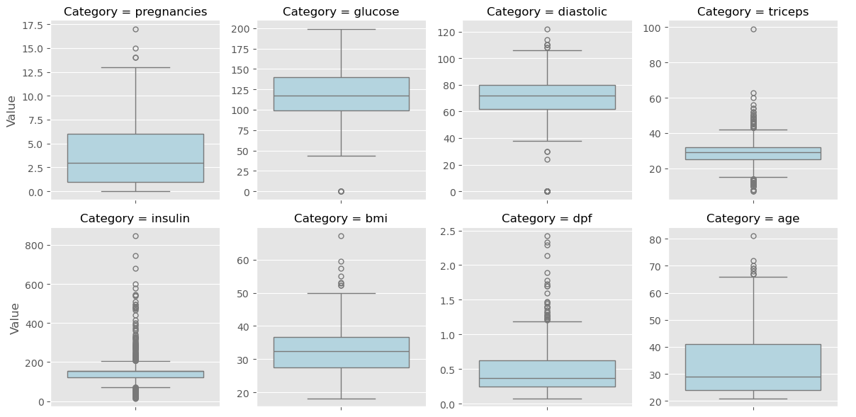
Imputing Within a Pipeline
- We can use the scikit-learn pipeline object to transform the data, and fit it to a model.
from sklearn.pipeline import Pipeline- We build a pipeline by object.
- Construct a list of steps in the pipeline, where each step is a 2-tuple containing the name you wish to give the relevant step and the estimator.
- Pass the list to the Pipeline constructor.
- Split the data into test and training sets.
- Fit the pipeline to the training set and then predict on the test set, as with any other model.
- Note that, in a pipeline, each step but the last must be a transformer and the last must be an estimator, such as a classifier, regressor, or transformer.
1
2
3
4
5
6
7
8
9
10
11
12
13
14
15
16
17
18
19
20
21
22
23
24
25
26
27
28
29
30
31
pima = pd.read_csv(datasets[2])

pima.insulin.replace(0, np.nan, inplace=True)
pima.triceps.replace(0, np.nan, inplace=True)
pima.bmi.replace(0, np.nan, inplace=True)


imp_mean = SimpleImputer(missing_values=np.nan, strategy='mean')

# instantiate the model
logreg = LogisticRegression()

# build the pipeline object by creating a list of steps in the pipeline
steps = [('imputation', imp_mean), ('logistic_regression', logreg)]

# and then pass the list to the Pipeline constructor
pipeline = Pipeline(steps)

# split the data
X_train, X_test, y_train, y_test = train_test_split(pima.iloc[:, :-1], pima.iloc[:, -1], test_size=0.3, random_state=42)

# fit the pipeline to the training set
pipeline.fit(X_train, y_train)

y_pred = pipeline.predict(X_test)

r2 = round(pipeline.score(X_test, y_test), 2)
mse = round(mean_squared_error(y_test, y_pred), 2)

print(f"R^2: {r2}")
print(f"Mean Square Error: {mse}")
1
2
R^2: 0.74
Mean Square Error: 0.26
Dropping missing data
The voting dataset from Chapter 1 contained a bunch of missing values that we dealt with for you behind the scenes. Now, it’s time for you to take care of these yourself!
The unprocessed dataset has been loaded into a DataFrame df. Explore it in the IPython Shell with the .head() method. You will see that there are certain data points labeled with a '?'. These denote missing values. As you saw in the video, different datasets encode missing values in different ways. Sometimes it may be a '9999', other times a 0 - real-world data can be very messy! If you’re lucky, the missing values will already be encoded as NaN. We use NaN because it is an efficient and simplified way of internally representing missing data, and it lets us take advantage of pandas methods such as .dropna() and .fillna(), as well as scikit-learn’s Imputation transformer Imputer().
In this exercise, your job is to convert the '?'s to NaNs, and then drop the rows that contain them from the DataFrame.
Instructions
- Explore the DataFrame
dfin the IPython Shell. Notice how the missing value is represented. - Convert all
'?'data points tonp.nan. - Count the total number of NaNs using the
.isnull()and.sum()methods. This has been done for you. - Drop the rows with missing values from
dfusing.dropna(). - Hit ‘Submit Answer’ to see how many rows were lost by dropping the missing values.
1
2
3
4
5
cols = ['party', 'infants', 'water', 'budget', 'physician', 'salvador', 'religious', 'satellite', 'aid',
        'missile', 'immigration', 'synfuels', 'education', 'superfund', 'crime', 'duty_free_exports', 'eaa_rsa']
df = pd.read_csv(datasets[4], header=None, names=cols)
df.iloc[:, 1:] = df.iloc[:, 1:].replace({'n': 0, 'y': 1})
df.head(2)
| party | infants | water | budget | physician | salvador | religious | satellite | aid | missile | immigration | synfuels | education | superfund | crime | duty_free_exports | eaa_rsa | |
|---|---|---|---|---|---|---|---|---|---|---|---|---|---|---|---|---|---|
| 0 | republican | 0 | 1 | 0 | 1 | 1 | 1 | 0 | 0 | 0 | 1 | ? | 1 | 1 | 1 | 0 | 1 |
| 1 | republican | 0 | 1 | 0 | 1 | 1 | 1 | 0 | 0 | 0 | 0 | 0 | 1 | 1 | 1 | 0 | ? |
1
2
3
4
5
6
7
8
9
10
11
12
13
14
# Convert '?' to NaN
df[df == '?'] = np.nan

# Print the number of NaNs
display(df.isnull().sum().to_frame().rename({0: 'NaN_Count'}, axis=1))

# Print shape of original DataFrame
print(f"Shape of Original DataFrame: {df.shape}")

# Drop missing values and print shape of new DataFrame
df = df.dropna()

# Print shape of new DataFrame
print(f"Shape of DataFrame After Dropping All Rows with Missing Values: {df.shape}")
| NaN_Count | |
|---|---|
| party | 0 |
| infants | 12 |
| water | 48 |
| budget | 11 |
| physician | 11 |
| salvador | 15 |
| religious | 11 |
| satellite | 14 |
| aid | 15 |
| missile | 22 |
| immigration | 7 |
| synfuels | 21 |
| education | 31 |
| superfund | 25 |
| crime | 17 |
| duty_free_exports | 28 |
| eaa_rsa | 104 |
1
2
Shape of Original DataFrame: (435, 17)
Shape of DataFrame After Dropping All Rows with Missing Values: (232, 17)
When many values in your dataset are missing, if you drop them, you may end up throwing away valuable information along with the missing data. It’s better instead to develop an imputation strategy. This is where domain knowledge is useful, but in the absence of it, you can impute missing values with the mean or the median of the row or column that the missing value is in.
Imputing missing data in a ML Pipeline I
As you’ve come to appreciate, there are many steps to building a model, from creating training and test sets, to fitting a classifier or regressor, to tuning its parameters, to evaluating its performance on new data. Imputation can be seen as the first step of this machine learning process, the entirety of which can be viewed within the context of a pipeline. Scikit-learn provides a pipeline constructor that allows you to piece together these steps into one process and thereby simplify your workflow.
You’ll now practice setting up a pipeline with two steps: the imputation step, followed by the instantiation of a classifier. You’ve seen three classifiers in this course so far: k-NN, logistic regression, and the decision tree. You will now be introduced to a fourth one - the Support Vector Machine, or SVM. For now, do not worry about how it works under the hood. It works exactly as you would expect of the scikit-learn estimators that you have worked with previously, in that it has the same .fit() and .predict() methods as before.
Instructions
- Import
Imputerfromsklearn.preprocessingandSVCfromsklearn.svm. SVC stands for Support Vector Classification, which is a type of SVM.- Note:
Imputerhas been replaced bySimpleImputerand there is noaxisparameter.
- Note:
- Setup the Imputation transformer to impute missing data (represented as
'NaN') with the'most_frequent'value in the column (axis=0). - Instantiate a
SVCclassifier. Store the result inclf. - Create the steps of the pipeline by creating a list of tuples:
- The first tuple should consist of the imputation step, using
imp. - The second should consist of the classifier.
- The first tuple should consist of the imputation step, using
1
2
3
4
5
6
7
8
9
# Setup the Imputation transformer: imp
imp = SimpleImputer(missing_values=np.nan, strategy='most_frequent')

# Instantiate the SVC classifier: clf
clf = SVC()

# Setup the pipeline with the required steps: steps
steps = [('imputation', imp),
        ('SVM', clf)]
Imputing missing data in a ML Pipeline II
Having setup the steps of the pipeline in the previous exercise, you will now use it on the voting dataset to classify a Congressman’s party affiliation. What makes pipelines so incredibly useful is the simple interface that they provide. You can use the .fit() and .predict() methods on pipelines just as you did with your classifiers and regressors!
Practice this for yourself now and generate a classification report of your predictions. The steps of the pipeline have been set up for you, and the feature array X and target variable array y have been pre-loaded. Additionally, train_test_split and classification_report have been imported from sklearn.model_selection and sklearn.metrics respectively.
Instructions
- Import the following modules:
Imputerfromsklearn.preprocessingandPipelinefromsklearn.pipeline.SVCfromsklearn.svm.
- Create the pipeline using
Pipeline()andsteps. - Create training and test sets. Use 30% of the data for testing and a random state of
42. - Fit the pipeline to the training set and predict the labels of the test set.
- Compute the classification report.
1
2
3
4
5
cols = ['party', 'infants', 'water', 'budget', 'physician', 'salvador', 'religious', 'satellite', 'aid',
        'missile', 'immigration', 'synfuels', 'education', 'superfund', 'crime', 'duty_free_exports', 'eaa_rsa']
df = pd.read_csv(datasets[4], header=None, names=cols)
df.iloc[:, 1:] = df.iloc[:, 1:].replace({'n': 0, 'y': 1})
df.head(2)
| party | infants | water | budget | physician | salvador | religious | satellite | aid | missile | immigration | synfuels | education | superfund | crime | duty_free_exports | eaa_rsa | |
|---|---|---|---|---|---|---|---|---|---|---|---|---|---|---|---|---|---|
| 0 | republican | 0 | 1 | 0 | 1 | 1 | 1 | 0 | 0 | 0 | 1 | ? | 1 | 1 | 1 | 0 | 1 |
| 1 | republican | 0 | 1 | 0 | 1 | 1 | 1 | 0 | 0 | 0 | 0 | 0 | 1 | 1 | 1 | 0 | ? |
1
df.eaa_rsa.value_counts()
1
2
3
4
5
eaa_rsa
1    269
?    104
0     62
Name: count, dtype: int64
1
2
3
4
5
6
7
8
9
10
11
12
13
14
15
16
17
# Setup the pipeline steps: steps
steps = [('imputation', SimpleImputer(missing_values='?', strategy='most_frequent')), ('SVM', SVC())]

# Create the pipeline: pipeline
pipeline = Pipeline(steps)

# Create training and test sets
X_train, X_test, y_train, y_test = train_test_split(df.iloc[:, 1:], df.party, test_size=0.3, random_state=42)

# Fit the pipeline to the train set
pipeline.fit(X_train, y_train)

# Predict the labels of the test set
y_pred = pipeline.predict(X_test)

# Compute metrics
print(classification_report(y_test, y_pred))
1
2
3
4
5
6
7
8
              precision    recall  f1-score   support

    democrat       0.98      0.96      0.97        85
  republican       0.94      0.96      0.95        46

    accuracy                           0.96       131
   macro avg       0.96      0.96      0.96       131
weighted avg       0.96      0.96      0.96       131
Centering and scaling
- Centering and scaling
- Great work on imputing data and building machine learning pipelines using scikit-learn!
- Data imputation is one of several important preprocessing steps for machine learning.
- In this video, will cover another: centering and scaling your data.
- Why scale your data?
- To motivate this, let’s use
df.describe()to check out the ranges of the feature variables in the red wine quality dataset. - The features are chemical properties such as
'acidity','pH', and'alcohol'content. - The target value is good or bad, encoded as ‘1’ and ‘0’, respectively.
- We see that the ranges vary widely:
'density'varies from (point) 99 to to 1 and'total sulfur dioxide'from 6 to 289!
- To motivate this, let’s use
- Why scale your data?
- Many machine learning models use some form of distance to inform them so if you have features on far larger scales, they can unduly influence your model.
- For example, K-nearest neighbors uses distance explicitly when making predictions.
- For this reason, we actually want features to be on a similar scale.
- To achieve this, we do what is called normalizing or scaling and centering.
- Ways to normalize your data
- There are several ways to normalize your data:
- given any column, you can subtract the mean and divide by the variance so that all features are centered around zero and have variance one.
- This is called standardization.
- You can also subtract the minimum and divide by the range of the data so the normalized dataset has minimum zero and maximum one.
- You can also normalize so that data ranges from -1 to 1 instead.
- given any column, you can subtract the mean and divide by the variance so that all features are centered around zero and have variance one.
- In this video, I’ll show you to to perform standardization.
- See the scikit-learn docs for how to implement the other approaches.
- There are several ways to normalize your data:
1
2
# create the red wine dataset
rw = pd.read_csv(datasets[6], sep=';')
1
rw.head()
| fixed acidity | volatile acidity | citric acid | residual sugar | chlorides | free sulfur dioxide | total sulfur dioxide | density | pH | sulphates | alcohol | quality | |
|---|---|---|---|---|---|---|---|---|---|---|---|---|
| 0 | 7.4 | 0.70 | 0.00 | 1.9 | 0.076 | 11.0 | 34.0 | 0.9978 | 3.51 | 0.56 | 9.4 | 5 |
| 1 | 7.8 | 0.88 | 0.00 | 2.6 | 0.098 | 25.0 | 67.0 | 0.9968 | 3.20 | 0.68 | 9.8 | 5 |
| 2 | 7.8 | 0.76 | 0.04 | 2.3 | 0.092 | 15.0 | 54.0 | 0.9970 | 3.26 | 0.65 | 9.8 | 5 |
| 3 | 11.2 | 0.28 | 0.56 | 1.9 | 0.075 | 17.0 | 60.0 | 0.9980 | 3.16 | 0.58 | 9.8 | 6 |
| 4 | 7.4 | 0.70 | 0.00 | 1.9 | 0.076 | 11.0 | 34.0 | 0.9978 | 3.51 | 0.56 | 9.4 | 5 |
1
2
# set the quality column as a binary target, with values < 5 = 0, otherwise 1
rw.quality = np.where(rw.quality < 5, 1, 0)
1
rw.head(2)
| fixed acidity | volatile acidity | citric acid | residual sugar | chlorides | free sulfur dioxide | total sulfur dioxide | density | pH | sulphates | alcohol | quality | |
|---|---|---|---|---|---|---|---|---|---|---|---|---|
| 0 | 7.4 | 0.70 | 0.0 | 1.9 | 0.076 | 11.0 | 34.0 | 0.9978 | 3.51 | 0.56 | 9.4 | 0 |
| 1 | 7.8 | 0.88 | 0.0 | 2.6 | 0.098 | 25.0 | 67.0 | 0.9968 | 3.20 | 0.68 | 9.8 | 0 |
1
rw.describe()
| fixed acidity | volatile acidity | citric acid | residual sugar | chlorides | free sulfur dioxide | total sulfur dioxide | density | pH | sulphates | alcohol | quality | |
|---|---|---|---|---|---|---|---|---|---|---|---|---|
| count | 1599.000000 | 1599.000000 | 1599.000000 | 1599.000000 | 1599.000000 | 1599.000000 | 1599.000000 | 1599.000000 | 1599.000000 | 1599.000000 | 1599.000000 | 1599.000000 |
| mean | 8.319637 | 0.527821 | 0.270976 | 2.538806 | 0.087467 | 15.874922 | 46.467792 | 0.996747 | 3.311113 | 0.658149 | 10.422983 | 0.039400 |
| std | 1.741096 | 0.179060 | 0.194801 | 1.409928 | 0.047065 | 10.460157 | 32.895324 | 0.001887 | 0.154386 | 0.169507 | 1.065668 | 0.194605 |
| min | 4.600000 | 0.120000 | 0.000000 | 0.900000 | 0.012000 | 1.000000 | 6.000000 | 0.990070 | 2.740000 | 0.330000 | 8.400000 | 0.000000 |
| 25% | 7.100000 | 0.390000 | 0.090000 | 1.900000 | 0.070000 | 7.000000 | 22.000000 | 0.995600 | 3.210000 | 0.550000 | 9.500000 | 0.000000 |
| 50% | 7.900000 | 0.520000 | 0.260000 | 2.200000 | 0.079000 | 14.000000 | 38.000000 | 0.996750 | 3.310000 | 0.620000 | 10.200000 | 0.000000 |
| 75% | 9.200000 | 0.640000 | 0.420000 | 2.600000 | 0.090000 | 21.000000 | 62.000000 | 0.997835 | 3.400000 | 0.730000 | 11.100000 | 0.000000 |
| max | 15.900000 | 1.580000 | 1.000000 | 15.500000 | 0.611000 | 72.000000 | 289.000000 | 1.003690 | 4.010000 | 2.000000 | 14.900000 | 1.000000 |
1
2
# stack feature columns
rws = rw.iloc[:, :-1].stack().reset_index(name='Values').drop(['level_0'], axis=1).rename({'level_1': 'Category'}, axis=1)
1
g = sns.catplot(data=rws, col='Category', col_wrap=4, y='Values', kind='box', sharey=False, height=3, aspect=1.25, color='lightgreen')
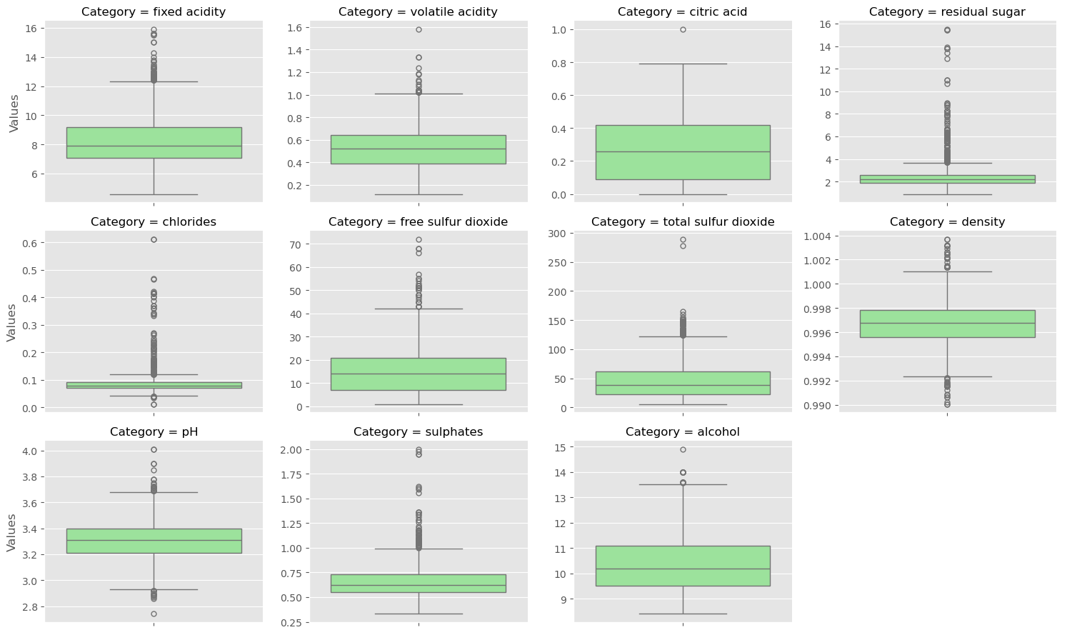
1
2
3
4
5
# select X and y - drop rows based on columns used in the video
cols = ['fixed acidity', 'free sulfur dioxide', 'total sulfur dioxide', 'density', 'pH', 'sulphates', 'alcohol']

X = rw[cols].to_numpy()
y = rw.quality.astype(bool)
- Scaling in scikit-learn
- To scale our features, we import scale from sklearn dot preprocessing.
- We then pass the feature data to scale and this returns our scaled data.
- Looking at the mean and standard deviation of the columns of both the original and scaled data verifies this.
1
2
# scale the features
X_scaled = scale(X)
1
2
3
4
5
6
7
# Print the mean and standard deviation of the unscaled features
print(f"Mean of Unscaled Features: {np.mean(X)}")
print(f"Standard Deviation of Unscaled Features: {np.std(X)}")

# Print the mean and standard deviation of the scaled features
print(f"\nMean of Scaled Features: {np.mean(X_scaled)}")
print(f"Standard Deviation of Scaled Features: {np.mean(X_scaled)}")
1
2
3
4
5
Mean of Unscaled Features: 12.29304904315197
Standard Deviation of Unscaled Features: 19.77975029339097

Mean of Scaled Features: -4.401771937604337e-15
Standard Deviation of Scaled Features: -4.401771937604337e-15
- Scaling in a pipeline
- We can also put a scalar in a pipeline object!
- To do so, we
import StandardScaler from sklearn.reprocessingand build a pipeline object as we did earlier; here we’ll use a K-nearest neighbors algorithm. - We then split our wine quality dataset in training and test sets, fit the pipeline to our training set, and predict on our test set.
- Computing the accuracy yields 0.956, whereas performing KNN without scaling resulted in an accuracy of 0.928. 1
- Scaling did not improve our model performance!
1: This notebook was created on 2021-03-13 with scikit-learn v0.24.1, which does not show a difference between the scaled and unscaled data.
1
2
3
4
5
6
7
8
9
# scaling in a pipeline
steps = [('scaler', StandardScaler()), ('knn', KNeighborsClassifier())]

pipeline = Pipeline(steps)
X_train, X_test, y_train, y_test = train_test_split(X, y, test_size=0.2, random_state=21)
knn_scaled = pipeline.fit(X_train, y_train)
y_pred = pipeline.predict(X_test)

accuracy_score(y_test, y_pred)
1
0.946875
1
2
3
4
# unscale model fitting
knn_unscaled = KNeighborsClassifier().fit(X_train, y_train)

knn_unscaled.score(X_test, y_test)
1
0.946875
- CV and scaling in a pipeline
- Let’s also take a look at how we can use cross-validation with a supervised learning pipeline.
- We first build our pipeline. We then specify our hyperparameter space by creating a dictionary:
- the keys are the pipeline step name followed by a double underscore, followed by the hyperparameter name
- the corresponding value is a list or an array of the values to try for that particular hyperparameter.
- In this case, we are tuning only the n neighbors in the KNN model.
- As always, we split our data into cross-validation and hold-out sets.
- We then perform a GridSearch over the parameters in the pipeline by instantiating the GridSearchCV object and fitting it to our training data.
- The predict method will call predict on the estimator with the best found parameters and we do this on the hold-out set.
- Scaling and CV in a pipeline
- We also print the best parameters chosen by our gridsearch, along with the accuracy and classification report of the predictions on the hold-out set.
1
2
3
4
5
6
7
8
9
10
11
steps = [('scaler', StandardScaler()), ('knn', KNeighborsClassifier())]
pipeline = Pipeline(steps)
parameters = {'knn__n_neighbors': np.arange(1, 50)}
X_train, X_test, y_train, y_test = train_test_split(X, y, test_size=0.2, random_state=56)
cv = GridSearchCV(pipeline, param_grid=parameters)
cv.fit(X_train, y_train)
y_pred = cv.predict(X_test)

print(cv.best_params_)
print(cv.score(X_test, y_test))
print(classification_report(y_test, y_pred))
1
2
3
4
5
6
7
8
9
10
{'knn__n_neighbors': 4}
0.95625
              precision    recall  f1-score   support

       False       0.96      1.00      0.98       306
        True       0.00      0.00      0.00        14

    accuracy                           0.96       320
   macro avg       0.48      0.50      0.49       320
weighted avg       0.91      0.96      0.93       320
1
y_train.value_counts()
1
2
3
4
quality
False    1230
True       49
Name: count, dtype: int64
1
y_test.value_counts()
1
2
3
4
quality
False    306
True      14
Name: count, dtype: int64
Centering and scaling your data
In the video, Hugo demonstrated how significantly the performance of a model can improve if the features are scaled. Note that this is not always the case: In the Congressional voting records dataset, for example, all of the features are binary. In such a situation, scaling will have minimal impact.
You will now explore scaling for yourself on a new dataset - White Wine Quality! Hugo used the Red Wine Quality dataset in the video. We have used the 'quality' feature of the wine to create a binary target variable: If 'quality' is less than 5, the target variable is 1, and otherwise, it is 0.
The DataFrame has been pre-loaded as df, along with the feature and target variable arrays X and y. Explore it in the IPython Shell. Notice how some features seem to have different units of measurement. 'density', for instance, takes values between 0.98 and 1.04, while 'total sulfur dioxide' ranges from 9 to 440. As a result, it may be worth scaling the features here. Your job in this exercise is to scale the features and compute the mean and standard deviation of the unscaled features compared to the scaled features.
Instructions
- Import
scalefromsklearn.preprocessing. - Scale the features
Xusingscale(). Print the mean and standard deviation of the unscaled features
X, and then the scaled featuresX_scaled. Use the numpy functionsnp.mean()andnp.std()to compute the mean and standard deviations.
1
2
3
ww = pd.read_csv(datasets[5])
ww.quality = np.where(ww.quality < 5, 1, 0)
ww.head()
| fixed acidity | volatile acidity | citric acid | residual sugar | chlorides | free sulfur dioxide | total sulfur dioxide | density | pH | sulphates | alcohol | quality | |
|---|---|---|---|---|---|---|---|---|---|---|---|---|
| 0 | 7.0 | 0.27 | 0.36 | 20.7 | 0.045 | 45.0 | 170.0 | 1.0010 | 3.00 | 0.45 | 8.8 | 0 |
| 1 | 6.3 | 0.30 | 0.34 | 1.6 | 0.049 | 14.0 | 132.0 | 0.9940 | 3.30 | 0.49 | 9.5 | 0 |
| 2 | 8.1 | 0.28 | 0.40 | 6.9 | 0.050 | 30.0 | 97.0 | 0.9951 | 3.26 | 0.44 | 10.1 | 0 |
| 3 | 7.2 | 0.23 | 0.32 | 8.5 | 0.058 | 47.0 | 186.0 | 0.9956 | 3.19 | 0.40 | 9.9 | 0 |
| 4 | 7.2 | 0.23 | 0.32 | 8.5 | 0.058 | 47.0 | 186.0 | 0.9956 | 3.19 | 0.40 | 9.9 | 0 |
1
2
wws = rw.iloc[:, :-1].stack().reset_index(name='Values').drop(['level_0'], axis=1).rename({'level_1': 'Category'}, axis=1)
g = sns.catplot(data=wws, col='Category', col_wrap=4, y='Values', kind='box', sharey=False, height=3, aspect=1.25, color='orchid')
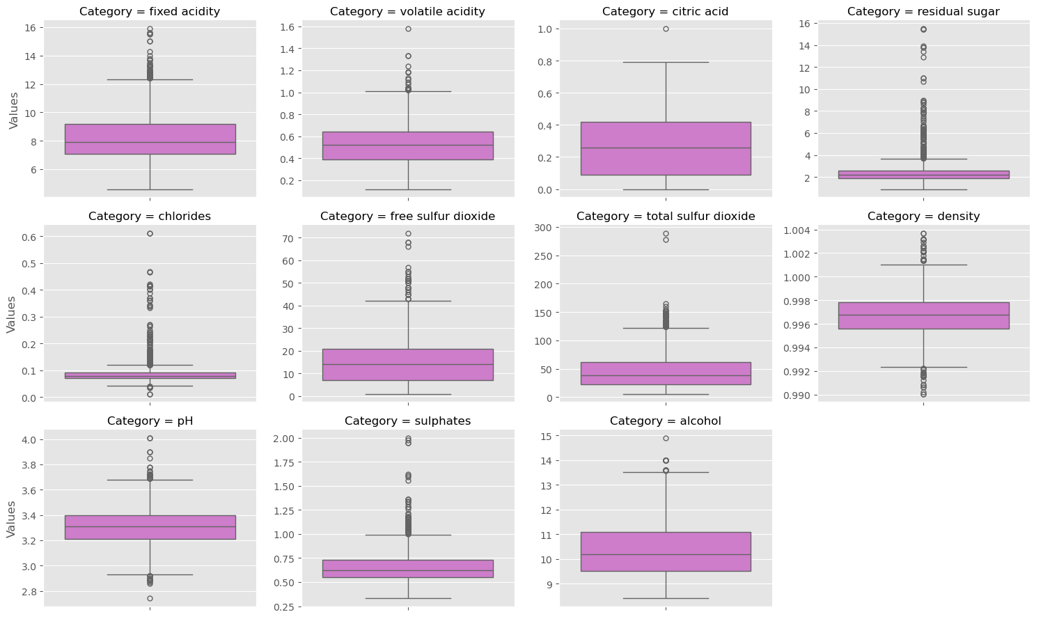
1
2
X = ww.iloc[:, :-1].to_numpy()
y = ww.quality.astype(bool).to_numpy()
1
2
3
4
5
6
7
8
9
10
# Scale the features: X_scaled
X_scaled = scale(X)

# Print the mean and standard deviation of the unscaled features
print(f"Mean of Unscaled Features: {np.mean(X)}")
print(f"Standard Deviation of Unscaled Features: {np.std(X)}")

# Print the mean and standard deviation of the scaled features
print(f"\nMean of Scaled Features: {np.mean(X_scaled)}")
print(f"Standard Deviation of Scaled Features: {np.std(X_scaled)}")
1
2
3
4
5
Mean of Unscaled Features: 18.432687072460002
Standard Deviation of Unscaled Features: 41.54494764094571

Mean of Scaled Features: 2.7452128118308485e-15
Standard Deviation of Scaled Features: 0.9999999999999999
Notice the difference in the mean and standard deviation of the scaled features compared to the unscaled features.
Centering and scaling in a pipeline
With regard to whether or not scaling is effective, the proof is in the pudding! See for yourself whether or not scaling the features of the White Wine Quality dataset has any impact on its performance. You will use a k-NN classifier as part of a pipeline that includes scaling, and for the purposes of comparison, a k-NN classifier trained on the unscaled data has been provided.
The feature array and target variable array have been pre-loaded as X and y. Additionally, KNeighborsClassifier and train_test_split have been imported from sklearn.neighbors and sklearn.model_selection, respectively.
Instructions
- Import the following modules:
StandardScalerfromsklearn.preprocessing.Pipelinefromsklearn.pipeline.
- Complete the steps of the pipeline with
StandardScaler()for'scaler'andKNeighborsClassifier()for'knn'. - Create the pipeline using
Pipeline()andsteps. - Create training and test sets, with
30%used for testing. Use a random state of42. - Fit the pipeline to the training set.
- Compute the accuracy scores of the scaled and unscaled models by using the
.score()method inside the providedprint()functions.
1
2
3
4
5
6
7
8
9
10
11
12
13
14
15
16
17
18
# Setup the pipeline steps: steps
steps = [('scaler', StandardScaler()), ('knn', KNeighborsClassifier())]

# Create the pipeline: pipeline
pipeline = Pipeline(steps)

# Create train and test sets
X_train, X_test, y_train, y_test = train_test_split(X, y, test_size=0.3, random_state=42)

# Fit the pipeline to the training set: knn_scaled
knn_scaled = pipeline.fit(X_train, y_train)

# Instantiate and fit a k-NN classifier to the unscaled data
knn_unscaled = KNeighborsClassifier().fit(X_train, y_train)

# Compute and print metrics
print(f'Accuracy with Scaling: {knn_scaled.score(X_test, y_test)}')
print(f'Accuracy without Scaling: {knn_unscaled.score(X_test, y_test)}')
1
2
Accuracy with Scaling: 0.964625850340136
Accuracy without Scaling: 0.9666666666666667
Bringing it all together I: Pipeline for classification
It is time now to piece together everything you have learned so far into a pipeline for classification! Your job in this exercise is to build a pipeline that includes scaling and hyperparameter tuning to classify wine quality.
You’ll return to using the SVM classifier you were briefly introduced to earlier in this chapter. The hyperparameters you will tune are $C$ and $gamma$. $C$ controls the regularization strength. It is analogous to the $C$ you tuned for logistic regression in Chapter 3, while $gamma$ controls the kernel coefficient: Do not worry about this now as it is beyond the scope of this course.
The following modules and functions have been pre-loaded: Pipeline, SVC, train_test_split, GridSearchCV, classification_report, accuracy_score. The feature and target variable arrays X and y have also been pre-loaded.
Instructions
- Setup the pipeline with the following steps:
- Scaling, called
'scaler'withStandardScaler(). - Classification, called
'SVM'withSVC().
- Scaling, called
- Specify the hyperparameter space using the following notation:
'step_name__parameter_name'. Here, thestep_nameisSVM, and theparameter_names areCandgamma. - Create training and test sets, with 20% of the data used for the test set. Use a random state of
21. - Instantiate
GridSearchCVwith the pipeline and hyperparameter space and fit it to the training set. Use 3-fold cross-validation (This is the default, so you don’t have to specify it). - Predict the labels of the test set and compute the metrics. The metrics have been computed for you.
1
2
3
4
5
6
7
8
9
10
11
12
13
14
15
16
17
18
19
20
21
22
23
24
# Setup the pipeline
steps = [('scaler', StandardScaler()), ('SVM', SVC())]

pipeline = Pipeline(steps)

# Specify the hyperparameter space
parameters = {'SVM__C':[1, 10, 100], 'SVM__gamma':[0.1, 0.01]}

# Create train and test sets
X_train, X_test, y_train, y_test = train_test_split(X, y, test_size=0.2, random_state=21)

# Instantiate the GridSearchCV object: cv
cv = GridSearchCV(pipeline, param_grid=parameters)

# Fit to the training set
cv.fit(X_train, y_train)

# Predict the labels of the test set: y_pred
y_pred = cv.predict(X_test)

# Compute and print metrics
print(f"Accuracy: {cv.score(X_test, y_test)}")
print(classification_report(y_test, y_pred))
print(f"Tuned Model Parameters: {cv.best_params_}")
1
2
3
4
5
6
7
8
9
10
11
Accuracy: 0.9693877551020408
              precision    recall  f1-score   support

       False       0.97      1.00      0.98       951
        True       0.43      0.10      0.17        29

    accuracy                           0.97       980
   macro avg       0.70      0.55      0.58       980
weighted avg       0.96      0.97      0.96       980

Tuned Model Parameters: {'SVM__C': 100, 'SVM__gamma': 0.01}
Bringing it all together II: Pipeline for regression
For this final exercise, you will return to the Gapminder dataset. Guess what? Even this dataset has missing values that we dealt with for you in earlier chapters! Now, you have all the tools to take care of them yourself!
Your job is to build a pipeline that imputes the missing data, scales the features, and fits an ElasticNet to the Gapminder data. You will then tune the l1_ratio of your ElasticNet using GridSearchCV.
All the necessary modules have been imported, and the feature and target variable arrays have been pre-loaded as X and y.
Instructions
- Set up a pipeline with the following steps:
'imputation', which uses theImputer()transformer and the'mean'strategy to impute missing data ('NaN') using the mean of the column.'scaler', which scales the features usingStandardScaler().'elasticnet', which instantiates anElasticNet()regressor.
- Specify the hyperparameter space for the $l1$ ratio using the following notation:
'step_name__parameter_name'. Here, thestep_nameiselasticnet, and theparameter_nameisl1_ratio. - Create training and test sets, with 40% of the data used for the test set. Use a random state of
42. - Instantiate
GridSearchCVwith the pipeline and hyperparameter space. Use 3-fold cross-validation (This is the default, so you don’t have to specify it). - Fit the
GridSearchCVobject to the training set. - Compute $R^2$ and the best parameters. This has been done for you, so hit ‘Submit Answer’ to see the results!
1
2
3
gm = pd.read_csv(datasets[3])
y = gm.pop('life').to_numpy()
X = gm.iloc[:, :-1].to_numpy()
1
2
3
4
5
6
7
8
9
10
11
12
13
14
15
16
17
18
19
20
21
22
23
24
# Setup the pipeline steps: steps
steps = [('imputation', SimpleImputer(missing_values=np.nan, strategy='mean')),
         ('scaler', StandardScaler()),
         ('elasticnet', ElasticNet())]

# Create the pipeline: pipeline
pipeline = Pipeline(steps)

# Specify the hyperparameter space
parameters = {'elasticnet__l1_ratio':np.linspace(0,1,30)}

# Create train and test sets
X_train, X_test, y_train, y_test = train_test_split(X, y, test_size=0.4, random_state=42)

# Create the GridSearchCV object: gm_cv
gm_cv = GridSearchCV(pipeline, param_grid=parameters)

# Fit to the training set
gm_cv.fit(X_train, y_train)

# Compute and print the metrics
r2 = gm_cv.score(X_test, y_test)
print(f"Tuned ElasticNet Alpha: {gm_cv.best_params_}")
print(f"Tuned ElasticNet R squared: {r2}")
1
2
Tuned ElasticNet Alpha: {'elasticnet__l1_ratio': 1.0}
Tuned ElasticNet R squared: 0.8862016570888216
Final Thoughts
What you’ve learned
- To recap, you have learned the fundamentals of using machine learning techniques to build predictive models for both regression and classification problems.
- You have used these skills to build models using real-world datasets.
- You have learned the concepts of underfitting, overfitting.
- And have learned the techniques of test-train split, cross-validation, and grid search in order to fine tune your models and report how good they are.
- You’ve also gained first-hand experience at using regularization in your models, seen the utility of lasso and ridge regression, and learned many types of data pre-processing steps that are essential for any well-rounded data scientist.
- For more information and examples, check out the scikit-learn documentation and my book, Introduction to Machine Learning with Python.
Certificate