- Course: DataCamp: Unsupervised Learning in Python
- This notebook was created as a reproducible reference.
- The material is from the course
- The course website uses
scikit-learn v0.19.2, pandas v0.19.2, and numpy v1.17.4 - If you find the content beneficial, consider a DataCamp Subscription.
- I added a function (
create_dir_save_file) to automatically download and save the required data (data/course_name) and image (Images/course_name) files. - Package Versions:
- Pandas version: 2.2.1
- Matplotlib version: 3.8.1
- Seaborn version: 0.13.2
- SciPy version: 1.12.0
- Scikit-Learn version: 1.3.2
- NumPy version: 1.26.4
Summary
The post delves into a variety of machine learning topics, specifically focusing on unsupervised learning techniques. It starts with an introduction to unsupervised learning, explaining its purpose and how it differs from supervised learning.
The post then explores specific unsupervised learning techniques such as clustering and dimension reduction. It elucidates how clustering is employed to group similar data points together, with a spotlight on K-Means clustering. It also covers hierarchical clustering and DBSCAN.
In the section on dimension reduction, the post clarifies the concept of Principal Component Analysis (PCA) and its usage in reducing the dimensionality of data while preserving its structure and relationships. It also introduces Non-negative Matrix Factorization (NMF) as a method to reduce dimensionality and find interpretable parts in the data.
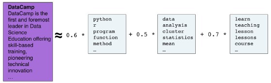
The post further discusses the application of these techniques in real-world scenarios. It demonstrates how to use PCA and NMF for image recognition and text mining, and how to construct recommender systems using NMF.
The post concludes with a brief discussion on the limitations and considerations when using unsupervised learning techniques, emphasizing that these methods should be employed as part of a larger data analysis pipeline.
Throughout the post, code snippets and examples are provided to illustrate the concepts, primarily using Python libraries such as scikit-learn and pandas. The post serves as a comprehensive guide for anyone looking to understand and apply unsupervised learning techniques in their data analysis projects.
Description
Say you have a collection of customers with a variety of characteristics such as age, location, and financial history, and you wish to discover patterns and sort them into clusters. Or perhaps you have a set of texts, such as Wikipedia pages, and you wish to segment them into categories based on their content. This is the world of unsupervised learning, called as such because you are not guiding, or supervising, the pattern discovery by some prediction task, but instead uncovering hidden structure from unlabeled data. Unsupervised learning encompasses a variety of techniques in machine learning, from clustering to dimension reduction to matrix factorization. In this course, you’ll learn the fundamentals of unsupervised learning and implement the essential algorithms using scikit-learn and scipy. You will learn how to cluster, transform, visualize, and extract insights from unlabeled datasets, and end the course by building a recommender system to recommend popular musical artists.
Imports
1
2
3
4
5
6
7
8
9
10
11
12
13
14
15
16
17
18
19
20
21
22
| import pandas as pd
from pprint import pprint as pp
from itertools import combinations
from zipfile import ZipFile
import matplotlib.pyplot as plt
from mpl_toolkits.mplot3d import Axes3D
import seaborn as sns
import numpy as np
from pathlib import Path
import requests
import sys
from scipy.sparse import csr_matrix
from scipy.cluster.hierarchy import linkage, dendrogram, fcluster
from scipy.stats import pearsonr
from sklearn.cluster import KMeans
from sklearn.preprocessing import StandardScaler, Normalizer, normalize, MaxAbsScaler
from sklearn.pipeline import make_pipeline
from sklearn.manifold import TSNE
from sklearn.decomposition import PCA, TruncatedSVD, NMF
from sklearn.feature_extraction.text import TfidfVectorizer
|
1
2
| import warnings
warnings.simplefilter(action="ignore", category=UserWarning)
|
Configuration Options
1
2
3
4
| pd.set_option('display.max_columns', 200)
pd.set_option('display.max_rows', 300)
pd.set_option('display.expand_frame_repr', True)
plt.rcParams["patch.force_edgecolor"] = True
|
Functions
1
2
3
4
5
6
7
8
9
10
11
12
13
14
15
16
17
| def create_dir_save_file(dir_path: Path, url: str):
"""
Check if the path exists and create it if it does not.
Check if the file exists and download it if it does not.
"""
if not dir_path.parents[0].exists():
dir_path.parents[0].mkdir(parents=True)
print(f'Directory Created: {dir_path.parents[0]}')
else:
print('Directory Exists')
if not dir_path.exists():
r = requests.get(url, allow_redirects=True)
open(dir_path, 'wb').write(r.content)
print(f'File Created: {dir_path.name}')
else:
print('File Exists')
|
1
2
| data_dir = Path('data/2021-03-29_unsupervised_learning_python')
images_dir = Path('Images/2021-03-29_unsupervised_learning_python')
|
Datasets
1
2
3
4
5
6
7
8
9
10
11
12
13
| # csv files
base = 'https://assets.datacamp.com/production/repositories/655/datasets'
file_spm = base + '/1304e66b1f9799e1a5eac046ef75cf57bb1dd630/company-stock-movements-2010-2015-incl.csv'
file_ev = base + '/2a1f3ab7bcc76eef1b8e1eb29afbd54c4ebf86f2/eurovision-2016.csv'
file_fish = base + '/fee715f8cf2e7aad9308462fea5a26b791eb96c4/fish.csv'
file_lcd = base + '/effd1557b8146ab6e620a18d50c9ed82df990dce/lcd-digits.csv'
file_wine = base + '/2b27d4c4bdd65801a3b5c09442be3cb0beb9eae0/wine.csv'
file_artists_sparse = 'https://raw.githubusercontent.com/trenton3983/DataCamp/master/data/2021-03-29_unsupervised_learning_python/artists_sparse.csv'
# zip files
file_grain = base + '/bb87f0bee2ac131042a01307f7d7e3d4a38d21ec/Grains.zip'
file_musicians = base + '/c974f2f2c4834958cbe5d239557fbaf4547dc8a3/Musical%20artists.zip'
file_wiki = base + '/8e2fbb5b8240c06602336f2148f3c42e317d1fdb/Wikipedia%20articles.zip'
|
1
2
3
4
5
6
7
8
| file_links = [file_spm, file_ev, file_fish, file_lcd, file_wine, file_grain, file_musicians, file_wiki, file_artists_sparse]
file_paths = list()
for file in file_links:
file_name = file.split('/')[-1].replace('?raw=true', '').replace('%20', '_')
data_path = data_dir / file_name
create_dir_save_file(data_path, file)
file_paths.append(data_path)
|
1
2
3
4
5
6
7
8
9
10
11
12
13
14
15
16
17
18
| Directory Exists
File Exists
Directory Exists
File Exists
Directory Exists
File Exists
Directory Exists
File Exists
Directory Exists
File Exists
Directory Exists
File Exists
Directory Exists
File Exists
Directory Exists
File Exists
Directory Exists
File Exists
|
1
2
3
4
5
| # unzip the zipped files
zip_files = [v for v in file_paths if v.suffix == '.zip']
for file in zip_files:
with ZipFile(file, 'r') as zip_:
zip_.extractall(data_dir)
|
1
2
| dp = [v for v in data_dir.rglob('*') if v.suffix in ['.csv', '.txt']]
dp
|
1
2
3
4
5
6
7
8
9
10
11
12
| [WindowsPath('data/2021-03-29_unsupervised_learning_python/artists_sparse.csv'),
WindowsPath('data/2021-03-29_unsupervised_learning_python/company-stock-movements-2010-2015-incl.csv'),
WindowsPath('data/2021-03-29_unsupervised_learning_python/eurovision-2016.csv'),
WindowsPath('data/2021-03-29_unsupervised_learning_python/fish.csv'),
WindowsPath('data/2021-03-29_unsupervised_learning_python/lcd-digits.csv'),
WindowsPath('data/2021-03-29_unsupervised_learning_python/wine.csv'),
WindowsPath('data/2021-03-29_unsupervised_learning_python/Grains/seeds-width-vs-length.csv'),
WindowsPath('data/2021-03-29_unsupervised_learning_python/Grains/seeds.csv'),
WindowsPath('data/2021-03-29_unsupervised_learning_python/Musical artists/artists.csv'),
WindowsPath('data/2021-03-29_unsupervised_learning_python/Musical artists/scrobbler-small-sample.csv'),
WindowsPath('data/2021-03-29_unsupervised_learning_python/Wikipedia articles/wikipedia-vectors.csv'),
WindowsPath('data/2021-03-29_unsupervised_learning_python/Wikipedia articles/wikipedia-vocabulary-utf8.txt')]
|
DataFrames
stk: Company Stock Movements 2010 - 2015
1
2
| stk = pd.read_csv(dp[1], index_col=[0])
stk.iloc[:2, :5]
|
| 2010-01-04 | 2010-01-05 | 2010-01-06 | 2010-01-07 | 2010-01-08 |
|---|
| Apple | 0.580000 | -0.220005 | -3.409998 | -1.17 | 1.680011 |
|---|
| AIG | -0.640002 | -0.650000 | -0.210001 | -0.42 | 0.710001 |
|---|
euv: Eurovision 2016
1
2
| euv = pd.read_csv(dp[2])
euv.head(2)
|
| From country | To country | Jury A | Jury B | Jury C | Jury D | Jury E | Jury Rank | Televote Rank | Jury Points | Televote Points |
|---|
| 0 | Albania | Belgium | 20 | 16 | 24 | 22 | 24 | 25 | 14 | NaN | NaN |
|---|
| 1 | Albania | Czech Republic | 21 | 15 | 25 | 23 | 16 | 22 | 22 | NaN | NaN |
|---|
fsh: Fish
1
2
| fsh = pd.read_csv(dp[3], header=None)
fsh.head(2)
|
| 0 | 1 | 2 | 3 | 4 | 5 | 6 |
|---|
| 0 | Bream | 242.0 | 23.2 | 25.4 | 30.0 | 38.4 | 13.4 |
|---|
| 1 | Bream | 290.0 | 24.0 | 26.3 | 31.2 | 40.0 | 13.8 |
|---|
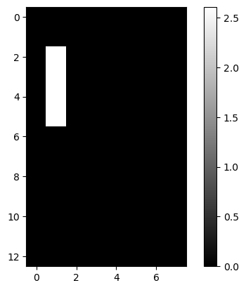
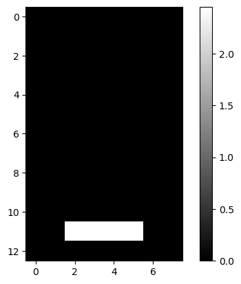
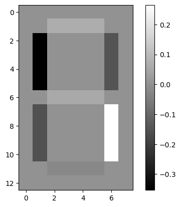
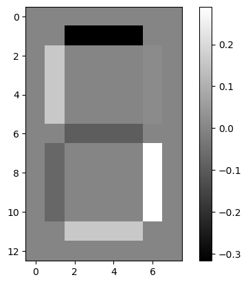
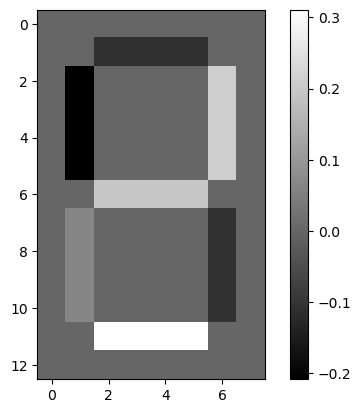
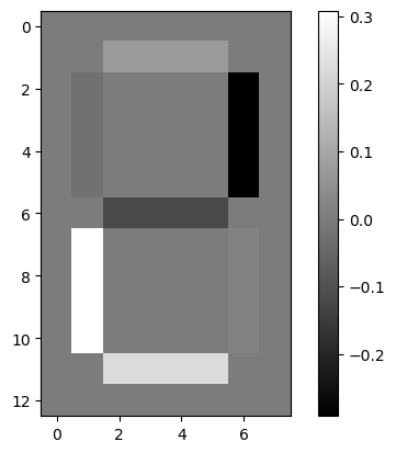
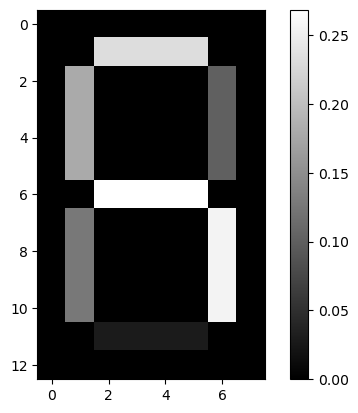
lcd: LCD Digits
1
2
| lcd = pd.read_csv(dp[4], header=None)
lcd.iloc[:2, :5]
|
| 0 | 1 | 2 | 3 | 4 |
|---|
| 0 | 0.0 | 0.0 | 0.0 | 0.0 | 0.0 |
|---|
| 1 | 0.0 | 0.0 | 0.0 | 0.0 | 0.0 |
|---|
win: Wine
1
2
| win = pd.read_csv(dp[5])
win.head(2)
|
| class_label | class_name | alcohol | malic_acid | ash | alcalinity_of_ash | magnesium | total_phenols | flavanoids | nonflavanoid_phenols | proanthocyanins | color_intensity | hue | od280 | proline |
|---|
| 0 | 1 | Barolo | 14.23 | 1.71 | 2.43 | 15.6 | 127 | 2.80 | 3.06 | 0.28 | 2.29 | 5.64 | 1.04 | 3.92 | 1065 |
|---|
| 1 | 1 | Barolo | 13.20 | 1.78 | 2.14 | 11.2 | 100 | 2.65 | 2.76 | 0.26 | 1.28 | 4.38 | 1.05 | 3.40 | 1050 |
|---|
swl: Seeds Width vs. Length
1
2
3
| swl = pd.read_csv(dp[6], header=None)
swl.columns = ['width', 'length']
swl.head(2)
|
| width | length |
|---|
| 0 | 3.312 | 5.763 |
|---|
| 1 | 3.333 | 5.554 |
|---|
sed: Seeds
1
2
3
4
5
| sed = pd.read_csv(dp[7], header=None)
sed['varieties'] = sed[7].map({1: 'Kama wheat', 2: 'Rosa wheat', 3: 'Canadian wheat'})
sed.head(2)
|
| 0 | 1 | 2 | 3 | 4 | 5 | 6 | 7 | varieties |
|---|
| 0 | 15.26 | 14.84 | 0.8710 | 5.763 | 3.312 | 2.221 | 5.220 | 1 | Kama wheat |
|---|
| 1 | 14.88 | 14.57 | 0.8811 | 5.554 | 3.333 | 1.018 | 4.956 | 1 | Kama wheat |
|---|
mus1: Musical Artists
1
2
| mus1 = pd.read_csv(dp[8])
mus1.head(2)
|
| Massive Attack |
|---|
| 0 | Sublime |
|---|
| 1 | Beastie Boys |
|---|
mus2: Musical Artists - Scrobbler Small Sample
1
2
| mus2 = pd.read_csv(dp[9])
mus2.head(2)
|
| user_offset | artist_offset | playcount |
|---|
| 0 | 1 | 79 | 58 |
|---|
| 1 | 1 | 84 | 80 |
|---|
artists_sparse
1
2
3
| artist_df = pd.read_csv(dp[0], header=None, index_col=[0])
artist_names = artist_df.index.tolist()
artists_sparse = csr_matrix(artist_df)
|
wik1: Wikipedia Vectors
1
2
| wik1 = pd.read_csv(dp[10], index_col=0).T
wik1.iloc[:4, :10]
|
| 0 | 1 | 2 | 3 | 4 | 5 | 6 | 7 | 8 | 9 |
|---|
| HTTP 404 | 0.0 | 0.0 | 0.000000 | 0.0 | 0.0 | 0.0 | 0.0 | 0.000000 | 0.0 | 0.0 |
|---|
| Alexa Internet | 0.0 | 0.0 | 0.029607 | 0.0 | 0.0 | 0.0 | 0.0 | 0.000000 | 0.0 | 0.0 |
|---|
| Internet Explorer | 0.0 | 0.0 | 0.000000 | 0.0 | 0.0 | 0.0 | 0.0 | 0.003772 | 0.0 | 0.0 |
|---|
| HTTP cookie | 0.0 | 0.0 | 0.000000 | 0.0 | 0.0 | 0.0 | 0.0 | 0.000000 | 0.0 | 0.0 |
|---|
1
2
| wik1_sparse = csr_matrix(wik1)
wik1_sparse
|
1
2
| <60x13125 sparse matrix of type '<class 'numpy.float64'>'
with 42091 stored elements in Compressed Sparse Row format>
|
wik2: Wikipedia Vocabulary
1
2
| wik2 = pd.read_csv(dp[11], header=None)
wik2.head(2)
|
Memory Usage
1
2
3
4
5
| # These are the usual ipython objects, including this one you are creating
ipython_vars = ['In', 'Out', 'exit', 'quit', 'get_ipython', 'ipython_vars'] # list a variables
# Get a sorted list of the objects and their sizes
sorted([(x, sys.getsizeof(globals().get(x))) for x in dir() if not x.startswith('_') and x not in sys.modules and x not in ipython_vars], key=lambda x: x[1], reverse=True)[:11]
|
1
2
3
4
5
6
7
8
9
10
11
| [('wik1', 6303933),
('wik2', 740775),
('stk', 465818),
('artist_df', 450773),
('euv', 198170),
('lcd', 83364),
('mus2', 69620),
('win', 30222),
('sed', 26274),
('fsh', 8817),
('mus1', 6841)]
|
Clustering for dataset exploration
Learn how to discover the underlying groups (or “clusters”) in a dataset. By the end of this chapter, you’ll be clustering companies using their stock market prices, and distinguishing different species by clustering their measurements.
Unsupervised Learning
- We’re here to learn about unsupervised learning in Python.
- Unsupervised learning is a class of machine learning techniques for discovering patterns in data. For instance, finding the natural “clusters” of customers based on their purchase histories, or searching for patterns and correlations among these purchases, and using these patterns to express the data in a compressed form. These are examples of unsupervised learning techniques called “clustering” and “dimension reduction”.
- Supervised vs unsupervised learning
- Unsupervised learning is defined in opposition to supervised learning.
- An example of supervised learning is using the measurements of tumors to classify them as benign or cancerous.
- In this case, the pattern discovery is guided, or “supervised”, so that the patterns are as useful as possible for predicting the label: benign or cancerous.
- Unsupervised learning, in contrast, is learning without labels.
- It is pure pattern discovery, unguided by a prediction task. You’ll start by learning about clustering.
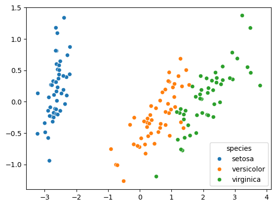
- Iris dataset
- The iris dataset consists of the measurements of many iris plants of three different species.
- setosa
- versicolor
- virginica
- There are four measurements: petal length, petal width, sepal length and sepal width. These are the features of the dataset.
- Arrays, features & samples
- Throughout this course, datasets like this will be written as two-dimensional numpy arrays.
- The columns of the array will correspond to the features.
- The measurements for individual plants are the samples of the dataset. These correspond to rows of the array.
- Iris data is 4-dimensional
- The samples of the iris dataset have four measurements, and so correspond to points in a four-dimensional space.
- This is the dimension of the dataset.
- We can’t visualize four dimensions directly, but using unsupervised learning techniques we can still gain insight.
- k-means clustering
- In this chapter, we’ll cluster these samples using k-means clustering.
- k-means finds a specified number of clusters in the samples.
- It’s implemented in the scikit-learn or “sklearn” library. Let’s see
kmeans in action on some samples from the iris dataset.
- k-means clustering with scikit-learn
- The iris samples are represented as an array. To start, import kmeans from scikit-learn.
- Then create a kmeans model, specifying the number of clusters you want to find.
- Let’s specify 3 clusters, since there are three species of iris.
- Now call the fit method of the model, passing the array of samples.
- This fits the model to the data, by locating and remembering the regions where the different clusters occur.
- Then we can use the predict method of the model on these same samples.
- This returns a cluster label for each sample, indicating to which cluster a sample belongs.
- Let’s assign the result to labels, and print it out.
- Cluster labels for new samples
- If someone comes along with some new iris samples, k-means can determine to which clusters they belong without starting over.
- k-means does this by remembering the mean of the samples in each cluster.
- These are called the “centroids”.
- New samples are assigned to the cluster whose centroid is closest.
- Suppose you’ve got an array of new samples.
- To assign the new samples to the existing clusters, pass the array of new samples to the predict method of the kmeans model.
- This returns the cluster labels of the new samples.
- Scatter plots
- In the next video, you’ll learn how to evaluate the quality of your clustering.
- Let’s visualize our clustering of the iris samples using scatter plots.
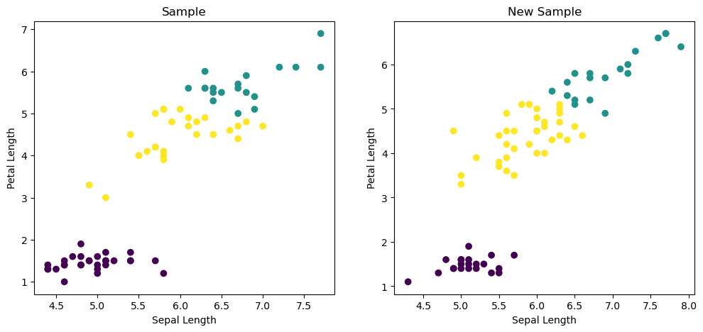
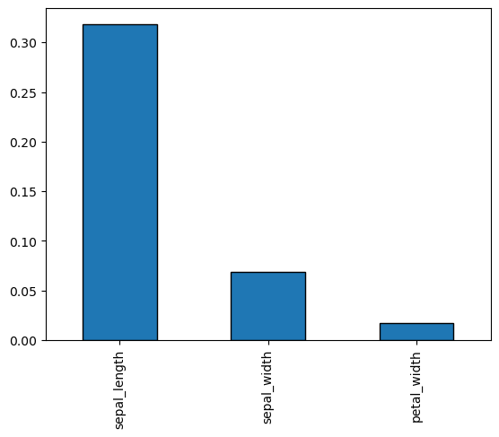
- Here is a scatter plot of the sepal length vs petal length of the iris samples. Each point represents an iris sample, and is colored according to the cluster of the sample.
- To create a scatter plot like this, use PyPlot.
- Firstly, import PyPlot. It is conventionally imported as plt.
- Now get the x- and y- co-ordinates of each sample.
- Sepal length is in the 0th column of the array, while petal length is in the 2nd column.
- Now call the plt.scatter function, passing the x- and y- co-ordinates and specifying c=labels to color by cluster label.
- When you are ready to show your plot, call plt.show().
1
2
3
4
| iris = sns.load_dataset('iris')
iris_samples = iris.sample(n=75, replace=False, random_state=3)
X_iris = iris_samples.iloc[:, :4]
y_iris = iris_samples.species
|
| sepal_length | sepal_width | petal_length | petal_width | species |
|---|
| 47 | 4.6 | 3.2 | 1.4 | 0.2 | setosa |
|---|
| 3 | 4.6 | 3.1 | 1.5 | 0.2 | setosa |
|---|
| 31 | 5.4 | 3.4 | 1.5 | 0.4 | setosa |
|---|
| 25 | 5.0 | 3.0 | 1.6 | 0.2 | setosa |
|---|
| 15 | 5.7 | 4.4 | 1.5 | 0.4 | setosa |
|---|
1
2
3
4
5
| iris_model = KMeans(n_clusters=3, n_init=10)
iris_model.fit(X_iris)
iris_labels = iris_model.predict(X_iris)
iris_labels
|
1
2
3
4
| array([0, 0, 0, 0, 0, 1, 2, 0, 1, 2, 2, 0, 2, 2, 1, 0, 2, 1, 2, 0, 2, 1,
1, 2, 0, 1, 1, 2, 2, 2, 0, 0, 1, 2, 0, 0, 1, 0, 1, 2, 1, 2, 0, 0,
2, 2, 0, 2, 2, 2, 0, 0, 2, 2, 2, 0, 1, 0, 1, 2, 0, 0, 1, 2, 0, 0,
2, 1, 1, 0, 1, 2, 0, 0, 1])
|
1
2
3
4
5
6
| iris_new_samples = iris[~iris.index.isin(iris_samples.index)].copy()
X_iris_new = iris_new_samples.iloc[:, :4]
y_iris_new = iris_new_samples.species
iris_new_labels = iris_model.predict(X_iris_new)
iris_new_labels
|
1
2
3
4
| array([0, 0, 0, 0, 0, 0, 0, 0, 0, 0, 0, 0, 0, 0, 0, 0, 0, 0, 0, 0, 0, 1,
2, 2, 2, 2, 2, 2, 2, 2, 2, 2, 2, 2, 2, 2, 2, 2, 2, 2, 2, 2, 2, 2,
2, 2, 2, 2, 1, 1, 1, 2, 1, 1, 1, 2, 1, 1, 2, 1, 2, 1, 2, 1, 1, 1,
1, 2, 2, 1, 1, 2, 1, 1, 2])
|
1
2
3
4
5
| iris_new_samples['pred_labels'] = iris_new_labels
iris_samples['pred_labels'] = iris_labels
pred_labels = pd.concat([iris_new_samples[['species', 'pred_labels']], iris_samples[['species', 'pred_labels']]]).sort_index()
pred_labels.head(2)
|
| species | pred_labels |
|---|
| 0 | setosa | 0 |
|---|
| 1 | setosa | 0 |
|---|
1
2
3
4
5
6
7
8
9
10
11
12
13
14
15
16
17
| fig, (ax1, ax2) = plt.subplots(nrows=1, ncols=2, figsize=(12, 5))
xs = X_iris.sepal_length
ys = X_iris.petal_length
xs_new = X_iris_new.sepal_length
ys_new = X_iris_new.petal_length
ax1.scatter(xs, ys, c=iris_labels)
ax1.set_ylabel('Petal Length')
ax1.set_xlabel('Sepal Length')
ax1.set_title('Sample')
ax2.scatter(xs_new, ys_new, c=iris_new_labels)
ax2.set_ylabel('Petal Length')
ax2.set_xlabel('Sepal Length')
ax2.set_title('New Sample')
plt.show()
|
How many clusters?
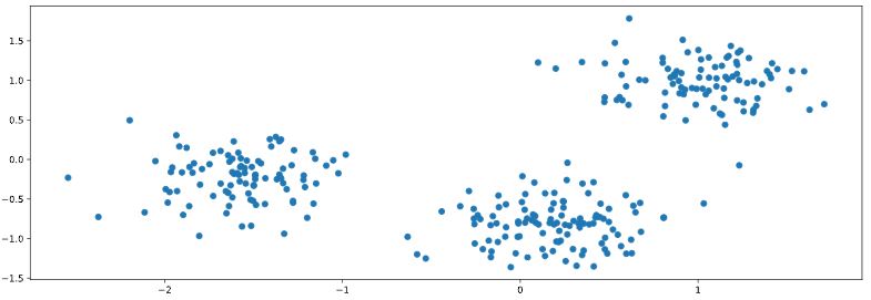
You are given an array points of size 300x2, where each row gives the (x, y) co-ordinates of a point on a map. Make a scatter plot of these points, and use the scatter plot to guess how many clusters there are.
matplotlib.pyplot has already been imported as plt. In the IPython Shell:
- Create an array called
xs that contains the values of points[:,0] - that is, column 0 of points. - Create an array called
ys that contains the values of points[:,1] - that is, column 1 of points. - Make a scatter plot by passing
xs and ys to the plt.scatter() function. - Call the
plt.show() function to show your plot.
How many clusters do you see?
Possible Answers
1
| pen = sns.load_dataset('penguins').dropna()
|
| species | island | bill_length_mm | bill_depth_mm | flipper_length_mm | body_mass_g | sex |
|---|
| 0 | Adelie | Torgersen | 39.1 | 18.7 | 181.0 | 3750.0 | Male |
|---|
| 1 | Adelie | Torgersen | 39.5 | 17.4 | 186.0 | 3800.0 | Female |
|---|
| 2 | Adelie | Torgersen | 40.3 | 18.0 | 195.0 | 3250.0 | Female |
|---|
| 4 | Adelie | Torgersen | 36.7 | 19.3 | 193.0 | 3450.0 | Female |
|---|
| 5 | Adelie | Torgersen | 39.3 | 20.6 | 190.0 | 3650.0 | Male |
|---|
| ... | ... | ... | ... | ... | ... | ... | ... |
|---|
| 338 | Gentoo | Biscoe | 47.2 | 13.7 | 214.0 | 4925.0 | Female |
|---|
| 340 | Gentoo | Biscoe | 46.8 | 14.3 | 215.0 | 4850.0 | Female |
|---|
| 341 | Gentoo | Biscoe | 50.4 | 15.7 | 222.0 | 5750.0 | Male |
|---|
| 342 | Gentoo | Biscoe | 45.2 | 14.8 | 212.0 | 5200.0 | Female |
|---|
| 343 | Gentoo | Biscoe | 49.9 | 16.1 | 213.0 | 5400.0 | Male |
|---|
333 rows × 7 columns
1
2
| points = pen.iloc[:, 2:4]
points.head()
|
| bill_length_mm | bill_depth_mm |
|---|
| 0 | 39.1 | 18.7 |
|---|
| 1 | 39.5 | 17.4 |
|---|
| 2 | 40.3 | 18.0 |
|---|
| 4 | 36.7 | 19.3 |
|---|
| 5 | 39.3 | 20.6 |
|---|
1
2
3
4
5
6
7
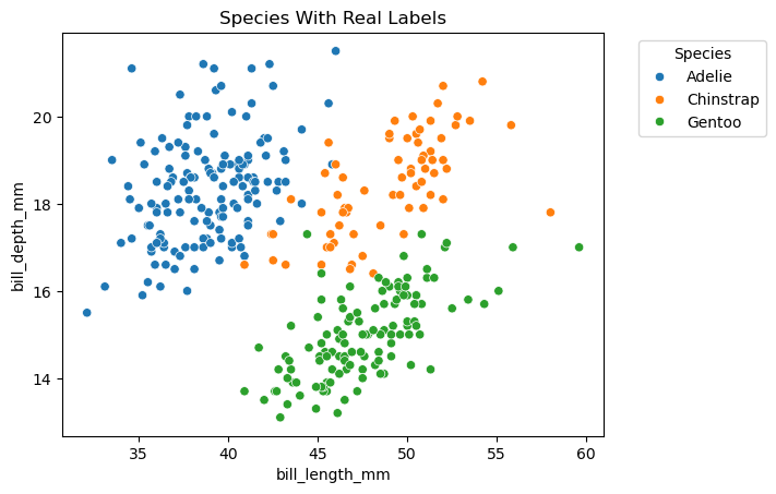
| xs = points.bill_length_mm
ys = points.bill_depth_mm
sns.scatterplot(x=xs, y=ys, hue=pen.species)
plt.legend(title='Species', bbox_to_anchor=(1.05, 1), loc='upper left')
plt.title('Species With Real Labels')
plt.show()
|
Clustering 2D points
From the scatter plot of the previous exercise, you saw that the points seem to separate into 3 clusters. You’ll now create a KMeans model to find 3 clusters, and fit it to the data points from the previous exercise. After the model has been fit, you’ll obtain the cluster labels for some new points using the .predict() method.
You are given the array points from the previous exercise, and also an array new_points.
Instructions
- Import
KMeans from sklearn.cluster. - Using
KMeans(), create a KMeans instance called model to find 3 clusters. To specify the number of clusters, use the n_clusters keyword argument. - Use the
.fit() method of model to fit the model to the array of points points. - Use the
.predict() method of model to predict the cluster labels of new_points, assigning the result to labels. - Hit ‘Submit Answer’ to see the cluster labels of
new_points.
1
2
3
4
5
6
7
8
9
10
11
12
13
14
15
16
17
18
19
20
| # create points
points = pen.iloc[:, 2:4].sample(n=177, random_state=3)
new_points = pen[~pen.index.isin(points.index)].iloc[:, 2:4]
# Import KMeans
# from sklearn.cluster import KMeans
# Create a KMeans instance with 3 clusters: model
model = KMeans(n_clusters=3, n_init=10)
# Fit model to points
model.fit(points)
labels = model.predict(points)
# Determine the cluster labels of new_points: labels
new_labels = model.predict(new_points)
# Print cluster labels of new_points
print(new_labels)
|
1
2
3
4
5
| [2 2 2 2 2 2 2 2 2 2 2 2 2 2 2 2 2 2 2 2 2 2 2 2 2 2 2 2 2 1 2 2 2 2 2 2 2
2 2 1 2 2 2 2 2 2 2 2 2 2 2 2 2 2 1 2 2 2 2 2 2 2 2 2 0 0 0 1 1 1 1 0 0 0
0 1 0 0 0 1 2 1 1 1 0 1 0 0 0 0 1 1 1 0 1 0 0 0 0 1 1 1 1 1 1 0 1 1 1 0 0
1 0 1 1 1 1 0 1 0 1 0 1 1 1 0 1 1 1 0 1 0 0 0 1 1 1 1 1 0 0 0 1 0 0 0 0 0
1 0 1 1 1 0 1 0]
|
| bill_length_mm | bill_depth_mm |
|---|
| 124 | 35.2 | 15.9 |
|---|
| 159 | 51.3 | 18.2 |
|---|
| 309 | 52.1 | 17.0 |
|---|
| 20 | 37.8 | 18.3 |
|---|
| 90 | 35.7 | 18.0 |
|---|
1
2
3
4
5
6
7
8
9
10
11
12
13
14
15
16
17
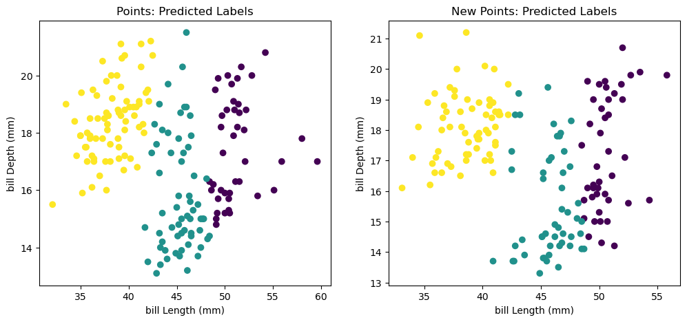
| fig, (ax1, ax2) = plt.subplots(nrows=1, ncols=2, figsize=(12, 5))
xs = points.bill_length_mm
ys = points.bill_depth_mm
xs_new = new_points.bill_length_mm
ys_new = new_points.bill_depth_mm
ax1.scatter(xs, ys, c=labels)
ax1.set_ylabel('bill Depth (mm)')
ax1.set_xlabel('bill Length (mm)')
ax1.set_title('Points: Predicted Labels')
ax2.scatter(xs_new, ys_new, c=new_labels)
ax2.set_ylabel('bill Depth (mm)')
ax2.set_xlabel('bill Length (mm)')
ax2.set_title('New Points: Predicted Labels')
plt.show()
|
You’ve successfully performed k-Means clustering and predicted the labels of new points. But it is not easy to inspect the clustering by just looking at the printed labels. A visualization would be far more useful. In the next exercise, you’ll inspect your clustering with a scatter plot!
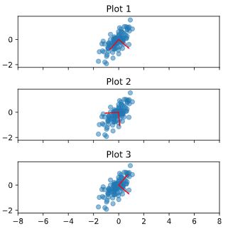
Inspect your clustering
Let’s now inspect the clustering you performed in the previous exercise!
A solution to the previous exercise has already run, so new_points is an array of points and labels is the array of their cluster labels.
Instructions
- Import
matplotlib.pyplot as plt. - Assign column
0 of new_points to xs, and column 1 of new_points to ys. - Make a scatter plot of
xs and ys, specifying the c=labels keyword arguments to color the points by their cluster label. Also specify alpha=0.5. - Compute the coordinates of the centroids using the
.cluster_centers_ attribute of model. - Assign column
0 of centroids to centroids_x, and column 1 of centroids to centroids_y. - Make a scatter plot of
centroids_x and centroids_y, using 'D' (a diamond) as a marker by specifying the marker parameter. Set the size of the markers to be 50 using s=50.
1
2
3
4
5
6
7
8
9
10
11
12
13
14
15
16
17
18
19
20
21
22
| # Import pyplot
# import matplotlib.pyplot as plt
new_points = new_points.to_numpy()
# Assign the columns of new_points: xs and ys
xs = new_points[:, 0]
ys = new_points[:, 1]
# Make a scatter plot of xs and ys, using labels to define the colors
plt.scatter(xs, ys, c=new_labels, alpha=0.5)
# Assign the cluster centers: centroids
centroids = model.cluster_centers_
# Assign the columns of centroids: centroids_x, centroids_y
centroids_x = centroids[:,0]
centroids_y = centroids[:,1]
# Make a scatter plot of centroids_x and centroids_y
plt.scatter(centroids_x, centroids_y, marker='D', s=50)
plt.show()
|
The clustering looks great! But how can you be sure that 3 clusters is the correct choice? In other words, how can you evaluate the quality of a clustering? Tune into the next video in which Ben will explain how to evaluate a clustering!
Evaluating a clustering
- In the previous video, we used k-means to cluster the iris samples into three clusters.
- But how can we evaluate the quality of this clustering?
- Evaluating a clustering
- A direct approach is to compare the clusters with the iris species.
- You’ll learn about this first, before considering the problem of how to measure the quality of a clustering in a way that doesn’t require our samples to come pre-grouped into species.
- This measure of quality can then be used to make an informed choice about the number of clusters to look for.
- Iris: clusters vs species
- Firstly, let’s check whether the 3 clusters of iris samples have any correspondence to the iris species.
- The correspondence is described by this table.
- There is one column for each of the three species of iris: setosa, versicolor and virginica, and one row for each of the three cluster labels: 0, 1 and 2.
- The table shows the number of samples that have each possible cluster label/species combination.
- For example, we see that cluster 1 corresponds perfectly with the species setosa.
- On the other hand, while cluster 0 contains mainly virginica samples, there are also some virginica samples in cluster 2.
- Cross tabulation with pandas
- Tables like these are called “cross-tabulations”.
- To construct one, we are going to use the pandas library.
- Let’s assume the species of each sample is given as a list of strings.
- Aligning labels and species
- Import pandas, and then create a two-column DataFrame, where the first column is cluster labels and the second column is the iris species, so that each row gives the cluster label and species of a single sample.
- Crosstab of labels and species
- Now use the pandas crosstab function to build the cross tabulation, passing the two columns of the DataFrame.
- Cross tabulations like these provide great insights into which sort of samples are in which cluster.
- But in most datasets, the samples are not labeled by species.
- How can the quality of a clustering be evaluated in these cases?
- Measuring clustering quality
- We need a way to measure the quality of a clustering that uses only the clusters and the samples themselves.
- A good clustering has tight clusters, meaning that the samples in each cluster are bunched together, not spread out.
- Inertia measures clustering quality
- How spread out the samples within each cluster are can be measured by the “inertia”.
- Intuitively, inertia measures how far samples are from their centroids.
- You can find the precise definition in the scikit-learn documentation.
- We want clusters that are not spread out, so lower values of the inertia are better.
- The inertia of a kmeans model is measured automatically when any of the
.fit() methods are called, and is available afterwards as the .inertia_ attribute. - In fact, kmeans aims to place the clusters in a way that minimizes the inertia.
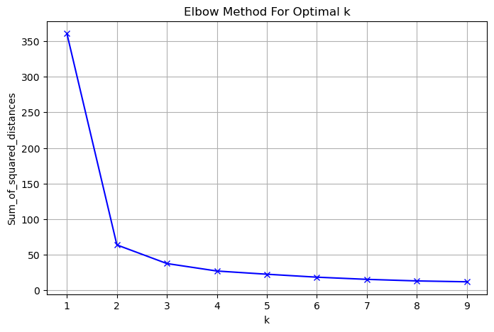
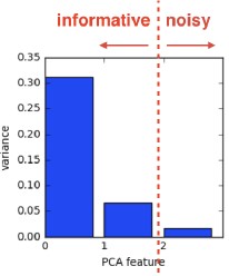
- The number of clusters
- Here is a plot of the inertia values of clusterings of the iris dataset with different numbers of clusters.
- Our kmeans model with 3 clusters has relatively low inertia, which is great.
- But notice that the inertia continues to decrease slowly.
- So what’s the best number of clusters to choose?
- How many clusters to choose?
- Ultimately, this is a trade-off.
- A good clustering has tight clusters (meaning low inertia).
- But it also doesn’t have too many clusters.
- A good rule of thumb is to choose an elbow in the inertia plot, that is, a point where the inertia begins to decrease more slowly.
- For example, by this criterion, 3 is a good number of clusters for the iris dataset.
1
2
| ct = pd.crosstab(pred_labels.pred_labels, pred_labels.species)
ct
|
| species | setosa | versicolor | virginica |
|---|
| pred_labels | | | |
|---|
| 0 | 50 | 0 | 0 |
|---|
| 1 | 0 | 2 | 36 |
|---|
| 2 | 0 | 48 | 14 |
|---|
1
2
3
4
5
6
| Sum_of_squared_distances = list()
K = range(1, 10)
for k in K:
km = KMeans(n_clusters=k, n_init=10)
km = km.fit(X_iris)
Sum_of_squared_distances.append(km.inertia_)
|
1
2
3
4
5
6
7
| plt.figure(figsize=(8, 5))
plt.plot(K, Sum_of_squared_distances, 'bx-')
plt.xlabel('k')
plt.ylabel('Sum_of_squared_distances')
plt.title('Elbow Method For Optimal k')
plt.grid()
plt.show()
|
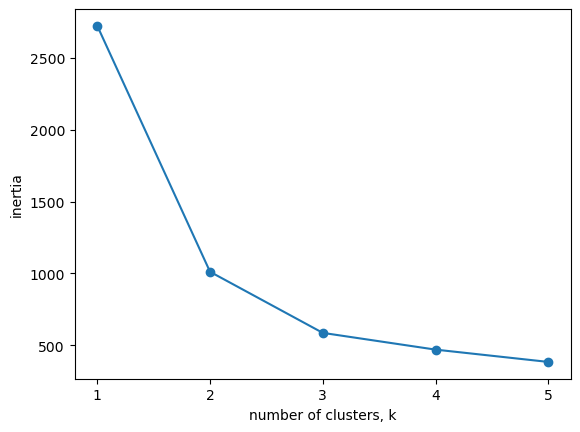
How many clusters of grain?
In the video, you learned how to choose a good number of clusters for a dataset using the k-means inertia graph. You are given an array samples containing the measurements (such as area, perimeter, length, and several others) of samples of grain. What’s a good number of clusters in this case?
KMeans and PyPlot (plt) have already been imported for you.
This dataset was sourced from the UCI Machine Learning Repository.
Instructions
- For each of the given values of
k, perform the following steps: - Create a
KMeans instance called model with k clusters. - Fit the model to the grain data
samples. - Append the value of the
inertia_ attribute of model to the list inertias. - The code to plot
ks vs inertias has been written for you, so hit ‘Submit Answer’ to see the plot!
1
2
3
4
5
6
7
8
9
10
11
12
13
14
15
16
17
18
19
20
21
| samples = sed.iloc[:, :-2]
ks = range(1, 6)
inertias = list()
for k in ks:
# Create a KMeans instance with k clusters: model
model = KMeans(n_clusters=k, n_init=10)
# Fit model to samples
model.fit(samples)
# Append the inertia to the list of inertias
inertias.append(model.inertia_)
# Plot ks vs inertias
plt.plot(ks, inertias, '-o')
plt.xlabel('number of clusters, k')
plt.ylabel('inertia')
plt.xticks(ks)
plt.show()
|
The inertia decreases very slowly from 3 clusters to 4, so it looks like 3 clusters would be a good choice for this data.
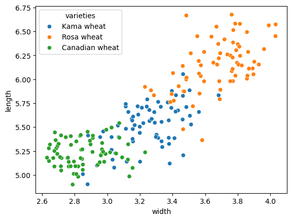
Evaluating the grain clustering
In the previous exercise, you observed from the inertia plot that 3 is a good number of clusters for the grain data. In fact, the grain samples come from a mix of 3 different grain varieties: “Kama”, “Rosa” and “Canadian”. In this exercise, cluster the grain samples into three clusters, and compare the clusters to the grain varieties using a cross-tabulation.
You have the array samples of grain samples, and a list varieties giving the grain variety for each sample. Pandas (pd) and KMeans have already been imported for you.
Instructions
- Create a
KMeans model called model with 3 clusters. - Use the
.fit_predict() method of model to fit it to samples and derive the cluster labels. Using .fit_predict() is the same as using .fit() followed by .predict(). - Create a DataFrame
df with two columns named 'labels' and 'varieties', using labels and varieties, respectively, for the column values. This has been done for you. - Use the
pd.crosstab() function on df['labels'] and df['varieties'] to count the number of times each grain variety coincides with each cluster label. Assign the result to ct. - Hit ‘Submit Answer’ to see the cross-tabulation!
1
2
3
4
5
6
7
8
9
10
11
12
13
14
15
16
| varieties = sed.varieties
# Create a KMeans model with 3 clusters: model
model = KMeans(n_clusters=3, n_init=10)
# Use fit_predict to fit model and obtain cluster labels: labels
labels = model.fit_predict(samples)
# Create a DataFrame with labels and varieties as columns: df
df = pd.DataFrame({'labels': labels, 'varieties': varieties})
# Create crosstab: ct
ct = pd.crosstab(df.labels, df.varieties)
# Display ct
ct
|
| varieties | Canadian wheat | Kama wheat | Rosa wheat |
|---|
| labels | | | |
|---|
| 0 | 0 | 1 | 60 |
|---|
| 1 | 68 | 9 | 0 |
|---|
| 2 | 2 | 60 | 10 |
|---|
The cross-tabulation shows that the 3 varieties of grain separate really well into 3 clusters. But depending on the type of data you are working with, the clustering may not always be this good. Is there anything you can do in such situations to improve your clustering?
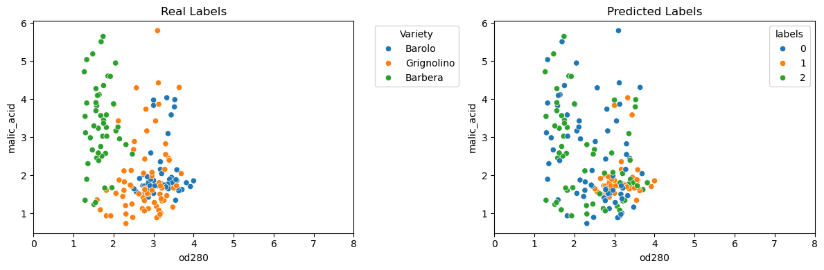
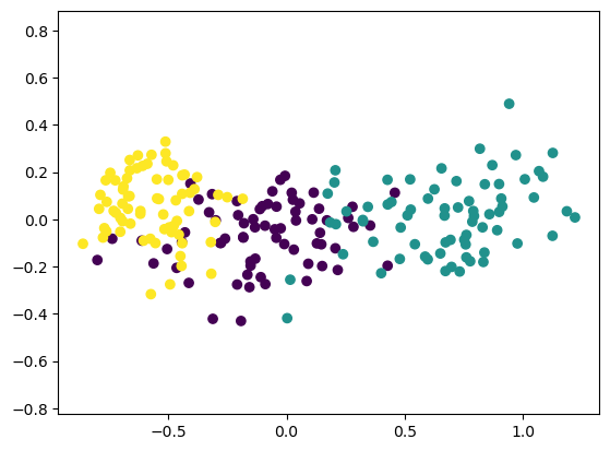
- Piedmont wines dataset
- The Piedmont wines dataset.
- We have 178 samples of red wine from the Piedmont region of Italy.
- The features measure chemical composition (like alcohol content) and visual properties like color intensity.
- The samples come from 3 distinct varieties of wine.
- Clustering the wines
- Let’s take the array of samples and use KMeans to find 3 clusters.
- Clusters vs. varieties
- There are three varieties of wine, so let’s use pandas crosstab to check the cluster label - wine variety correspondence.
- As you can see, this time things haven’t worked out so well.
- The KMeans clusters don’t correspond well with the wine varieties.
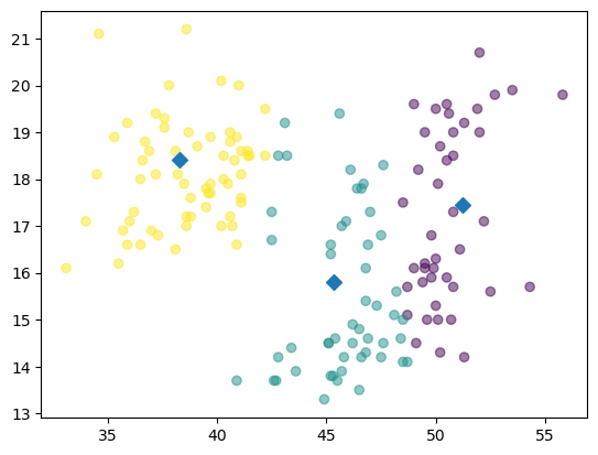
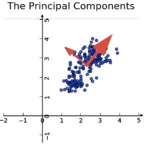
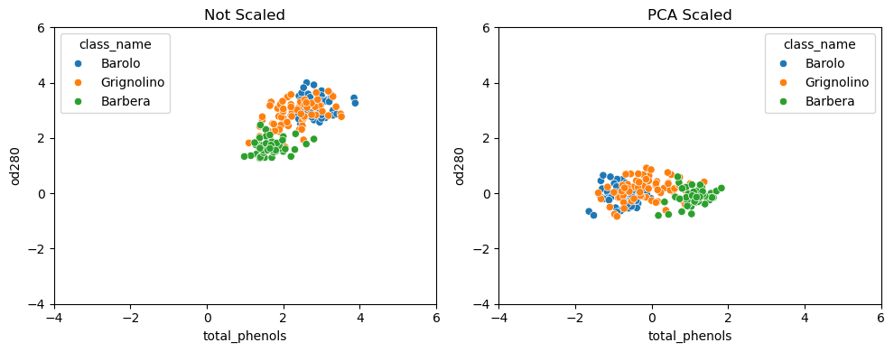
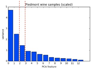
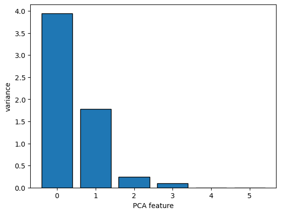
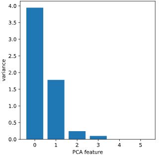
- Feature variances
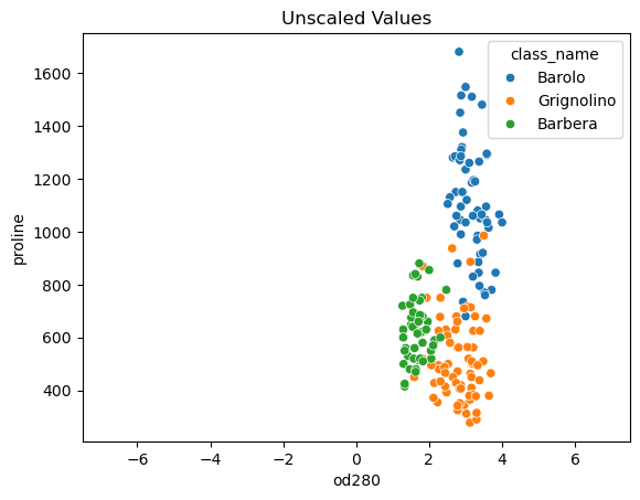
- The problem is that the features of the wine dataset have very different variances.
- The variance of a feature measures the spread of its values.
- For example, the malic acid feature has a higher variance than the od280 feature, and this can also be seen in their scatter plot.
- The differences in some of the feature variances is enormous, as seen here, for example, in the scatter plot of the od280 and proline features.
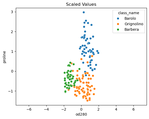
- StandardScaler
- In KMeans clustering, the variance of a feature corresponds to its influence on the clustering algorithm.
- To give every feature a chance, the data needs to be transformed so that features have equal variance.
- This can be achieved with the StandardScaler from scikit-learn.
- It transforms every feature to have mean 0 and variance 1.
- The resulting “standardized” features can be very informative.
- Using standardized od280 and proline, for example, the three wine varieties are much more distinct.
- sklearn StandardScaler
- Let’s see the StandardScaler in action.
- First, import StandardScaler from sklearn.preprocessing.
- Then create a StandardScaler object, and fit it to the samples.
- The transform method can now be used to standardize any samples, either the same ones, or completely new ones.
- Similar methods
- The APIs of StandardScaler and KMeans are similar, but there is an important difference.
- StandardScaler transforms data, and so has a transform method.
- KMeans, in contrast, assigns cluster labels to samples, and this done using the predict method.
- StandardScaler, then KMeans
- Let’s return to the problem of clustering the wines.
- We need to perform two steps.
- Firstly, to standardize the data using StandardScaler, and secondly to take the standardized data and cluster it using KMeans.
- This can be conveniently achieved by combining the two steps using a scikit-learn pipeline.
- Data then flows from one step into the next, automatically.
- Pipelines combine multiple steps
- The first steps are the same: creating a StandardScaler and a KMeans object.
- After that, import the make_pipeline function from sklearn.pipeline.
- Apply the make_pipeline function to the steps that you want to compose in this case, the scaler and the kmeans objects.
- Now use the fit method of the pipeline to fit both the scaler and kmeans, and use its predict method to obtain the cluster labels.
- Feature standardization improves clustering
- Checking the correspondence between the cluster labels and the wine varieties reveals that this new clustering, incorporating standardization, is fantastic.
- Its three clusters correspond almost exactly to the three wine varieties.
- This is a huge improvement on the clustering without standardization.
- sklearn preprocessing steps
- StandardScaler is an example of a “preprocessing” step.
- There are several of these available in scikit-learn, for example MaxAbsScaler and Normalizer.
| class_label | class_name | alcohol | malic_acid | ash | alcalinity_of_ash | magnesium | total_phenols | flavanoids | nonflavanoid_phenols | proanthocyanins | color_intensity | hue | od280 | proline |
|---|
| 0 | 1 | Barolo | 14.23 | 1.71 | 2.43 | 15.6 | 127 | 2.80 | 3.06 | 0.28 | 2.29 | 5.64 | 1.04 | 3.92 | 1065 |
|---|
| 1 | 1 | Barolo | 13.20 | 1.78 | 2.14 | 11.2 | 100 | 2.65 | 2.76 | 0.26 | 1.28 | 4.38 | 1.05 | 3.40 | 1050 |
|---|
1
2
3
4
5
6
7
| wine_samples = win.iloc[:, 2:]
wine_model = KMeans(n_clusters=3, n_init=10)
wine_labels = wine_model.fit_predict(wine_samples)
wine_pred = pd.DataFrame({'labels': wine_labels, 'varieties': win.class_name})
wine_ct = pd.crosstab(wine_pred.labels, wine_pred.varieties)
wine_ct
|
| varieties | Barbera | Barolo | Grignolino |
|---|
| labels | | | |
|---|
| 0 | 19 | 0 | 50 |
|---|
| 1 | 0 | 46 | 1 |
|---|
| 2 | 29 | 13 | 20 |
|---|
1
| wine_samples.var().round(3)
|
1
2
3
4
5
6
7
8
9
10
11
12
13
14
| alcohol 0.659
malic_acid 1.248
ash 0.075
alcalinity_of_ash 11.153
magnesium 203.989
total_phenols 0.392
flavanoids 0.998
nonflavanoid_phenols 0.015
proanthocyanins 0.328
color_intensity 5.374
hue 0.052
od280 0.504
proline 99166.717
dtype: float64
|
1
2
3
4
5
6
7
8
9
10
11
| fig, (ax1, ax2) = plt.subplots(ncols=2, figsize=(12, 4))
sns.scatterplot(data=win, x='od280', y='malic_acid', hue='class_name', ax=ax1)
ax1.legend(title='Variety', bbox_to_anchor=(1.05, 1), loc='upper left')
ax1.set_xlim(0, 8)
ax1.set_title('Real Labels')
sns.scatterplot(data=win, x='od280', y='malic_acid', hue=wine_pred.labels, palette="tab10", ax=ax2)
ax2.set_xlim(0, 8)
ax2.set_title('Predicted Labels')
plt.tight_layout()
|
1
2
3
| p1 = sns.scatterplot(data=win, x='od280', y='proline', hue='class_name')
p1.set_xlim(-7.5, 7.5)
p1.set_title('Unscaled Values');
|
1
2
3
4
| wine_scaler = StandardScaler()
wine_scaler.fit(wine_samples)
StandardScaler(copy=True, with_mean=True, with_std=True)
wine_samples_scaled = wine_scaler.transform(wine_samples)
|
1
2
| wine_samples_scaled = pd.DataFrame(wine_samples_scaled, columns=win.columns[2:])
wine_samples_scaled.head(2)
|
| alcohol | malic_acid | ash | alcalinity_of_ash | magnesium | total_phenols | flavanoids | nonflavanoid_phenols | proanthocyanins | color_intensity | hue | od280 | proline |
|---|
| 0 | 1.518613 | -0.562250 | 0.232053 | -1.169593 | 1.913905 | 0.808997 | 1.034819 | -0.659563 | 1.224884 | 0.251717 | 0.362177 | 1.847920 | 1.013009 |
|---|
| 1 | 0.246290 | -0.499413 | -0.827996 | -2.490847 | 0.018145 | 0.568648 | 0.733629 | -0.820719 | -0.544721 | -0.293321 | 0.406051 | 1.113449 | 0.965242 |
|---|
1
2
3
| p2 = sns.scatterplot(data=wine_samples_scaled, x='od280', y='proline', hue=win.class_name)
p2.set_xlim(-7.5, 7.5)
p2.set_title('Scaled Values');
|
1
2
3
4
5
| scaler = StandardScaler()
kmeans = KMeans(n_clusters=3, n_init=10)
pipeline = make_pipeline(scaler, kmeans)
pipeline.fit(wine_samples_scaled)
wine_scaled_labels = pipeline.predict(wine_samples_scaled)
|
1
2
3
| wine_pred_scaled = pd.DataFrame({'labels': wine_scaled_labels, 'varieties': win.class_name})
wine_scaled_ct = pd.crosstab(wine_pred_scaled.labels, wine_pred_scaled.varieties)
wine_scaled_ct
|
| varieties | Barbera | Barolo | Grignolino |
|---|
| labels | | | |
|---|
| 0 | 48 | 0 | 3 |
|---|
| 1 | 0 | 0 | 65 |
|---|
| 2 | 0 | 59 | 3 |
|---|
Scaling fish data for clustering
You are given an array samples giving measurements of fish. Each row represents an individual fish. The measurements, such as weight in grams, length in centimeters, and the percentage ratio of height to length, have very different scales. In order to cluster this data effectively, you’ll need to standardize these features first. In this exercise, you’ll build a pipeline to standardize and cluster the data.
These fish measurement data were sourced from the Journal of Statistics Education.
Instructions
- Import:
make_pipeline from sklearn.pipeline.StandardScaler from sklearn.preprocessing.KMeans from sklearn.cluster.
- Create an instance of
StandardScaler called scaler. - Create an instance of
KMeans with 4 clusters called kmeans. - Create a pipeline called
pipeline that chains scaler and kmeans. To do this, you just need to pass them in as arguments to make_pipeline().
1
2
3
4
5
6
7
8
9
10
11
12
13
| # Perform the necessary imports
# from sklearn.pipeline import make_pipeline
# from sklearn.preprocessing import StandardScaler
# from sklearn.cluster import KMeans
# Create scaler: scaler
scaler = StandardScaler()
# Create KMeans instance: kmeans
kmeans = KMeans(n_clusters=4, n_init=10)
# Create pipeline: pipeline
pipeline = make_pipeline(scaler, kmeans)
|
Now that you’ve built the pipeline, you’ll use it in the next exercise to cluster the fish by their measurements.
Clustering the fish data
You’ll now use your standardization and clustering pipeline from the previous exercise to cluster the fish by their measurements, and then create a cross-tabulation to compare the cluster labels with the fish species.
As before, samples is the 2D array of fish measurements. Your pipeline is available as pipeline, and the species of every fish sample is given by the list species.
Instructions
- Import
pandas as pd. - Fit the pipeline to the fish measurements
samples. - Obtain the cluster labels for
samples by using the .predict() method of pipeline. - Using
pd.DataFrame(), create a DataFrame df with two columns named 'labels' and 'species', using labels and species, respectively, for the column values. - Using
pd.crosstab(), create a cross-tabulation ct of df['labels'] and df['species']
1
2
3
4
5
6
7
8
9
10
11
12
13
14
15
16
17
| samples = fsh.iloc[:, 1:]
species = fsh[0]
# Fit the pipeline to samples
pipeline.fit(samples)
# Calculate the cluster labels: labels
labels = pipeline.predict(samples)
# Create a DataFrame with labels and species as columns: df
df = pd.DataFrame({'labels': labels, 'species': species})
# Create crosstab: ct
ct = pd.crosstab(df.labels, df.species)
# Display ct
ct
|
| species | Bream | Pike | Roach | Smelt |
|---|
| labels | | | | |
|---|
| 0 | 1 | 0 | 19 | 1 |
|---|
| 1 | 0 | 17 | 0 | 0 |
|---|
| 2 | 33 | 0 | 1 | 0 |
|---|
| 3 | 0 | 0 | 0 | 13 |
|---|
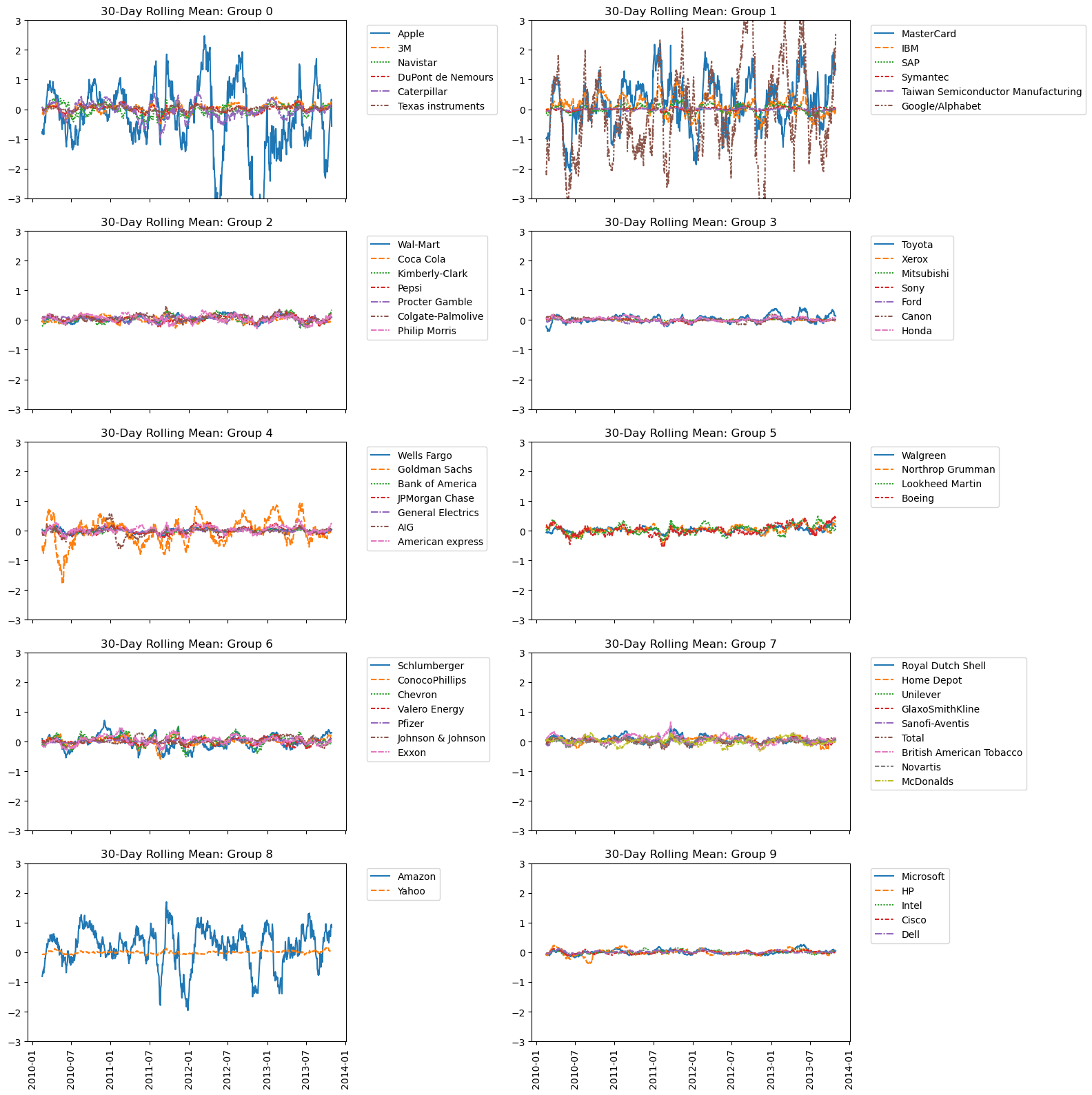
Clustering stocks using KMeans
In this exercise, you’ll cluster companies using their daily stock price movements (i.e. the dollar difference between the closing and opening prices for each trading day). You are given a NumPy array movements of daily price movements from 2010 to 2015 (obtained from Yahoo! Finance), where each row corresponds to a company, and each column corresponds to a trading day.
Some stocks are more expensive than others. To account for this, include a Normalizer at the beginning of your pipeline. The Normalizer will separately transform each company’s stock price to a relative scale before the clustering begins.
Note that Normalizer() is different to StandardScaler(), which you used in the previous exercise. While StandardScaler() standardizes features (such as the features of the fish data from the previous exercise) by removing the mean and scaling to unit variance, Normalizer() rescales each sample - here, each company’s stock price - independently of the other.
KMeans and make_pipeline have already been imported for you.
Instructions
- Import
Normalizer from sklearn.preprocessing. - Create an instance of
Normalizer called normalizer. - Create an instance of
KMeans called kmeans with 10 clusters. - Using
make_pipeline(), create a pipeline called pipeline that chains normalizer and kmeans. - Fit the pipeline to the
movements array.
1
2
| movements = stk.to_numpy()
companies = stk.index.to_list()
|
1
2
3
4
5
6
7
8
9
10
11
12
13
14
| # Import Normalizer
# from sklearn.preprocessing import Normalizer
# Create a normalizer: normalizer
normalizer = Normalizer()
# Create a KMeans model with 10 clusters: kmeans
kmeans = KMeans(n_clusters=10, random_state=12, n_init=10)
# Make a pipeline chaining normalizer and kmeans: pipeline
pipeline = make_pipeline(normalizer, kmeans)
# Fit pipeline to the daily price movements
pipeline.fit(movements)
|
Pipeline(steps=[('normalizer', Normalizer()),
                ('kmeans', KMeans(n_clusters=10, n_init=10, random_state=12))])
In a Jupyter environment, please rerun this cell to show the HTML representation or trust the notebook.
On GitHub, the HTML representation is unable to render, please try loading this page with nbviewer.org.Now that your pipeline has been set up, you can find out which stocks move together in the next exercise!
Which stocks move together?
In the previous exercise, you clustered companies by their daily stock price movements. So which company have stock prices that tend to change in the same way? You’ll now inspect the cluster labels from your clustering to find out.
Your solution to the previous exercise has already been run. Recall that you constructed a Pipeline pipeline containing a KMeans model and fit it to the NumPy array movements of daily stock movements. In addition, a list companies of the company names is available.
Instructions
- Import
pandas as pd. - Use the
.predict() method of the pipeline to predict the labels for movements. - Align the cluster labels with the list of company names
companies by creating a DataFrame df with labels and companies as columns. This has been done for you. - Use the
.sort_values() method of df to sort the DataFrame by the 'labels' column, and print the result. - Hit ‘Submit Answer’ and take a moment to see which companies are together in each cluster!
1
2
3
4
5
6
7
8
9
| # Predict the cluster labels: labels
labels = pipeline.predict(movements)
# Create a DataFrame aligning labels and companies: df
df = pd.DataFrame({'labels': labels, 'companies': companies})
# Display df sorted by cluster label
df = df.sort_values('labels')
df
|
| labels | companies |
|---|
| 0 | 0 | Apple |
|---|
| 32 | 0 | 3M |
|---|
| 35 | 0 | Navistar |
|---|
| 13 | 0 | DuPont de Nemours |
|---|
| 8 | 0 | Caterpillar |
|---|
| 51 | 0 | Texas instruments |
|---|
| 30 | 1 | MasterCard |
|---|
| 23 | 1 | IBM |
|---|
| 43 | 1 | SAP |
|---|
| 47 | 1 | Symantec |
|---|
| 50 | 1 | Taiwan Semiconductor Manufacturing |
|---|
| 17 | 1 | Google/Alphabet |
|---|
| 56 | 2 | Wal-Mart |
|---|
| 28 | 2 | Coca Cola |
|---|
| 27 | 2 | Kimberly-Clark |
|---|
| 38 | 2 | Pepsi |
|---|
| 40 | 2 | Procter Gamble |
|---|
| 9 | 2 | Colgate-Palmolive |
|---|
| 41 | 2 | Philip Morris |
|---|
| 48 | 3 | Toyota |
|---|
| 58 | 3 | Xerox |
|---|
| 34 | 3 | Mitsubishi |
|---|
| 45 | 3 | Sony |
|---|
| 15 | 3 | Ford |
|---|
| 7 | 3 | Canon |
|---|
| 21 | 3 | Honda |
|---|
| 55 | 4 | Wells Fargo |
|---|
| 18 | 4 | Goldman Sachs |
|---|
| 5 | 4 | Bank of America |
|---|
| 26 | 4 | JPMorgan Chase |
|---|
| 16 | 4 | General Electrics |
|---|
| 1 | 4 | AIG |
|---|
| 3 | 4 | American express |
|---|
| 54 | 5 | Walgreen |
|---|
| 36 | 5 | Northrop Grumman |
|---|
| 29 | 5 | Lookheed Martin |
|---|
| 4 | 5 | Boeing |
|---|
| 44 | 6 | Schlumberger |
|---|
| 10 | 6 | ConocoPhillips |
|---|
| 12 | 6 | Chevron |
|---|
| 53 | 6 | Valero Energy |
|---|
| 39 | 6 | Pfizer |
|---|
| 25 | 6 | Johnson & Johnson |
|---|
| 57 | 6 | Exxon |
|---|
| 42 | 7 | Royal Dutch Shell |
|---|
| 20 | 7 | Home Depot |
|---|
| 52 | 7 | Unilever |
|---|
| 19 | 7 | GlaxoSmithKline |
|---|
| 46 | 7 | Sanofi-Aventis |
|---|
| 49 | 7 | Total |
|---|
| 6 | 7 | British American Tobacco |
|---|
| 37 | 7 | Novartis |
|---|
| 31 | 7 | McDonalds |
|---|
| 2 | 8 | Amazon |
|---|
| 59 | 8 | Yahoo |
|---|
| 33 | 9 | Microsoft |
|---|
| 22 | 9 | HP |
|---|
| 24 | 9 | Intel |
|---|
| 11 | 9 | Cisco |
|---|
| 14 | 9 | Dell |
|---|
Take a look at the clusters. Are you surprised by any of the results? In the next chapter, you’ll learn about how to communicate results such as this through visualizations.
1
2
3
| stk_t = stk.T.copy()
stk_t.index = pd.to_datetime(stk_t.index)
stk_t = stk_t.rolling(30).mean()
|
1
2
3
4
5
6
7
8
9
10
11
12
| fig, axes = plt.subplots(nrows=5, ncols=2, figsize=(16, 16))
axes = axes.ravel()
for i, (g, d) in enumerate(df.groupby('labels')):
cols = d.companies.tolist()
sns.lineplot(data=stk_t[cols], ax=axes[i])
axes[i].legend(bbox_to_anchor=(1.05, 1), loc='upper left')
axes[i].set_title(f'30-Day Rolling Mean: Group {g}')
axes[i].set_ylim(-3, 3)
fig.autofmt_xdate(rotation=90, ha='center')
plt.tight_layout()
plt.show()
|
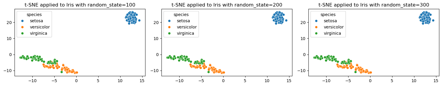
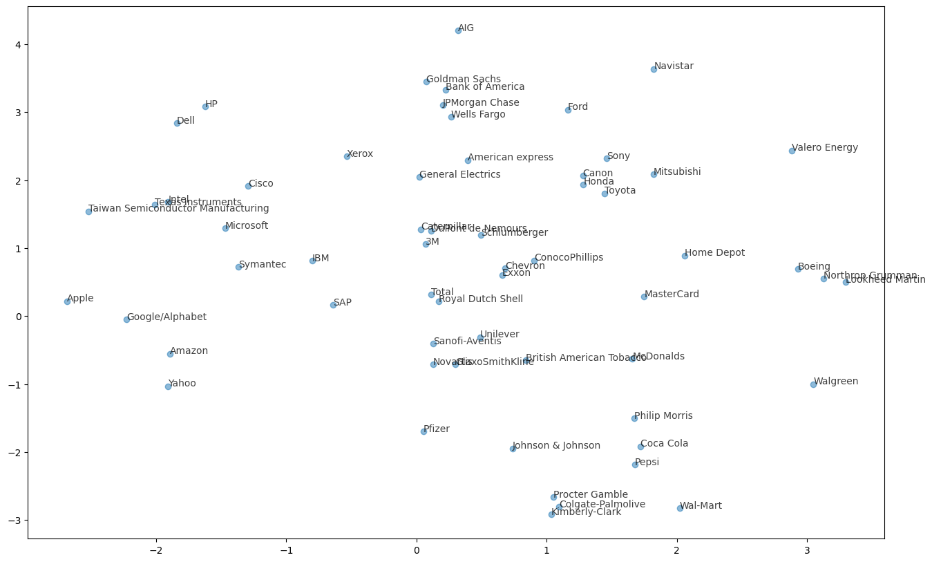
Visualization with hierarchical clustering and t-SNE
In this chapter, you’ll learn about two unsupervised learning techniques for data visualization, hierarchical clustering and t-SNE. Hierarchical clustering merges the data samples into ever-coarser clusters, yielding a tree visualization of the resulting cluster hierarchy. t-SNE maps the data samples into 2d space so that the proximity of the samples to one another can be visualized.
Visualizing hierarchies
- A huge part of your work as a data scientist will be the communication of your insights to other people.
- Visualizations communicate insight
- Visualizations are an excellent way to share your findings, particularly with a non-technical audience.
- In this chapter, you’ll learn about two unsupervised learning techniques for visualization: t-SNE and hierarchical clustering.
- t-SNE, which we’ll consider later, creates a 2d map of any dataset, and conveys useful information about the proximity of the samples to one another.
- First up, however, let’s learn about hierarchical clustering.
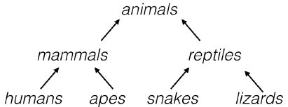
- A hierarchy of groups
- You’ve already seen many hierarchical clusterings in the real world.
- For example, living things can be organized into small narrow groups, like humans, apes, snakes and lizards, or into larger, broader groups like mammals and reptiles, or even broader groups like animals and plants.
- These groups are contained in one another, and form a hierarchy.
- Analogously, hierarchical clustering arranges samples into a hierarchy of clusters.
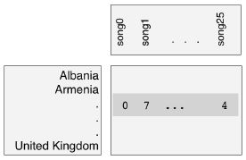
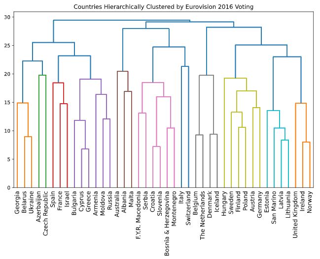
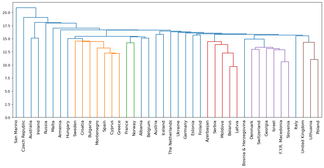
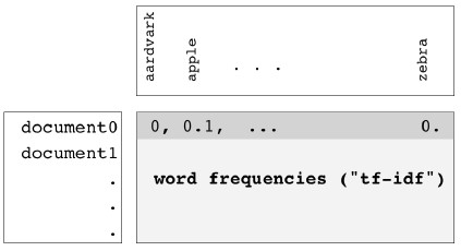
- Eurovision scoring dataset
- Hierarchical clustering can organize any sort of data into a hierarchy, not just samples of plants and animals.
- Let’s consider a new type of dataset, describing how countries scored performances at the Eurovision 2016 song contest.
- The data is arranged in a rectangular array, where the rows of the array show how many points a country gave to each song.
- The “samples” in this case are the countries.
- Hierarchical clustering of voting countries
- The result of applying hierarchical clustering to the Eurovision scores can be visualized as a tree-like diagram called a “dendrogram”.
- This single picture reveals a great deal of information about the voting behavior of countries at the Eurovision.
- The dendrogram groups the countries into larger and larger clusters, and many of these clusters are immediately recognizable as containing countries that are close to one another geographically, or that have close cultural or political ties, or that belong to single language group.
- So hierarchical clustering can produce great visualizations. But how does it work?
- Hierarchical clustering
- Hierarchical clustering proceeds in steps.
- In the beginning, every country is its own cluster - so there are as many clusters as there are countries!
- At each step, the two closest clusters are merged.
- This decreases the number of clusters, and eventually, there is only one cluster left, and it contains all the countries.
- This process is actually a particular type of hierarchical clustering called “agglomerative clustering” - there is also “divisive clustering”, which works the other way around.
- We haven’t defined yet what it means for two clusters to be close, but we’ll revisit that later on.
- The dendrogram of a hierarchical clustering
scipy.cluster.hierarchy.dendrogram- The entire process of the hierarchical clustering is encoded in the dendrogram.
- At the bottom, each country is in a cluster of its own.
- The clustering then proceeds from the bottom up.
- Clusters are represented as vertical lines, and a joining of vertical lines indicates a merging of clusters.
- To understand better, let’s zoom in and look at just one part of this dendrogram.
- Dendrograms, step-by-step
- In the beginning, there are six clusters, each containing only one country.
- The first merging is here, where the clusters containing Cyprus and Greece are merged together in a single cluster.
- Later on, this new cluster is merged with the cluster containing Bulgaria.
- Shortly after that, the clusters containing Moldova and Russia are merged, which later is in turn merged with the cluster containing Armenia.
- Later still, the two big composite clusters are merged together. This process continues
- until there is only one cluster left, and it contains all the countries.
- Hierarchical clustering with SciPy
- We’ll use functions from scipy to perform a hierarchical clustering on the array of scores.
- For the dendrogram, we’ll also need a list of country names.
- Firstly, import the linkage and dendrogram functions.
- Then, apply the linkage function to the sample array.
- Its the linkage function that performs the hierarchical clustering.
- Notice there is an extra method parameter - we’ll cover that in the next video.
- Now pass the output of linkage to the dendrogram function, specifying the list of country names as the labels parameter.
- In the next video, you’ll learn how to extract information from a hierarchical clustering.
A Note Regarding the Data
- The Eurovision data,
euv, is used for the lecture and some of the following exercises. - The
.shape of the Eurovision samples is (42, 26) - The Eurovision DataFrame must be pivoted to achieve the correct shape
'From country' is index'To country' is columns'Jury Points' is values- In
samples produced by DataCamp, they have changed the order of the values for every row, so that the correct data point does not correctly correspond to 'To country' - Other than copying
samples from the iPython shell, there isn’t an automated way, that I can see, to sort the rows to match the DataCamp example, so the Dendrogram will not look the same
1
2
| euvp = euv.pivot(index='From country', columns='To country', values='Jury Points').fillna(0)
euv_samples = euvp.to_numpy()
|
| To country | Armenia | Australia | Austria | Azerbaijan | Belgium |
|---|
| From country | | | | | |
|---|
| Albania | 0.0 | 12.0 | 0.0 | 0.0 | 0.0 |
|---|
| Armenia | 0.0 | 5.0 | 0.0 | 0.0 | 4.0 |
|---|
| Australia | 0.0 | 0.0 | 0.0 | 0.0 | 12.0 |
|---|
| Austria | 2.0 | 12.0 | 0.0 | 0.0 | 5.0 |
|---|
| Azerbaijan | 0.0 | 7.0 | 0.0 | 0.0 | 0.0 |
|---|
1
2
3
4
5
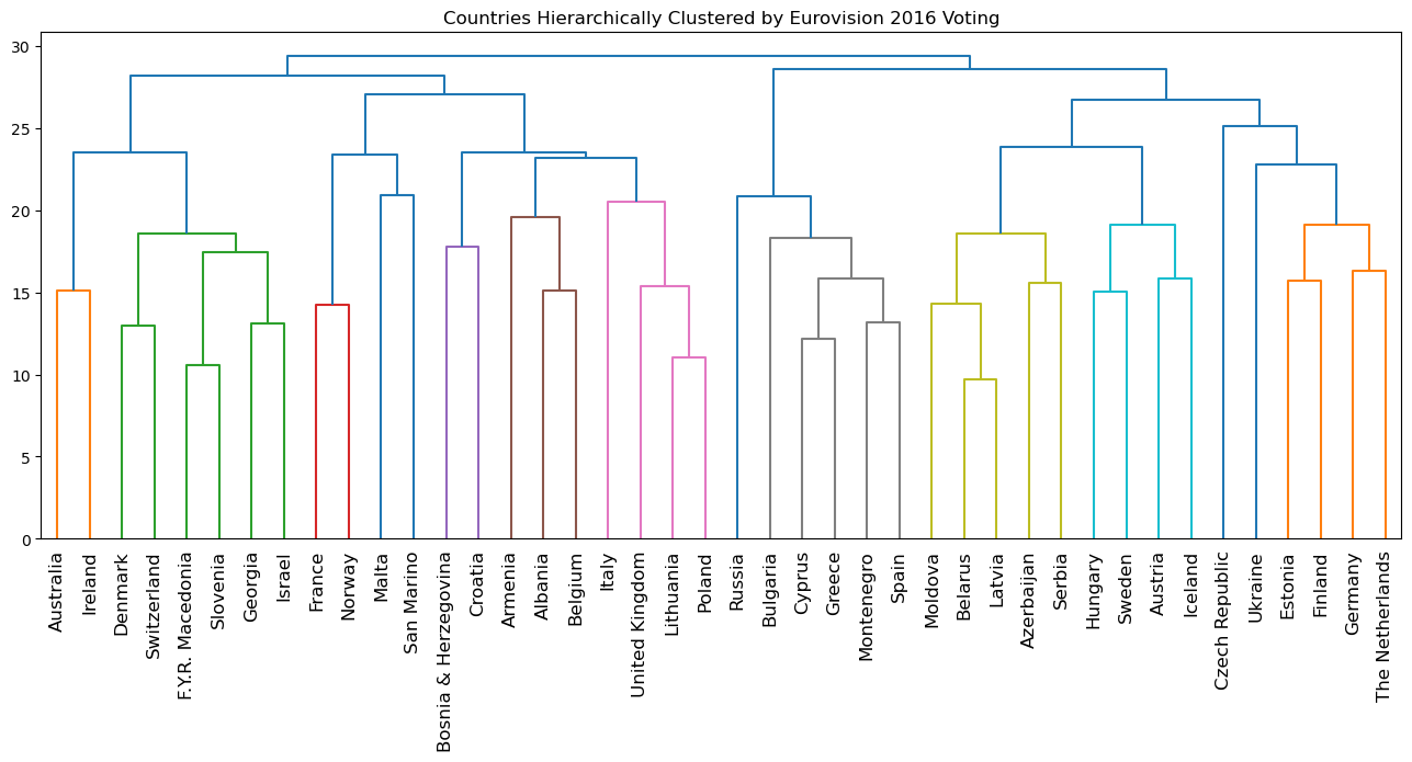
| plt.figure(figsize=(16, 6))
euv_mergings = linkage(euv_samples, method='complete')
dendrogram(euv_mergings, labels=euvp.index, leaf_rotation=90, leaf_font_size=12)
plt.title('Countries Hierarchically Clustered by Eurovision 2016 Voting')
plt.show()
|
How many merges?
If there are 5 data samples, how many merge operations will occur in a hierarchical clustering?
(To help answer this question, think back to the video, in which Ben walked through an example of hierarchical clustering using 6 countries.)
Possible Answers
- 4 merges.
- With 5 data samples, there would be 4 merge operations, and with 6 data samples, there would be 5 merges, and so on.
3 merges.This can’t be known in advance.
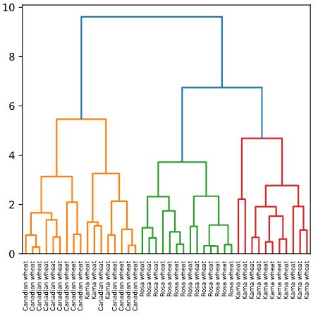
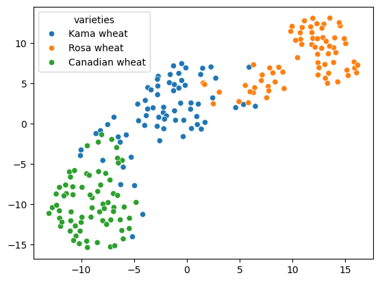
Hierarchical clustering of the grain data
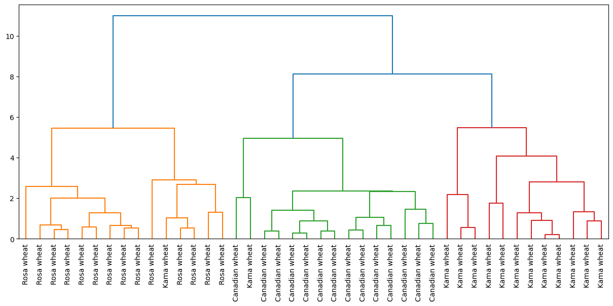
In the video, you learned that the SciPy linkage() function performs hierarchical clustering on an array of samples. Use the linkage() function to obtain a hierarchical clustering of the grain samples, and use dendrogram() to visualize the result. A sample of the grain measurements is provided in the array samples, while the variety of each grain sample is given by the list varieties.
Instructions
- Import:
linkage and dendrogram from scipy.cluster.hierarchy.matplotlib.pyplot as plt.
- Perform hierarchical clustering on
samples using the linkage() function with the method='complete' keyword argument. Assign the result to mergings. - Plot a dendrogram using the
dendrogram() function on mergings. Specify the keyword arguments labels=varieties, leaf_rotation=90, and leaf_font_size=6.
1
2
3
4
| # the DataCamp sample uses a subset of the seed data; the linkage result is very dependant upon the random_state
seed_sample = sed.groupby('varieties').sample(n=14, random_state=250)
samples = seed_sample.iloc[:, :7]
varieties = seed_sample.varieties.tolist()
|
1
2
3
4
5
6
7
8
9
10
11
| # Perform the necessary imports
# from scipy.cluster.hierarchy import linkage, dendrogram
# import matplotlib.pyplot as plt
# Calculate the linkage: mergings
mergings = linkage(samples, method='complete')
# Plot the dendrogram, using varieties as labels
plt.figure(figsize=(15, 6))
dendrogram(mergings, labels=varieties, leaf_rotation=90, leaf_font_size=10)
plt.show()
|
Dendrograms are a great way to illustrate the arrangement of the clusters produced by hierarchical clustering.
Hierarchies of stocks
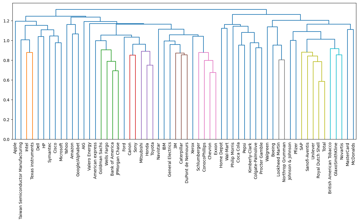
In chapter 1, you used k-means clustering to cluster companies according to their stock price movements. Now, you’ll perform hierarchical clustering of the companies. You are given a NumPy array of price movements movements, where the rows correspond to companies, and a list of the company names companies. SciPy hierarchical clustering doesn’t fit into a sklearn pipeline, so you’ll need to use the normalize() function from sklearn.preprocessing instead of Normalizer.
linkage and dendrogram have already been imported from scipy.cluster.hierarchy, and PyPlot has been imported as plt.
Instructions
- Import
normalize from sklearn.preprocessing. - Rescale the price movements for each stock by using the
normalize() function on movements. - Apply the
linkage() function to normalized_movements, using 'complete' linkage, to calculate the hierarchical clustering. Assign the result to mergings. - Plot a dendrogram of the hierarchical clustering, using the list
companies of company names as the labels. In addition, specify the leaf_rotation=90, and leaf_font_size=6 keyword arguments as you did in the previous exercise.
1
2
3
4
5
6
7
8
9
10
11
12
13
| # Import normalize
# from sklearn.preprocessing import normalize
# Normalize the movements: normalized_movements
normalized_movements = normalize(stk)
# Calculate the linkage: mergings
mergings = linkage(normalized_movements, method='complete')
# Plot the dendrogram
plt.figure(figsize=(15, 6))
dendrogram(mergings, labels=stk.index, leaf_rotation=90, leaf_font_size=10)
plt.show()
|
Cluster labels in hierarchical clustering
- Cluster labels in hierarchical clustering
- To create a great visualization of the voting behavior at the Eurovision.
- But hierarchical clustering is not only a visualization tool.
- In this video, you’ll learn how to extract the clusters from intermediate stages of a hierarchical clustering.
- The cluster labels for these intermediate clusterings can then be used in further computations, such as cross tabulations, just like the cluster labels from k-means.
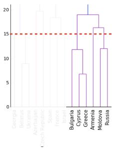
- Intermediate clusterings & height on dendrogram
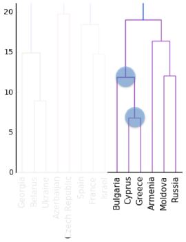
- An intermediate stage in the hierarchical clustering is specified by choosing a height on the dendrogram.
- For example, choosing a height of 15 defines a clustering in which Bulgaria, Cyprus and Greece are in one cluster, Russia and Moldova are in another, and Armenia is in a cluster on its own.
- But what is the meaning of the height?
- Dendrograms show cluster distances
- The y-axis of the dendrogram encodes the distance between merging clusters.
- For example, the distance between the cluster containing Cyprus and the cluster containing Greece was approximately 6 when they were merged into a single cluster.
- When this new cluster was merged with the cluster containing Bulgaria, the distance between them was 12.
- Intermediate clusterings & height on dendrogram
- So the height that specifies an intermediate clustering corresponds to a distance.
- This specifies that the hierarchical clustering should stop merging clusters when all clusters are at least this far apart.
- Distance between clusters
- The distance between two clusters is measured using a “linkage method”.
- In our example, we used “complete” linkage, where the distance between two clusters is the maximum of the distances between their samples.
- This was specified via the “method” parameter.
- There are many other linkage methods, and you’ll see in the exercises that different linkage methods give different hierarchical clusterings!
- Extracting cluster labels
- The cluster labels for any intermediate stage of the hierarchical clustering can be extracted using the fcluster function.
- Let’s try it out, specifying the height of 15.
- Extracting cluster labels using fcluster
- After performing the hierarchical clustering of the Eurovision data, import the fcluster function.
- Then pass the result of the linkage function to the fcluster function, specifying the height as the second argument.
- This returns a numpy array containing the cluster labels for all the countries.
- Aligning cluster labels with country names
- To inspect cluster labels, let’s use a DataFrame to align the labels with the country names.
- Firstly, import pandas, then create the data frame, and then sort by cluster label, printing the result.
- As expected, the cluster labels group Bulgaria, Greece and Cyprus in the same cluster.
- But do note that the scipy cluster labels start at 1, not at 0 like they do in scikit-learn.
1
2
3
| mergings = linkage(euv_samples, method='complete')
labels = fcluster(mergings, 15, criterion='distance')
print(labels)
|
1
2
| [11 13 1 26 22 21 12 9 19 10 17 33 3 28 4 29 6 5 30 17 24 27 2 5
16 21 14 7 21 18 6 14 20 8 23 4 18 25 3 31 32 15]
|
1
2
| pairs = pd.DataFrame({'labels': labels, 'countries': euvp.index}).sort_values('labels')
pairs
|
| labels | countries |
|---|
| 2 | 1 | Australia |
|---|
| 22 | 2 | Ireland |
|---|
| 38 | 3 | Switzerland |
|---|
| 12 | 3 | Denmark |
|---|
| 35 | 4 | Slovenia |
|---|
| 14 | 4 | F.Y.R. Macedonia |
|---|
| 23 | 5 | Israel |
|---|
| 17 | 5 | Georgia |
|---|
| 16 | 6 | France |
|---|
| 30 | 6 | Norway |
|---|
| 27 | 7 | Malta |
|---|
| 33 | 8 | San Marino |
|---|
| 7 | 9 | Bosnia & Herzegovina |
|---|
| 9 | 10 | Croatia |
|---|
| 0 | 11 | Albania |
|---|
| 6 | 12 | Belgium |
|---|
| 1 | 13 | Armenia |
|---|
| 31 | 14 | Poland |
|---|
| 26 | 14 | Lithuania |
|---|
| 41 | 15 | United Kingdom |
|---|
| 24 | 16 | Italy |
|---|
| 10 | 17 | Cyprus |
|---|
| 19 | 17 | Greece |
|---|
| 36 | 18 | Spain |
|---|
| 29 | 18 | Montenegro |
|---|
| 8 | 19 | Bulgaria |
|---|
| 32 | 20 | Russia |
|---|
| 25 | 21 | Latvia |
|---|
| 5 | 21 | Belarus |
|---|
| 28 | 21 | Moldova |
|---|
| 4 | 22 | Azerbaijan |
|---|
| 34 | 23 | Serbia |
|---|
| 20 | 24 | Hungary |
|---|
| 37 | 25 | Sweden |
|---|
| 3 | 26 | Austria |
|---|
| 21 | 27 | Iceland |
|---|
| 13 | 28 | Estonia |
|---|
| 15 | 29 | Finland |
|---|
| 18 | 30 | Germany |
|---|
| 39 | 31 | The Netherlands |
|---|
| 40 | 32 | Ukraine |
|---|
| 11 | 33 | Czech Republic |
|---|
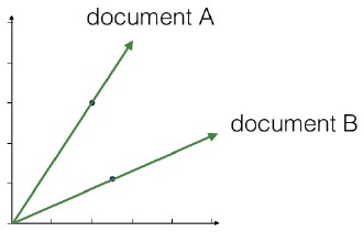
Which clusters are closest?
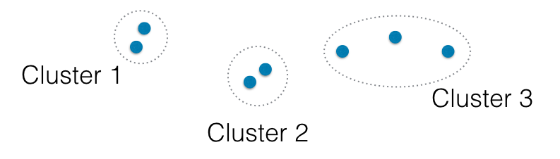
In the video, you learned that the linkage method defines how the distance between clusters is measured. In complete linkage, the distance between clusters is the distance between the furthest points of the clusters. In single linkage, the distance between clusters is the distance between the closest points of the clusters.
Consider the three clusters in the diagram. Which of the following statements are true?
A. In single linkage, Cluster 3 is the closest to Cluster 2.
B. In complete linkage, Cluster 1 is the closest to Cluster 2.
Possible Answers
Neither A nor B.A only.- Both A and B.
Different linkage, different hierarchical clustering
In the video, you saw a hierarchical clustering of the voting countries at the Eurovision song contest using 'complete' linkage. Now, perform a hierarchical clustering of the voting countries with 'single' linkage, and compare the resulting dendrogram with the one in the video. Different linkage, different hierarchical clustering!
You are given an array samples. Each row corresponds to a voting country, and each column corresponds to a performance that was voted for. The list country_names gives the name of each voting country. This dataset was obtained from Eurovision.
Instructions
- Import
linkage and dendrogram from scipy.cluster.hierarchy. - Perform hierarchical clustering on
samples using the linkage() function with the method='single' keyword argument. Assign the result to mergings. - Plot a dendrogram of the hierarchical clustering, using the list
country_names as the labels. In addition, specify the leaf_rotation=90, and leaf_font_size=6 keyword arguments as you have done earlier.
1
| country_names = euv['From country'].unique()
|
1
2
3
4
5
6
7
8
9
10
11
| # Perform the necessary imports
# import matplotlib.pyplot as plt
# from scipy.cluster.hierarchy import linkage, dendrogram
# Calculate the linkage: mergings
mergings = linkage(euv_samples, method='single')
# Plot the dendrogram
plt.figure(figsize=(16, 6))
dendrogram(mergings, labels=country_names, leaf_rotation=90, leaf_font_size=12)
plt.show()
|
As you can see, performing single linkage hierarchical clustering produces a different dendrogram!
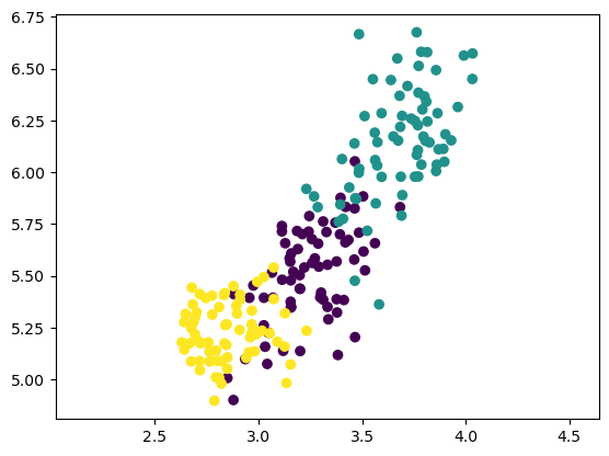
Displayed on the right is the dendrogram for the hierarchical clustering of the grain samples that you computed earlier. If the hierarchical clustering were stopped at height 6 on the dendrogram, how many clusters would there be?
Possible Answers
1- 3
As many as there were at the beginning.
In the previous exercise, you saw that the intermediate clustering of the grain samples at height 6 has 3 clusters. Now, use the fcluster() function to extract the cluster labels for this intermediate clustering, and compare the labels with the grain varieties using a cross-tabulation.
The hierarchical clustering has already been performed and mergings is the result of the linkage() function. The list varieties gives the variety of each grain sample.
Instructions
- Import:
pandas as pd.fcluster from scipy.cluster.hierarchy.
- Perform a flat hierarchical clustering by using the
fcluster() function on mergings. Specify a maximum height of 6 and the keyword argument criterion='distance'. - Create a DataFrame
df with two columns named 'labels' and 'varieties', using labels and varieties, respectively, for the column values. This has been done for you. - Create a cross-tabulation
ct between df['labels'] and df['varieties'] to count the number of times each grain variety coincides with each cluster label.
1
2
3
4
5
6
7
| # the DataCamp sample uses a subset of the seed data; the linkage result is very dependant upon the random_state
seed_sample = sed.groupby('varieties').sample(n=14, random_state=250)
samples = seed_sample.iloc[:, :7]
varieties = seed_sample.varieties.tolist()
# Calculate the linkage: mergings
mergings = linkage(samples, method='complete')
|
1
2
3
4
5
6
7
8
9
10
11
12
13
14
15
| # Perform the necessary imports
# import pandas as pd
# from scipy.cluster.hierarchy import fcluster
# Use fcluster to extract labels: labels
labels = fcluster(mergings, 6, criterion='distance')
# Create a DataFrame with labels and varieties as columns: df
df = pd.DataFrame({'labels': labels, 'varieties': varieties})
# Create crosstab: ct
ct = pd.crosstab(df.labels, df.varieties)
# Display ct
ct
|
| varieties | Canadian wheat | Kama wheat | Rosa wheat |
|---|
| labels | | | |
|---|
| 1 | 0 | 1 | 14 |
|---|
| 2 | 14 | 1 | 0 |
|---|
| 3 | 0 | 12 | 0 |
|---|
t-SNE for 2-dimensional maps
- In this video, you’ll learn about an unsupervised learning method for visualization called “t-SNE”.
- t-SNE for 2-dimensional maps
- t-SNE stands for “t-distributed stochastic neighbor embedding”.
- It has a complicated name, but it serves a very simple purpose.
- It maps samples from their high-dimensional space into a 2- or 3-dimensional space so they can visualized.
- While some distortion is inevitable, t-SNE does a great job of approximately representing the distances between the samples.
- For this reason, t-SNE is an invaluable visual aid for understanding a dataset.
- t-SNE on the iris dataset
- To see what sorts of insights are possible with t-SNE, let’s look at how it performs on the iris dataset.
- The iris samples are in a four dimensional space, where each dimension corresponds to one of the four iris measurements, such as petal length and petal width.
- Now t-SNE was given only the measurements of the iris samples.
- In particular it wasn’t given any information about the three species of iris.
- But if we color the species differently on the scatter plot, we see that t-SNE has kept the species separate.
- Interpreting t-SNE scatter plots
- This scatter plot gives us a new insight.
- We learn that there are two iris species, versicolor and virginica, whose samples are close together in space.
- So it could happen that the iris dataset appears to have two clusters, instead of three.
- This is compatible with our previous examples using k-means, where we saw that a clustering with 2 clusters also had relatively low inertia, meaning tight clusters.
- t-SNE in sklearn
- t-SNE is available in scikit-learn, but it works a little differently to the fit/transform components you’ve already met.
- Let’s see it in action on the iris dataset.
- The samples are in a 2-dimensional numpy array, and there is a list giving the species of each sample.
- To start with, import TSNE and create a TSNE object.
- Apply the fit_transform method to the samples, and then make a scatter plot of the result, coloring the points using the species.
- There are two aspects that deserve special attention: the fit_transform method, and the learning rate.
- t-SNE has only fit_transform()
- t-SNE only has a fit_transform method.
- As you might expect, the fit_transform method simultaneously fits the model and transforms the data.
- However, t-SNE does not have separate fit and transform methods.
- This means that you can’t extend a t-SNE map to include new samples.
- Instead, you have to start over each time.
- t-SNE learning rate
- The second thing to notice is the learning rate.
- The learning rate makes the use of t-SNE more complicated than some other techniques.
- You may need to try different learning rates for different datasets.
- It is clear, however, when you’ve made a bad choice, because all the samples appear bunched together in the scatter plot.
- Normally it’s enough to try a few values between 50 and 200.
- Different every time
- A final thing to be aware of is that the axes of a t-SNE plot do not have any interpretable meaning.
- In fact, they are different every time t-SNE is applied, even on the same data.
- For example, here are three t-SNE plots of the scaled Piedmont wine samples, generated using the same code.
- Note that while the orientation of the plot is different each time, the three wine varieties, represented here using colors, have the same position relative to one another.
1
2
3
4
5
6
7
8
9
10
11
12
13
14
15
16
17
18
| rs = [100, 200, 300]
fig, axes = plt.subplots(ncols=3, figsize=(15, 3))
axes = axes.ravel()
for i, state in enumerate(rs):
ax = axes[i]
model = TSNE(learning_rate=100, random_state=state)
transformed = model.fit_transform(iris.iloc[:, :4])
xs = transformed[:, 0]
ys = transformed[:, 1]
sns.scatterplot(x=xs, y=ys, hue=iris.species, ax=ax)
ax.set_title(f't-SNE applied to Iris with random_state={state}')
plt.tight_layout()
plt.show()
|
t-SNE visualization of grain dataset
In the video, you saw t-SNE applied to the iris dataset. In this exercise, you’ll apply t-SNE to the grain samples data and inspect the resulting t-SNE features using a scatter plot. You are given an array samples of grain samples and a list variety_numbers giving the variety number of each grain sample.
Instructions
- Import
TSNE from sklearn.manifold. - Create a TSNE instance called
model with learning_rate=200. - Apply the
.fit_transform() method of model to samples. Assign the result to tsne_features. - Select the column
0 of tsne_features. Assign the result to xs. - Select the column
1 of tsne_features. Assign the result to ys. - Make a scatter plot of the t-SNE features
xs and ys. To color the points by the grain variety, specify the additional keyword argument c=variety_numbers.
1
2
3
| samples = sed.iloc[:, :7]
variety_numbers = sed[7]
variety_names = sed.varieties
|
1
2
3
4
5
6
7
8
9
10
11
12
13
14
15
16
17
18
19
| # Import TSNE
# from sklearn.manifold import TSNE
# Create a TSNE instance: model
model = TSNE(learning_rate=200, random_state=300)
# Apply fit_transform to samples: tsne_features
tsne_features = model.fit_transform(samples)
# Select the 0th feature: xs
xs = tsne_features[:,0]
# Select the 1st feature: ys
ys = tsne_features[:,1]
# Scatter plot, coloring by variety_numbers
# plt.scatter(xs, ys, c=variety_numbers)
sns.scatterplot(x=xs, y=ys, hue=variety_names)
plt.show()
|
A t-SNE map of the stock market
t-SNE provides great visualizations when the individual samples can be labeled. In this exercise, you’ll apply t-SNE to the company stock price data. A scatter plot of the resulting t-SNE features, labeled by the company names, gives you a map of the stock market! The stock price movements for each company are available as the array normalized_movements (these have already been normalized for you). The list companies gives the name of each company. PyPlot (plt) has been imported for you.
Instructions
- Import
TSNE from sklearn.manifold. - Create a TSNE instance called
model with learning_rate=50. - Apply the
.fit_transform() method of model to normalized_movements. Assign the result to tsne_features. - Select column
0 and column 1 of tsne_features. - Make a scatter plot of the t-SNE features
xs and ys. Specify the additional keyword argument alpha=0.5. - Code to label each point with its company name has been written for you using
plt.annotate(), so just hit ‘Submit Answer’ to see the visualization!
1
2
3
4
5
6
7
8
9
10
11
12
13
14
15
16
17
18
19
20
21
22
23
| # Import TSNE
# from sklearn.manifold import TSNE
# Create a TSNE instance: model
model = TSNE(learning_rate=50, random_state=300)
# Apply fit_transform to normalized_movements: tsne_features
tsne_features = model.fit_transform(normalized_movements)
# Select the 0th feature: xs
xs = tsne_features[:, 0]
# Select the 1th feature: ys
ys = tsne_features[:, 1]
# Scatter plot
plt.figure(figsize=(16, 10))
plt.scatter(xs, ys, alpha=0.5)
# Annotate the points
for x, y, company in zip(xs, ys, companies):
plt.annotate(company, (x, y), fontsize=10, alpha=0.75)
plt.show()
|
It’s visualizations such as this that make t-SNE such a powerful tool for extracting quick insights from high dimensional data.
Decorrelating your data and dimension reduction
Dimension reduction summarizes a dataset using its common occuring patterns. In this chapter, you’ll learn about the most fundamental of dimension reduction techniques, “Principal Component Analysis” (“PCA”). PCA is often used before supervised learning to improve model performance and generalization. It can also be useful for unsupervised learning. For example, you’ll employ a variant of PCA will allow you to cluster Wikipedia articles by their content!
- In the next two chapters you’ll learn techniques for dimension reduction.
- Dimension reduction
- Dimension reduction finds patterns in data, and uses these patterns to re-express it in a compressed form.
- This makes subsequent computation with the data much more efficient, and this can be a big deal in a world of big datasets.
- However, the most important function of dimension reduction is to reduce a dataset to its “bare bones”, discarding noisy features that cause big problems for supervised learning tasks like regression and classification.
- In many real-world applications, it’s dimension reduction that makes prediction possible.
- Principal Component Analysis
- In this chapter, you’ll learn about the most fundamental of dimension reduction techniques.
- It’s called “Principal Component Analysis”, or “PCA” for short.
- PCA performs dimension reduction in two steps, and the first one, called “de-correlation”, doesn’t change the dimension of the data at all.
- It’s this first step that we’ll focus on in this video.
- PCA aligns data with axes
- In this first step, PCA rotates the samples so that they are aligned with the coordinate axes.
- In fact, it does more than this: PCA also shifts the samples so that they have mean zero.
- These scatter plots show the effect of PCA applied to two features of the wine dataset.
- Notice that no information is lost - this is true no matter how many features your dataset has.
- You’ll practice visualizing this transformation in the exercises.
- PCA follows the fit/transform pattern
- scikit-learn has an implementation of
PCA, and it has fit() and transform() methods just like StandardScaler. - The fit method learns how to shift and how to rotate the samples, but doesn’t actually change them.
- The transform method, on the other hand, applies the transformation that fit learned.
- In particular, the transform method can be applied to new, unseen samples.
- Using scikit-learn PCA
from sklearn.decomposition import PCA- Let’s see PCA in action on the some features of the wine dataset.
- Firstly, import PCA.
- Now create a PCA object, and fit it to the samples.
- Then use the fit PCA object to transform the samples.
- This returns a new array of transformed samples.
- PCA features
- This new array has the same number of rows and columns as the original sample array.
- In particular, there is one row for each transformed sample.
- The columns of the new array correspond to “PCA features”, just as the original features corresponded to columns of the original array.
- PCA features are not correlated
- It is often the case that the features of a dataset are correlated.
- This is the case with many of the features of the wine dataset, for instance.
- However, PCA, due to the rotation it performs, “de-correlates” the data, in the sense that the columns of the transformed array are not linearly correlated.
- Pearson correlation
- Linear correlation can be measured with the Pearson correlation.
- It takes values between -1 and 1, where larger values indicate a stronger correlation, and 0 indicates no linear correlation.
- Here are some examples of features with varying degrees of correlation.
- Principal components
- Finally, PCA is called “principal component analysis” because it learns the “principal components” of the data.
- These are the directions in which the samples vary the most, depicted here in red.
- “Principal components” = directions of variance
- It is the principal components that PCA aligns with the coordinate axes.
- After a PCA model has been fit, the principal components are available as the components attribute.
- This is numpy array with one row for each principal component.
1
2
| wine_samples = win[['total_phenols', 'od280']]
wine_samples.head(3)
|
| total_phenols | od280 |
|---|
| 0 | 2.80 | 3.92 |
|---|
| 1 | 2.65 | 3.40 |
|---|
| 2 | 2.80 | 3.17 |
|---|
1
| wine_samples.corr().round(1)
|
| total_phenols | od280 |
|---|
| total_phenols | 1.0 | 0.7 |
|---|
| od280 | 0.7 | 1.0 |
|---|
1
2
3
4
5
6
| wine_model = PCA()
wine_model.fit(wine_samples)
wine_transformed = wine_model.transform(wine_samples)
wine_transformed_df = pd.DataFrame(wine_transformed, columns=['total_phenols', 'od280'])
wine_transformed_df.head(3)
|
| total_phenols | od280 |
|---|
| 0 | -1.327720 | 0.451396 |
|---|
| 1 | -0.832496 | 0.233100 |
|---|
| 2 | -0.752169 | -0.029479 |
|---|
1
| wine_transformed_df.corr().round(1)
|
| total_phenols | od280 |
|---|
| total_phenols | 1.0 | 0.0 |
|---|
| od280 | 0.0 | 1.0 |
|---|
1
2
| array([[-0.64116665, -0.76740167],
[-0.76740167, 0.64116665]])
|
1
2
3
4
5
6
7
8
9
10
11
12
13
| fig, (ax1, ax2) = plt.subplots(ncols=2, figsize=(10, 4))
sns.scatterplot(data=wine_samples, x='total_phenols', y='od280', hue=win.class_name, ax=ax1)
ax1.set_ylim(-4, 6)
ax1.set_xlim(-4, 6)
ax1.set_title('Not Scaled')
sns.scatterplot(data=wine_transformed_df, x='total_phenols', y='od280', hue=win.class_name, ax=ax2)
ax2.set_ylim(-4, 6)
ax2.set_xlim(-4, 6)
ax2.set_title('PCA Scaled')
plt.tight_layout()
plt.show()
|
You are given an array grains giving the width and length of samples of grain. You suspect that width and length will be correlated. To confirm this, make a scatter plot of width vs length and measure their Pearson correlation.
Instructions
- Import:
matplotlib.pyplot as plt.pearsonr from scipy.stats.
- Assign column
0 of grains to width and column 1 of grains to length. - Make a scatter plot with
width on the x-axis and length on the y-axis. - Use the
pearsonr() function to calculate the Pearson correlation of width and length.
1
2
3
| grains = sed[[4, 3]].to_numpy()
varieties = sed[7]
grains[:2, :]
|
1
2
| array([[3.312, 5.763],
[3.333, 5.554]])
|
1
2
3
4
5
6
7
8
9
10
11
12
13
14
15
16
17
18
19
20
| # Perform the necessary imports
# import matplotlib.pyplot as plt
# from scipy.stats import pearsonr
# Assign the 0th column of grains: width
width = grains[:, 0]
# Assign the 1st column of grains: length
length = grains[:, 1]
# Scatter plot width vs length
plt.scatter(width, length, c=varieties)
plt.axis('equal')
plt.show()
# Calculate the Pearson correlation
correlation, pvalue = pearsonr(width, length)
# Display the correlation
print(correlation)
|
1
2
3
| p = sns.scatterplot(data=sed, x=4, y=3, hue='varieties')
p.set_xlabel('width')
p.set_ylabel('length')
|
| 4 | 3 |
|---|
| 4 | 1.000000 | 0.860415 |
|---|
| 3 | 0.860415 | 1.000000 |
|---|
Decorrelating the grain measurements with PCA
You observed in the previous exercise that the width and length measurements of the grain are correlated. Now, you’ll use PCA to decorrelate these measurements, then plot the decorrelated points and measure their Pearson correlation.
Instructions
- Import
PCA from sklearn.decomposition. - Create an instance of
PCA called model. - Use the
.fit_transform() method of model to apply the PCA transformation to grains. Assign the result to pca_features. - The subsequent code to extract, plot, and compute the Pearson correlation of the first two columns
pca_features has been written for you, so hit ‘Submit Answer’ to see the result!
1
2
3
4
5
6
7
8
9
10
11
12
13
14
15
16
17
18
19
20
21
22
23
24
25
| # Import PCA
# from sklearn.decomposition import PCA
# Create PCA instance: model
model = PCA()
# Apply the fit_transform method of model to grains: pca_features
pca_features = model.fit_transform(grains)
# Assign 0th column of pca_features: xs
xs = pca_features[:,0]
# Assign 1st column of pca_features: ys
ys = pca_features[:,1]
# Scatter plot xs vs ys
plt.scatter(xs, ys, c=varieties)
plt.axis('equal')
plt.show()
# Calculate the Pearson correlation of xs and ys
correlation, pvalue = pearsonr(xs, ys)
# Display the correlation
print(f'Correlation: {round(correlation)}')
|
Principal components
There are three scatter plots of the same point cloud. Each scatter plot shows a different set of axes (in red). In which of the plots could the axes represent the principal components of the point cloud?
Recall that the principal components are the directions along which the the data varies.
Possible Answers
None of them.- Both plot 1 and plot 3.
- You’ve correctly inferred that the principal components have to align with the axes of the point cloud. This happens in both plot 1 and plot 3.
Plot 2.
Intrinsic dimension
- Intrinsic dimension of a flight path
- Consider this dataset with 2 features: latitude and longitude.
- These two features might track the flight of an airplane, for example.
- This dataset is 2-dimensional, yet it turns out that it can be closely approximated using only one feature: the displacement along the flight path.
- This dataset is intrinsically one-dimensional.
- Intrinsic dimension
- The intrinsic dimension of a dataset is the number of features required to approximate it.
- The intrinsic dimension informs dimension reduction, because it tells us how much a dataset can be compressed.
- In this video, you’ll gain a solid understanding of the intrinsic dimension, and be able to use PCA to identify it in real-world datasets that have thousands of features.
- Versicolor dataset
- To better illustrate the intrinsic dimension, let’s consider an example dataset containing only some of the samples from the iris dataset.
- Specifically, let’s take three measurements from the iris versicolor samples: sepal length, sepal width, and petal width.
- So each sample is represented as a point in 3-dimensional space.
- Versicolor dataset has intrinsic dimension 2
- However, if we make a 3d scatter plot of the samples, we see that they all lie very close to a flat, 2-dimensional sheet.
- This means that the data can be approximated by using only two coordinates, without losing much information.
- So this dataset has intrinsic dimension 2.
- PCA identifies intrinsic dimension
- But scatter plots are only possible if there are 3 features or less.
- So how can the intrinsic dimension be identified, even if there are many features?
- This is where PCA is really helpful.
- The intrinsic dimension can be identified by counting the PCA features that have high variance.
- To see how, let’s see what happens when PCA is applied to the dataset of versicolor samples.
- PCA of the versicolor samples
- PCA rotates and shifts the samples to align them with the coordinate axes.
- This expresses the samples using three PCA features.
- PCA features are ordered by variance descending
- The PCA features are in a special order.
- Here is a bar graph showing the variance of each of the PCA features.
- As you can see, each PCA feature has less variance than the last, and in this case the last PCA feature has very low variance.
- This agrees with the scatter plot of the PCA features, where the samples don’t vary much in the vertical direction.
- In the other two directions, however, the variance is apparent.
- Variance and intrinsic dimension
- The intrinsic dimension is the number of PCA features that have significant variance.
- In our example, only the first two PCA features have significant variance.
- So this dataset has intrinsic dimension 2, which agrees with what we observed when inspecting the scatter plot.
- Plotting the variances of PCA features
- Let’s see how to plot the variances of the PCA features in practice.
- Firstly, make the necessary imports.
- Then create a PCA model, and fit it to the samples.
- Now create a range enumerating the PCA features, and make a bar plot of the variances; the variances are available as the explained_variance attribute of the PCA model.
- Intrinsic dimension can be ambiguous
- The intrinsic dimension is a useful idea that helps to guide dimension reduction.
- However, it is not always unambiguous.
- Here is a graph of the variances of the PCA features for the wine dataset.
- We could argue for an intrinsic dimension of 2, of 3, or even more, depending upon the threshold you chose.
1
2
3
4
5
| iris = sns.load_dataset('iris')
iris.head()
y = iris.species.astype('category').cat.codes
vers = iris[iris.species.eq('versicolor')]
|
1
2
3
4
5
6
7
8
9
10
| fig = plt.figure(1, figsize=(8, 6))
ax = Axes3D(fig, elev=15, azim=40)
ax.scatter(iris.sepal_length, iris.sepal_width, iris.petal_width, c=y, edgecolor='k', s=40)
ax.set_title("Iris")
ax.set_xlabel("Sepal Length")
ax.set_ylabel("Sepal Width")
ax.set_zlabel("Petal Width")
plt.show()
|
1
| <Figure size 800x600 with 0 Axes>
|
1
2
3
4
5
6
7
8
9
10
11
12
13
14
| pca = PCA()
iris_reduced = pca.fit_transform(iris[['sepal_length', 'sepal_width', 'petal_width']])
fig = plt.figure(1, figsize=(8, 6))
ax = Axes3D(fig, elev=25, azim=55)
ax.scatter(iris_reduced[:, 0], iris_reduced[:, 1], iris_reduced[:, 2], c=y, edgecolor='k', s=40)
ax.set_title("Iris Reduced")
ax.set_xlabel("Sepal Length")
ax.set_ylabel("Sepal Width")
ax.set_zlabel("Petal Width")
plt.show()
|
1
| <Figure size 800x600 with 0 Axes>
|
1
2
3
4
5
6
7
8
9
10
11
12
13
14
| fig = plt.figure(1, figsize=(8, 6))
ax = Axes3D(fig, elev=25, azim=-235)
ax.scatter(vers.sepal_length, vers.sepal_width, vers.petal_width, edgecolor='k', s=40)
ax.set_title("Versicolor")
ax.set_xlabel("Sepal Length")
ax.set_ylabel("Sepal Width")
ax.set_zlabel("Petal Width")
ax.set_xlim(4.5, 7.5)
ax.set_ylim(1.5, 4.0)
ax.set_zlim(0, 2.5)
plt.show()
|
1
| <Figure size 800x600 with 0 Axes>
|
1
2
3
4
5
6
7
8
9
10
11
12
13
14
15
16
17
18
19
| pca = PCA()
pca.fit(vers[['sepal_length', 'sepal_width', 'petal_width']])
vers_reduced = pca.transform(vers[['sepal_length', 'sepal_width', 'petal_width']])
fig = plt.figure(1, figsize=(8, 6))
ax = Axes3D(fig, elev=15, azim=-245)
ax.scatter(vers_reduced[:, 0], vers_reduced[:, 1], vers_reduced[:, 2], edgecolor='k', s=40)
ax.set_title("Versicolor Reduced")
ax.set_xlabel("Sepal Length")
ax.set_ylabel("Sepal Width")
ax.set_zlabel("Petal Width")
ax.set_xlim(-1.5, 1.5)
ax.set_ylim(-1.5, 1.5)
ax.set_zlim(-1.5, 1.5)
plt.show()
|
1
| <Figure size 800x600 with 0 Axes>
|
1
2
| features = range(pca.n_components_)
features
|
1
| pca.explained_variance_
|
1
| array([0.31838135, 0.06840638, 0.01722043])
|
1
2
| versi_df = pd.DataFrame(vers_reduced, columns=['sepal_length', 'sepal_width', 'petal_width'])
versi_df.var().plot(kind='bar')
|
1
2
3
4
| sepal_length 0.318381
sepal_width 0.068406
petal_width 0.017220
dtype: float64
|
The first principal component
The first principal component of the data is the direction in which the data varies the most. In this exercise, your job is to use PCA to find the first principal component of the length and width measurements of the grain samples, and represent it as an arrow on the scatter plot.
The array grains gives the length and width of the grain samples. PyPlot (plt) and PCA have already been imported for you.
Instructions
- Make a scatter plot of the grain measurements. This has been done for you.
- Create a
PCA instance called model. - Fit the model to the
grains data. - Extract the coordinates of the mean of the data using the
.mean_ attribute of model. - Get the first principal component of
model using the .components_[0,:] attribute. - Plot the first principal component as an arrow on the scatter plot, using the
plt.arrow() function. You have to specify the first two arguments - mean[0] and mean[1].
1
2
3
4
5
6
7
8
9
10
11
12
13
14
15
16
17
18
19
20
21
| # Make a scatter plot of the untransformed points
plt.scatter(grains[:,0], grains[:,1])
# Create a PCA instance: model
model = PCA()
# Fit model to points
model.fit(grains)
# Get the mean of the grain samples: mean
mean = model.mean_
# Get the first principal component: first_pc
first_pc = model.components_[0, :]
# Plot first_pc as an arrow, starting at mean
plt.arrow(mean[0], mean[1], first_pc[0], first_pc[1], color='red', width=0.01)
# Keep axes on same scale
plt.axis('equal')
plt.show()
|
This is the direction in which the grain data varies the most.
Variance of the PCA features
The fish dataset is 6-dimensional. But what is its intrinsic dimension? Make a plot of the variances of the PCA features to find out. As before, samples is a 2D array, where each row represents a fish. You’ll need to standardize the features first.
Instructions
- Create an instance of
StandardScaler called scaler. - Create a
PCA instance called pca. - Use the
make_pipeline() function to create a pipeline chaining scaler and pca. - Use the
.fit() method of pipeline to fit it to the fish samples samples. - Extract the number of components used using the
.n_components_ attribute of pca. Place this inside a range() function and store the result as features. - Use the
plt.bar() function to plot the explained variances, with features on the x-axis and pca.explained_variance_ on the y-axis.
1
2
| samples = fsh.iloc[:, 1:].to_numpy()
samples[:3, :]
|
1
2
3
| array([[242. , 23.2, 25.4, 30. , 38.4, 13.4],
[290. , 24. , 26.3, 31.2, 40. , 13.8],
[340. , 23.9, 26.5, 31.1, 39.8, 15.1]])
|
1
2
3
4
5
6
7
8
9
10
11
12
13
14
15
16
17
18
19
20
21
22
23
24
25
| # Perform the necessary imports
# from sklearn.decomposition import PCA
# from sklearn.preprocessing import StandardScaler
# from sklearn.pipeline import make_pipeline
# import matplotlib.pyplot as plt
# Create scaler: scaler
scaler = StandardScaler()
# Create a PCA instance: pca
pca = PCA()
# Create pipeline: pipeline
pipeline = make_pipeline(scaler, pca)
# Fit the pipeline to 'samples'
pipeline.fit(samples)
# Plot the explained variances
features = range(pca.n_components_)
plt.bar(features, pca.explained_variance_)
plt.xlabel('PCA feature')
plt.ylabel('variance')
plt.xticks(features)
plt.show()
|
It looks like PCA features 0 and 1 have significant variance.
Intrinsic dimension of the fish data
In the previous exercise, you plotted the variance of the PCA features of the fish measurements. Looking again at your plot, what do you think would be a reasonable choice for the “intrinsic dimension” of the fish measurements? Recall that the intrinsic dimension is the number of PCA features with significant variance.
Possible Answers
1- 2
- Since PCA features 0 and 1 have significant variance, the intrinsic dimension of this dataset appears to be 2.
5
Dimension reduction with PCA
- Dimension reduction
- Dimension reduction represents the same data using less features and is vital for building machine learning pipelines using real-world data.
- Finally, in this video, you’ll learn how to perform dimension reduction using PCA.
- Dimension reduction with PCA
- We’ve already seen that the PCA features are in decreasing order of variance.
- PCA performs dimension reduction by discarding the PCA features with lower variance, which it assumes to be noise, and retaining the higher variance PCA features, which it assumes to be informative.
- To use PCA for dimension reduction, you need to specify how many PCA features to keep.
- For example, specifying n_components=2 when creating a PCA model tells it to keep only the first two PCA features.
- A good choice is the intrinsic dimension of the dataset, if you know it.
- Let’s consider an example right away.
- Dimension reduction of iris dataset
- The iris dataset has 4 features representing the 4 measurements.
- Here, the measurements are in a numpy array called samples.
- Let’s use PCA to reduce the dimension of the iris dataset to only 2.
- Begin by importing PCA as usual.
- Create a PCA model specifying n_components=2, and then fit the model and transform the samples as usual.
- Printing the shape of the transformed samples, we see that there are only two features, as expected.
- Iris dataset in 2 dimensions
- Here is a scatterplot of the two PCA features, where the colors represent the three species of iris.
- Remarkably, despite having reduced the dimension from 4 to 2, the species can still be distinguished.
- Remember that PCA didn’t even know that there were distinct species.
- PCA simply took the 2 PCA features with highest variance.
- As we can see, these two features are very informative.
- Dimension reduction with PCA
- PCA discards the low variance features, and assumes that the higher variance features are informative.
- Like all assumptions, there are cases where this doesn’t hold.
- As we saw with the iris dataset, however, it often does in practice.
- Word frequency arrays
- In some cases, an alternative implementation of PCA needs to be used.
- Word frequency arrays are a great example.
- In a word-frequency array, each row corresponds to a document, and each column corresponds to a word from a fixed vocabulary.
- The entries of the word-frequency array measure how often each word appears in each document.
- Only some of the words from the vocabulary appear in any one document, so most entries of the word frequency array are zero.
- Sparse arrays and
csr_matrix- Arrays like this are said to be sparse, and are often represented using a special type of array called a csr_matrix.
- Sparse: most entries are zero
- CSR: compressed sparse row
- Can use
scipy.sparse.csr_matrix instead of NumPy array csr_matrices save space by remembering only the non-zero entries of the array.
- TruncatedSVD and csr_matrix
- Scikit-learn’s
PCA doesn’t supportcsr_matrices, and you’ll need to use TruncatedSVD instead. TruncatedSVD performs the same transformation as PCA, but accepts csr matrices as input.- Other than that, you interact with TruncatedSVD and PCA in exactly the same way.
Dimension Reduction of the Iris Dataset
1
2
3
4
| pca = PCA(n_components=2)
pca.fit(iris.iloc[:, :4])
transformed = pca.transform(iris.iloc[:, :4])
transformed.shape
|
1
2
3
4
| xs = transformed[:,0]
ys = transformed[:,1]
sns.scatterplot(x=xs, y=ys, hue=iris.species)
plt.show()
|
TruncatedSVD and csr_matrix
| 0 | 1 | 2 | 3 | 4 | 5 |
|---|
| HTTP 404 | 0.0 | 0.0 | 0.000000 | 0.0 | 0.0 | 0.0 |
|---|
| Alexa Internet | 0.0 | 0.0 | 0.029607 | 0.0 | 0.0 | 0.0 |
|---|
| Internet Explorer | 0.0 | 0.0 | 0.000000 | 0.0 | 0.0 | 0.0 |
|---|
1
2
3
4
| model = TruncatedSVD(n_components=3)
model.fit(wik1) # documents is csr_matrix
TruncatedSVD(algorithm='randomized')
transformed = model.transform(wik1)
|
1
2
3
| array([[0.08762773, 0.0379932 , 0.10293489],
[0.14416571, 0.04489059, 0.11561421],
[0.10969886, 0.02656882, 0.07616178]])
|
Dimension reduction of the fish measurements
In a previous exercise, you saw that 2 was a reasonable choice for the “intrinsic dimension” of the fish measurements. Now use PCA for dimensionality reduction of the fish measurements, retaining only the 2 most important components.
The fish measurements have already been scaled for you, and are available as scaled_samples.
Instructions
- Import
PCA from sklearn.decomposition. - Create a PCA instance called
pca with n_components=2. - Use the
.fit() method of pca to fit it to the scaled fish measurements scaled_samples. - Use the
.transform() method of pca to transform the scaled_samples. Assign the result to pca_features.
1
2
3
4
5
6
7
8
9
10
11
12
13
14
| <class 'pandas.core.frame.DataFrame'>
RangeIndex: 85 entries, 0 to 84
Data columns (total 7 columns):
# Column Non-Null Count Dtype
--- ------ -------------- -----
0 0 85 non-null object
1 1 85 non-null float64
2 2 85 non-null float64
3 3 85 non-null float64
4 4 85 non-null float64
5 5 85 non-null float64
6 6 85 non-null float64
dtypes: float64(6), object(1)
memory usage: 4.8+ KB
|
1
2
3
| scaler = StandardScaler()
scaler.fit(fsh.iloc[:, 1:])
scaled_samples = scaler.transform(fsh.iloc[:, 1:])
|
1
2
3
4
5
6
| array([[-0.50109735, -0.36878558, -0.34323399, -0.23781518, 1.0032125 ,
0.25373964],
[-0.37434344, -0.29750241, -0.26893461, -0.14634781, 1.15869615,
0.44376493],
[-0.24230812, -0.30641281, -0.25242364, -0.15397009, 1.13926069,
1.0613471 ]])
|
1
2
3
4
5
6
7
8
9
10
11
12
13
14
| # Import PCA
# from sklearn.decomposition import PCA
# Create a PCA model with 2 components: pca
pca = PCA(n_components=2)
# Fit the PCA instance to the scaled samples
pca.fit(scaled_samples)
# Transform the scaled samples: pca_features
pca_features = pca.transform(scaled_samples)
# Print the shape of pca_features
pca_features.shape
|
A tf-idf word-frequency array
In this exercise, you’ll create a tf-idf word frequency array for a toy collection of documents. For this, use the TfidfVectorizer from sklearn. It transforms a list of documents into a word frequency array, which it outputs as a csr_matrix. It has fit() and transform() methods like other sklearn objects.
You are given a list documents of toy documents about pets. Its contents have been printed in the IPython Shell.
Instructions
- Import
TfidfVectorizer from sklearn.feature_extraction.text. - Create a
TfidfVectorizer instance called tfidf. - Apply
.fit_transform() method of tfidf to documents and assign the result to csr_mat. This is a word-frequency array in csr_matrix format. - Inspect
csr_mat by calling its .toarray() method and printing the result. This has been done for you. - The columns of the array correspond to words. Get the list of words by calling the
.get_feature_names_out() method of tfidf, and assign the result to words.
1
| documents = ['cats say meow', 'dogs say woof', 'dogs chase cats']
|
1
2
3
4
5
6
7
8
9
10
11
12
13
14
15
16
17
| # Import TfidfVectorizer
# from sklearn.feature_extraction.text import TfidfVectorizer
# Create a TfidfVectorizer: tfidf
tfidf = TfidfVectorizer()
# Apply fit_transform to document: csr_mat
csr_mat = tfidf.fit_transform(documents)
# Print result of toarray() method
print(csr_mat.toarray())
# Get the words: words
words = tfidf.get_feature_names_out()
# Print words
print(words)
|
1
2
3
4
| [[0.51785612 0. 0. 0.68091856 0.51785612 0. ]
[0. 0. 0.51785612 0. 0.51785612 0.68091856]
[0.51785612 0.68091856 0.51785612 0. 0. 0. ]]
['cats' 'chase' 'dogs' 'meow' 'say' 'woof']
|
Clustering Wikipedia part I
You saw in the video that TruncatedSVD is able to perform PCA on sparse arrays in csr_matrix format, such as word-frequency arrays. Combine your knowledge of TruncatedSVD and k-means to cluster some popular pages from Wikipedia. In this exercise, build the pipeline. In the next exercise, you’ll apply it to the word-frequency array of some Wikipedia articles.
Create a Pipeline object consisting of a TruncatedSVD followed by KMeans. (This time, we’ve precomputed the word-frequency matrix for you, so there’s no need for a TfidfVectorizer).
The Wikipedia dataset you will be working with was obtained from here.
Instructions
- Import:
TruncatedSVD from sklearn.decomposition.KMeans from sklearn.cluster.make_pipeline from sklearn.pipeline.
- Create a
TruncatedSVD instance called svd with n_components=50. - Create a
KMeans instance called kmeans with n_clusters=6. - Create a pipeline called
pipeline consisting of svd and kmeans.
1
2
3
4
5
6
7
8
9
10
11
12
13
| # Perform the necessary imports
# from sklearn.decomposition import TruncatedSVD
# from sklearn.cluster import KMeans
# from sklearn.pipeline import make_pipeline
# Create a TruncatedSVD instance: svd
svd = TruncatedSVD(n_components=50)
# Create a KMeans instance: kmeans
kmeans = KMeans(n_clusters=6, n_init=10)
# Create a pipeline: pipeline
pipeline = make_pipeline(svd, kmeans)
|
Clustering Wikipedia part II
It is now time to put your pipeline from the previous exercise to work! You are given an array articles of tf-idf word-frequencies of some popular Wikipedia articles, and a list titles of their titles. Use your pipeline to cluster the Wikipedia articles.
A solution to the previous exercise has been pre-loaded for you, so a Pipeline pipeline chaining TruncatedSVD with KMeans is available.
Instructions
- Import
pandas as pd. - Fit the pipeline to the word-frequency array
articles. - Predict the cluster labels.
- Align the cluster labels with the list
titles of article titles by creating a DataFrame df with labels and titles as columns. This has been done for you. - Use the
.sort_values() method of df to sort the DataFrame by the 'label' column, and print the result. - Hit ‘Submit Answer’ and take a moment to investigate your amazing clustering of Wikipedia pages!
| 0 | 1 | 2 | 3 | 4 |
|---|
| HTTP 404 | 0.0 | 0.0 | 0.000000 | 0.0 | 0.0 |
|---|
| Alexa Internet | 0.0 | 0.0 | 0.029607 | 0.0 | 0.0 |
|---|
| Internet Explorer | 0.0 | 0.0 | 0.000000 | 0.0 | 0.0 |
|---|
| HTTP cookie | 0.0 | 0.0 | 0.000000 | 0.0 | 0.0 |
|---|
| Google Search | 0.0 | 0.0 | 0.000000 | 0.0 | 0.0 |
|---|
1
2
| articles = csr_matrix(wik1)
articles.shape
|
1
2
| titles = wik1.index
print(titles)
|
1
2
3
4
5
6
7
8
9
10
11
12
13
14
15
16
17
18
19
20
| Index(['HTTP 404', 'Alexa Internet', 'Internet Explorer', 'HTTP cookie',
'Google Search', 'Tumblr', 'Hypertext Transfer Protocol',
'Social search', 'Firefox', 'LinkedIn', 'Global warming',
'Nationally Appropriate Mitigation Action', 'Nigel Lawson',
'Connie Hedegaard', 'Climate change', 'Kyoto Protocol', '350.org',
'Greenhouse gas emissions by the United States',
'2010 United Nations Climate Change Conference',
'2007 United Nations Climate Change Conference', 'Angelina Jolie',
'Michael Fassbender', 'Denzel Washington', 'Catherine Zeta-Jones',
'Jessica Biel', 'Russell Crowe', 'Mila Kunis', 'Dakota Fanning',
'Anne Hathaway', 'Jennifer Aniston', 'France national football team',
'Cristiano Ronaldo', 'Arsenal F.C.', 'Radamel Falcao',
'Zlatan Ibrahimović', 'Colombia national football team',
'2014 FIFA World Cup qualification', 'Football', 'Neymar',
'Franck Ribéry', 'Tonsillitis', 'Hepatitis B', 'Doxycycline',
'Leukemia', 'Gout', 'Hepatitis C', 'Prednisone', 'Fever', 'Gabapentin',
'Lymphoma', 'Chad Kroeger', 'Nate Ruess', 'The Wanted', 'Stevie Nicks',
'Arctic Monkeys', 'Black Sabbath', 'Skrillex', 'Red Hot Chili Peppers',
'Sepsis', 'Adam Levine'],
dtype='object')
|
1
2
3
4
5
6
7
8
9
10
11
12
13
14
| # Import pandas
# import pandas as pd
# Fit the pipeline to articles
pipeline.fit(wik1)
# Calculate the cluster labels: labels
labels = pipeline.predict(wik1)
# Create a DataFrame aligning labels and titles: df
df = pd.DataFrame({'label': labels, 'article': titles})
# Display df sorted by cluster label
df.sort_values(['label', 'article'])
|
| label | article |
|---|
| 42 | 0 | Doxycycline |
|---|
| 47 | 0 | Fever |
|---|
| 48 | 0 | Gabapentin |
|---|
| 44 | 0 | Gout |
|---|
| 41 | 0 | Hepatitis B |
|---|
| 45 | 0 | Hepatitis C |
|---|
| 43 | 0 | Leukemia |
|---|
| 49 | 0 | Lymphoma |
|---|
| 46 | 0 | Prednisone |
|---|
| 40 | 0 | Tonsillitis |
|---|
| 19 | 1 | 2007 United Nations Climate Change Conference |
|---|
| 18 | 1 | 2010 United Nations Climate Change Conference |
|---|
| 16 | 1 | 350.org |
|---|
| 14 | 1 | Climate change |
|---|
| 13 | 1 | Connie Hedegaard |
|---|
| 10 | 1 | Global warming |
|---|
| 17 | 1 | Greenhouse gas emissions by the United States |
|---|
| 15 | 1 | Kyoto Protocol |
|---|
| 11 | 1 | Nationally Appropriate Mitigation Action |
|---|
| 12 | 1 | Nigel Lawson |
|---|
| 20 | 2 | Angelina Jolie |
|---|
| 28 | 2 | Anne Hathaway |
|---|
| 23 | 2 | Catherine Zeta-Jones |
|---|
| 27 | 2 | Dakota Fanning |
|---|
| 22 | 2 | Denzel Washington |
|---|
| 29 | 2 | Jennifer Aniston |
|---|
| 24 | 2 | Jessica Biel |
|---|
| 21 | 2 | Michael Fassbender |
|---|
| 26 | 2 | Mila Kunis |
|---|
| 25 | 2 | Russell Crowe |
|---|
| 1 | 3 | Alexa Internet |
|---|
| 8 | 3 | Firefox |
|---|
| 4 | 3 | Google Search |
|---|
| 0 | 3 | HTTP 404 |
|---|
| 3 | 3 | HTTP cookie |
|---|
| 6 | 3 | Hypertext Transfer Protocol |
|---|
| 2 | 3 | Internet Explorer |
|---|
| 9 | 3 | LinkedIn |
|---|
| 7 | 3 | Social search |
|---|
| 5 | 3 | Tumblr |
|---|
| 59 | 4 | Adam Levine |
|---|
| 54 | 4 | Arctic Monkeys |
|---|
| 55 | 4 | Black Sabbath |
|---|
| 50 | 4 | Chad Kroeger |
|---|
| 51 | 4 | Nate Ruess |
|---|
| 57 | 4 | Red Hot Chili Peppers |
|---|
| 58 | 4 | Sepsis |
|---|
| 56 | 4 | Skrillex |
|---|
| 53 | 4 | Stevie Nicks |
|---|
| 52 | 4 | The Wanted |
|---|
| 36 | 5 | 2014 FIFA World Cup qualification |
|---|
| 32 | 5 | Arsenal F.C. |
|---|
| 35 | 5 | Colombia national football team |
|---|
| 31 | 5 | Cristiano Ronaldo |
|---|
| 37 | 5 | Football |
|---|
| 30 | 5 | France national football team |
|---|
| 39 | 5 | Franck Ribéry |
|---|
| 38 | 5 | Neymar |
|---|
| 33 | 5 | Radamel Falcao |
|---|
| 34 | 5 | Zlatan Ibrahimović |
|---|
Discovering interpretable features
In this chapter, you’ll learn about a dimension reduction technique called “Non-negative matrix factorization” (“NMF”) that expresses samples as combinations of interpretable parts. For example, it expresses documents as combinations of topics, and images in terms of commonly occurring visual patterns. You’ll also learn to use NMF to build recommender systems that can find you similar articles to read, or musical artists that match your listening history!
Non-negative matrix factorization (NMF)
- NMF stands for “non-negative matrix factorization”.
- NMF, like PCA, is a dimension reduction technique.
- In constract to PCA, however, NMF models are interpretable.
- This means an NMF models are easier to understand yourself, and much easier for you to explain to others.
- NMF can not be applied to every dataset, however.
- It is required that the sample features be “non-negative”, so greater than or equal to 0.
- Interpretable parts
- NMF achieves its interpretability by decomposing samples as sums of their parts.
- For example, NMF decomposes documents as combinations of common themes, and images as combinations of common patterns.
- You’ll learn about both these examples in detail later.
- For now, let’s focus on getting started.
- Using scikit-learn NMF
- NMF is available in scikit learn, and follows the same
fit/transform pattern as PCA. - However, unlike PCA, the desired number of components must always be specified.
- NMF works both with numpy arrays and sparse arrays in the csr_matrix format.
- Example word-frequency array
- Let’s see an application of NMF to a toy example of a word-frequency array.
- In this toy dataset, there are only 4 words in the vocabulary, and these correspond to the four columns of the word-frequency array.
- Each row represents a document, and the entries of the array measure the frequency of each word in the document using what’s known as “tf-idf”.
- “tf” is the frequency of the word in the document.
- So if 10% of the words in the document are “datacamp”, then the tf of “datacamp” for that document is point-1.
- “idf” is a weighting scheme that reduces the influence of frequent words like “the”.
- Example usage of NMF
- Let’s now see how to use NMF in Python.
- Firstly, import NMF. Create a model, specifying the desired number of components.
- Let’s specify 2. Fit the model to the samples, then use the fit model to perform the transformation.
- NMF components
- Just as PCA has principal components, NMF has components which it learns from the samples, and as with PCA, the dimension of the components is the same as the dimension of the samples.
- In our example, for instance, there are 2 components, and they live in 4 dimensional space, corresponding to the 4 words in the vocabulary.
- The entries of the NMF components are always non-negative.
- NMF features
- The NMF feature values are non-negative, as well.
- As we saw with PCA, our transformed data in this example will have two columns, corresponding to our two new features.
- The features and the components of an NMF model can be combined to approximately reconstruct the original data samples.
- Reconstruction of a sample
- Let’s see how this works with a single data sample.
- Here is a sample representing a document from our toy dataset, and here are its NMF feature values.
- Now if we multiply each NMF components by the corresponding NMF feature value, and add up each column, we get something very close to the original sample.
- Sample reconstruction
- So a sample can be reconstructed by multiplying the NMF components by the NMF feature values of the sample, and adding up.
- This calculation also can be expressed as what is known as a product of matrices.
- We won’t be using that point of view, but that’s where the “matrix factorization”, or “MF”, in NMF comes from.
- NMF fits to non-negative data only
- Finally, remember that NMF can only be applied to arrays of non-negative data, such as word-frequency arrays.
- In the next video, you’ll construct another example by encoding collections of images as non-negative arrays.
- There are many other great examples as well, such as arrays encoding audio spectrograms, and arrays representing the purchase histories on e-Commerce sites.
- The data associated to the example from the slides/lecture is not provided so the
wik1 dataset is used. wik1 has 13125 columns, while the toy example had 4
1
2
3
| model = NMF(n_components=6, init=None)
model.fit(wik1_sparse)
nmf_features = model.transform(wik1_sparse)
|
1
2
3
4
5
6
7
8
9
10
11
12
| array([[1.15100316e-02, 1.22397375e-03, 0.00000000e+00, ...,
0.00000000e+00, 4.28397141e-04, 0.00000000e+00],
[0.00000000e+00, 9.60792422e-06, 5.69479856e-03, ...,
2.82848329e-03, 2.98992983e-04, 0.00000000e+00],
[0.00000000e+00, 8.34872023e-06, 0.00000000e+00, ...,
0.00000000e+00, 1.43953985e-04, 0.00000000e+00],
[4.17489308e-03, 0.00000000e+00, 3.07618771e-03, ...,
1.75345465e-03, 6.76422974e-03, 0.00000000e+00],
[0.00000000e+00, 5.71124236e-04, 4.94162694e-03, ...,
1.92566721e-04, 1.35801269e-03, 0.00000000e+00],
[1.38880936e-04, 0.00000000e+00, 8.78400110e-03, ...,
2.41052638e-03, 1.68913433e-03, 0.00000000e+00]])
|
1
2
| # just the first 6 features
nmf_features[:6]
|
1
2
3
4
5
6
7
8
9
10
11
12
| array([[0. , 0. , 0. , 0. , 0. ,
0.43868139],
[0. , 0. , 0. , 0. , 0. ,
0.56431811],
[0.00377639, 0. , 0. , 0. , 0. ,
0.39703094],
[0. , 0. , 0. , 0. , 0. ,
0.38019254],
[0. , 0. , 0. , 0. , 0. ,
0.48356352],
[0.01278237, 0.01371635, 0.00772634, 0.03321995, 0. ,
0.33317426]])
|
1
| sample_row = wik1.loc['Climate change', :].to_numpy()
|
1
| nmf_features[14, :].reshape((6, 1))
|
1
2
3
4
5
6
| array([[0.00458381],
[0. ],
[0.43277538],
[0. ],
[0.03824124],
[0.00306827]])
|
1
2
| reconstruction = np.sum(nmf_features[14, :].reshape((6, 1)) * model.components_, axis=0)
reconstruction
|
1
2
| array([5.31858918e-05, 3.10640784e-05, 2.15925586e-04, ...,
1.47601263e-05, 1.21378230e-04, 0.00000000e+00])
|
- The reconstructed data isn’t nearly as close is the original example with 4 features transformed into 2 principal components
- In this case, 13125 features were transformed into 6 principal components, which doesn’t reconstruct the original values that well
- Increasing the number of principal components increases the accuracy of the reconstructed value
1
2
| df_exp = pd.DataFrame({'original value': sample_row, 'reconstructed value': reconstruction})
df_exp[df_exp['original value'].gt(0.15)]
|
| original value | reconstructed value |
|---|
| 1865 | 0.182426 | 0.107495 |
|---|
| 2078 | 0.562542 | 0.296025 |
|---|
| 5216 | 0.159313 | 0.109003 |
|---|
| 5818 | 0.214277 | 0.032007 |
|---|
| 11866 | 0.154174 | 0.048423 |
|---|
wik2 contains the columns names of wik1 (i.e. the feature terms)
1
| wik2.iloc[[1865, 2078, 5216, 5818, 11866], :]
|
| 0 |
|---|
| 1865 | change |
|---|
| 2078 | climate |
|---|
| 5216 | global |
|---|
| 5818 | ice |
|---|
| 11866 | temperature |
|---|
Non-negative data
Which of the following 2-dimensional arrays are examples of non-negative data?
A tf-idf word-frequency array. An array daily stock market price movements (up and down), where each row represents a company. An array where rows are customers, columns are products and entries are 0 or 1, indicating whether a customer has purchased a product.
Possible Answers
1 only2 and 3- 1 and 3
- Stock prices can go down as well as up, so an array of daily stock market price movements is not an example of non-negative data.
NMF applied to Wikipedia articles
In the video, you saw NMF applied to transform a toy word-frequency array. Now it’s your turn to apply NMF, this time using the tf-idf word-frequency array of Wikipedia articles, given as a csr matrix articles. Here, fit the model and transform the articles. In the next exercise, you’ll explore the result.
Instructions
- Import
NMF from sklearn.decomposition. - Create an
NMF instance called model with 6 components. - Fit the model to the word count data
articles. - Use the
.transform() method of model to transform articles, and assign the result to nmf_features. - Print
nmf_features to get a first idea what it looks like (.round(2) rounds the entries to 2 decimal places.)
1
2
3
4
5
6
7
8
9
10
11
12
13
14
| # Import NMF
# from sklearn.decomposition import NMF
# Create an NMF instance: model
model = NMF(n_components=6, init=None)
# Fit the model to articles
model.fit(articles)
# Transform the articles: nmf_features
nmf_features = model.transform(articles)
# Print the NMF features
print(nmf_features.round(2))
|
1
2
3
4
5
6
7
8
9
10
11
12
13
14
15
16
17
18
19
20
21
22
23
24
25
26
27
28
29
30
31
32
33
34
35
36
37
38
39
40
41
42
43
44
45
46
47
48
49
50
51
52
53
54
55
56
57
58
59
60
| [[0. 0. 0. 0. 0. 0.44]
[0. 0. 0. 0. 0. 0.56]
[0. 0. 0. 0. 0. 0.4 ]
[0. 0. 0. 0. 0. 0.38]
[0. 0. 0. 0. 0. 0.48]
[0.01 0.01 0.01 0.03 0. 0.33]
[0. 0. 0.02 0. 0.01 0.36]
[0. 0. 0. 0. 0. 0.49]
[0.02 0.01 0. 0.02 0.03 0.48]
[0.01 0.03 0.03 0.07 0.02 0.34]
[0. 0. 0.53 0. 0.03 0. ]
[0. 0. 0.35 0. 0. 0. ]
[0.01 0.01 0.31 0.06 0.01 0.02]
[0. 0.01 0.34 0.01 0. 0. ]
[0. 0. 0.43 0. 0.04 0. ]
[0. 0. 0.48 0. 0. 0. ]
[0.01 0.02 0.37 0.03 0. 0.01]
[0. 0. 0.48 0. 0. 0. ]
[0. 0.01 0.55 0. 0. 0. ]
[0. 0. 0.46 0. 0. 0. ]
[0. 0.01 0.02 0.51 0.06 0.01]
[0. 0. 0. 0.51 0. 0. ]
[0. 0.01 0. 0.42 0. 0. ]
[0. 0. 0. 0.43 0. 0. ]
[0. 0. 0. 0.49 0. 0. ]
[0.1 0.09 0. 0.38 0. 0.01]
[0. 0. 0. 0.57 0. 0.01]
[0.01 0.01 0. 0.47 0. 0.01]
[0. 0. 0. 0.57 0. 0. ]
[0. 0. 0. 0.52 0.01 0.01]
[0. 0.41 0. 0. 0. 0. ]
[0. 0.6 0. 0.01 0. 0. ]
[0.01 0.26 0. 0.02 0.01 0. ]
[0. 0.64 0. 0. 0. 0. ]
[0. 0.61 0. 0. 0. 0. ]
[0. 0.34 0. 0. 0. 0. ]
[0.01 0.31 0.02 0. 0.01 0. ]
[0.01 0.21 0.01 0.05 0.02 0.01]
[0.01 0.46 0. 0.02 0. 0. ]
[0. 0.64 0. 0. 0. 0. ]
[0. 0. 0. 0. 0.47 0. ]
[0. 0. 0. 0. 0.49 0. ]
[0. 0. 0. 0. 0.38 0.01]
[0. 0. 0. 0.01 0.54 0. ]
[0. 0. 0.01 0. 0.42 0. ]
[0. 0. 0. 0. 0.51 0. ]
[0. 0. 0. 0. 0.37 0. ]
[0. 0. 0.04 0. 0.23 0. ]
[0.01 0. 0.02 0.01 0.32 0.04]
[0. 0. 0. 0. 0.42 0. ]
[0.3 0. 0. 0. 0. 0. ]
[0.36 0. 0. 0. 0. 0. ]
[0.39 0.03 0. 0.02 0. 0.02]
[0.37 0. 0. 0.04 0. 0.01]
[0.43 0. 0. 0. 0. 0. ]
[0.45 0. 0. 0. 0. 0. ]
[0.27 0. 0. 0.05 0. 0.02]
[0.44 0. 0. 0. 0.01 0. ]
[0.29 0.01 0.01 0.01 0.19 0.01]
[0.37 0.01 0. 0.1 0.01 0. ]]
|
NMF features of the Wikipedia articles
Now you will explore the NMF features you created in the previous exercise. A solution to the previous exercise has been pre-loaded, so the array nmf_features is available. Also available is a list titles giving the title of each Wikipedia article.
When investigating the features, notice that for both actors, the NMF feature 3 has by far the highest value. This means that both articles are reconstructed using mainly the 3rd NMF component. In the next video, you’ll see why: NMF components represent topics (for instance, acting!).
Instructions
- Import
pandas as pd. - Create a DataFrame
df from nmf_features using pd.DataFrame(). Set the index to titles using index=titles. - Use the
.loc[] accessor of df to select the row with title 'Anne Hathaway', and print the result. These are the NMF features for the article about the actress Anne Hathaway. - Repeat the last step for
'Denzel Washington' (another actor).
1
2
3
4
5
6
7
8
9
10
| # Create a pandas DataFrame: df
df = pd.DataFrame(nmf_features, index=wik1.index)
display(df.head())
# Print the row for 'Anne Hathaway'
display(df.loc['Anne Hathaway'].to_frame())
# Print the row for 'Denzel Washington'
display(df.loc['Denzel Washington'].to_frame())
|
| 0 | 1 | 2 | 3 | 4 | 5 |
|---|
| HTTP 404 | 0.000000 | 0.0 | 0.0 | 0.0 | 0.0 | 0.438763 |
|---|
| Alexa Internet | 0.000000 | 0.0 | 0.0 | 0.0 | 0.0 | 0.564424 |
|---|
| Internet Explorer | 0.003777 | 0.0 | 0.0 | 0.0 | 0.0 | 0.397106 |
|---|
| HTTP cookie | 0.000000 | 0.0 | 0.0 | 0.0 | 0.0 | 0.380264 |
|---|
| Google Search | 0.000000 | 0.0 | 0.0 | 0.0 | 0.0 | 0.483653 |
|---|
| Anne Hathaway |
|---|
| 0 | 0.003815 |
|---|
| 1 | 0.000000 |
|---|
| 2 | 0.000000 |
|---|
| 3 | 0.571900 |
|---|
| 4 | 0.000000 |
|---|
| 5 | 0.000000 |
|---|
| Denzel Washington |
|---|
| 0 | 0.000000 |
|---|
| 1 | 0.005575 |
|---|
| 2 | 0.000000 |
|---|
| 3 | 0.419589 |
|---|
| 4 | 0.000000 |
|---|
| 5 | 0.000000 |
|---|
Notice that for both actors, the NMF feature 3 has by far the highest value. This means that both articles are reconstructed using mainly the 3rd NMF component. In the next video, you’ll see why: NMF components represent topics (for instance, acting!).
NMF reconstructs samples
In this exercise, you’ll check your understanding of how NMF reconstructs samples from its components using the NMF feature values. On the right are the components of an NMF model. If the NMF feature values of a sample are [2, 1], then which of the following is most likely to represent the original sample? A pen and paper will help here! You have to apply the same technique Ben used in the video to reconstruct the sample [0.1203 0.1764 0.3195 0.141].
Possible Answers
[2.2, 1.1, 2.1][0.5, 1.6, 3.1][-4.0, 1.0, -2.0]
1
2
3
4
| mc = np.array([[1., 0.5, 0. ], [0.2, 0.1, 2.1]])
f = np.array([[2], [1]])
np.sum(f * mc, axis=0)
|
NMF learns interpretable parts
- In this video, you’ll learn that the components of NMF represent patterns that frequently occur in the samples.
- Example: NMF learns interpretable parts
- Let’s consider a concrete example, where scientific articles are represented by their word frequencies.
- There are 20000 articles, and 800 words.
- So the array has 800 columns.
- Applying NMF to the articles
- Let’s fit an NMF model with 10 components to the articles.
- The 10 components are stored as the 10 rows of a 2-dimensional numpy array.
- NMF components are topics
- The rows, or components, live in an 800-dimensional space - there is one dimension for each of the words.
- Aligning the words of our vocabulary with the columns of the NMF components allows them to be interpreted.
- Choosing a component, such as this one, and looking at which words have the highest values, we see that they fit a theme: the words are ‘species’, ‘plant’, ‘plants’, ‘genetic’, ‘evolution’ and ‘life’.
- The same happens if any other component is considered.
- NMF components
- So if NMF is applied to documents, then the components correspond to topics, and the NMF features reconstruct the documents from the topics.
- If NMF is applied to a collection of images, on the other hand, then the NMF components represent patterns that frequently occur in the images.
- In this example, for instance, NMF decomposes images from an LCD display into the individual cells of the display.
- This example you’ll investigate for yourself in the exercises.
- To do this, you’ll need to know how to represent a collection of images as a non-negative array.
- Grayscale images
- An image in which all the pixels are shades of gray ranging from black to white is called a “grayscale image”.
- Since there are only shades of grey, a grayscale image can be encoded by the brightness of every pixel.
- Representing the brightness as a number between 0 and 1, where 0 is totally black and 1 is totally white, the image can be represented as 2-dimensional array of numbers.
- Grayscale image example
- Here, for example, is a grayscale photo of the moon!
- Grayscale images as flat arrays
- These 2-dimensional arrays of numbers can then be flattened by enumerating the entries.
- For instance, we could read-off the values row-by-row, from left-to-right and top to bottom.
- The grayscale image is now represented by a flat array of non-negative numbers.
- Encoding a collection of images
- A collection of grayscale images of the same size can thus be encoded as a 2-dimensional array, in which each row represents an image as a flattened array, and each column represents a pixel.
- Viewing the images as samples, and the pixels as features, we see that the data is arranged similarly to the word frequency array.
- Indeed, the entries of this array are non-negative, so NMF can be used to learn the parts of the images.
- Visualizing samples
- It’s difficult to visualize an image by just looking at the flattened array.
- To recover the image, use the reshape method of the sample, specifying the dimensions of the original image as a tuple.
- This yields the 2-dimensional array of pixel brightnesses.
- To display the corresponding image, import pyplot, and pass the 2-dimensional array to the plt dot imshow function.
1
2
3
4
5
| sample = np.array([0, 1, 0.5, 1, 0, 1])
bitmap = sample.reshape((2, 3))
plt.imshow(bitmap, cmap='gray', interpolation='nearest')
plt.show()
|
NMF learns topics of documents
In the video, you learned when NMF is applied to documents, the components correspond to topics of documents, and the NMF features reconstruct the documents from the topics. Verify this for yourself for the NMF model that you built earlier using the Wikipedia articles. Previously, you saw that the 3rd NMF feature value was high for the articles about actors Anne Hathaway and Denzel Washington. In this exercise, identify the topic of the corresponding NMF component.
The NMF model you built earlier is available as model, while words is a list of the words that label the columns of the word-frequency array.
After you are done, take a moment to recognise the topic that the articles about Anne Hathaway and Denzel Washington have in common!
Instructions
- Import
pandas as pd. - Create a DataFrame
components_df from model.components_, setting columns=words so that columns are labeled by the words. - Print
components_df.shape to check the dimensions of the DataFrame. - Use the
.iloc[] accessor on the DataFrame components_df to select row 3. Assign the result to component. - Call the
.nlargest() method of component, and print the result. This gives the five words with the highest values for that component.
1
| words = wik2[0].tolist()
|
1
2
3
4
5
6
7
8
9
10
11
12
13
| # Create a DataFrame: components_df
components_df = pd.DataFrame(model.components_, columns=words)
display(components_df.iloc[:5, :5])
# Print the shape of the DataFrame
print(components_df.shape)
# Select row 3: component
component = components_df.iloc[3, :]
# Print result of nlargest
component.nlargest()
|
| aaron | abandon | abandoned | abandoning | abandonment |
|---|
| 0 | 0.011509 | 0.001224 | 0.000000 | 0.001759 | 0.000138 |
|---|
| 1 | 0.000000 | 0.000010 | 0.005695 | 0.000000 | 0.000002 |
|---|
| 2 | 0.000000 | 0.000008 | 0.000000 | 0.000000 | 0.004715 |
|---|
| 3 | 0.004175 | 0.000000 | 0.003076 | 0.000000 | 0.000618 |
|---|
| 4 | 0.000000 | 0.000571 | 0.004942 | 0.000000 | 0.000000 |
|---|
1
2
3
4
5
6
7
8
9
10
11
12
| (6, 13125)
film 0.632067
award 0.254819
starred 0.246922
role 0.212862
actress 0.187641
Name: 3, dtype: float64
|
Take a moment to recognise the topics that the articles about Anne Hathaway and Denzel Washington have in common!
Explore the LED digits dataset
In the following exercises, you’ll use NMF to decompose grayscale images into their commonly occurring patterns. Firstly, explore the image dataset and see how it is encoded as an array. You are given 100 images as a 2D array samples, where each row represents a single 13x8 image. The images in your dataset are pictures of a LED digital display.
Instructions
- Import
matplotlib.pyplot as plt. - Select row
0 of samples and assign the result to digit. For example, to select column 2 of an array a, you could use a[:,2]. Remember that since samples is a NumPy array, you can’t use the .loc[] or iloc[] accessors to select specific rows or columns. - Print
digit. This has been done for you. Notice that it is a 1D array of 0s and 1s. - Use the
.reshape() method of digit to get a 2D array with shape (13, 8). Assign the result to bitmap. - Print
bitmap, and notice that the 1s show the digit 7! - Use the
plt.imshow() function to display bitmap as an image.
1
| samples = lcd.to_numpy()
|
1
2
3
4
5
6
7
8
9
10
11
12
13
14
15
16
| # Select the 0th row: digit
digit = samples[0]
# Print digit
print(digit)
# Reshape digit to a 13x8 array: bitmap
bitmap = digit.reshape((13, 8))
# Print bitmap
print(bitmap)
# Use plt.imshow to display bitmap
plt.imshow(bitmap, cmap='gray', interpolation='nearest')
plt.colorbar()
plt.show()
|
1
2
3
4
5
6
7
8
9
10
11
12
13
14
15
16
17
18
| [0. 0. 0. 0. 0. 0. 0. 0. 0. 0. 1. 1. 1. 1. 0. 0. 0. 0. 0. 0. 0. 0. 1. 0.
0. 0. 0. 0. 0. 0. 1. 0. 0. 0. 0. 0. 0. 0. 1. 0. 0. 0. 0. 0. 0. 0. 1. 0.
0. 0. 0. 0. 0. 0. 0. 0. 0. 0. 0. 0. 0. 0. 1. 0. 0. 0. 0. 0. 0. 0. 1. 0.
0. 0. 0. 0. 0. 0. 1. 0. 0. 0. 0. 0. 0. 0. 1. 0. 0. 0. 0. 0. 0. 0. 0. 0.
0. 0. 0. 0. 0. 0. 0. 0.]
[[0. 0. 0. 0. 0. 0. 0. 0.]
[0. 0. 1. 1. 1. 1. 0. 0.]
[0. 0. 0. 0. 0. 0. 1. 0.]
[0. 0. 0. 0. 0. 0. 1. 0.]
[0. 0. 0. 0. 0. 0. 1. 0.]
[0. 0. 0. 0. 0. 0. 1. 0.]
[0. 0. 0. 0. 0. 0. 0. 0.]
[0. 0. 0. 0. 0. 0. 1. 0.]
[0. 0. 0. 0. 0. 0. 1. 0.]
[0. 0. 0. 0. 0. 0. 1. 0.]
[0. 0. 0. 0. 0. 0. 1. 0.]
[0. 0. 0. 0. 0. 0. 0. 0.]
[0. 0. 0. 0. 0. 0. 0. 0.]]
|
You’ll explore this dataset further in the next exercise and see for yourself how NMF can learn the parts of images.
NMF learns the parts of images
Now use what you’ve learned about NMF to decompose the digits dataset. You are again given the digit images as a 2D array samples. This time, you are also provided with a function show_as_image() that displays the image encoded by any 1D array:
1
2
3
4
5
6
| def show_as_image(sample):
bitmap = sample.reshape((13, 8))
plt.figure()
plt.imshow(bitmap, cmap='gray', interpolation='nearest')
plt.colorbar()
plt.show()
|
After you are done, take a moment to look through the plots and notice how NMF has expressed the digit as a sum of the components!
Instructions
- Import
NMF from sklearn.decomposition. - Create an
NMF instance called model with 7 components. (7 is the number of cells in an LED display). - Apply the
.fit_transform() method of model to samples. Assign the result to features. - To each component of the model (accessed via
model.components_), apply the show_as_image() function to that component inside the loop. - Assign the row
0 of features to digit_features. - Print
digit_features.
1
2
3
4
5
6
| def show_as_image(sample):
bitmap = sample.reshape((13, 8))
plt.figure()
plt.imshow(bitmap, cmap='gray', interpolation='nearest')
plt.colorbar()
plt.show()
|
1
2
3
4
5
6
7
8
9
10
11
12
13
14
15
16
17
18
| # Import NMF
# from sklearn.decomposition import NMF
# Create an NMF model: model
model = NMF(n_components=7, init=None)
# Apply fit_transform to samples: features
features = model.fit_transform(samples)
# Call show_as_image on each component
for component in model.components_:
show_as_image(component)
# Assign the 0th row of features: digit_features
digit_features = features[0, :]
# Print digit_features
print(digit_features)
|
1
2
| [2.57347960e-01 0.00000000e+00 0.00000000e+00 3.94333376e-01
3.64045642e-01 0.00000000e+00 3.51281663e-14]
|
Take a moment to look through the plots and notice how NMF has expressed the digit as a sum of the components!
PCA doesn’t learn parts
Unlike NMF, PCA doesn’t learn the parts of things. Its components do not correspond to topics (in the case of documents) or to parts of images, when trained on images. Verify this for yourself by inspecting the components of a PCA model fit to the dataset of LED digit images from the previous exercise. The images are available as a 2D array samples. Also available is a modified version of the show_as_image() function which colors a pixel red if the value is negative.
After submitting the answer, notice that the components of PCA do not represent meaningful parts of images of LED digits!
Instructions
- Import
PCA from sklearn.decomposition. - Create a
PCA instance called model with 7 components. - Apply the
.fit_transform() method of model to samples. Assign the result to features. - To each component of the model (accessed via
model.components_), apply the show_as_image() function to that component inside the loop.
1
2
3
4
5
6
7
8
9
10
11
12
| # Import PCA
# from sklearn.decomposition import PCA
# Create a PCA instance: model
model = PCA(n_components=7)
# Apply fit_transform to samples: features
features = model.fit_transform(samples)
# Call show_as_image on each component
for component in model.components_:
show_as_image(component)
|
Notice that the components of PCA do not represent meaningful parts of images of LED digits!
Building recommender systems using NMF
- Finding similar articles
- Suppose that you are an engineer at a large online newspaper.
- You’ve been given the task of recommending articles that are similar to the article currently being read by a customer.
- Given an article, how can you find articles that have similar topics?
- In this video, you’ll learn how to solve this problem, and others like it, by using NMF.
- Strategy
- Our strategy for solving this problem is to apply NMF to the word-frequency array of the articles, and to use the resulting NMF features.
- You learned in the previous videos these NMF features describe the topic mixture of an article.
- So similar articles will have similar NMF features.
- But how can two articles be compared using their NMF features?
- Before answering this question, let’s set the scene by doing the first step.
- Apply NMF to the word-frequency array
- You are given a word frequency array articles corresponding to the collection of newspaper articles in question. Import NMF, create the model, and use the fit_transform method to obtain the transformed articles. Now we’ve got NMF features for every article, given by the columns of the new array.
- Strategy
- Now we need to define how to compare articles using their NMF features.
- Versions of articles
- Similar documents have similar topics, but it isn’t always the case that the NMF feature values are exactly the same.
- For instance, one version of a document might use very direct language, whereas other versions might interleave the same content with meaningless chatter.
- Meaningless chatter reduces the frequency of the topic words overall, which reduces the values of the NMF features representing the topics.
- However, on a scatter plot of the NMF features, all these versions lie on a single line passing through the origin.
- Cosine similarity
- For this reason, when comparing two documents, it’s a good idea to compare these lines.
- We’ll compare them using what is known as the cosine similarity, which uses the angle between the two lines.
- Higher values indicate greater similarity.
- The technical definition of the cosine similarity is out the scope of this course, but we’ve already gained an intuition.
- Calculating the cosine similarities
- Let’s see now how to compute the cosine similarity.
- Firstly, import the normalize function, and apply it to the array of all NMF features.
- Now select the row corresponding to the current article, and pass it to the dot method of the array of all normalized features.
- This results in the cosine similarities.
- DataFrames and labels
- With the help of a pandas DataFrame, we can label the similarities with the article titles.
- Start by importing pandas. After normalizing the NMF features, create a DataFrame whose rows are the normalized features, using the titles as an index.
- Now use the loc method of the DataFrame to select the normalized feature values for the current article, using its title ‘Dog bites man’.
- Calculate the cosine similarities using the dot method of the DataFrame.
- DataFrames and labels
- Finally, use the nlargest method of the resulting pandas Series to find the articles with the highest cosine similarity.
- We see that all of them are concerned with ‘domestic animals’ and/or ‘danger’!
- The data associated to the example from the slides/lecture is not provided so the
wik1 dataset is used.
1
2
3
4
5
6
7
| nmf = NMF(n_components=6, init=None)
nmf_features = nmf.fit_transform(wik1_sparse)
norm_features = normalize(nmf_features)
current_article = norm_features[45, :]
similarities = norm_features.dot(current_article)
print(similarities)
|
1
2
3
4
5
6
7
8
9
10
| [0. 0. 0. 0. 0. 0.
0.01681167 0. 0.05442118 0.05647838 0.05339491 0.
0.03568315 0. 0.08804606 0. 0. 0.
0. 0. 0.11172296 0. 0. 0.
0. 0.00108832 0. 0. 0. 0.02282541
0.00728549 0.00194956 0.02405309 0. 0. 0.01158439
0.01605136 0.0784572 0. 0. 1. 1.
0.9998669 0.99994603 0.99943272 1. 0.99996118 0.98795929
0.99112135 0.99999963 0. 0. 0.00493202 0.
0. 0. 0. 0.01240589 0.54142412 0.03495963]
|
1
2
3
4
| norm_features = normalize(nmf_features)
df = pd.DataFrame(norm_features, index=wik1.index)
current_article = df.loc['Hepatitis C']
similarities = df.dot(current_article)
|
1
| similarities.nlargest(10)
|
1
2
3
4
5
6
7
8
9
10
11
| Tonsillitis 1.000000
Hepatitis B 1.000000
Hepatitis C 1.000000
Lymphoma 1.000000
Prednisone 0.999961
Leukemia 0.999946
Doxycycline 0.999867
Gout 0.999433
Gabapentin 0.991121
Fever 0.987959
dtype: float64
|
Which articles are similar to ‘Cristiano Ronaldo’?
In the video, you learned how to use NMF features and the cosine similarity to find similar articles. Apply this to your NMF model for popular Wikipedia articles, by finding the articles most similar to the article about the footballer Cristiano Ronaldo. The NMF features you obtained earlier are available as nmf_features, while titles is a list of the article titles.
Instructions
- Import
normalize from sklearn.preprocessing. - Apply the
normalize() function to nmf_features. Store the result as norm_features. - Create a DataFrame
df from norm_features, using titles as an index. - Use the
.loc[] accessor of df to select the row of 'Cristiano Ronaldo'. Assign the result to article. - Apply the
.dot() method of df to article to calculate the cosine similarity of every row with article. - Print the result of the
.nlargest() method of similarities to display the most similiar articles. This has been done for you, so hit ‘Submit Answer’ to see the result!
1
2
3
4
5
6
7
8
9
10
11
12
13
14
15
16
17
18
| # Perform the necessary imports
# import pandas as pd
# from sklearn.preprocessing import normalize
# Normalize the NMF features: norm_features
norm_features = normalize(nmf_features)
# Create a DataFrame: df
df = pd.DataFrame(norm_features, index=wik1.index)
# Select the row corresponding to 'Cristiano Ronaldo': article
article = df.loc['Cristiano Ronaldo']
# Compute the dot products: similarities
similarities = df.dot(article)
# Display those with the largest cosine similarity
print(similarities.nlargest())
|
1
2
3
4
5
6
| Cristiano Ronaldo 1.000000
Franck Ribéry 0.999973
Radamel Falcao 0.999942
Zlatan Ibrahimović 0.999942
France national football team 0.999923
dtype: float64
|
You may need to know a little about football (or soccer, depending on where you’re from!) to be able to evaluate for yourself the quality of the computed similarities!
Recommend musical artists part II
In this exercise and the next, you’ll use what you’ve learned about NMF to recommend popular music artists! You are given a sparse array artists whose rows correspond to artists and whose columns correspond to users. The entries give the number of times each artist was listened to by each user.
In this exercise, build a pipeline and transform the array into normalized NMF features. The first step in the pipeline, MaxAbsScaler, transforms the data so that all users have the same influence on the model, regardless of how many different artists they’ve listened to. In the next exercise, you’ll use the resulting normalized NMF features for recommendation!
Instructions
- Import:
NMF from sklearn.decomposition.Normalizer and MaxAbsScaler from sklearn.preprocessing.make_pipeline from sklearn.pipeline.
- Create an instance of
MaxAbsScaler called scaler. - Create an
NMF instance with 20 components called nmf. - Create an instance of
Normalizer called normalizer. - Create a pipeline called
pipeline that chains together scaler, nmf, and normalizer. - Apply the
.fit_transform() method of pipeline to artists. Assign the result to norm_features.
1
2
3
4
5
6
7
8
9
10
11
12
13
14
15
16
17
18
19
| # Perform the necessary imports
# from sklearn.decomposition import NMF
# from sklearn.preprocessing import Normalizer, MaxAbsScaler
# from sklearn.pipeline import make_pipeline
# Create a MaxAbsScaler: scaler
scaler = MaxAbsScaler()
# Create an NMF model: nmf
nmf = NMF(n_components=20, init=None)
# Create a Normalizer: normalizer
normalizer = Normalizer()
# Create a pipeline: pipeline
pipeline = make_pipeline(scaler, nmf, normalizer)
# Apply fit_transform to artists: norm_features
norm_features = pipeline.fit_transform(artists_sparse)
|
Recommend musical artists part II
Suppose you were a big fan of Bruce Springsteen - which other musicial artists might you like? Use your NMF features from the previous exercise and the cosine similarity to find similar musical artists. A solution to the previous exercise has been run, so norm_features is an array containing the normalized NMF features as rows. The names of the musical artists are available as the list artist_names.
Instructions
- Import
pandas as pd. - Create a DataFrame
df from norm_features, using artist_names as an index. - Use the
.loc[] accessor of df to select the row of 'Bruce Springsteen'. Assign the result to artist. - Apply the
.dot() method of df to artist to calculate the dot product of every row with artist. Save the result as similarities. - Print the result of the
.nlargest() method of similarities to display the artists most similar to 'Bruce Springsteen'.
1
2
3
4
5
6
7
8
9
10
11
12
13
14
| # Import pandas
# import pandas as pd
# Create a DataFrame: df
df = pd.DataFrame(norm_features, index=artist_names)
# Select row of 'Bruce Springsteen': artist
artist = df.loc['Bruce Springsteen']
# Compute cosine similarities: similarities
similarities = df.dot(artist)
# Display those with highest cosine similarity
similarities.nlargest()
|
1
2
3
4
5
6
| Bruce Springsteen 1.000000
Leonard Cohen 0.962375
Neil Young 0.950511
The Beach Boys 0.857898
Van Morrison 0.838980
dtype: float64
|
Final Thoughts
You’ve learned all about Unsupervised Learning, and applied the techniques to real-world datasets, and built your knowledge of Python along the way. In particular, you’ve become a whiz at using scikit-learn and scipy for unsupervised learning challenges. You have harnessed both clustering and dimension reduction techniques to tackle serious problems with real-world datasets, such as clustering Wikipedia documents by the words they contain, and recommending musical artists to consumers.
Certificate