Interactive Data Visualization with Bokeh
- Course: DataCamp: Interactive Data Visualization with Bokeh
- This notebook was created as a reproducible reference.
- The material is from the course
- I completed the exercises
- If you find the content beneficial, consider a DataCamp Subscription.
- I added a function (
create_dir_save_file) to automatically download and save the required data (data/2020-03-15_interactive_data_visualization_with_bokeh) and image (Images/2020-03-15_interactive_data_visualization_with_bokeh) files. - The notebook code has be updated to work with Bokeh 3.4.1
- The interactive Bokeh plots are not displayed in the markdown blog rendering. You can view the notebook on nbviewer or run the code in your local environment.
Course Description
Bokeh is an interactive data visualization library for Python, and other languages, that targets modern web browsers for presentation. It can create versatile, data-driven graphics and connect the full power of the entire Python data science stack to create rich, interactive visualizations.
Imports
1
2
3
4
5
6
7
8
9
10
11
12
13
14
15
16
17
18
19
import pandas as pd
from pprint import pprint as pp
from itertools import combinations
from pathlib import Path
import requests
import numpy as np
from bokeh.io import output_notebook, curdoc  # output_file
from bokeh.plotting import figure, show
from bokeh.sampledata.iris import flowers
from bokeh.sampledata.iris import flowers as iris_df
from bokeh.models import ColumnDataSource, HoverTool, CategoricalColorMapper, Slider, Column, Select
from bokeh.models import CheckboxGroup, RadioGroup, Toggle, Button
from bokeh.models import TabPanel, Tabs
from bokeh.layouts import row, column, gridplot
from bokeh.palettes import Spectral6
from bokeh.themes import Theme
import yaml

output_notebook()
Pandas Configuration Options
1
2
3
pd.set_option('display.max_columns', 200)
pd.set_option('display.max_rows', 300)
pd.set_option('display.expand_frame_repr', True)
Functions
1
2
3
4
5
6
7
8
9
10
11
12
13
14
15
16
17
def create_dir_save_file(dir_path: Path, url: str):
    """
    Check if the path exists and create it if it does not.
    Check if the file exists and download it if it does not.
    """
    if not dir_path.parents[0].exists():
        dir_path.parents[0].mkdir(parents=True)
        print(f'Directory Created: {dir_path.parents[0]}')
    else:
        print('Directory Exists')

    if not dir_path.exists():
        r = requests.get(url, allow_redirects=True)
        open(dir_path, 'wb').write(r.content)
        print(f'File Created: {dir_path.name}')
    else:
        print('File Exists')
1
2
data_dir = Path('data/2020-03-15_interactive_data_visualization_with_bokeh')
images_dir = Path('Images/2020-03-15_interactive_data_visualization_with_bokeh')
Datasets
1
2
3
4
5
6
7
8
9
10
11
12
13
14
# AAPL Stock
aapl_url = 'https://assets.datacamp.com/production/repositories/401/datasets/313eb985cce85923756a128e49d7260a24ce6469/aapl.csv'
# Automobile miles per gallon
auto_url = 'https://assets.datacamp.com/production/repositories/401/datasets/2a776ae9ef4afc3f3f3d396560288229e160b830/auto-mpg.csv'
# Gapminder
gap_url = 'https://assets.datacamp.com/production/repositories/401/datasets/09378cc53faec573bcb802dce03b01318108a880/gapminder_tidy.csv'
# Blood glucose levels
glucose_url = 'https://assets.datacamp.com/production/repositories/401/datasets/edcedae3825e0483a15987248f63f05a674244a6/glucose.csv'
# Female literacy and birth rate
female_url = 'https://assets.datacamp.com/production/repositories/401/datasets/5aae6591ddd4819dec17e562f206b7840a272151/literacy_birth_rate.csv'
# Olympic medals (100m sprint)
sprint_url = 'https://assets.datacamp.com/production/repositories/401/datasets/68b7a450b34d1a331d4ebfba22069ce87bb5625d/sprint.csv'
# State coordinates
state_url = 'https://github.com/trenton3983/DataCamp/blob/master/data/2020-03-15_interactive_data_visualization_with_bokeh/state_coordinates.xlsx?raw=true'
1
2
3
4
5
6
7
8
datasets = [aapl_url, auto_url, gap_url, glucose_url, female_url, sprint_url, state_url]
data_paths = list()

for data in datasets:
    file_name = data.split('/')[-1].replace('?raw=true', '')
    data_path = data_dir / file_name
    create_dir_save_file(data_path, data)
    data_paths.append(data_path)
1
2
3
4
5
6
7
8
9
10
11
12
13
14
Directory Exists
File Exists
Directory Exists
File Exists
Directory Exists
File Exists
Directory Exists
File Exists
Directory Exists
File Exists
Directory Exists
File Exists
Directory Exists
File Exists
DataFrames
1
2
3
4
5
6
7
8
9
10
11
12
13
14
aapl = pd.read_csv(data_paths[0])
aapl.drop('Unnamed: 0', axis=1, inplace=True)
aapl['date'] = pd.to_datetime(aapl['date'])
auto = pd.read_csv(data_paths[1])
gap = pd.read_csv(data_paths[2])
gluc = pd.read_csv(data_paths[3])
gluc['datetime'] = pd.to_datetime(gluc['datetime'])
gluc.set_index('datetime', inplace=True, drop=True)
lit = pd.read_csv(data_paths[4])
lit = lit.iloc[0:162, :]
lit[['female literacy', 'fertility']] = lit[['female literacy', 'fertility']].astype('float')
lit.columns = [x.strip() for x in lit.columns]  # Country has a whitespace at the end
run = pd.read_csv(data_paths[5])
state_coor_dict = {state: pd.read_excel(data_paths[6], sheet_name=state) for state in ['az', 'co', 'nm', 'ut']}
Basic plotting with Bokeh
This chapter provides an introduction to basic plotting with Bokeh. You will create your first plots, learn about different data formats Bokeh understands, and make visual customizations for selections and mouse hovering.
What is Bokeh?
- Bokeh at a Glance
- Real Python: Interactive Data Visualization in Python With Bokeh by Christopher Bailey
- Interactive visualization, controls, and tools
- Versatile and high-level graphics
- High-level statistical charts
- Streaming, dynamic, large data
- For the browser, with or without a server
- No JavaScript
What you will learn
- Basic plotting with
bokeh.plotting - Layouts, interactions, and annotations
- Statistical charting with
bokeh.charts - Interactive data applications in the browser
- Case Study: A Gapminder explorer
Plotting with glyphs
What are Glyphs
- Visual shapes
- circles, squares, triangles
- rectangles, lines, wedges
- With properties a!ached to data
- coordinates (x,y)
- size, color, transparency
Typical usage
1
2
3
4
plot = figure(height=300, width=400, tools='pan,box_zoom,reset')
plot.scatter(x=[1, 2, 3, 4, 5], y=[8, 6, 5, 2, 3], color='violet')
# output_file('circle.html')
show(plot)
Glyph properties
- Lists, arrays, sequences of values
- Single fixed values
1
2
3
plot = figure(height=400, width=400, )
plot.scatter(x=10, y=[2, 5, 8, 12], size=[10, 20, 30, 40])
show(plot)
Markers
- asterisk()
- circle()
- circle_cross()
- circle_x()
- cross()
- diamond()
- diamond_cross()
- inverted_triangle()
- square()
- square_cross()
- square_x()
- triangle()
- x()
What are glyphs?
In Bokeh, visual properties of shapes are called glyphs. The visual properties of these glyphs such as position or color can be assigned single values, for example x=10 or fill_color='red'.
What other kinds of values can glyph properties be set to in normal usage?
Answer the question
Dictionaries- Sequences (lists, arrays): Multiple glyphs can be drawn by setting glyph properties to ordered sequences of values.
Sets
A simple scatter plot
In this example, you’re going to make a scatter plot of female literacy vs fertility using data from the European Environmental Agency. This dataset highlights that countries with low female literacy have high birthrates. The x-axis data has been loaded for you as fertility and the y-axis data has been loaded as female_literacy.
Your job is to create a figure, assign x-axis and y-axis labels, and plot female_literacy vs fertility using the circle glyph.
After you have created the figure, in this exercise and the ones to follow, play around with it! Explore the different options available to you on the tab to the right, such as “Pan”, “Box Zoom”, and “Wheel Zoom”. You can click on the question mark sign for more details on any of these tools.
Note: You may have to scroll down to view the lower portion of the figure.
Instructions
- Import the
figurefunction frombokeh.plotting, and theoutput_fileandshowfunctions frombokeh.io. - Create the figure
pwithfigure(). It has two parameters:x_axis_labelandy_axis_label. - Add a circle glyph to the figure
pusing the functionp.scatter()where the inputs are, in order, the x-axis data and y-axis data. - Use the
output_file()function to specify the name'fert_lit.html'for the output file. - Create and display the output file using
show()and passing in the figurep.
1
2
3
4
5
6
7
8
9
10
11
12
13
14
fertility = lit['fertility']
female_literacy = lit['female literacy']

# Create the figure: p
p = figure(height=300, x_axis_label='fertility (children per woman)', y_axis_label='female_literacy (% population)')

# Add a circle glyph to the figure p
p.scatter(fertility, female_literacy)

# Call the output_file() function and specify the name of the file
# output_file('fert_lit.html')

# Display the plot
show(p)
A scatter plot with different shapes
By calling multiple glyph functions on the same figure object, we can overlay multiple data sets in the same figure.
In this exercise, you will plot female literacy vs fertility for two different regions, Africa and Latin America. Each set of x and y data has been loaded separately for you as fertility_africa, female_literacy_africa, fertility_latinamerica, and female_literacy_latinamerica.
Your job is to plot the Latin America data with the circle() glyph, and the Africa data with the x() glyph.
figure has already been imported for you from bokeh.plotting.
Instructions
- Create the figure
pwith thefigure()function. It has two parameters:x_axis_labeland_axis_label. - Add a circle glyph to the figure
pusing the functionp.scatter()where the inputs are the x and y data from Latin America:fertility_latinamericaandfemale_literacy_latinamerica. - Add an x glyph to the figure
pusing the functionp.x()where the inputs are the x and y data from Africa:fertility_africaandfemale_literacy_africa. - The code to create, display, and specify the name of the output file has been written for you, so after adding the x glyph, hit ‘Submit Answer’ to view the figure.
1
lit.head()
| Country | Continent | female literacy | fertility | population | |
|---|---|---|---|---|---|
| 0 | Chine | ASI | 90.5 | 1.769 | 1.324655e+09 |
| 1 | Inde | ASI | 50.8 | 2.682 | 1.139965e+09 |
| 2 | USA | NAM | 99.0 | 2.077 | 3.040600e+08 |
| 3 | Indonésie | ASI | 88.8 | 2.132 | 2.273451e+08 |
| 4 | Brésil | LAT | 90.2 | 1.827 | 1.919715e+08 |
1
2
3
4
fertility_africa = lit[lit.Continent == 'AF']['fertility']
fertility_latinamerica = lit[lit.Continent == 'LAT']['fertility']
female_literacy_africa = lit[lit.Continent == 'AF']['female literacy']
female_literacy_latinamerica = lit[lit.Continent == 'LAT']['female literacy']
1
2
3
4
5
6
7
8
9
10
11
12
13
14
# Create the figure: p
p = figure(height=300, x_axis_label='fertility (children per woman)', y_axis_label='female literacy (% population)')

# Add a circle glyph to the figure p
p.scatter(fertility_latinamerica, female_literacy_latinamerica)

# Add an x glyph to the figure p
p.scatter(fertility_africa, female_literacy_africa, marker='x', color='red')

# Specify the name of the file
# output_file('fert_lit_separate.html')

# Display the plot
show(p)
Customizing your scatter plots
The three most important arguments to customize scatter glyphs are color, size, and alpha. Bokeh accepts colors as hexadecimal strings, tuples of RGB values between 0 and 255, and any of the 147 CSS color names. Size values are supplied in screen space units with 100 meaning the size of the entire figure.
The alpha parameter controls transparency. It takes in floating point numbers between 0.0, meaning completely transparent, and 1.0, meaning completely opaque.
In this exercise, you’ll plot female literacy vs fertility for Africa and Latin America as red and blue circle glyphs, respectively.
Instructions
- Using the Latin America data (
fertility_latinamericaandfemale_literacy_latinamerica), add abluecircle glyph ofsize=10andalpha=0.8to the figurep. To do this, you will need to specify thecolor,sizeandalphakeyword arguments insidep.scatter(). - Using the Africa data (
fertility_africaandfemale_literacy_africa), add aredcircle glyph ofsize=10andalpha=0.8to the figurep.
1
2
3
4
5
6
7
8
9
10
11
12
13
14
# Create the figure: p
p = figure(height=300, x_axis_label='fertility (children per woman)', y_axis_label='female_literacy (% population)')

# Add a blue circle glyph to the figure p
p.scatter(fertility_latinamerica, female_literacy_latinamerica, color='blue', size=10, alpha=0.8)

# Add a red circle glyph to the figure p
p.scatter(fertility_africa, female_literacy_africa, color='red', size=10, alpha=0.8)

# Specify the name of the file
# output_file('fert_lit_separate_colors.html')

# Display the plot
show(p)
Additional glyphs
Lines
1
2
3
4
5
6
x = [1,2,3,4,5]
y = [8,6,5,2,3]
plot = figure(height=300)
plot.line(x, y, line_width=3)
# output_file('line.html')
show(plot)
Lines and Markers Together
1
2
3
4
5
6
7
x = [1,2,3,4,5]
y = [8,6,5,2,3]
plot = figure(height=300)
plot.line(x, y, color='purple', line_width=2)
plot.scatter(x, y, color='purple', fill_color='white', size=10)
# output_file('line.html')
show(plot)
Patches
- Useful for showing geographic regions
- Data given as “list of lists”
1
2
3
4
5
6
xs = [[1,1,2,2], [2,2,4], [2,2,3,3]]
ys = [[2,5,5,2], [3,5,5], [2,3,4,2]]
plot = figure(height=300)
plot.patches(xs, ys, fill_color=['red', 'blue','green'], line_color='white')
# output_file('patches.html')
show(plot)
Other glyphs
- annulus()
- annular_wedge()
- wedge()
- rect()
- quad()
- vbar()
- hbar()
- image()
- image_rgba()
- image_url()
- patch()
- patches()
- line()
- multi_line()
- circle()
- oval()
- ellipse()
- arc()
- quadratic()
- bezier()
Lines
We can draw lines on Bokeh plots with the line() glyph function.
In this exercise, you’ll plot the daily adjusted closing price of Apple Inc.’s stock (AAPL) from 2000 to 2013.
The data points are provided for you as lists. date is a list of datetime objects to plot on the x-axis and price is a list of prices to plot on the y-axis.
Since we are plotting dates on the x-axis, you must add x_axis_type='datetime' when creating the figure object.
Instructions
- Import the
figurefunction frombokeh.plotting. - Create a figure
pusing thefigure()function withx_axis_typeset to'datetime'. The other two parameters arex_axis_labelandy_axis_label. - Plot
dateandpricealong the x- and y-axes usingp.line().
1
2
3
4
5
6
7
8
9
# Create a figure with x_axis_type="datetime": p
p = figure(height=300, x_axis_type="datetime", x_axis_label='Date', y_axis_label='US Dollars')

# Plot date along the x axis and price along the y axis
p.line(aapl['date'], aapl['adj_close'], line_color='green')

# Specify the name of the output file and show the result
# output_file('line.html')
show(p)
Lines and markers
Lines and markers can be combined by plotting them separately using the same data points.
In this exercise, you’ll plot a line and circle glyph for the AAPL stock prices. Further, you’ll adjust the fill_color keyword argument of the circle() glyph function while leaving the line_color at the default value.
The date and price lists are provided. The Bokeh figure object p that you created in the previous exercise has also been provided.
Instructions
- Plot
datealong the x-axis andpricealong the y-axis withp.line(). - With
dateon the x-axis andpriceon the y-axis, usep.scatter()to add a'white'circle glyph of size4. To do this, you will need to specify thefill_colorandsizearguments.
1
2
aapl_mar_jul_2000 = aapl[(aapl['date'] >= '2000-01') & (aapl['date'] < '2000-08')]
aapl_mar_jul_2000.head()
| adj_close | close | date | high | low | open | volume | |
|---|---|---|---|---|---|---|---|
| 0 | 31.68 | 130.31 | 2000-03-01 | 132.06 | 118.50 | 118.56 | 38478000 |
| 1 | 29.66 | 122.00 | 2000-03-02 | 127.94 | 120.69 | 127.00 | 11136800 |
| 2 | 31.12 | 128.00 | 2000-03-03 | 128.23 | 120.00 | 124.87 | 11565200 |
| 3 | 30.56 | 125.69 | 2000-03-06 | 129.13 | 125.00 | 126.00 | 7520000 |
| 4 | 29.87 | 122.87 | 2000-03-07 | 127.44 | 121.12 | 126.44 | 9767600 |
1
2
3
4
5
6
7
8
9
10
11
12
# Create a figure with x_axis_type="datetime": p
p = figure(height=300, x_axis_type="datetime", x_axis_label='Date', y_axis_label='US Dollars')

# Plot date along the x axis and price along the y axis
p.line(aapl_mar_jul_2000['date'], aapl_mar_jul_2000['adj_close'])

# With date on the x-axis and price on the y-axis, add a white circle glyph of size 4
p.scatter(aapl_mar_jul_2000['date'], aapl_mar_jul_2000['adj_close'], fill_color='white', size=4)

# Specify the name of the output file and show the result
# output_file('line.html')
show(p)
Patches
In Bokeh, extended geometrical shapes can be plotted by using the patches() glyph function. The patches glyph takes as input a list-of-lists collection of numeric values specifying the vertices in x and y directions of each distinct patch to plot.
In this exercise, you will plot the state borders of Arizona, Colorado, New Mexico and Utah. The latitude and longitude vertices for each state have been prepared as lists.
Your job is to plot longitude on the x-axis and latitude on the y-axis. The figure object has been created for you as p.
Instructions
- Create a list of the longitude positions for each state as
x. This has already been done for you. - Create a list of the latitude positions for each state as
y. The variable names for the latitude positions areaz_lats,co_lats,nm_lats, andut_lats. - Use the
.patches()method to add the patches glyph to the figurep. Supply thexandylists as arguments along with aline_colorof'white'.
1
2
3
4
5
6
7
8
az_lons = state_coor_dict['az'].az_lons
az_lats = state_coor_dict['az'].az_lats
co_lons = state_coor_dict['co'].co_lons
co_lats = state_coor_dict['co'].co_lats
nm_lons = state_coor_dict['nm'].nm_lons
nm_lats = state_coor_dict['nm'].nm_lats
ut_lons = state_coor_dict['ut'].ut_lons
ut_lats = state_coor_dict['ut'].ut_lats
1
2
3
4
5
6
7
8
9
10
11
12
13
# Create a list of az_lons, co_lons, nm_lons and ut_lons: x
x = [az_lons, co_lons, nm_lons, ut_lons]

# Create a list of az_lats, co_lats, nm_lats and ut_lats: y
y = [az_lats, co_lats, nm_lats, ut_lats]

# Add patches to figure p with line_color=white for x and y
p = figure(height=400, width=400)
p.patches(x, y, line_color='white')

# Specify the name of the output file and show the result
# output_file('four_corners.html')
show(p)
Data formats
Python Basic Types
1
2
3
4
5
6
7
x = [1,2,3,4,5]
y = [8,6,5,2,3]
plot = figure(height=300)
plot.line(x, y, line_width=3)
plot.scatter(x, y, fill_color='white', size=10)
# output_file('basic.html')
show(plot)
NumPy Arrays
1
2
3
4
5
6
x = np.linspace(0, 10, 1000)
y = np.sin(x) + np.random.random(1000) * 0.2
plot = figure(height=300)
plot.line(x, y)
# output_file('numpy.html')
show(plot)
Pandas
1
2
3
4
5
# Flowers is a Pandas DataFrame
plot = figure(height=300)
plot.scatter(flowers['petal_length'], flowers['sepal_length'], size=10)
# output_file('pandas.html')
show(plot)
Column Data Source
- Common fundamental data structure for Bokeh
- Maps string column names to sequences of data
- Often created automatically for you
- Can be shared between glyphs to link selections
- Extra columns can be used with hover tooltips
1
2
3
4
# from bokey.models import ColumnDataSource  # imported at the top of the notebook
source = ColumnDataSource(data={'x': [1,2,3,4,5],
                                'y': [8,6,5,2,3]})
source.data
1
{'x': [1, 2, 3, 4, 5], 'y': [8, 6, 5, 2, 3]}
1
iris_df.head()
| sepal_length | sepal_width | petal_length | petal_width | species | |
|---|---|---|---|---|---|
| 0 | 5.1 | 3.5 | 1.4 | 0.2 | setosa |
| 1 | 4.9 | 3.0 | 1.4 | 0.2 | setosa |
| 2 | 4.7 | 3.2 | 1.3 | 0.2 | setosa |
| 3 | 4.6 | 3.1 | 1.5 | 0.2 | setosa |
| 4 | 5.0 | 3.6 | 1.4 | 0.2 | setosa |
1
source = ColumnDataSource(iris_df)
Plotting data from NumPy arrays
In the previous exercises, you made plots using data stored in lists. You learned that Bokeh can plot both numbers and datetime objects.
In this exercise, you’ll generate NumPy arrays using np.linspace() and np.cos() and plot them using the circle glyph.
np.linspace() is a function that returns an array of evenly spaced numbers over a specified interval. For example, np.linspace(0, 10, 5) returns an array of 5 evenly spaced samples calculated over the interval [0, 10]. np.cos(x) calculates the element-wise cosine of some array x.
For more information on NumPy functions, you can refer to the NumPy User Guide and NumPy Reference.
The figure p has been provided for you.
Instructions
- Import
numpyasnp. - Create an array
xusingnp.linspace()with0,5, and100as inputs. - Create an array
yusingnp.cos()withxas input. - Add circles at
xandyusingp.scatter().
1
2
3
4
5
6
7
8
9
10
11
12
13
# Create array using np.linspace: x
x = np.linspace(0, 5, 100)

# Create array using np.cos: y
y = np.cos(x)

# Add circles at x and y
p = figure(height=300)
p.scatter(x, y)

# Specify the name of the output file and show the result
# output_file('numpy.html')
show(p)
Plotting data from Pandas DataFrames
You can create Bokeh plots from Pandas DataFrames by passing column selections to the glyph functions.
Bokeh can plot floating point numbers, integers, and datetime data types. In this example, you will read a CSV file containing information on 392 automobiles manufactured in the US, Europe and Asia from 1970 to 1982.
The CSV file is provided for you as 'auto.csv'.
Your job is to plot miles-per-gallon (mpg) vs horsepower (hp) by passing Pandas column selections into the p.scatter() function. Additionally, each glyph will be colored according to values in the color column.
Instructions
- Import
pandasaspd. - Use the
read_csv()function ofpandasto read in'auto.csv'and store it in the DataFramedf. - Import
figurefrombokeh.plotting. - Use the
figure()function to create a figurepwith the x-axis labeled'HP'and the y-axis labeled'MPG'. - Plot
mpg(on the y-axis) vshp(on the x-axis) bycolorusingp.scatter(). Note that the x-axis should be specified before the y-axis insidep.scatter(). You will need to use Pandas DataFrame indexing to pass in the columns. For example, to access thecolorcolumn, you can usedf['color'], and then pass it in as an argument to thecolorparameter ofp.scatter(). Also specify asizeof10.
1
2
3
4
5
6
7
8
9
# Create the figure: p
p = figure(height=400, x_axis_label='HP', y_axis_label='MPG')

# Plot mpg vs hp by color
p.scatter(auto.hp, auto.mpg, size=10, color=auto.color)

# Specify the name of the output file and show the result
# output_file('auto-df.html')
show(p)
The Bokeh ColumnDataSource
The ColumnDataSource is a table-like data object that maps string column names to sequences (columns) of data. It is the central and most common data structure in Bokeh.
Which of the following statements about ColumnDataSource objects is true?
Answer the question
- All columns in a ColumnDataSource must have the same length.
ColumnDataSource objects cannot be shared between different plots.ColumnDataSource objects are interchangeable with Pandas DataFrames.
The Bokeh ColumnDataSource (continued)
You can create a ColumnDataSource object directly from a Pandas DataFrame by passing the DataFrame to the class initializer.
In this exercise, we have imported pandas as pd and read in a data set containing all Olympic medals awarded in the 100 meter sprint from 1896 to 2012. A color column has been added indicating the CSS colorname we wish to use in the plot for every data point.
Your job is to import the ColumnDataSource class, create a new ColumnDataSource object from the DataFrame df, and plot circle glyphs with 'Year' on the x-axis and 'Time' on the y-axis. Color each glyph by the color column.
The figure object p has already been created for you.
Instructions
- Import the
ColumnDataSourceclass frombokeh.plotting. - Use the
ColumnDataSource()function to make a new ColumnDataSource object calledsourcefrom the DataFramedf. - Use
p.scatter()to plot circle glyphs on the figurepwith'Year'on the x-axis and'Time'on the y-axis. - Make the size of the circles
8, and usecolor='color'to ensure each glyph is colored by thecolorcolumn. - Make sure to specify
source=sourceso that the ColumnDataSource object is used.
1
run.head()
| Name | Country | Medal | Time | Year | color | |
|---|---|---|---|---|---|---|
| 0 | Usain Bolt | JAM | GOLD | 9.63 | 2012 | goldenrod |
| 1 | Yohan Blake | JAM | SILVER | 9.75 | 2012 | silver |
| 2 | Justin Gatlin | USA | BRONZE | 9.79 | 2012 | saddlebrown |
| 3 | Usain Bolt | JAM | GOLD | 9.69 | 2008 | goldenrod |
| 4 | Richard Thompson | TRI | SILVER | 9.89 | 2008 | silver |
1
2
3
4
5
6
7
8
9
10
# Create a ColumnDataSource from df: source
source = ColumnDataSource(run)

# Add circle glyphs to the figure p
p = figure(height=400, x_axis_label='Race Year', y_axis_label='Race Run Time (seconds)', title='100 Meter Sprint Run Times: 1896 - 2012')
p.scatter('Year', 'Time', source=source, size=8, color='color')

# Specify the name of the output file and show the result
# output_file('sprint.html')
show(p)
Customizing glyphs
Selection appearance
1
2
3
plot = figure(height=400, tools='box_select, lasso_select, reset')
plot.scatter(iris_df.petal_length, iris_df.sepal_length, selection_color='red', nonselection_fill_alpha=0.2, nonselection_fill_color='grey')
show(plot)
Hover appearance
1
2
3
np.random.seed(365)
a = np.random.random_sample(1000)
b = np.random.random_sample(1000)
1
2
3
4
5
hover = HoverTool(tooltips=None, mode='hline')
plot = figure(height=400, tools=[hover, 'crosshair'])
# x and y are lists of random points
plot.scatter(a, b, size=8, hover_color='magenta')
show(plot)
Color mapping
1
iris_df.head()
| sepal_length | sepal_width | petal_length | petal_width | species | |
|---|---|---|---|---|---|
| 0 | 5.1 | 3.5 | 1.4 | 0.2 | setosa |
| 1 | 4.9 | 3.0 | 1.4 | 0.2 | setosa |
| 2 | 4.7 | 3.2 | 1.3 | 0.2 | setosa |
| 3 | 4.6 | 3.1 | 1.5 | 0.2 | setosa |
| 4 | 5.0 | 3.6 | 1.4 | 0.2 | setosa |
1
2
3
4
5
source = ColumnDataSource(iris_df)
mapper = CategoricalColorMapper( factors=['setosa', 'virginica', 'versicolor'], palette=['red', 'green', 'blue'])
plot = figure(height=400, x_axis_label='petal_length', y_axis_label='sepal_length')
plot.scatter('petal_length', 'sepal_length', size=10, source=source, color={'field': 'species', 'transform': mapper})
show(plot)
Selection and non-selection glyphs
In this exercise, you’re going to add the box_select tool to a figure and change the selected and non-selected circle glyph properties so that selected glyphs are red and non-selected glyphs are transparent blue.
You’ll use the ColumnDataSource object of the Olympic Sprint dataset you made in the last exercise. It is provided to you with the name source.
After you have created the figure, be sure to experiment with the Box Select tool you added! As in previous exercises, you may have to scroll down to view the lower portion of the figure.
Instructions
- Create a figure
pwith an x-axis label of'Year', y-axis label of'Time', and the'box_select'tool. To add the ‘box_select’ tool, you have to specify the keyword argumenttools='box_select'inside thefigure()function. - Now that you have added
'box_select'top, add in circle glyphs withp.scatter()such that the selected glyphs are red and non-selected glyphs are transparent blue. This can be done by specifying'red'as the argument toselection_colorand0.1tononselection_alpha. Remember to also pass in the arguments for thex('Year'),y('Time'), andsourceparameters ofp.scatter(). - Click ‘Submit Answer’ to output the file and show the figure.
1
2
3
4
5
6
7
8
9
10
11
12
# Create a ColumnDataSource from df: source
source = ColumnDataSource(run)

# Create a figure with the "box_select" tool: p
p = figure(height=400, x_axis_label='Year', y_axis_label='Time', tools='box_select, reset')

# Add circle glyphs to the figure p with the selected and non-selected properties
p.scatter('Year', 'Time', source=source, selection_color='red', nonselection_alpha=0.1)

# Specify the name of the output file and show the result
# output_file('selection_glyph.html')
show(p)
Hover glyphs
Now let’s practice using and customizing the hover tool.
In this exercise, you’re going to plot the blood glucose levels for an unknown patient. The blood glucose levels were recorded every 5 minutes on October 7th starting at 3 minutes past midnight.
The date and time of each measurement are provided to you as x and the blood glucose levels in mg/dL are provided as y.
A bokeh figure is also provided in the workspace as p.
Your job is to add a circle glyph that will appear red when the mouse is hovered near the data points. You will also add a customized hover tool object to the plot.
When you’re done, play around with the hover tool you just created! Notice how the points where your mouse hovers over turn red.
Instructions
- Import
HoverToolfrombokeh.models. - Add a circle glyph to the existing figure
pforxandywith asizeof10,fill_colorof'grey', alpha of0.1,line_colorofNone,hover_fill_colorof'firebrick',hover_alphaof0.5, andhover_line_colorof'white'. - Use the
HoverTool()function to create a HoverTool calledhoverwithtooltips=Noneandmode='vline'. - Add the HoverTool
hoverto the figurepusing thep.add_tools()function.
1
gluc.head()
| isig | glucose | |
|---|---|---|
| datetime | ||
| 2010-10-07 00:03:00 | 22.10 | 150 |
| 2010-10-07 00:08:00 | 21.46 | 152 |
| 2010-10-07 00:13:00 | 21.06 | 149 |
| 2010-10-07 00:18:00 | 20.96 | 147 |
| 2010-10-07 00:23:00 | 21.52 | 148 |
1
2
3
4
5
6
7
8
9
10
11
12
13
14
15
16
17
# Add circle glyphs to figure p
p = figure(height=400, width=800, x_axis_type="datetime", x_axis_label='Date', y_axis_label='Glucose Level', tools=[])

p.scatter(gluc.index, gluc.glucose, size=10,
         fill_color='grey', alpha=0.1, line_color=None,
         hover_fill_color='purple', hover_alpha=0.5,
         hover_line_color='white')

# Create a HoverTool: hover
hover = HoverTool(tooltips=None, mode='vline')

# Add the hover tool to the figure p
p.add_tools(hover)

# Specify the name of the output file and show the result
# output_file('hover_glyph.html')
show(p)
Colormapping
The final glyph customization we’ll practice is using the CategoricalColorMapper to color each glyph by a categorical property.
Here, you’re going to use the automobile dataset to plot miles-per-gallon vs weight and color each circle glyph by the region where the automobile was manufactured.
The origin column will be used in the ColorMapper to color automobiles manufactured in the US as blue, Europe as red and Asia as green.
The automobile data set is provided to you as a Pandas DataFrame called df. The figure is provided for you as p.
Instructions
- Import
CategoricalColorMapperfrombokeh.models. - Convert the DataFrame
dfto a ColumnDataSource calledsource. This has already been done for you. - Make a CategoricalColorMapper object called
color_mapperwith theCategoricalColorMapper()function. It has two parameters here:factorsandpalette. - Add a
circleglyph to the figurepto plot'mpg'(on the y-axis) vs'weight'(on the x-axis). Remember to pass insourceand'origin'as arguments tosourceandlegend. For thecolorparameter, usedict(field='origin', transform=color_mapper).
1
auto.head()
| mpg | cyl | displ | hp | weight | accel | yr | origin | name | color | size | |
|---|---|---|---|---|---|---|---|---|---|---|---|
| 0 | 18.0 | 6 | 250.0 | 88 | 3139 | 14.5 | 71 | US | ford mustang | blue | 15.0 |
| 1 | 9.0 | 8 | 304.0 | 193 | 4732 | 18.5 | 70 | US | hi 1200d | blue | 20.0 |
| 2 | 36.1 | 4 | 91.0 | 60 | 1800 | 16.4 | 78 | Asia | honda civic cvcc | red | 10.0 |
| 3 | 18.5 | 6 | 250.0 | 98 | 3525 | 19.0 | 77 | US | ford granada | blue | 15.0 |
| 4 | 34.3 | 4 | 97.0 | 78 | 2188 | 15.8 | 80 | Europe | audi 4000 | green | 10.0 |
1
2
3
4
5
6
7
8
9
10
11
12
13
14
# Convert df to a ColumnDataSource: source
source = ColumnDataSource(auto)

# Make a CategoricalColorMapper object: color_mapper
color_mapper = CategoricalColorMapper(factors=['Europe', 'Asia', 'US'],
                                      palette=['red', 'green', 'blue'])

# Add a circle glyph to the figure p
p = figure(height=400, x_axis_label='Vehicle Weight', y_axis_label='MPG')
p.scatter('weight', 'mpg', source=source, color=dict(field='origin', transform=color_mapper), legend_field='origin')

# Specify the name of the output file and show the result
# output_file('colormap.html')
show(p)
Layouts, Interactions, and Annotations
Learn how to combine multiple Bokeh plots into different kinds of layouts on a page, how to easily link different plots together, and how to add annotations such as legends and hover tooltips.
Introduction to layouts
Arranging multiple plots
- Arrange plots (and controls) visually on a page:
- rows, columns
- grid arrangements
- tabbed layouts
Rows of plots
1
2
3
4
5
6
7
8
9
10
11
12
source = ColumnDataSource(iris_df)

# Flowers is a Pandas DataFrame
p1 = figure(width=300, height=300, toolbar_location=None, title='petal length vs. sepal length')
p1.scatter('petal_length', 'sepal_length', source=source, color='blue')
p2 = figure(width=300, height=300, toolbar_location=None, title='petal length vs. sepal width')
p2.scatter('petal_length', 'sepal_width', source=source, color='green')
p3 = figure(width=300, height=300, toolbar_location=None, title='petal length vs. petal width')
p3.scatter('petal_length', 'petal_width', source=source, color='red')
layout = row(p1, p2, p3)
# output_file('row.html')
show(layout)
Columns of plots
1
2
3
layout = column(p1, p2, p3)
# output_file('column.html')
show(layout)
Nested Layouts
1
2
3
layout = row(column(p1, p2), p3)
# output_file('nested.html')
show(layout)
Creating rows of plots
Layouts are collections of Bokeh figure objects.
In this exercise, you’re going to create two plots from the Literacy and Birth Rate data set to plot fertility vs female literacy and population vs female literacy.
By using the row() method, you’ll create a single layout of the two figures.
Remember, as in the previous chapter, once you have created your figures, you can interact with them in various ways.
In this exercise, you may have to scroll sideways to view both figures in the row layout. Alternatively, you can view the figures in a new window by clicking on the expand icon to the right of the “Bokeh plot” tab.
Instructions
- Import
rowfrom thebokeh.layoutsmodule. - Create a new figure
p1using thefigure()function and specifying the two parametersx_axis_labelandy_axis_label. - Add a circle glyph to
p1. The x-axis data is'fertility'and y-axis data is'female_literacy'. Be sure to also specifysource=source. - Create a new figure
p2using thefigure()function and specifying the two parametersx_axis_labelandy_axis_label. - Add a
circle()glyph top2, specifying thexandyparameters. - Put
p1andp2into a horizontal layout usingrow(). - Click ‘Submit Answer’ to output the file and show the figure.
1
lit.head()
| Country | Continent | female literacy | fertility | population | |
|---|---|---|---|---|---|
| 0 | Chine | ASI | 90.5 | 1.769 | 1.324655e+09 |
| 1 | Inde | ASI | 50.8 | 2.682 | 1.139965e+09 |
| 2 | USA | NAM | 99.0 | 2.077 | 3.040600e+08 |
| 3 | Indonésie | ASI | 88.8 | 2.132 | 2.273451e+08 |
| 4 | Brésil | LAT | 90.2 | 1.827 | 1.919715e+08 |
1
2
3
4
5
6
7
8
9
10
11
12
13
14
15
16
17
18
19
20
source = ColumnDataSource(lit)

# Create the first figure: p1
p1 = figure(height=300, x_axis_label='fertility (children per woman)', y_axis_label='female literacy (% population)')

# Add a circle glyph to p1
p1.scatter('fertility', 'female literacy', source=source)

# Create the second figure: p2
p2 = figure(height=300, x_axis_label='population', y_axis_label='female literacy (% population)')

# Add a circle glyph to p2
p2.scatter('population', 'female literacy', source=source)

# Put p1 and p2 into a horizontal row: layout
layout = row(p1, p2)

# Specify the name of the output_file and show the result
# output_file('fert_row.html')
show(layout)
Creating columns of plots
In this exercise, you’re going to use the column() function to create a single column layout of the two plots you created in the previous exercise.
Figure p1 has been created for you.
In this exercise and the ones to follow, you may have to scroll down to view the lower portion of the figure.
Instructions
- Import
columnfrom thebokeh.layoutsmodule. - The figure
p1has been created for you. Create a new figurep2with an x-axis label of'population'and y-axis label of'female_literacy (% population)'. - Add a circle glyph to the figure
p2. - Put
p1andp2into a vertical layout usingcolumn(). - Click ‘Submit Answer’ to output the file and show the figure.
1
2
3
4
5
6
7
8
9
10
11
12
13
14
15
16
17
18
# Create a blank figure: p1
p1 = figure(height=300, x_axis_label='fertility (children per woman)', y_axis_label='female literacy (% population)')

# Add circle scatter to the figure p1
p1.scatter('fertility', 'female literacy', source=source)

# Create a new blank figure: p2
p2 = figure(height=300, x_axis_label='population', y_axis_label='female literacy (% population)')

# Add circle scatter to the figure p2
p2.scatter('population', 'female literacy', source=source)

# Put plots p1 and p2 in a column: layout
layout = column(p1, p2)

# Specify the name of the output_file and show the result
# output_file('fert_column.html')
show(layout)
Nesting rows and columns of plots
You can create nested layouts of plots by combining row and column layouts. In this exercise, you’ll make a 3-plot layout in two rows using the auto-mpg data set. Three plots have been created for you of average mpg vs year (avg_mpg), mpg vs hp (mpg_hp), and mpg vs weight (mpg_weight).
Your job is to use the row() and column() functions to make a two-row layout where the first row will have only the average mpg vs year plot and the second row will have mpg vs hp and mpg vs weight plots as columns.
By using the sizing_mode argument, you can scale the widths to fill the whole figure.
Instructions
- Import
rowandcolumnfrombokeh.layouts. - Create a row layout called
row2with the figuresmpg_hpandmpg_weightin a list and setsizing_mode='scale_width'. - Create a column layout called
layoutwith the figureavg_mpgand the row layoutrow2in a list and setsizing_mode='scale_width'.
1
auto.head()
| mpg | cyl | displ | hp | weight | accel | yr | origin | name | color | size | |
|---|---|---|---|---|---|---|---|---|---|---|---|
| 0 | 18.0 | 6 | 250.0 | 88 | 3139 | 14.5 | 71 | US | ford mustang | blue | 15.0 |
| 1 | 9.0 | 8 | 304.0 | 193 | 4732 | 18.5 | 70 | US | hi 1200d | blue | 20.0 |
| 2 | 36.1 | 4 | 91.0 | 60 | 1800 | 16.4 | 78 | Asia | honda civic cvcc | red | 10.0 |
| 3 | 18.5 | 6 | 250.0 | 98 | 3525 | 19.0 | 77 | US | ford granada | blue | 15.0 |
| 4 | 34.3 | 4 | 97.0 | 78 | 2188 | 15.8 | 80 | Europe | audi 4000 | green | 10.0 |
1
2
3
4
5
6
7
8
9
10
11
12
13
14
15
16
17
18
19
20
21
22
23
avg_mpg_df = pd.DataFrame(auto.groupby('yr')['mpg'].mean()).reset_index()
avg_mpg_source = ColumnDataSource(avg_mpg_df)

auto_source = ColumnDataSource(auto)

avg_mpg = figure(height=150, x_axis_label='year', y_axis_label='mean mpg')
avg_mpg.line('yr', 'mpg', source=avg_mpg_source)

mpg_hp = figure(height=300, x_axis_label='hp', y_axis_label='mpg')
mpg_hp.scatter('hp', 'mpg', source=auto_source)

mpg_weight = figure(height=300, x_axis_label='weight', y_axis_label='mpg')
mpg_weight.scatter('weight', 'mpg', source=auto_source)

# Make a row layout that will be used as the second row: row2
row2 = row([mpg_hp, mpg_weight], sizing_mode='scale_width')

# Make a column layout that includes the above row layout: layout
layout = column([avg_mpg, row2], sizing_mode='scale_width')

# Specify the name of the output_file and show the result
# output_file('layout_custom.html')
show(layout)
Advanced layouts
Gridplots
- Give a “list of rows” for layout
- can use None as a placeholder
- Accepts
toolbar_location, which can be set to'above','below','left', or'right'.
1
2
3
4
5
6
7
8
9
10
11
12
13
source = ColumnDataSource(iris_df)

# Flowers is a Pandas DataFrame
p1 = figure(width=300, height=300, toolbar_location=None, title='petal length vs. sepal length')
p1.scatter(flowers['petal_length'], flowers['sepal_length'], color='blue')
p2 = figure(width=300, height=300, toolbar_location=None, title='petal length vs. sepal width')
p2.scatter(flowers['petal_length'], flowers['sepal_width'], color='green')
p3 = figure(width=300, height=300, toolbar_location=None, title='petal length vs. petal width')
p3.scatter(flowers['petal_length'], flowers['petal_width'], color='red')

layout = gridplot([[None, p1], [p2, p3]], toolbar_location=None)
# output_file('nested.html')
show(layout)
Tabbed Layouts
1
2
3
4
5
6
7
8
# from bokeh.models.widgets import Tabs, Panel  # done at the top of the notebook

first = TabPanel(child=row(p1, p2), title='first')
second = TabPanel(child=row(p3), title='second')
# Put the Panels in a Tabs object
tabs = Tabs(tabs=[first, second])
# output_file('tabbed.html')
show(tabs)
Investigating the layout API
Bokeh layouts allow for positioning items visually in the page presented to the user. What kinds of objects can be put into Bokeh layouts?
Answer the question
PlotsWidgetsOther Layouts- All of the above: Plots, widgets and nested sub-layouts can be handled.
Creating gridded layouts
Regular grids of Bokeh plots can be generated with gridplot.
In this example, you’re going to display four plots of fertility vs female literacy for four regions: Latin America, Africa, Asia and Europe.
Your job is to create a list-of-lists for the four Bokeh plots that have been provided to you as p1, p2, p3 and p4. The list-of-lists defines the row and column placement of each plot.
Instructions
- Import
gridplotfrom thebokeh.layoutsmodule. - Create a list called
row1containing plotsp1andp2. - Create a list called
row2containing plotsp3andp4. - Create a gridplot using
row1androw2. You will have to pass inrow1androw2in the form of a list.
1
2
3
4
lit_la = lit[lit.Continent == 'LAT']
lit_af = lit[lit.Continent == 'AF']
lit_as = lit[lit.Continent == 'ASI']
lit_eu = lit[lit.Continent == 'EUR']
1
2
3
4
5
6
7
8
9
10
11
12
13
14
15
16
17
18
19
20
21
22
23
# from bokeh.layouts import gridplot  ## done at the top of the notebook

p1 = figure(height=300, width=300, x_axis_label='fertility (children per woman)', y_axis_label='female_literacy (% population)', title='Latin America')
p1.scatter(lit_la['fertility'], lit_la['female literacy'])
p2 = figure(height=300, width=300, x_axis_label='fertility (children per woman)', y_axis_label='female_literacy (% population)', title='Africa')
p2.scatter(lit_af['fertility'], lit_af['female literacy'])
p3 = figure(height=300, width=300, x_axis_label='fertility (children per woman)', y_axis_label='female_literacy (% population)', title='Asia')
p3.scatter(lit_as['fertility'], lit_as['female literacy'])
p4 = figure(height=300, width=300, x_axis_label='fertility (children per woman)', y_axis_label='female_literacy (% population)', title='Europe')
p4.scatter(lit_eu['fertility'], lit_eu['female literacy'])

# Create a list containing plots p1 and p2: row1
row1 = [p1, p2]

# Create a list containing plots p3 and p4: row2
row2 = [p3, p4]

# Create a gridplot using row1 and row2: layout
layout = gridplot([row1, row2])

# Specify the name of the output_file and show the result
# output_file('grid.html')
show(layout)
Starting tabbed layouts
Tabbed layouts can be created in Bokeh by placing plots or layouts in Panels.
In this exercise, you’ll take the four fertility vs female literacy plots from the last exercise and make a Panel() for each.
No figure will be generated in this exercise. Instead, you will use these panels in the next exercise to build and display a tabbed layout.
Instructions
- Import
Panelfrombokeh.models.widgets. - Create a new panel
tab1with childp1and a title of'Latin America'. - Create a new panel
tab2with childp2and a title of'Africa'. - Create a new panel
tab3with childp3and a title of'Asia'. - Create a new panel
tab4with childp4and a title of'Europe'. - Click submit to check your work.
1
2
3
4
5
6
7
8
9
10
11
12
13
14
# Import Panel from bokeh.models.widgets
# from bokeh.models.widgets import Panel  # done at the top of the notebook

# Create tab1 from plot p1: tab1
tab1 = TabPanel(child=p1, title='Latin America')

# Create tab2 from plot p2: tab2
tab2 = TabPanel(child=p2, title='Africa')

# Create tab3 from plot p3: tab3
tab3 = TabPanel(child=p3, title='Asia')

# Create tab4 from plot p4: tab4
tab4 = TabPanel(child=p4, title='Europe')
Displaying tabbed layouts
Tabbed layouts are collections of Panel objects. Using the figures and Panels from the previous two exercises, you’ll create a tabbed layout to change the region in the fertility vs female literacy plots.
Your job is to create the layout using Tabs() and assign the tabs keyword argument to your list of Panels. The Panels have been created for you as tab1, tab2, tab3 and tab4.
After you’ve displayed the figure, explore the tabs you just added! The “Pan”, “Box Zoom” and “Wheel Zoom” tools are also all available as before.
Instructions
- Import
Tabsfrombokeh.models.widgets. - Create a
Tabslayout calledlayoutwithtab1,tab2,tab3, andtab4. - Click ‘Submit Answer’ to output the file and show the figure.
1
2
3
4
5
6
7
8
9
# Import Tabs from bokeh.models.widgets
# from bokeh.models.widgets import Tabs  # done at the top of the notebook

# Create a Tabs layout: layout
layout = Tabs(tabs=[tab1, tab2, tab3, tab4])

# Specify the name of the output_file and show the result
# output_file('tabs.html')
show(layout)
Linking plots together
- With the ability to display multiple plots at once, we might want to link them together in various ways
- Bokeh has a variety of methods to achieve very sophisticated linked interactions.
- In this section we’ll take a look at two of the simplest to use capabilities:
Linking axes
- Linked panning: if we present more than one plot, we might wish for the displayed ranges of the plots to stay synchronized.
- To share any range between plot, assign the x_range or y_range property from one plot to another plot
1
2
3
4
5
6
7
8
9
10
11
12
13
14
source = ColumnDataSource(iris_df)

# Flowers is a Pandas DataFrame
plot1 = figure(width=300, height=300, toolbar_location=None, title='petal length vs. sepal length')
plot1.scatter(flowers['petal_length'], flowers['sepal_length'], color='blue')
plot2 = figure(width=300, height=300, toolbar_location=None, title='petal length vs. sepal width')
plot2.scatter(flowers['petal_length'], flowers['sepal_width'], color='green')
plot3 = figure(width=300, height=300, toolbar_location=None, title='petal length vs. petal width')
plot3.scatter(flowers['petal_length'], flowers['petal_width'], color='red')

plot3.x_range = plot2.x_range = plot1.x_range
plot3.y_range = plot2.y_range = plot1.y_range
layout = row(plot1, plot2, plot3)
show(layout)
Linking selections
- Linked brushing
- This is when one set of points is highlighted on one plot, and the corresponding points in a second plot also become highlighted.
- It’s necessary that the plots share data with the same shape.
- The visualizations share the same column data source, so the selections will be linked by default.
- Linked brushing can be a great way to enable users to explore connections between different dimensions of a data set.
1
2
3
4
5
6
7
8
9
10
11
12
source = ColumnDataSource(iris_df)
tool_list = ['lasso_select', 'tap', 'reset', 'save']
plot1 = figure(title='petal length vs. sepal length', height=300, width=300, tools=tool_list)
plot1.scatter('petal_length', 'sepal_length', color='blue', source=source)
plot2 = figure(title='petal length vs. sepal width', height=300, width=300, tools=tool_list)
plot2.scatter('petal_length', 'sepal_width', color='green', source=source)
plot3 = figure(title='petal length vs. petal width', height=300, width=300, tools=tool_list)
plot3.scatter('petal_length', 'petal_width', line_color='red', fill_color=None, source=source)
plot3.x_range = plot2.x_range = plot1.x_range
plot3.y_range = plot2.y_range = plot1.y_range
layout = row(plot1, plot2, plot3)
show(layout)
Linked axes
Linking axes between plots is achieved by sharing range objects.
In this exercise, you’ll link four plots of female literacy vs fertility so that when one plot is zoomed or dragged, one or more of the other plots will respond.
The four plots p1, p2, p3 and p4 along with the layout that you created in the last section have been provided for you.
Your job is link p1 with the three other plots by assignment of the .x_range and .y_range attributes.
After you have linked the axes, explore the plots by clicking and dragging along the x or y axes of any of the plots, and notice how the linked plots change together.
Instructions
- Link the
x_rangeofp2top1. - Link the
y_rangeofp2top1. - Link the
x_rangeofp3top1. Link the
y_rangeofp4top1.- Relies on plots (
p1,p2,p3, andp4) from Creating Gridded Layouts
1
2
3
4
5
6
7
8
9
10
11
12
13
14
15
# Link the x_range of p2 to p1: p2.x_range
p2.x_range = p1.x_range

# Link the y_range of p2 to p1: p2.y_range
p2.y_range = p1.y_range

# Link the x_range of p3 to p1: p3.x_range
p3.x_range = p1.x_range

# Link the y_range of p4 to p1: p4.y_range
p4.y_range = p1.y_range

# Specify the name of the output_file and show the result
# output_file('linked_range.html')
show(layout)
Linked brushing
By sharing the same ColumnDataSource object between multiple plots, selection tools like BoxSelect and LassoSelect will highlight points in both plots that share a row in the ColumnDataSource.
In this exercise, you’ll plot female literacy vs fertility and population vs fertility in two plots using the same ColumnDataSource.
After you have built the figure, experiment with the Lasso Select and Box Select tools. Use your mouse to drag a box or lasso around points in one figure, and notice how points in the other figure that share a row in the ColumnDataSource also get highlighted.
Before experimenting with the Lasso Select, however, click the Bokeh plot pop-out icon to pop out the figure so that you can definitely see everything that you’re doing.
Instructions
- Create a
ColumnDataSourceobject calledsourcefrom thedataDataFrame. - Create a new figure
p1using thefigure()function. In addition to specifying the parametersx_axis_labelandy_axis_label, you will also have to specify the BoxSelect and LassoSelect selection tools withtools='box_select,lasso_select'. - Add a circle glyph to
p1. The x-axis data isfertilityand y-axis data isfemale literacy. Be sure to also specifysource=source. - Create a second figure
p2similar to how you createdp1. - Add a circle glyph to
p2. The x-axis data isfertilityand y-axis data ispopulation. Be sure to also specifysource=source. - Create a row layout of figures
p1andp2.
1
2
3
4
5
6
7
8
9
10
11
12
13
14
15
16
17
18
19
20
21
22
23
# Create ColumnDataSource: source
source = ColumnDataSource(lit)

# Create the first figure: p1
p1 = figure(height=400, width=400, x_axis_label='fertility (children per woman)', y_axis_label='female literacy (% population)',
            tools='box_select,lasso_select')

# Add a circle glyph to p1
p1.scatter('fertility', 'female literacy', source=source)

# Create the second figure: p2
p2 = figure(height=400, width=400, x_axis_label='fertility (children per woman)', y_axis_label='population (millions)',
            tools='box_select,lasso_select')

# Add a circle glyph to p2
p2.scatter('fertility', 'population', source=source)

# Create row layout of figures p1 and p2: layout
layout = row(p1, p2)

# Specify the name of the output_file and show the result
# output_file('linked_brush.html')
show(layout)
Annotations and guides
What are they?
- Help relate scale information to the viewer
- Axes, Grids (default on most plots)
- Explain the visual encodings that are used
- Legends
- Drill down into details not visible in the plot
- Hover Tooltips
Legends
1
2
3
4
5
6
7
source = ColumnDataSource(iris_df)
mapper = CategoricalColorMapper( factors=['setosa', 'virginica', 'versicolor'], palette=['red', 'green', 'blue'])
plot = figure(height=400, width=400)
plot.scatter('petal_length', 'sepal_length', size=10, source=source,
            color={'field': 'species', 'transform': mapper}, legend_field='species')
plot.legend.location = 'top_left'
show(plot)
Hover Tooltips
1
2
3
4
5
6
hover = HoverTool(tooltips=[('species name', '@species'), ('petal length', '@petal_length'), ('sepal length', '@sepal_length'),])
plot = figure(height=400, width=400, tools=[hover, 'pan', 'wheel_zoom'])
plot.scatter('petal_length', 'sepal_length', size=10, source=source,
            color={'field': 'species', 'transform': mapper}, legend_field='species')
plot.legend.location = 'top_left'
show(plot)
How to create legends
Legends can be added to any glyph by using the legend keyword argument.
In this exercise, you will plot two circle glyphs for female literacy vs fertility in Africa and Latin America.
Two ColumnDataSources called latin_america and africa have been provided.
Your job is to plot two circle glyphs for these two objects with fertility on the x axis and female_literacy on the y axis and add the legend values. The figure p has been provided for you.
Instructions
- Add a
redcircle glyph to the figurepusing thelatin_americaColumnDataSource. Specify asizeof10andlegendofLatin America. - Add a
bluecircle glyph to the figurepusing theafricaColumnDataSource. Specify asizeof10andlegendofAfrica.
1
2
3
4
5
6
7
8
9
10
11
12
13
14
latin_america = ColumnDataSource(lit[lit.Continent == 'LAT'])
africa = ColumnDataSource(lit[lit.Continent == 'AF'])

p = figure(height=400, width=800, title='Female Literacy vs. Fertility', x_axis_label='fertility (children per women)', y_axis_label='literacy (% of population)')

# Add the first circle glyph to the figure p
p.scatter('fertility', 'female literacy', source=latin_america, size=10, color='red', legend_label='Latin America')

# Add the second circle glyph to the figure p
p.scatter('fertility', 'female literacy', source=africa, size=10, color='blue', legend_label='Africa')

# Specify the name of the output_file and show the result
# output_file('fert_lit_groups.html')
show(p)
Positioning and styling legends
Properties of the legend can be changed by using the legend member attribute of a Bokeh figure after the glyphs have been plotted.
In this exercise, you’ll adjust the background color and legend location of the female literacy vs fertility plot from the previous exercise.
The figure object p has been created for you along with the circle glyphs.
Instructions
- Use
p.legend.locationto adjust the legend location to be on the'bottom_left'. - Use
p.legend.background_fill_colorto set the background color of the legend to'lightgray'.
1
2
3
4
5
6
7
# Assign the legend to the bottom left: p.legend.location
p.legend.location = 'bottom_left'

# Fill the legend background with the color 'lightgray': p.legend.background_fill_color
p.legend.background_fill_color = 'lightgray'

show(p)
Hover tooltips for exposing details
When configuring hover tools, certain pre-defined fields such as mouse position or glyph index can be accessed with $ - prefixed names, for example $x, $index. But tooltips can display values from arbitrary columns in a ColumnDataSource.
What is the correct format to display values from a column "sales" in a hover tooltip?
Answer the question
&{sales}%sales%@sales- The @ prefix denotes the name of a column to display values from.
Adding a hover tooltip
Working with the HoverTool is easy for data stored in a ColumnDataSource.
In this exercise, you will create a HoverTool object and display the country for each circle glyph in the figure that you created in the last exercise. This is done by assigning the tooltips keyword argument to a list-of-tuples specifying the label and the column of values from the ColumnDataSource using the @ operator.
The figure object has been prepared for you as p.
After you have added the hover tooltip to the figure, be sure to interact with it by hovering your mouse over each point to see which country it represents.
Instructions
- Import the
HoverToolclass frombokeh.models. - Use the
HoverTool()function to create aHoverToolobject calledhoverand set thetooltipsargument to be[('Country','@Country')]. - Use
p.add_tools()with yourHoverToolobject to add it to the figure.
1
2
3
4
5
6
7
8
9
# Create a HoverTool object: hover
hover = HoverTool(tooltips=[('Country','@Country ')])

# Add the HoverTool object to figure p
p.add_tools(hover)

# Specify the name of the output_file and show the result
# output_file('hover.html')
show(p)
Building interactive apps with Bokeh
Bokeh server applications allow you to connect all of the powerful Python libraries for data science and analytics, such as NumPy and pandas to create rich, interactive Bokeh visualizations. Learn about Bokeh’s built-in widgets, how to add them to Bokeh documents alongside plots, and how to connect everything to real Python code using the Bokeh server.
Introduction to Bokeh Server
Understanding Bokeh apps
The main purpose of the Bokeh server is to synchronize python objects with web applications in a browser, so that rich, interactive data applications can be connected to powerful PyData libraries such as NumPy, SciPy, Pandas, and scikit-learn.
What sort of properties can the Bokeh server automatically keep in sync?
Answer the question
Only data source objects.Only glyph properties.- Any property of any Bokeh object.
Bokeh server will automatically keep every property of any Bokeh object in sync.
Using the current document
Let’s get started with building an interactive Bokeh app. This typically begins with importing the curdoc, or “current document”, function from bokeh.io. This current document will eventually hold all the plots, controls, and layouts that you create. Your job in this exercise is to use this function to add a single plot to your application.
In the video, Bryan described the process for running a Bokeh app using the bokeh serve command line tool. In this chapter and the one that follows, the DataCamp environment does this for you behind the scenes. Notice that your code is part of a script.py file. When you hit ‘Submit Answer’, you’ll see in the IPython Shell that we call bokeh serve script.py for you.
Remember, as in the previous chapters, that there are different options available for you to interact with your plots, and as before, you may have to scroll down to view the lower portion of the plots.
Instructions
- Import
curdocfrombokeh.ioandfigurefrombokeh.plotting. - Create a new plot called
plotusing thefigure()function. - Add a line to the plot using
[1,2,3,4,5]as thexcoordinates and[2,5,4,6,7]as theycoordinates. - Add the
plotto the current document usingcurdoc().add_root(). It needs to be passed in as an argument toadd_root().
1
2
3
4
5
6
7
8
9
# Create a new plot: plot
plot = figure(width=300, height=300)

# Add a line to the plot
plot.line(x=[1,2,3,4,5], y=[2,5,4,6,7])

# Add the plot to the current document
curdoc().add_root(plot)
show(plot)
Add a single slider
In the previous exercise, you added a single plot to the “current document” of your application. In this exercise, you’ll practice adding a layout to your current document.
Your job here is to create a single slider, use it to create a widgetbox layout, and then add this layout to the current document.
The slider you create here cannot be used for much, but in the later exercises, you’ll use it to update your plots!
Instructions
- Import
curdocfrombokeh.io,widgetboxfrombokeh.layouts, andSlider frombokeh.models. - Create a slider called
sliderby using theSlider()function and specifying the parameterstitle,start,end,step, andvalue. - Use the slider to create a widgetbox layout called
layout. - Add the layout to the current document using
curdoc().add_root(). It needs to be passed in as an argument toadd_root().
1
2
3
4
5
6
7
8
9
# Create a slider: slider
slider = Slider(title='my slider', start=0, end=10, step=0.1, value=2)

# Create a widgetbox layout: layout
layout = Column(slider)  # widgetbox is deprecated

# Add the layout to the current document
curdoc().add_root(layout)
show(layout)
Multiple sliders in one document
Having added a single slider in a widgetbox layout to your current document, you’ll now add multiple sliders into the current document.
Your job in this exercise is to create two sliders, add them to a widgetbox layout, and then add the layout into the current document.
Instructions
- Create the first slider,
slider1, using theSlider()function. Give it a title of'slider1'. Have itstartat0,endat10, with astepof0.1and initialvalueof2. - Create the second slider,
slider2, using theSlider()function. Give it a title of'slider2'. Have itstartat10,endat100, with astepof1and initialvalueof20. - Use
slider1andslider2to create a widgetbox layout calledlayout. - Add the layout to the current document using
curdoc().add_root(). This has already been done for you.
1
2
3
4
5
6
7
8
9
10
11
12
# Create first slider: slider1
slider1 = Slider(title='slider1', start=0, end=10, step=0.1, value=2)

# Create second slider: slider2
slider2 = Slider(title='slider2', start=10, end=100, step=1, value=20)

# Add slider1 and slider2 to a widgetbox
layout = Column(slider1, slider2)

# Add the layout to the current document
curdoc().add_root(layout)
show(layout)
Connecting sliders to plots
A slider example
1
2
3
4
5
6
7
8
9
10
11
12
13
14
15
16
17
18
19
20
21
22
23
24
25
26
27
28
29
%%script false  # doesn't work in Jupyter as configured
# imported at the top of the notebook
# from bokeh.io import curdoc
# from bokeh.layouts import column
# from bokeh.models import ColumnDataSource, Slider
# from bokeh.plotting import figure
# from numpy.random import random

N = 300
np.random.seed(365)
source = ColumnDataSource(data={'x': np.random.random(N), 'y': np.random.random(N)})

# Create plots and widgets
plot = figure()
plot.scatter(x= 'x', y='y', source=source)
slider = Slider(start=100, end=1000, value=N,
step=10, title='Number of points')

# Add callback to widgets
def callback(attr, old, new):
    N = slider.value
    source.data={'x': np.random.random(N), 'y': np.random.random(N)}

slider.on_change('value', callback)

# Arrange plots and widgets in layouts
layout = column(slider, plot)
curdoc().add_root(layout)
show(layout)
1
Couldn't find program: 'false'
- See Running a Bokeh Server
- The previous code doesn’t function in a Jupyter Notebook, for the stated reason shown above.
- stackoverflow: How to link a multiselect widget to a datatable using bokeh in a jupyter notebook? and Embedding a Bokeh server in a Notebook resolve the issue.
1
2
3
4
%%script false  # imported at the top, don't run here.

from bokeh.themes import Theme
import yaml
1
Couldn't find program: 'false'
1
2
3
4
5
6
7
8
9
10
11
12
13
14
15
16
17
18
19
20
21
22
23
24
25
26
27
28
29
30
31
def bkapp(doc):
    N = 300
    np.random.seed(365)
    source = ColumnDataSource(data={'x': np.random.random(N), 'y': np.random.random(N)})

    # Create plots and widgets
    plot = figure()
    plot.scatter(x= 'x', y='y', source=source)
    slider = Slider(start=100, end=1000, value=N, step=10, title='Number of points')

    # Add callback to widgets
    def callback(attr, old, new):
        N = slider.value
        source.data={'x': np.random.random(N), 'y': np.random.random(N)}

    slider.on_change('value', callback)

    doc.add_root(column(slider, plot))

    doc.theme = Theme(json=yaml.load("""
        attrs:
            Figure:
                background_fill_color: "#DDDDDD"
                outline_line_color: white
                toolbar_location: above
                height: 350
                width: 350
            Grid:
                grid_line_dash: [6, 4]
                grid_line_color: white
    """, Loader=yaml.FullLoader))
1
2
# this won't disply in the HTML notebook
show(bkapp)
- Bokeh callbacks can be added to any property and the function always has the same format:
- three parameters,
attr,old, andnew, that provice the name of the attribute that changed, as well as the old and new values. - The Bokeh server will supply these values whenever it calls one of your callbacks.
- In this callback we read off the value from the slider with
N = slider.value - Then, we create a new data dictionary for our column data source with new numpy arrays of random points.
- The number of points is determined by the slider value.
- Setting the
dataattribute on the column source is the only action required to update the plot. - No special trigger or commands are required.
- Bokeh will notice the change, and synchronize the new values in the browser session, causing the plot to update and the reflect the new data automatically.
- Callbacks like this are attached to Bokeh objects (like sliders) using the
on_changemethod. - We call
on_changewith the name of the property we’d like to watch as the first argument, and thecallbackas the second. - In this case we want our callbacks to execute whenever the
valueof the slider changes, so we callslider.on_changewith the argumentsvalueandcallback. - For our application we want the slider above the plot, so we call
columnwithsliderand thenplotas arguments to get the vertical layout we desire. - Then we call
curdoc().add_root(layout), which adds the layout (and all that it contains) to our current document. - Nothing else is needed except to run the application and use it.
Adding callbacks to sliders
Callbacks are functions that a user can define, like def callback(attr, old, new), that can be called automatically when some property of a Bokeh object (e.g., the value of a Slider) changes.
How are callbacks added for the value property of Slider objects?
Answer the question
By passing a callback function to thecallbackmethod.- By passing a callback function to the
on_changemethod. - A callback is added by calling
myslider.on_change('value', callback). By assigning the callback function to theSlider.updateproperty.
How to combine Bokeh models into layouts
Let’s begin making a Bokeh application that has a simple slider and plot, that also updates the plot based on the slider.
In this exercise, your job is to first explicitly create a ColumnDataSource. You’ll then combine a plot and a slider into a single column layout, and add it to the current document.
After you are done, notice how in the figure you generate, the slider will not actually update the plot, because a widget callback has not been defined. You’ll learn how to update the plot using widget callbacks in the next exercise.
All the necessary modules have been imported for you. The plot is available in the workspace as plot, and the slider is available as slider.
Instructions
- Create a ColumnDataSource called
source. Explicitly specify thedataparameter ofColumnDataSource()with{'x': x, 'y': y}. - Add a line to the figure
plot, with'x'and'y'from the ColumnDataSource. - Combine the slider and the plot into a column layout called
layout. Be sure to first create a widgetbox layout usingwidgetbox()withsliderand pass that into thecolumn()function along withplot.
1
2
3
4
5
6
7
8
9
10
11
12
13
14
15
16
17
18
19
20
21
22
23
24
25
26
27
28
29
30
31
32
33
34
35
36
37
38
39
40
41
42
43
44
45
46
47
48
49
50
51
52
53
54
55
56
57
58
59
60
61
62
63
64
65
66
67
68
69
70
71
72
73
74
75
x = np.array([  0.3       ,   0.33244147,   0.36488294,   0.39732441,
         0.42976589,   0.46220736,   0.49464883,   0.5270903 ,
         0.55953177,   0.59197324,   0.62441472,   0.65685619,
         0.68929766,   0.72173913,   0.7541806 ,   0.78662207,
         0.81906355,   0.85150502,   0.88394649,   0.91638796,
         0.94882943,   0.9812709 ,   1.01371237,   1.04615385,
         1.07859532,   1.11103679,   1.14347826,   1.17591973,
         1.2083612 ,   1.24080268,   1.27324415,   1.30568562,
         1.33812709,   1.37056856,   1.40301003,   1.43545151,
         1.46789298,   1.50033445,   1.53277592,   1.56521739,
         1.59765886,   1.63010033,   1.66254181,   1.69498328,
         1.72742475,   1.75986622,   1.79230769,   1.82474916,
         1.85719064,   1.88963211,   1.92207358,   1.95451505,
         1.98695652,   2.01939799,   2.05183946,   2.08428094,
         2.11672241,   2.14916388,   2.18160535,   2.21404682,
         2.24648829,   2.27892977,   2.31137124,   2.34381271,
         2.37625418,   2.40869565,   2.44113712,   2.4735786 ,
         2.50602007,   2.53846154,   2.57090301,   2.60334448,
         2.63578595,   2.66822742,   2.7006689 ,   2.73311037,
         2.76555184,   2.79799331,   2.83043478,   2.86287625,
         2.89531773,   2.9277592 ,   2.96020067,   2.99264214,
         3.02508361,   3.05752508,   3.08996656,   3.12240803,
         3.1548495 ,   3.18729097,   3.21973244,   3.25217391,
         3.28461538,   3.31705686,   3.34949833,   3.3819398 ,
         3.41438127,   3.44682274,   3.47926421,   3.51170569,
         3.54414716,   3.57658863,   3.6090301 ,   3.64147157,
         3.67391304,   3.70635452,   3.73879599,   3.77123746,
         3.80367893,   3.8361204 ,   3.86856187,   3.90100334,
         3.93344482,   3.96588629,   3.99832776,   4.03076923,
         4.0632107 ,   4.09565217,   4.12809365,   4.16053512,
         4.19297659,   4.22541806,   4.25785953,   4.290301  ,
         4.32274247,   4.35518395,   4.38762542,   4.42006689,
         4.45250836,   4.48494983,   4.5173913 ,   4.54983278,
         4.58227425,   4.61471572,   4.64715719,   4.67959866,
         4.71204013,   4.74448161,   4.77692308,   4.80936455,
         4.84180602,   4.87424749,   4.90668896,   4.93913043,
         4.97157191,   5.00401338,   5.03645485,   5.06889632,
         5.10133779,   5.13377926,   5.16622074,   5.19866221,
         5.23110368,   5.26354515,   5.29598662,   5.32842809,
         5.36086957,   5.39331104,   5.42575251,   5.45819398,
         5.49063545,   5.52307692,   5.55551839,   5.58795987,
         5.62040134,   5.65284281,   5.68528428,   5.71772575,
         5.75016722,   5.7826087 ,   5.81505017,   5.84749164,
         5.87993311,   5.91237458,   5.94481605,   5.97725753,
         6.009699  ,   6.04214047,   6.07458194,   6.10702341,
         6.13946488,   6.17190635,   6.20434783,   6.2367893 ,
         6.26923077,   6.30167224,   6.33411371,   6.36655518,
         6.39899666,   6.43143813,   6.4638796 ,   6.49632107,
         6.52876254,   6.56120401,   6.59364548,   6.62608696,
         6.65852843,   6.6909699 ,   6.72341137,   6.75585284,
         6.78829431,   6.82073579,   6.85317726,   6.88561873,
         6.9180602 ,   6.95050167,   6.98294314,   7.01538462,
         7.04782609,   7.08026756,   7.11270903,   7.1451505 ,
         7.17759197,   7.21003344,   7.24247492,   7.27491639,
         7.30735786,   7.33979933,   7.3722408 ,   7.40468227,
         7.43712375,   7.46956522,   7.50200669,   7.53444816,
         7.56688963,   7.5993311 ,   7.63177258,   7.66421405,
         7.69665552,   7.72909699,   7.76153846,   7.79397993,
         7.8264214 ,   7.85886288,   7.89130435,   7.92374582,
         7.95618729,   7.98862876,   8.02107023,   8.05351171,
         8.08595318,   8.11839465,   8.15083612,   8.18327759,
         8.21571906,   8.24816054,   8.28060201,   8.31304348,
         8.34548495,   8.37792642,   8.41036789,   8.44280936,
         8.47525084,   8.50769231,   8.54013378,   8.57257525,
         8.60501672,   8.63745819,   8.66989967,   8.70234114,
         8.73478261,   8.76722408,   8.79966555,   8.83210702,
         8.86454849,   8.89698997,   8.92943144,   8.96187291,
         8.99431438,   9.02675585,   9.05919732,   9.0916388 ,
         9.12408027,   9.15652174,   9.18896321,   9.22140468,
         9.25384615,   9.28628763,   9.3187291 ,   9.35117057,
         9.38361204,   9.41605351,   9.44849498,   9.48093645,
         9.51337793,   9.5458194 ,   9.57826087,   9.61070234,
         9.64314381,   9.67558528,   9.70802676,   9.74046823,
         9.7729097 ,   9.80535117,   9.83779264,   9.87023411,
         9.90267559,   9.93511706,   9.96755853,  10.        ])
1
y = [np.sin(1/y) for y in x]
1
2
3
4
5
6
7
8
9
10
11
12
13
14
15
16
17
# Create ColumnDataSource: source
source = ColumnDataSource(data={'x': x, 'y': y})

# create slider
slider = Slider(title='scale', start=1, end=10, step=1, value=1)

# Add a line to the plot
plot = figure()
plot.line('x', 'y', source=source)

# Create a column layout: layout
# layout = column(widgetbox(slider), plot)  # Deprecated
layout = Column(slider, plot)

# Add the layout to the current document
curdoc().add_root(layout)
show(layout)
Since a widget callback hasn’t been defined here, the slider does not update the figure.
Learn about widget callbacks
You’ll now learn how to use widget callbacks to update the state of a Bokeh application, and in turn, the data that is presented to the user.
Your job in this exercise is to use the slider’s on_change() function to update the plot’s data from the previous example. NumPy’s sin() function will be used to update the y-axis data of the plot.
Now that you have added a widget callback, notice how as you move the slider of your app, the figure also updates!
Instructions
- Define a callback function
callbackwith the parametersattr,old,new. - Read the current value of
slideras a variablescale. You can do this usingslider.value. - Compute values for the updated y using
np.sin(scale/x). - Update
source.datawith the new data dictionary. The value for'x'remains the same, but'y'should be set to the updated value. - Attach the callback to the
'value'property ofslider. This can be done usingon_change()and passing in'value'andcallback.
1
2
3
4
5
6
7
8
9
10
11
12
13
14
15
16
17
18
%%script false  # doesn't work in Jupyter as configured
def callback(attr, old, new):

    # Read the current value of the slider: scale
    scale = slider.value

    # Compute the updated y using np.sin(scale/x): new_y
    new_y = np.sin(scale/x)

    # Update source with the new data values
    source.data = {'x': x, 'y': new_y}

# Attach the callback to the 'value' property of slider
slider.on_change('value', callback)

# Create layout and add to current document
layout = column(widgetbox(slider), plot)
curdoc().add_root(layout)
1
Couldn't find program: 'false'
1
2
3
4
5
6
7
8
9
10
11
12
13
14
15
16
17
18
19
20
21
22
23
24
25
26
27
28
29
30
31
32
33
34
35
36
37
38
def bkapp(doc):
    # Create ColumnDataSource: source
    source = ColumnDataSource(data={'x': x, 'y': y})

    # create slider
    slider = Slider(title='scale', start=1, end=10, step=1, value=1)

    # Add a line to the plot
    plot = figure(height=400, width=400)
    plot.line('x', 'y', source=source)

    # Add callback to widgets
    def callback(attr, old, new):
        # Read the current value of the slider: scale
        scale = slider.value

        # Compute the updated y using np.sin(scale/x): new_y
        new_y = np.sin(scale/x)

        # Update source with the new data values
        source.data = {'x': x, 'y': new_y}

    slider.on_change('value', callback)

    doc.add_root(column(slider, plot))

    doc.theme = Theme(json=yaml.load("""
        attrs:
            Figure:
                background_fill_color: "#DDDDDD"
                outline_line_color: white
                toolbar_location: above
                height: 350
                width: 350
            Grid:
                grid_line_dash: [6, 4]
                grid_line_color: white
    """, Loader=yaml.FullLoader))
1
2
# this won't disply in the HTML notebook
show(bkapp)
Updating plots from dropdowns
1
2
3
4
5
6
%%script false  # imported at the top, don't run here.

from bokeh.io import curdoc
from bokeh.layouts import column
from bokeh.modles import ColumnDataSource, Select
from bokeh.plotting import figure
1
Couldn't find program: 'false'
1
2
3
4
5
6
7
8
9
10
11
12
13
14
15
16
17
18
19
20
21
22
23
24
25
26
27
%%script false  # doesn't work in Jupyter as configured

N = 1000
source = ColumnDataSource(data={'x': np.random.random(N), 'y': np.random.random(N)})

# Create plots and widgets
plot = figure(height=400, width=400)
plot.scatter(x='x', y='y', source=source)

menu = Select(options=['uniform', 'normal', 'lognormal'], value='uniform', title='Distribution')

# Add callback to widgets
def callback(attr, old, new):
    if menu.value == 'uniform':
        f=np.random.random
    elif menu.value == 'normal':
        f=np.random.normal
    else:
        f=np.random.lognormal
    source.data={'x': f(size=N), 'y': f(size=N)}

menu.on_change('value', callback)

# Arrange plots and widgets in layouts
layout = column(menu, plot)

curdoc().add_root(layout)
1
Couldn't find program: 'false'
1
2
3
4
5
6
7
8
9
10
11
12
13
14
15
16
17
18
19
20
21
22
23
24
25
26
27
28
29
30
31
32
33
34
35
36
37
def bkapp(doc):

    N = 1000
    source = ColumnDataSource(data={'x': np.random.random(N), 'y': np.random.random(N)})

    # Create plots and widgets
    plot = figure(height=400, width=400)
    plot.scatter(x='x', y='y', source=source)

    menu = Select(options=['uniform', 'normal', 'lognormal'], value='uniform', title='Distribution')

    # Add callback to widgets
    def callback(attr, old, new):
        if menu.value == 'uniform':
            f=np.random.random
        elif menu.value == 'normal':
            f=np.random.normal
        else:
            f=np.random.lognormal
        source.data={'x': f(size=N), 'y': f(size=N)}

    menu.on_change('value', callback)

    doc.add_root(column(menu, plot))

    doc.theme = Theme(json=yaml.load("""
        attrs:
            Figure:
                background_fill_color: "#DDDDDD"
                outline_line_color: white
                toolbar_location: above
                height: 400
                width: 400
            Grid:
                grid_line_dash: [6, 4]
                grid_line_color: white
    """, Loader=yaml.FullLoader))
1
2
# this won't disply in the HTML notebook
show(bkapp)
Updating data sources from dropdown callbacks
You’ll now learn to update the plot’s data using a drop down menu instead of a slider. This would allow users to do things like select between different data sources to view.
The ColumnDataSource source has been created for you along with the plot. Your job in this exercise is to add a drop down menu to update the plot’s data.
All necessary modules have been imported for you.
Instructions
- Define a callback function called
update_plotwith the parametersattr,old,new. - If the
newselection is'female_literacy', update the'y'value of the ColumnDataSource tofemale_literacy. Else,'y'should bepopulation. 'x'remainsfertilityin both cases.- Create a dropdown select widget using
Select(). Specify the parameterstitle,options, andvalue. Theoptionsare'female_literacy'and'population', while thevalueis'female_literacy'. - Attach the callback to the
'value'property ofselect. This can be done usingon_change()and passing in'value'andupdate_plot.
1
2
%%script false  # imported at the top, don't run here.
from bokeh.models import ColumnDataSource, Select
1
Couldn't find program: 'false'
1
2
3
fertility = lit.fertility
female_literacy = lit['female literacy']
population = lit.population
1
2
3
4
5
6
7
8
9
10
11
12
13
14
15
16
17
18
19
20
21
22
23
24
25
26
27
28
29
30
31
32
33
34
35
36
37
38
39
%%script false  # doesn't work in Jupyter as configured

# Create ColumnDataSource: source
source = ColumnDataSource(data={
    'x' : fertility,
    'y' : female_literacy
})

# Create a new plot: plot
plot = figure()

# Add circles to the plot
plot.scatter('x', 'y', source=source)

# Define a callback function: update_plot
def update_plot(attr, old, new):
    # If the new Selection is 'female_literacy', update 'y' to female_literacy
    if new == 'female_literacy':
        source.data = {
            'x' : fertility,
            'y' : female_literacy
        }
    # Else, update 'y' to population
    else:
        source.data = {
            'x' : fertility,
            'y' : population
        }

# Create a dropdown Select widget: select
select = Select(title="distribution", options=['female_literacy', 'population'], value='female_literacy')

# Attach the update_plot callback to the 'value' property of select
select.on_change('value', update_plot)

# Create layout and add to current document
layout = row(select, plot)
curdoc().add_root(layout)
show(layout)
1
Couldn't find program: 'false'
1
2
3
4
5
6
7
8
9
10
11
12
13
14
15
16
17
18
19
20
21
22
23
24
25
26
27
28
29
30
31
32
33
34
35
36
37
38
39
40
41
42
43
44
45
46
47
48
def bkapp(doc):
    # Create ColumnDataSource: source
    source = ColumnDataSource(data={
        'x' : fertility,
        'y' : female_literacy
    })

    # Create a new plot: plot
    plot = figure()

    # Add circles to the plot
    plot.scatter('x', 'y', source=source)

    # Define a callback function: update_plot
    def update_plot(attr, old, new):
        # If the new Selection is 'female_literacy', update 'y' to female_literacy
        if new == 'female_literacy':
            source.data = {
                'x' : fertility,
                'y' : female_literacy
            }
        # Else, update 'y' to population
        else:
            source.data = {
                'x' : fertility,
                'y' : population
            }

    # Create a dropdown Select widget: select
    select = Select(title="distribution", options=['female_literacy', 'population'], value='female_literacy')

    # Attach the update_plot callback to the 'value' property of select
    select.on_change('value', update_plot)

    doc.add_root(row(select, plot))

    doc.theme = Theme(json=yaml.load("""
        attrs:
            Figure:
                background_fill_color: "#DDDDDD"
                outline_line_color: white
                toolbar_location: above
                height: 400
                width: 400
            Grid:
                grid_line_dash: [6, 4]
                grid_line_color: white
    """, Loader=yaml.FullLoader))
1
2
# this won't disply in the HTML notebook
show(bkapp)
Synchronize two dropdowns
Here, you’ll practice using a dropdown callback to update another dropdown’s options. This will allow you to customize your applications even further and is a powerful addition to your toolbox.
Your job in this exercise is to create two dropdown select widgets and then define a callback such that one dropdown is used to update the other dropdown.
All modules necessary have been imported.
Instructions
- Create
select1, the first dropdown select widget. Specify the parameterstitle,options, andvalue. - Create
select2, the second dropdown select widget. Specify the parameterstitle,options, andvalue. - Inside the callback function, if
select1.valueequals'A', update the options ofselect2to['1', '2', '3']and set its.valueto'1'. - If
select1.valuedoes not equal'A', update the options ofselect2to['100', '200', '300']and set its value to'100'. - Attach the callback to the
'value'property ofselect1. This can be done usingon_change()and passing in'value'andcallback.
1
2
3
4
5
6
7
8
9
10
11
12
13
14
15
16
17
18
19
20
21
22
23
24
25
26
27
28
29
%%script false  # imported at the top, don't run here.

# Create two dropdown Select widgets: select1, select2
select1 = Select(title='First', options=['A', 'B'], value='A')
select2 = Select(title='Second', options=['1', '2', '3'], value='1')

# Define a callback function: callback
def callback(attr, old, new):
    # If select1 is 'A'
    if select1.value == 'A':
        # Set select2 options to ['1', '2', '3']
        select2.options = ['1', '2', '3']

        # Set select2 value to '1'
        select2.value = '1'
    else:
        # Set select2 options to ['100', '200', '300']
        select2.options = ['100', '200', '300']

        # Set select2 value to '100'
        select2.value = '100'

# Attach the callback to the 'value' property of select1
select1.on_change('value', callback)

# Create layout and add to current document
layout = widgetbox(select1, select2)
curdoc().add_root(layout)
show(layout)
1
Couldn't find program: 'false'
1
2
3
4
5
6
7
8
9
10
11
12
13
14
15
16
17
18
19
20
21
22
23
24
25
26
27
28
29
30
31
32
33
34
35
36
37
38
def bkapp(doc):
    # Create two dropdown Select widgets: select1, select2
    select1 = Select(title='First', options=['A', 'B'], value='A')
    select2 = Select(title='Second', options=['1', '2', '3'], value='1')

    # Define a callback function: callback
    def callback(attr, old, new):
        # If select1 is 'A'
        if select1.value == 'A':
            # Set select2 options to ['1', '2', '3']
            select2.options = ['1', '2', '3']

            # Set select2 value to '1'
            select2.value = '1'
        else:
            # Set select2 options to ['100', '200', '300']
            select2.options = ['100', '200', '300']

            # Set select2 value to '100'
            select2.value = '100'

    # Attach the callback to the 'value' property of select1
    select1.on_change('value', callback)

    doc.add_root(Column(select1, select2))

    doc.theme = Theme(json=yaml.load("""
        attrs:
            Figure:
                background_fill_color: "#DDDDDD"
                outline_line_color: white
                toolbar_location: above
                height: 400
                width: 400
            Grid:
                grid_line_dash: [6, 4]
                grid_line_color: white
    """, Loader=yaml.FullLoader))
1
2
# this won't disply in the HTML notebook
show(bkapp)
Buttons
- Instead of
on_change, we add the button callback usingbutton.on_click(update)
1
2
3
4
5
from bokeh.models import Button
button = Button(label='press me')
def update():
    # Do something interesting
button.on_click(update)
Button Types
- There are a few different button types in addition to plain buttons.
1
2
3
4
5
6
from bokeh.models import CheckboxGroup, RadioGroup, Toggle
toggle = Toggle(label='Some on/off', button_type='success')
checkbox = CheckboxGroup(labels=['foo', 'bar', 'baz'])
radio = RadioGroup(labels=['2000', '2010', '2020'])
def callback(active):
    # Active tells which button is active
- The previous sample code creates toggle, checkbox and radiogroup buttons.
- These buttons have the notion of an active state: is the button currently on or off, and for checkbox and radiogroups, which buttons are on or off?
- Bokeh expects callbacks for these types of buttons to take a single parameter, ‘active’, and when the server executes the callback it will use this parameter to provide information about which buttons are currently active.
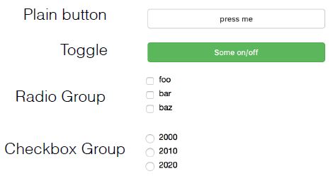
Button widgets
It’s time to practice adding buttons to your interactive visualizations. Your job in this exercise is to create a button and use its on_click() method to update a plot.
All necessary modules have been imported for you. In addition, the ColumnDataSource with data x and y as well as the figure have been created for you and are available in the workspace as source and plot.
When you’re done, be sure to interact with the button you just added to your plot, and notice how it updates the data!
Instructions
- Create a button called
buttonusing the functionButton()with the label'Update Data'. - Define an update callback
update()with no arguments. - Compute new y values using the code provided.
- Update the ColumnDataSource data dictionary
source.datawith the new'y'value. - Add the update callback to the button using
on_click().
1
2
3
4
5
6
7
8
9
10
11
12
13
14
15
16
17
18
19
20
21
22
23
24
25
26
27
28
29
30
31
32
33
34
35
36
37
38
39
40
41
42
43
44
45
46
def bkapp(doc):
    # Create ColumnDataSource: source
    N = 200
    x = list(np.arange(0, 10.01, 0.05025126))
    source = ColumnDataSource(data={'x' : x, 'y' : np.sin(x) + np.random.random(N)})

    # Create a new plot: plot
    plot = figure()

    # Add circles to the plot
    plot.scatter('x', 'y', source=source)


    # Create a Button with label 'Update Data'
    button = Button(label='Update Data')

    # Define an update callback with no arguments: update
    def update():

        # Compute new y values: y
        y = np.sin(x) + np.random.random(N)

        # Update the ColumnDataSource data dictionary
        source.data = {'x': x, 'y': y}

    # Add the update callback to the button
    button.on_click(update)

#     # Create layout and add to current document
#     layout = column(widgetbox(button), plot)
#     curdoc().add_root(layout)

    doc.add_root(Column(button, plot))

    doc.theme = Theme(json=yaml.load("""
        attrs:
            Figure:
                background_fill_color: "#DDDDDD"
                outline_line_color: white
                toolbar_location: above
                height: 400
                width: 400
            Grid:
                grid_line_dash: [6, 4]
                grid_line_color: white
    """, Loader=yaml.FullLoader))
1
2
# this won't disply in the HTML notebook
show(bkapp)
Button styles
You can also get really creative with your Button widgets.
In this exercise, you’ll practice using CheckboxGroup, RadioGroup, and Toggle to add multiple Button widgets with different styles.
curdoc and widgetbox have already been imported for you.
Instructions
- Import
CheckboxGroup,RadioGroup,Togglefrombokeh.models. - Add a Toggle called
toggleusing theToggle()function withbutton_type'success'andlabel'Toggle button'. - Add a CheckboxGroup called
checkboxusing theCheckboxGroup()function withlabels=['Option 1', 'Option 2', 'Option 3']. - Add a RadioGroup called
radiousing theRadioGroup()function withlabels=['Option 1', 'Option 2', 'Option 3']. - Add a widgetbox containing the Toggle
toggle, CheckboxGroupcheckbox, and RadioGroupradioto the current document.
1
2
3
4
%%script false  # imported at the top, don't run here.

# Import CheckboxGroup, RadioGroup, Toggle from bokeh.models
from bokeh.models import CheckboxGroup, RadioGroup, Toggle
1
Couldn't find program: 'false'
1
2
3
4
5
6
7
8
9
10
11
12
13
# Add a Toggle: toggle
toggle = Toggle(label='Toggle button', button_type='success')

# Add a CheckboxGroup: checkbox
checkbox = CheckboxGroup(labels=['Option 1', 'Option 2', 'Option 3'])

# Add a RadioGroup: radio
radio = RadioGroup(labels=['Option 1', 'Option 2', 'Option 3'])

# Add widgetbox(toggle, checkbox, radio) to the current document
layout = Column(toggle, checkbox, radio)
curdoc().add_root(layout)
show(layout)
Hosting applications for wider audiences
- Running a Bokeh Server
- Bokeh applications can be published on Anaconda Cloud
Putting It All Together! A Case Study
In this final chapter, you’ll build a more sophisticated Bokeh data exploration application from the ground up based on the famous Gapminder dataset.
Time to put it all together!
Introducing the project dataset
For the final chapter, you’ll be looking at some of the Gapminder datasets combined into one tidy file called “gapminder_tidy.csv”. This data set is available as a pandas DataFrame under the variable name data.
It is always a good idea to begin with some Exploratory Data Analysis. Pandas has a number of built-in methods that help with this. For example, data.head() displays the first five rows/entries of data, while data.tail() displays the last five rows/entries. data.shape gives you information about how many rows and columns there are in the data set. Another particularly useful method is data.info(), which provides a concise summary of data, including information about the number of entries, columns, data type of each column, and number of non-null entries in each column.
Use the IPython Shell and the pandas methods mentioned above to explore this data set. How many entries and columns does this data set have?
Instructions
7 entries, 10111 columns.- 10111 entries, 7 columns.
9000 entries, 7 columns.
There are 10111 entries, or rows, and 7 columns in the data set. Both the data.info() and data.shape methods provide this information.
Some exploratory plots of the data
Here, you’ll continue your Exploratory Data Analysis by making a simple plot of Life Expectancy vs Fertility for the year 1970.
Your job is to import the relevant Bokeh modules and then prepare a ColumnDataSource object with the fertility, life and Country columns, where you only select the rows with the index value 1970.
Remember, as with the figures you generated in previous chapters, you can interact with your figures here with a variety of tools.
Instructions
- Import output_file and show from bokeh.io, figure from bokeh.plotting, and HoverTool and ColumnDataSource from bokeh.models.
- Make a ColumnDataSource called source with:
- ‘x’ set to the fertility column.
- ‘y’ set to the life column.
- ‘country’ set to the Country column.
- For all columns, select the rows with index value 1970. This can be done using data.loc[1970].column_name.
1
2
3
4
%%script false  # imported at the top, don't run here.
from bokeh.io import output_file, show
from bokeh.plotting import figure
from bokeh.models import HoverTool, ColumnDataSource
1
Couldn't find program: 'false'
1
gap.set_index('Year', inplace=True)
1
2
3
4
5
6
7
8
9
10
11
12
13
14
15
16
17
18
# Make the ColumnDataSource: source
source = ColumnDataSource(data={
    'x'       : gap.loc[1970].fertility,
    'y'       : gap.loc[1970].life,
    'country' : gap.loc[1970].Country,
})

# Create the figure: p
p = figure(title='1970', x_axis_label='Fertility (children per woman)', y_axis_label='Life Expectancy (years)',
           height=400, width=700,
           tools=[HoverTool(tooltips='@country')])

# Add a circle glyph to the figure p
p.scatter(x='x', y='y', source=source)

# Output the file and show the figure
# output_file('gapminder.html')
show(p)
Starting the app
Beginning with just a plot
Let’s get started on the Gapminder app. Your job is to make the ColumnDataSource object, prepare the plot, and add circles for Life expectancy vs Fertility. You’ll also set x and y ranges for the axes.
As in the previous chapter, the DataCamp environment executes the bokeh serve command to run the app for you. When you hit ‘Submit Answer’, you’ll see in the IPython Shell that bokeh serve script.py gets called to run the app. This is something to keep in mind when you are creating your own interactive visualizations outside of the DataCamp environment.
Instructions
- Make a
ColumnDataSourceobject calledsourcewith'x','y','country','pop'and'region'keys. The Pandas selections are provided for you. - Save the minimum and maximum values of the life expectancy column
data.lifeasyminandymax. As a guide, you can refer to the way we saved the minimum and maximum values of the fertility columndata.fertilityasxminandxmax. - Create a plot called
plotby specifying thetitle, settingplot_heightto400,plot_widthto700, and adding thex_rangeandy_rangeparameters. - Add circle glyphs to the plot. Specify an
fill_alphaof0.8andsource=source.
1
2
3
4
5
%%script false  # imported at the top, don't run here.

from bokeh.io import curdoc
from bokeh.models import ColumnDataSource
from bokeh.plotting import figure
1
Couldn't find program: 'false'
1
2
3
4
5
6
7
8
# Make the ColumnDataSource: source
source = ColumnDataSource(data={
    'x'       : gap.loc[1970].fertility,
    'y'       : gap.loc[1970].life,
    'country' : gap.loc[1970].Country,
    'pop'     : (gap.loc[1970].population / 20000000) + 2,
    'region'  : gap.loc[1970].region,
})
1
2
3
4
5
6
7
8
9
10
11
12
13
14
15
16
17
18
19
20
21
22
23
# Save the minimum and maximum values of the fertility column: xmin, xmax
xmin, xmax = min(gap.fertility), max(gap.fertility)

# Save the minimum and maximum values of the life expectancy column: ymin, ymax
ymin, ymax = min(gap.life), max(gap.life)

# Create the figure: plot
plot = figure(title='Gapminder Data for 1970', height=400, width=700,
              x_range=(xmin, xmax), y_range=(ymin, ymax))

# Add circle glyphs to the plot
plot.scatter(x='x', y='y', fill_alpha=0.8, source=source)

# Set the x-axis label
plot.xaxis.axis_label ='Fertility (children per woman)'

# Set the y-axis label
plot.yaxis.axis_label = 'Life Expectancy (years)'

# Add the plot to the current document and add a title
curdoc().add_root(plot)
curdoc().title = 'Gapminder'
show(plot)
Notice how life expectancy seems to go down as fertility goes up? It would be interesting to see how this varies by continent. In the next exercise, you’ll do this by shading each glyph by its continent.
Enhancing the plot with some shading
Now that you have the base plot ready, you can enhance it by coloring each circle glyph by continent.
Your job is to make a list of the unique regions from the data frame, prepare a ColorMapper, and add it to the circle glyph.
Instructions
- Make a list of the unique values from the
regioncolumn. You can use theunique()andtolist()methods ondata.regionto do this. - Import
CategoricalColorMapperfrombokeh.modelsand theSpectral6palette frombokeh.palettes. - Use the
CategoricalColorMapper()function to make a color mapper calledcolor_mapperwithfactors=regions_listandpalette=Spectral6(spelled with the letter l, not the number 16). - Add the color mapper to the circle glyph as a dictionary with
dict(field='region', transform=color_mapper)as the argument passed to thecolorparameter ofplot.scatter(). Also set thelegend_labelparameter to be the'region'. - Set the
legend.locationattribute ofplotto'top_right'(i.e.plot.____).
1
2
3
4
%%script false  # imported at the top, don't run here.

from bokeh.models import CategoricalColorMapper
from bokeh.palettes import Spectral6
1
Couldn't find program: 'false'
1
2
3
4
5
6
7
8
9
10
11
12
13
14
15
16
17
18
# Make a list of the unique values from the region column: regions_list
regions_list = gap.region.unique()

# Make a color mapper: color_mapper
color_mapper = CategoricalColorMapper(factors=regions_list, palette=Spectral6)

# Add the color mapper to the circle glyph
plot.scatter(x='x', y='y', fill_alpha=0.8, source=source,
            color=dict(field='region', transform=color_mapper),
            legend_field='region')

# Set the legend.location attribute of the plot to 'top_right'
plot.legend.location = 'bottom_left'

# Add the plot to the current document and add the title
curdoc().add_root(plot)
curdoc().title = 'Gapminder'
show(plot)
The plot provides a lot more information now that you have added the shading. The next step is to add a slider to control the year. This will let you interactively visualize the change over the last few decades.
Adding a slider to vary the year
Until now, we’ve been plotting data only for 1970. In this exercise, you’ll add a slider to your plot to change the year being plotted. To do this, you’ll create an update_plot() function and associate it with a slider to select values between 1970 and 2010.
After you are done, you may have to scroll to the right to view the entire plot. As you play around with the slider, notice that the title of the plot is not updated along with the year. This is something you’ll fix in the next exercise!
Instructions
- Import the
widgetboxandrowfunctions frombokeh.layouts, and theSliderfunction frombokeh.models. - Define the
update_plotcallback function with parametersattr,oldandnew. - Set the
yrname toslider.valueand setsource.data = new_data. - Make a slider object called
sliderusing theSlider()function with astartyear of1970,endyear of2010,stepof1,valueof1970, andtitleof'Year'. - Attach the callback to the
'value'property of slider. This can be done usingon_change()and passing in'value'andupdate_plot. - Make a row
layoutofwidgetbox(slider)andplotand add it to the current document.
1
2
3
4
%%script false  # imported at the top, don't run here.

from bokeh.layouts import widgetbox, row
from bokeh.models import Slider
1
Couldn't find program: 'false'
1
2
3
4
5
6
7
8
9
10
11
12
13
14
15
16
17
18
19
20
21
22
23
24
%%script false  # doesn't work in Jupyter as configured

# Define the callback function: update_plot
def update_plot(attr, old, new):
    # Set the yr name to slider.value and new_data to source.data
    yr = slider.value
    new_data = {'x'       : gap.loc[yr].fertility,
                'y'       : gap.loc[yr].life,
                'country' : gap.loc[yr].Country,
                'pop'     : (gap.loc[yr].population / 20000000) + 2,
                'region'  : gap.loc[yr].region}
    source.data = new_data


# Make a slider object: slider
slider = Slider(start=1970, end=2010, step=1, value=1970, title='Year')

# Attach the callback to the 'value' property of slider
slider.on_change('value', update_plot)

# Make a row layout of widgetbox(slider) and plot and add it to the current document
layout = row(Column(slider), plot)
curdoc().add_root(layout)
show(layout)
1
Couldn't find program: 'false'
1
2
3
4
5
6
7
8
9
10
11
12
13
14
15
16
17
18
19
20
21
22
23
24
25
26
27
28
29
30
31
32
33
34
35
36
37
38
39
40
41
42
43
44
45
46
47
48
49
50
51
52
53
54
55
56
57
58
59
60
61
62
63
64
65
def bkapp(doc):

    source = ColumnDataSource(data={'x'       : gap.loc[1970].fertility,
                                    'y'       : gap.loc[1970].life,
                                    'country' : gap.loc[1970].Country,
                                    'pop'     : (gap.loc[1970].population / 20000000) + 2,
                                    'region'  : gap.loc[1970].region})

    # Make a list of the unique values from the region column: regions_list
    regions_list = gap.region.unique()

    # Make a color mapper: color_mapper
    color_mapper = CategoricalColorMapper(factors=regions_list, palette=Spectral6)

    # Save the minimum and maximum values of the fertility column: xmin, xmax
    xmin, xmax = min(gap.fertility), max(gap.fertility)

    # Save the minimum and maximum values of the life expectancy column: ymin, ymax
    ymin, ymax = min(gap.life), max(gap.life)

    # Add the color mapper to the circle glyph
    plot = figure(title='Gapminder Data for 1970', height=400, width=700,
                  x_range=(xmin, xmax), y_range=(ymin, ymax))
    plot.scatter(x='x', y='y', fill_alpha=0.8, source=source,
                color=dict(field='region', transform=color_mapper),
                legend_field='region')

    # Set the legend.location attribute of the plot to 'top_right'
    plot.legend.location = 'bottom_left'

    # Define the callback function: update_plot
    def update_plot(attr, old, new):
        # Set the yr name to slider.value and new_data to source.data
        yr = slider.value
        new_data = {'x'       : gap.loc[yr].fertility,
                    'y'       : gap.loc[yr].life,
                    'country' : gap.loc[yr].Country,
                    'pop'     : (gap.loc[yr].population / 20000000) + 2,
                    'region'  : gap.loc[yr].region}
        source.data = new_data


    # Make a slider object: slider
    slider = Slider(start=1970, end=2010, step=1, value=1970, title='Year')

    # Attach the callback to the 'value' property of slider
    slider.on_change('value', update_plot)

    # Make a row layout of widgetbox(slider) and plot and add it to the current document
    layout = row(Column(slider), plot)

    doc.add_root(layout)

    doc.theme = Theme(json=yaml.load("""
        attrs:
            Figure:
                background_fill_color: "#DDDDDD"
                outline_line_color: white
                toolbar_location: above
                height: 400
                width: 700
            Grid:
                grid_line_dash: [6, 4]
                grid_line_color: white
    """, Loader=yaml.FullLoader))
1
2
# this won't disply in the HTML notebook
show(bkapp)
Customizing based on user input
Remember how in the plot from the previous exercise, the title did not update along with the slider? In this exercise, you’ll fix this.
In Python, you can format strings by specifying placeholders with the % keyword. For example, if you have a string company = 'DataCamp', you can use print('%s' % company) to print DataCamp. Placeholders are useful when you are printing values that are not static, such as the value of the year slider. You can specify a placeholder for a number with %d. Here, when you’re updating the plot title inside your callback function, you should make use of a placeholder so that the year displayed is in accordance with the value of the year slider.
In addition to updating the plot title, you’ll also create the callback function and slider as you did in the previous exercise, so you get a chance to practice these concepts further.
All necessary modules have been imported for you, and as in the previous exercise, you may have to scroll to the right to view the entire figure.
Instructions
- Define the
update_plotcallback function with parametersattr,oldandnew. - Inside
update_plot(), assign the value of the slider,slider.value, toyrand setsource.data = new_data. - Inside
update_plot(), specifyplot.title.textto update the plot title and add it to the figure. You want the plot to update based on the value of the slider, which you have assigned above toyr. Make use of the placeholder syntax provided for you. - Make a slider object called
sliderusing theSlider()function with astartyear of1970,endyear of2010,stepof1,valueof1970, and title of'Year'. - Attach the callback to the
'value'property of slider. This can be done usingon_change()and passing in'value'andupdate_plot.
1
2
3
4
5
6
7
8
9
10
11
12
13
14
15
16
17
18
19
20
21
22
23
24
25
26
27
28
29
30
31
32
33
34
35
36
37
38
39
40
41
42
43
44
45
46
47
48
49
50
51
52
53
54
55
56
57
58
59
60
61
62
63
64
65
66
67
68
69
70
71
72
def bkapp(doc):

    source = ColumnDataSource(data={'x'       : gap.loc[1970].fertility,
                                    'y'       : gap.loc[1970].life,
                                    'country' : gap.loc[1970].Country,
                                    'pop'     : (gap.loc[1970].population / 20000000) + 2,
                                    'region'  : gap.loc[1970].region})

    # Make a list of the unique values from the region column: regions_list
    regions_list = gap.region.unique()

    # Make a color mapper: color_mapper
    color_mapper = CategoricalColorMapper(factors=regions_list, palette=Spectral6)

    # Save the minimum and maximum values of the fertility column: xmin, xmax
    xmin, xmax = min(gap.fertility), max(gap.fertility)

    # Save the minimum and maximum values of the life expectancy column: ymin, ymax
    ymin, ymax = min(gap.life), max(gap.life)

    # Add the color mapper to the circle glyph
    plot = figure(title='Gapminder Data for 1970', height=400, width=700,
                  x_range=(xmin, xmax), y_range=(ymin, ymax),
                  x_axis_label='Fertility (children per woman)', y_axis_label='Life Expectancy')
    plot.scatter(x='x', y='y', fill_alpha=0.8, source=source,
                color=dict(field='region', transform=color_mapper),
                legend_field='region')

    # Set the legend.location attribute of the plot to 'top_right'
    plot.legend.location = 'bottom_left'

    # Define the callback function: update_plot
    def update_plot(attr, old, new):
        # Assign the value of the slider: yr
        yr = slider.value
        # Set new_data
        new_data = {
            'x'       : gap.loc[yr].fertility,
            'y'       : gap.loc[yr].life,
            'country' : gap.loc[yr].Country,
            'pop'     : (gap.loc[yr].population / 20000000) + 2,
            'region'  : gap.loc[yr].region,
        }
        # Assign new_data to: source.data
        source.data = new_data

        # Add title to figure: plot.title.text
        plot.title.text = f'Gapminder data for {yr}'

    # Make a slider object: slider
    slider = Slider(start=1970, end=2010, step=1, value=1970, title='Year')

    # Attach the callback to the 'value' property of slider
    slider.on_change('value', update_plot)

    # Make a row layout of widgetbox(slider) and plot and add it to the current document
    layout = row(Column(slider), plot)

    doc.add_root(layout)

    doc.theme = Theme(json=yaml.load("""
        attrs:
            Figure:
                background_fill_color: "#DDDDDD"
                outline_line_color: white
                toolbar_location: above
                height: 400
                width: 700
            Grid:
                grid_line_dash: [6, 4]
                grid_line_color: white
    """, Loader=yaml.FullLoader))
1
2
# this won't disply in the HTML notebook
show(bkapp)
Adding more interactivity to the app
Adding a hover tool
In this exercise, you’ll practice adding a hover tool to drill down into data column values and display more detailed information about each scatter point.
After you’re done, experiment with the hover tool and see how it displays the name of the country when your mouse hovers over a point!
The figure and slider have been created for you and are available in the workspace as plot and slider.
Instructions
- Import
HoverToolfrombokeh.models. - Create a HoverTool object called
hoverwithtooltips=[('Country', '@country')]. - Add the HoverTool object you created to the
plotusingadd_tools(). - Create a row
layoutusingwidgetbox(slider)andplot. - Add the layout to the current document. This has already been done for you.
1
2
3
%%script false  # imported at the top, don't run here.

from bokeh.models import HoverTool
1
Couldn't find program: 'false'
1
2
3
4
5
6
7
8
9
10
11
12
13
%%script false  # place inside the function in the next cell

# Create a HoverTool: hover
hover = HoverTool(tooltips=[('Country', '@country')])

# Add the HoverTool to the plot
plot.add_tools(hover)

# Create layout: layout
layout = row(widgetbox(slider), plot)

# Add layout to current document
curdoc().add_root(layout)
1
Couldn't find program: 'false'
1
2
3
4
5
6
7
8
9
10
11
12
13
14
15
16
17
18
19
20
21
22
23
24
25
26
27
28
29
30
31
32
33
34
35
36
37
38
39
40
41
42
43
44
45
46
47
48
49
50
51
52
53
54
55
56
57
58
59
60
61
62
63
64
65
66
67
68
69
70
71
72
73
74
75
76
77
78
def bkapp(doc):

    source = ColumnDataSource(data={'x'       : gap.loc[1970].fertility,
                                    'y'       : gap.loc[1970].life,
                                    'country' : gap.loc[1970].Country,
                                    'pop'     : (gap.loc[1970].population / 20000000) + 2,
                                    'region'  : gap.loc[1970].region})

    # Make a list of the unique values from the region column: regions_list
    regions_list = gap.region.unique()

    # Make a color mapper: color_mapper
    color_mapper = CategoricalColorMapper(factors=regions_list, palette=Spectral6)

    # Save the minimum and maximum values of the fertility column: xmin, xmax
    xmin, xmax = min(gap.fertility), max(gap.fertility)

    # Save the minimum and maximum values of the life expectancy column: ymin, ymax
    ymin, ymax = min(gap.life), max(gap.life)

    # Add the color mapper to the circle glyph
    plot = figure(title='Gapminder Data for 1970', height=400, width=700,
                  x_range=(xmin, xmax), y_range=(ymin, ymax),
                  x_axis_label='Fertility (children per woman)', y_axis_label='Life Expectancy')
    plot.scatter(x='x', y='y', fill_alpha=0.8, source=source,
                color=dict(field='region', transform=color_mapper),
                legend_field='region')

    # Set the legend.location attribute of the plot to 'top_right'
    plot.legend.location = 'bottom_left'

    # Define the callback function: update_plot
    def update_plot(attr, old, new):
        # Assign the value of the slider: yr
        yr = slider.value
        # Set new_data
        new_data = {
            'x'       : gap.loc[yr].fertility,
            'y'       : gap.loc[yr].life,
            'country' : gap.loc[yr].Country,
            'pop'     : (gap.loc[yr].population / 20000000) + 2,
            'region'  : gap.loc[yr].region,
        }
        # Assign new_data to: source.data
        source.data = new_data

        # Add title to figure: plot.title.text
        plot.title.text = f'Gapminder data for {yr}'

    # Create a HoverTool: hover
    hover = HoverTool(tooltips=[('Country', '@country')])

    # Add the HoverTool to the plot
    plot.add_tools(hover)

    # Make a slider object: slider
    slider = Slider(start=1970, end=2010, step=1, value=1970, title='Year')

    # Attach the callback to the 'value' property of slider
    slider.on_change('value', update_plot)

    # Make a row layout of widgetbox(slider) and plot and add it to the current document
    layout = row(Column(slider), plot)

    doc.add_root(layout)

    doc.theme = Theme(json=yaml.load("""
        attrs:
            Figure:
                background_fill_color: "#DDDDDD"
                outline_line_color: white
                toolbar_location: above
                height: 400
                width: 700
            Grid:
                grid_line_dash: [6, 4]
                grid_line_color: white
    """, Loader=yaml.FullLoader))
1
2
# this won't disply in the HTML notebook
show(bkapp)
Adding dropdowns to the app
As a final step in enhancing your application, in this exercise you’ll add dropdowns for interactively selecting different data features. In combination with the hover tool you added in the previous exercise, as well as the slider to change the year, you’ll have a powerful app that allows you to interactively and quickly extract some great insights from the dataset!
All necessary modules have been imported, and the previous code you wrote is taken care of. In the provided sample code, the dropdown for selecting features on the x-axis has been added for you. Using this as a reference, your job in this final exercise is to add a dropdown menu for selecting features on the y-axis.
Take a moment, after you are done, to enjoy exploring the visualization by experimenting with the hover tools, sliders, and dropdown menus that you have learned how to implement in this course.
Instructions
- Inside the update_plot() callback function, read in the current value of the y dropdown, y_select.
- Use plot.yaxis.axis_label to label the y-axis as y.
- Set the start and end range of the y-axis of plot.
- Specify the parameters of the y_select dropdown widget: options, value, and title. The default value should be ‘life’.
- Attach the callback to the ‘value’ property of y_select. This can be done using on_change() and passing in ‘value’ and update_plot.
1
gap.head()
| Country | fertility | life | population | child_mortality | gdp | region | |
|---|---|---|---|---|---|---|---|
| Year | |||||||
| 1964 | Afghanistan | 7.671 | 33.639 | 10474903.0 | 339.7 | 1182.0 | South Asia |
| 1965 | Afghanistan | 7.671 | 34.152 | 10697983.0 | 334.1 | 1182.0 | South Asia |
| 1966 | Afghanistan | 7.671 | 34.662 | 10927724.0 | 328.7 | 1168.0 | South Asia |
| 1967 | Afghanistan | 7.671 | 35.170 | 11163656.0 | 323.3 | 1173.0 | South Asia |
| 1968 | Afghanistan | 7.671 | 35.674 | 11411022.0 | 318.1 | 1187.0 | South Asia |
1
2
3
4
5
6
7
8
9
10
11
12
13
14
15
16
17
18
19
20
21
22
23
24
25
26
27
28
29
30
31
32
33
34
35
36
37
38
39
40
41
42
43
44
45
46
47
48
49
50
51
52
53
54
55
56
57
58
59
60
61
62
63
64
65
66
67
68
69
70
71
72
73
74
75
76
77
78
79
80
81
82
83
84
85
86
87
88
89
90
91
92
93
94
95
96
97
98
99
100
101
102
103
104
105
106
107
108
109
110
111
112
113
def bkapp(doc):

    source = ColumnDataSource(data={'x'       : gap.loc[1970].fertility,
                                    'y'       : gap.loc[1970].life,
                                    'country' : gap.loc[1970].Country,
                                    'pop'     : (gap.loc[1970].population / 20000000) + 2,
                                    'region'  : gap.loc[1970].region})

    # Make a list of the unique values from the region column: regions_list
    regions_list = gap.region.unique()

    # Make a color mapper: color_mapper
    color_mapper = CategoricalColorMapper(factors=regions_list, palette=Spectral6)

    # Save the minimum and maximum values of the fertility column: xmin, xmax
    xmin, xmax = min(gap.fertility), max(gap.fertility)

    # Save the minimum and maximum values of the life expectancy column: ymin, ymax
    ymin, ymax = min(gap.life), max(gap.life)

    # Add the color mapper to the circle glyph
    plot = figure(title='Gapminder Data for 1970', height=400, width=700,
                  x_range=(xmin, xmax), y_range=(ymin, ymax),
                  x_axis_label='Fertility (children per woman)', y_axis_label='Life Expectancy')

    plot.scatter(x='x', y='y', fill_alpha=0.8, source=source,
                color=dict(field='region', transform=color_mapper),
                legend_field='region')

    # Set the legend.location attribute of the plot to 'top_right'
#     plot.legend.location = (457, -10)
    plot.legend.location = 'top_right'
    plot.legend.background_fill_color = None
    plot.legend.background_fill_alpha = 0.5

    # Define the callback: update_plot
    def update_plot(attr, old, new):
        # Read the current value off the slider and 2 dropdowns: yr, x, y
        yr = slider.value
        x = x_select.value
        y = y_select.value
        # Label axes of plot
        plot.xaxis.axis_label = x
        plot.yaxis.axis_label = y
        # Set new_data
        new_data = {
            'x'       : gap.loc[yr][x],
            'y'       : gap.loc[yr][y],
            'country' : gap.loc[yr].Country,
            'pop'     : (gap.loc[yr].population / 20000000) + 2,
            'region'  : gap.loc[yr].region,
        }
        # Assign new_data to source.data
        source.data = new_data

        # Set the range of all axes
        plot.x_range.start = min(gap[x])
        plot.x_range.end = max(gap[x])
        plot.y_range.start = min(gap[y])
        plot.y_range.end = max(gap[y])

        # Add title to plot
        plot.title.text = f'Gapminder data for {yr}'

    # Create a HoverTool: hover
    hover = HoverTool(tooltips=[('Country', '@country')])

    # Add the HoverTool to the plot
    plot.add_tools(hover)

    # Make a slider object: slider
    slider = Slider(start=1970, end=2010, step=1, value=1970, title='Year')

    # Attach the callback to the 'value' property of slider
    slider.on_change('value', update_plot)

    # Create a dropdown Select widget for the x data: x_select
    x_select = Select(
        options=['fertility', 'life', 'child_mortality', 'gdp'],
        value='fertility',
        title='x-axis data'
    )

    # Attach the update_plot callback to the 'value' property of x_select
    x_select.on_change('value', update_plot)

    # Create a dropdown Select widget for the y data: y_select
    y_select = Select(
        options=['fertility', 'life', 'child_mortality', 'gdp'],
        value='life',
        title='y-axis data'
    )

    # Attach the update_plot callback to the 'value' property of y_select
    y_select.on_change('value', update_plot)

    # Create layout and add to current document
    layout = row(Column(slider, x_select, y_select), plot)

    doc.add_root(layout)

    doc.theme = Theme(json=yaml.load("""
        attrs:
            Figure:
                background_fill_color: "#DDDDDD"
                outline_line_color: white
                toolbar_location: above
                height: 400
                width: 700
            Grid:
                grid_line_dash: [6, 4]
                grid_line_color: white
    """, Loader=yaml.FullLoader))
1
2
# this won't disply in the HTML notebook
show(bkapp)
Certificate