Visualizing Space Weather Data: From Procedural to Object-Oriented Approach
Summary
This post presents a comprehensive guide on visualizing space weather data, specifically focusing on the transformation from a procedural code approach to an object-oriented one. The initial procedural code provided was a script that loaded, cleaned, and visualized the data in a single sequence of steps. It demonstrated various visualization methods such as imshow, pcolormesh, contourf, and plot_surface to represent the data.
The transformation into an object-oriented approach involved refactoring the related data and methods into a class called SpaceWeather. This class improved the structure and efficiency of the code by bundling related data and methods together, enhancing code manageability. The class has methods for loading and cleaning the data (load_and_clean_data), and for plotting the data (plot_data and its subsidiaries for different plot types).
The post also provides a detailed explanation of the key enhancements brought about by the object-oriented approach, including refactoring, modularity, type hints, efficiency, code comments and docstrings, PEP8 compliance, improved code structure, improved plotting functionality, and improved code readability.
In summary, the post demonstrates how procedural code can be refactored into an object-oriented approach to improve code structure, readability, and maintainability. It serves as a practical guide for developers looking to enhance their data visualization techniques and code organization skills.
The code and data used in this post can be found in GitHub repository.
Task
The task is to visualize the given data in a plot where the date is represented on the x-axis, the hour of the day on the y-axis, and the dst index is represented by the color. Additionally, the goal includes adding annotations to the plot to highlight specific events that occurred during the period of data collection.
Here is a sample of spaceWeather.csv:
,year,doy,hr,kp,ssn,dst,f10_7
2020-08-02 00:00:00,YEAR,DOY,HR,1,2,3,4.0
2020-08-02 01:00:00,2020,215,0,3,15,18,74.9
2020-08-02 02:00:00,2020,215,1,3,15,16,74.9
2020-08-02 03:00:00,2020,215,2,3,15,10,74.9
2020-08-02 04:00:00,2020,215,3,7,15,7,74.9
The data being visualized in the described scenario is time series data concerning space weather indices, which track various environmental and astronomical measurements over time. The specific indices mentioned are:
- kp: A planetary geomagnetic activity index, which measures geomagnetic storms. KP values above 40 typically indicate significant geomagnetic activity or storms.
- dst: Another geomagnetic index, where values below -30 indicate geomagnetic storms.
- ssn: Sunspot number, which is an index of the number of sunspots and groups of sunspots present on the surface of the sun.
- f10.7: The solar radio flux at 10.7 cm (2800 MHz), which is a measurement of the solar emissions in the microwave range, and it’s often used as a proxy for solar activity.
The visualization aims to present space weather conditions by plotting KP index values across different hours and days. In this heatmap, the KP index is used as an indicator of geomagnetic activity, with higher values signifying more intense geomagnetic storms. By setting up the axes with dates on the x-axis and hours on the y-axis, and by mapping KP index values to color intensity, the visualization provides an insightful look into how geomagnetic conditions fluctuate over time. This approach allows for easy identification of critical events, such as storms, by observing changes in color intensity across the grid.
The intended visualization method, such as using pcolormesh, pcolor, imshow, or Seaborn’s heatmap, is apt for this kind of data as they can effectively show variations across two dimensions with color coding to represent the third dimension (intensity or magnitude of the indices). Other indices like dst, ssn, and f10.7 could potentially be visualized in a similar manner to track different types of environmental conditions or solar activity.
Script Based Solutions
Answer 1
This answer aims to meet the user’s requirement of visualizing space weather indices, specifically KP and DST values, in a heatmap format. The user intends to plot dates on the x-axis and hours on the y-axis, using color intensities to represent the index values. To achieve this, the answer provides a detailed Python script that utilizes libraries like Pandas, Seaborn, and Matplotlib to format the data suitably for visualization. The script includes steps to import data, create necessary columns for dates and hours, set conditions for labeling weather events like storms, and finally, generate a heatmap that visually represents the space weather conditions over time. The script also adds annotations to highlight significant dates or events, thus enhancing the heatmap’s interpretability. This approach effectively fulfills the user’s goal of creating an insightful visualization to monitor and analyze space weather trends.
1
2
3
4
5
6
7
8
9
10
11
12
13
14
15
16
17
18
import pandas as pd
import seaborn as sns
import matplotlib.pyplot as plt

df = pd.read_csv('spaceWeather.csv', parse_dates=[0], usecols=[0, 4, 6])
df['Date'] = df['Unnamed: 0'].dt.date
df['Hour'] = df['Unnamed: 0'].dt.hour
df['Weather'] = ''
df.loc[(df['kp'] > 40) | (df['dst'] < -30), 'Weather'] = 'Storm'
df = df[df['Date'] != pd.Timestamp('2020-09-17').date()]
annot = df.pivot(index='Date', columns='Hour', values='Weather')
dst = df.pivot(index='Date', columns='Hour', values='dst')
plt.figure(figsize=(16, 10))
ax = sns.heatmap(data=dst, annot=annot, fmt='', cmap='coolwarm', cbar_kws={'label': 'dst'})
ax.set_title('Space Weather')
plt.text(0.07, 0.335, 'Earthquake', horizontalalignment='center', verticalalignment='center', transform=ax.transAxes, fontsize=15)
plt.savefig('spaceWeather.png')
plt.show()
Answer 2
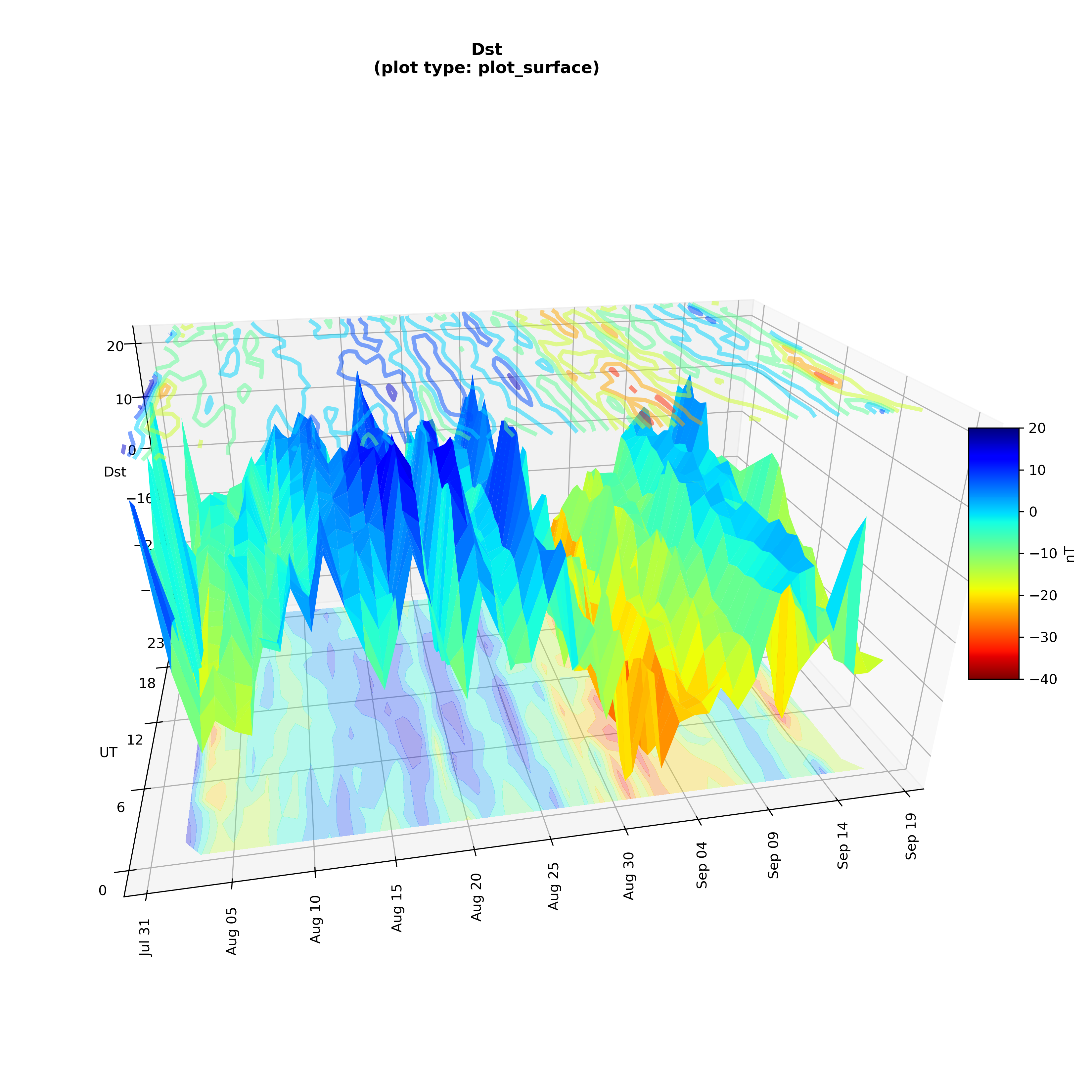
This answer demonstrates various visualization methods to represent space weather indices, a response tailored to the user’s interest in different plotting techniques for their data, including a unique 3D plot. The responder takes the user’s dataset, which tracks geomagnetic and solar activity, and applies different plotting methods like imshow, pcolormesh, contourf, and plot_surface to visually represent the data. Each method is showcased with an example image to help the user compare and select the visualization that best fits their needs. Additionally, the responder enhances the functionality of the plots by adjusting the tick frequency on the axes, making it easier for the user to interpret patterns over time. This answer not only addresses the user’s specific request for visualizing time-series data but also adds practical value by modifying the axis ticks to display data points every five days or on specific days of each month, improving the clarity and usability of the visualizations.
1
2
3
4
5
6
7
8
9
10
11
12
13
14
15
16
17
18
19
20
21
22
23
24
25
26
27
28
29
30
31
32
33
34
35
36
37
38
39
40
41
42
43
44
45
46
47
48
49
50
51
52
53
54
55
56
57
58
59
60
61
62
63
64
65
66
import pandas as pd
from matplotlib import pyplot as plt, dates as mdates
import numpy as np

df = pd.read_csv('spaceWeather.csv')[1:]
df = df.rename(columns={'Unnamed: 0': 'date'})
df.date = pd.to_datetime(df.date)
df = df.sort_values(by='date')

df = df.drop(columns=['year', 'doy', 'hr'])
df['day_of_year'] = df['date'].dt.day_of_year
df['hour'] = df['date'].dt.hour

df['event'] = ''
df.loc[(df.kp > 40) | (df.dst < -30), 'event'] = 'S'
df.loc[df.date == pd.Timestamp('2020/09/01 01:00'), 'event'] = 'E'

img_data = df.pivot_table(index='hour', columns='day_of_year', values='dst').values
labels = df.pivot(index='hour', columns='day_of_year', values='event').values
dates = pd.date_range(start=df.date.min(), end=df.date.max() + pd.offsets.Day(), freq='D', inclusive='both')

plot_type = 'imshow'
plot_type = 'contourf'
plot_type = 'plot_surface'
plot_type = 'pcolormesh'

f, ax = plt.subplots(figsize=(11, 3))

common_params = dict(vmin=-40, vmax=20, cmap='jet_r')

if plot_type != 'imshow':
    X, Y = np.meshgrid(mdates.date2num(dates), range(img_data.shape[0]))

if plot_type == 'imshow':
    im = ax.imshow(img_data, interpolation='none', aspect='auto', origin='lower', extent=[dates[0] - pd.offsets.Hour(12), dates[-1] + pd.offsets.Hour(12), df['hour'].min(), df['hour'].max()], **common_params)
elif plot_type == 'pcolormesh':
    im = ax.pcolormesh(X, Y, img_data, **common_params)
elif plot_type == 'contourf':
    im = ax.contourf(X, Y, img_data, levels=10, **common_params)
elif plot_type == 'plot_surface':
    f = plt.figure(figsize=(11, 11))
    ax = f.add_subplot(projection='3d', proj_type='persp', focal_length=0.2)
    ax.view_init(azim=79, elev=25)
    ax.set_box_aspect(aspect=(3, 2, 1.5), zoom=0.95)
    im = ax.plot_surface(X, Y, img_data, **common_params)
    ax.contourf(X, Y, img_data, levels=10, zdir='z', offset=-35, alpha=0.3, **common_params)
    ax.contour(X, Y, img_data, levels=8, zdir='z', offset=24, alpha=0.5, linewidths=3, **common_params)
    ax.set_zlabel('Dst')

for (row, col), label in np.ndenumerate(labels):
    if plot_type == 'plot_surface': break
    if type(label) is not str: continue
    ax.text(dates[col] - pd.offsets.Hour(6), row, label, fontsize=9, fontweight='bold')

ax.set_xticks(dates)
ax.xaxis.set_major_formatter(mdates.DateFormatter(fmt='%b %d'))
ax.xaxis.set_major_locator(mdates.DayLocator(interval=5))
ax.tick_params(axis='x', rotation=90)

ax.set_yticks([0, 6, 12, 18, 23])
ax.set_ylabel('UT')

aspect, fraction = (10, 0.15) if plot_type != 'plot_surface' else (5, 0.05)
f.colorbar(im, aspect=aspect, fraction=fraction, pad=0.01, label='nT')

ax.set_title(f'Dst\n(plot type: {plot_type})', fontweight='bold')
Object Oriented Approach
The updated version of the code, which organizes the management of space weather data into a class called SpaceWeather, improves the structure and efficiency of the code. The class handles data loading, cleaning, and plotting through defined methods, thus enhancing code modularity and readability.
Key enhancements include:
Refactoring: The
SpaceWeatherclass bundles related data and methods, thus improving code manageability. Theload_and_clean_datamethod is dedicated to data loading and cleaning, while theplot_datamethod and its subsidiaries handle the plotting.Modularity: Separate methods are implemented for different plot types (
imshow,pcolormesh,contourf,plot_surface), enhancing the modularity and readability of the code. This also makes it easier to introduce new plot types later.Type Hints: All function parameters and return types employ type hints, which clarify the code and help mitigate type-related errors.
Efficiency: The creation of unnecessary new empty figures is avoided in
plot_surface, which increases efficiency.Code Comments and Docstrings: Detailed comments and docstrings describe each method’s functionality, making the code more accessible to other developers.
PEP8 Compliance: The code follows the PEP8 style guide, using lowercase for variable and function names, and spacing around operators and after commas to enhance readability.
Improved Code Structure: The code is structured into a class, making it more organized and easier to maintain and extend.
Improved Plotting Functionality: The
plot_datamethod in the class can handle different types of plots, making the code more versatile.Improved Code Readability: The use of a class and methods makes the code easier to read and understand.
Object Oriented Code
1
2
3
4
5
6
7
8
9
10
11
12
13
14
15
16
17
18
19
20
21
22
23
24
25
26
27
28
29
30
31
32
33
34
35
36
37
38
39
40
41
42
43
44
45
46
47
48
49
50
51
52
53
54
55
56
57
58
59
60
61
62
63
64
65
66
67
68
69
70
71
72
73
74
75
76
77
78
79
80
81
82
83
84
85
86
87
88
89
90
91
92
93
94
95
96
97
98
99
100
101
102
103
104
105
106
107
108
109
110
111
112
113
114
115
116
117
118
119
120
121
122
123
124
125
126
127
128
129
130
131
132
133
134
135
136
137
138
139
140
141
142
143
144
145
146
147
148
149
150
151
152
153
154
155
156
157
158
159
160
161
162
163
164
165
166
167
168
169
170
171
172
173
174
175
176
177
178
179
180
181
182
183
184
185
186
187
188
189
190
191
192
193
194
195
196
197
198
199
200
201
202
203
204
205
206
207
208
209
210
211
212
213
214
215
216
217
218
219
220
221
222
223
224
225
226
227
228
229
230
231
232
233
234
235
236
237
238
239
240
241
242
243
244
245
246
247
248
249
250
251
252
253
254
255
256
257
import pandas as pd
import numpy as np
import matplotlib.pyplot as plt
import matplotlib.dates as mdates
from typing import Dict, Union
import matplotlib.figure
import matplotlib.axes


class SpaceWeather:
    """
    Solution to Stack Overflow question https://stackoverflow.com/q/78293639/7758804
    """

    def __init__(self, file_path: str):
        """
        Initialize the SpaceWeather class.

        Parameters:
        file_path (str): The path to the CSV file containing the data.
        """
        self.file_path = file_path
        self.df = None
        self.img_data = None
        self.labels = None
        self.dates = None

    def load_and_clean_data(self):
        """
        Load and clean the space weather data.
        The code for which is from https://stackoverflow.com/a/78294905/7758804
        """
        # Load the necessary columns, parse dates, skip header, and rename columns
        self.df = pd.read_csv(
            self.file_path,
            parse_dates=[0],
            skiprows=1,
            usecols=[0, 4, 6],
            names=["date", "kp", "dst"],
            header=0,
        )

        # Extract day of year and hour into new columns
        self.df["day_of_year"] = self.df["date"].dt.day_of_year  # new columns
        self.df["hour"] = self.df["date"].dt.hour

        # Add event column
        self.df["event"] = ""
        self.df.loc[(self.df.kp > 40) | (self.df.dst < -30), "event"] = "S"
        self.df.loc[self.df.date == pd.Timestamp("2020/09/01 01:00"), "event"] = "E"

        # Create image data
        self.img_data = self.df.pivot_table(
            index="hour", columns="day_of_year", values="dst"
        ).values
        # Create labels to be used as annotations
        self.labels = self.df.pivot(
            index="hour", columns="day_of_year", values="event"
        ).values
        # Create date range for x-axis
        self.dates = pd.date_range(
            start=self.df.date.min(),
            end=self.df.date.max() + pd.offsets.Day(),
            freq="D",
            inclusive="both",
        )

    def plot_data(self, plot_type: str = "imshow"):
        """
        Plot the space weather data.
        The code for plotting is from https://stackoverflow.com/a/78294536/7758804

        Parameters:
        plot_type (str): The type of plot to create. Options are 'imshow', 'pcolormesh', 'contourf', 'plot_surface'.
        """
        common_params: Dict[str, Union[int, str]] = dict(
            vmin=-40, vmax=20, cmap="jet_r"
        )

        # Create meshgrid for non-imshow plots
        if plot_type != "imshow":
            x, y = np.meshgrid(
                mdates.date2num(self.dates), range(self.img_data.shape[0])
            )

        # Plot data based on a plot type
        if plot_type == "imshow":
            self.plot_imshow(common_params)
        elif plot_type == "pcolormesh":
            self.plot_pcolormesh(x, y, common_params)
        elif plot_type == "contourf":
            self.plot_contourf(x, y, common_params)
        elif plot_type == "plot_surface":
            self.plot_surface(x, y, common_params)

    def plot_imshow(self, common_params: Dict[str, Union[int, str]]):
        """
        Plot the space weather data using imshow.

        Parameters:
        common_params (Dict[str, Union[int, str]]): Common parameters for the plot.
        """
        f, ax = plt.subplots(figsize=(11, 3))
        im = ax.imshow(
            self.img_data,
            interpolation="none",
            aspect="auto",
            origin="lower",
            extent=(
                mdates.date2num(self.dates[0] - pd.offsets.Hour(12)),
                mdates.date2num(self.dates[-1] + pd.offsets.Hour(12)),
                float(self.df["hour"].min()),
                float(self.df["hour"].max()),
            ),
            **common_params,
        )
        self.format_plot(f, im, ax, "imshow")

    def plot_pcolormesh(
        self, x: np.ndarray, y: np.ndarray, common_params: Dict[str, Union[int, str]]
    ):
        """
        Plot the space weather data using pcolormesh.

        Parameters:
        x (np.ndarray): The X coordinates of the meshgrid.
        y (np.ndarray): The Y coordinates of the meshgrid.
        common_params (Dict[str, Union[int, str]]): Common parameters for the plot.
        """
        f, ax = plt.subplots(figsize=(11, 3))
        im = ax.pcolormesh(x, y, self.img_data, **common_params)
        self.format_plot(f, im, ax, "pcolormesh")

    def plot_contourf(
        self, x: np.ndarray, y: np.ndarray, common_params: Dict[str, Union[int, str]]
    ):
        """
        Plot the space weather data using contourf.

        Parameters:
        x (np.ndarray): The X coordinates of the meshgrid.
        y (np.ndarray): The Y coordinates of the meshgrid.
        common_params (Dict[str, Union[int, str]]): Common parameters for the plot.
        """
        f, ax = plt.subplots(figsize=(11, 3))
        im = ax.contourf(x, y, self.img_data, levels=10, **common_params)
        self.format_plot(f, im, ax, "contourf")

    def plot_surface(
        self, x: np.ndarray, y: np.ndarray, common_params: Dict[str, Union[int, str]]
    ):
        """
        Plot the space weather data using plot_surface.

        Parameters:
        x (np.ndarray): The X coordinates of the meshgrid.
        y (np.ndarray): The Y coordinates of the meshgrid.
        common_params (Dict[str, Union[int, str]]): Common parameters for the plot.
        """
        f = plt.figure(figsize=(11, 11))
        ax = f.add_subplot(projection="3d", proj_type="persp", focal_length=0.2)

        ax.view_init(azim=79, elev=25)
        ax.set_box_aspect(aspect=(3, 2, 1.5), zoom=0.95)

        im = ax.plot_surface(x, y, self.img_data, **common_params)
        ax.contourf(
            x,
            y,
            self.img_data,
            levels=10,
            zdir="z",
            offset=-35,
            alpha=0.3,
            **common_params,
        )
        ax.contour(
            x,
            y,
            self.img_data,
            levels=8,
            zdir="z",
            offset=24,
            alpha=0.5,
            linewidths=3,
            **common_params,
        )
        ax.set_zlabel("Dst")
        ax.invert_xaxis()  # Orders the dates from left to right
        ax.invert_yaxis()  # Orders the hours from front to back
        self.format_plot(f, im, ax, "plot_surface")

    def format_plot(
        self,
        f: matplotlib.figure.Figure,
        im: matplotlib.image.AxesImage,
        ax: matplotlib.axes.Axes,
        plot_type: str,
    ):
        """
        Format the plot.

        Parameters:
        f (matplotlib.figure.Figure): The figure.
        im (matplotlib.image.AxesImage): The image.
        ax (matplotlib.axes.Axes): The axes.
        plot_type (str): The type of plot.
        """
        # Add labels
        for (row, col), label in np.ndenumerate(self.labels):
            if plot_type == "plot_surface":
                break  # skip labels on 3d plot for simplicity

            if type(label) is not str:
                continue
            ax.text(
                self.dates[col] - pd.offsets.Hour(6),
                row,
                label,
                fontsize=9,
                fontweight="bold",
            )

        # Format x-axis with dates
        ax.set_xticks(self.dates)
        ax.xaxis.set_major_formatter(mdates.DateFormatter(fmt="%b %d"))
        ax.xaxis.set_major_locator(mdates.DayLocator(interval=5))  # Tick every 5 days
        ax.tick_params(axis="x", rotation=90)

        # Format y axis
        ax.set_yticks([0, 6, 12, 18, 23])
        ax.set_ylabel("UT")

        # Add colorbar
        aspect, fraction = (10, 0.15) if plot_type != "plot_surface" else (5, 0.05)
        f.colorbar(im, aspect=aspect, fraction=fraction, pad=0.01, label="nT")

        # Add title
        ax.set_title(f"Dst\n(plot type: {plot_type})", fontweight="bold")

        # Adjust layout
        plt.tight_layout()

        # Save the plot
        plt.savefig(f"{plot_type}_plot.png", dpi=300)

        # Show the plot
        plt.show()


if __name__ == "__main__":
    sw = SpaceWeather("spaceWeather.csv")
    sw.load_and_clean_data()

    for plot_type in ["imshow", "pcolormesh", "contourf", "plot_surface"]:
        print(f"Plotting with plot type: {plot_type}")
        sw.plot_data(plot_type)